
One of the first steps to better understand the principles and elements of design is to identify what they are and how they function.
The elements are the building blocks of a work of art or design. They are the lines and shapes to create the product.
Principles are the arrangement of these elements and the relationship of the elements to one another.
The two come together in specific ways that create different aesthetically pleasing compositions for the viewer. Being able to understand, play around with, and utilize these elements and principles in one’s own work is a vital first step to becoming a stronger designer.
By the end of this training you will:
- Learn the elements and principles that build up a work of graphic design
- Understanding how to arrange elements in a way that is visually more effective and aesthetically pleasing
- Be able to identify the relationship between elements in other design works as well as your own
The Elements
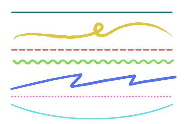
Line
Line is formed by connecting two points at different locations. They can be in any position and are straight, wavy, spiraled, zig-zag, arced, etc.
Shape
A shape is a 2D object bounded by one or more lines. Shapes can be geometric or organic.

Form
A form is a 3D object with a width, height, and length that is measurable. The form can be geometric, organic, or a mix.

Size
How small or large something is

Space
Space is the unoccupied area of objects it can be inside, outside, or between elements.

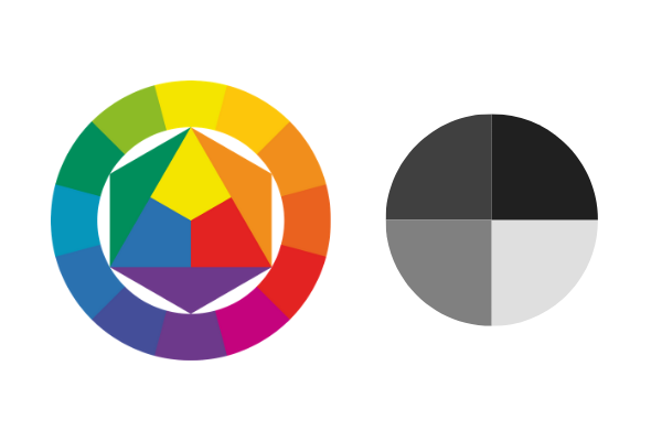
Value
How light or dark an area will look.

Color
Wavelengths of light that we perceive as color.
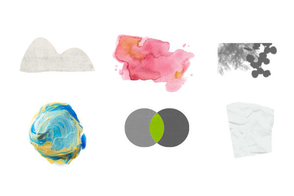
Texture
Texture is a tangible (seen or felt) surface.
The Principles
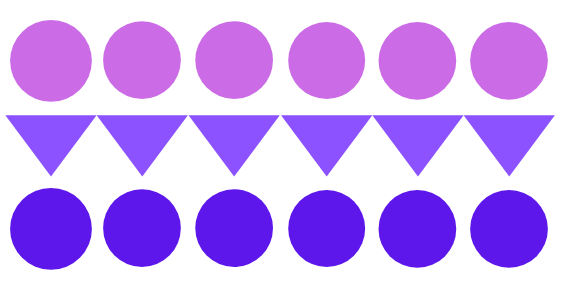
Repetition
The same components or similar-looking components in a composition are arranged in close proximity repetitively. This creates a sense of unity and provides consistency.
Rhythm
Objects have varying distances between several frequencies. It can influence and evoke emotions such as excitement and joy.

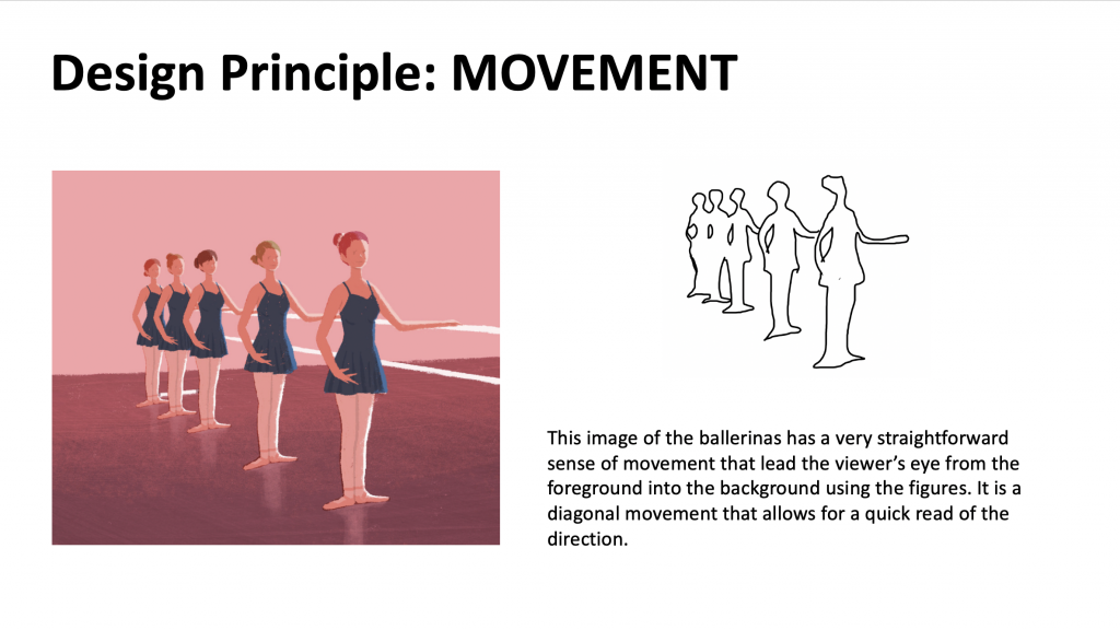
Movement
Arranging the composition in such a way that the objects lead the viewer’s eye along a path. This is used to suggest how external factors are arranging the composition.

Balance
Objects all have visual equilibrium, either as collectively smaller objects or as a singular large object.

Proportion/Scale
The relationship between two elements in terms of their comparing/contrasting size and visual weight. This is used to grant higher importance or priority of some objects over others.

Negative Space
The empty space in a work is used to guide the viewers’ focus to certain features or create breathing room in a piece.

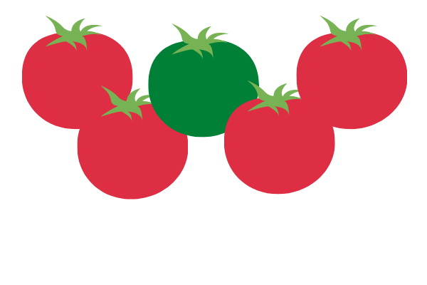
Contrast
Objects in the composition are starkly different visually through properties such as color, size and shapes.

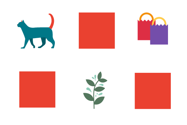
Emphasis
This creates focus at a particular element to highlight its importance.
Variety
Adding frequent changes of visually diverse elements to disrupt the monotony of a work or piece.
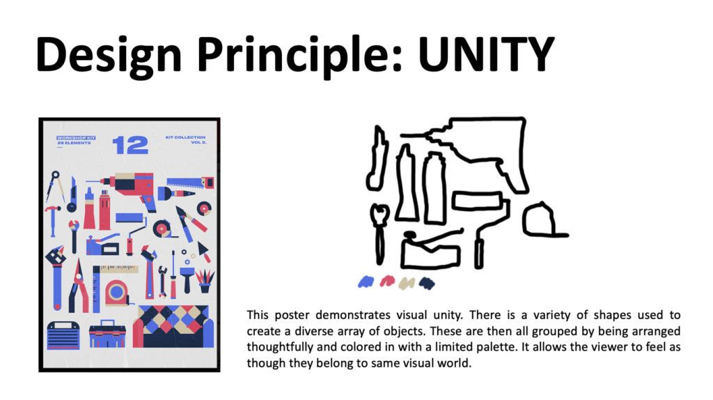
Unity/Harmony
Taking different elements in a composition and creating visual similarity by the way one arranges them.

Hierarchy
Arranged in a way for the eye to follow elements of most important to least. It remains consistent and brings order.

Check out this video for a full wrap up as well: https://www.youtube.com/watch?v=YqQx75OPRa0
Demonstrate Your Understanding
- Create a Google Slide Presentation or PowerPoint file to work within.
- The title of each slide should be of one design element or principle from the list above. Make sure to have a slide made for each one.
- Use the following resources to find images that you think applies to each design element/principle. Know that no single work only utilizes one element or principle, but pick one where you can identify a single element/principle more obviously.
3. Using a paper or drawing tablet/tool, outline where you are identifying the element or principle and insert your sketch side-by-side to the original image.
4. Add a description of where you see it, how it is working in the piece in relation to other compositional elements, and how the viewer may interpret the piece based on that element or principle.
Here are some examples below of how the slides may look. You can lay it out differently but keep all the content on a single slide for each one.
5. Tag the STA overseeing your training for feedback and make adjustments and edits as necessary.
6. Update your blog with images of your slides and a short description of your experience. Then post the box link to your training and close out the to-do once STA feedback and edits have been given.