
Design often relies of photography to better communicate its ideas – a picture is worth a thousand words and all that.
Subtleties in a photo from subject matter, to layout, to coloring can have a big non-verbal impact on how your design is interpreted. It’s important for designers to know how to choose photos that fit their project, and how to further adjust photos as needed.
By the end of this training you will:
- More about photo licensing and copyright law
- How to find copyright-free images on stock websites and crediting a source when necessary
- Multiple ways to create color schemes in Photoshop based off of an image
- How to apply a color scheme as a gradient map to an image
Photo Licensing and Copyright Law
Below are the U.S. Copyright Laws and Types of Fair Use for photographs depending on their copyright designation. Familiarize yourself with this information.
| Copyright Law | Fair Use |
| Title 17 of the U.S. Code, the right of authors to control the use of their work for a limited period of time. | Conditions must be met in order to use copyrighted photos without license or paying royalties. |
| Exclusive rights under the copyright law: – Reproduce – Distribute – Create derivative – Publicly perform – Public display Digital audio transmission | Photo licenses regulate the scope of use, the types of use, and limitations of use: – Editorial use – Commercial use – Promotional use CC photos allow you to: – Copy – Distribute -Display -Digitalize – Shift the work |
| The author has the sole right to determine when and how the work is used for commercial or other purposes. Types of usage rights: – Non-exclusive rights of use: author or owner can allocate non-exclusive usage rights. – Exclusive rights of use: use remains reserved to the author. | When sourcing/attributing a photo include the title, author, license information, and copyright notices if applicable. Do not use the photo if you can’t find the author or license information. |
| Works created on/after January 1, 1978 are protected for a term of the life of the author plus 70 years. Corporate author contents are protected for 95 years from publication or 120 years from creation. Copyright duration chart: http://copyright.cornell.edu/resources/publicdomain.cfm | Stock photos sites: – Unsplash – Pixabay – Pexels – Freestocks – Burst |
Note: For official UT purposes, you may also find utexas.imagerelay.com useful as a repository of UT imagery free for use. Please email submissions@utexas.edu to gain access.
Things to Consider When Choosing Dynamic Photos
Wait, what’s a dynamic photo?
A dynamic photo is content-appropriate and visually intriguing, and these qualities draw the reader into the graphic or text that it is attached to. Here are a few things to consider when choosing photos for your next project:
Resolution
Photos with high resolution have relatively more pixels per inch than low resolution photos, which allows them to be resized or manipulated without losing a lot of quality.
Brands, Symbols, People and What They Represent
Brands and people have symbolic meanings and histories attached to them, so be sure to do some research to ensure that an image’s contents do not conflict with your project’s intentions. For example, you shouldn’t use a photo of a specific city skyline (downtown Dallas, Houston, Austin, etc.) for a Texas-wide organization because it will look like the organization favors that city over others. Another example could be if you are choosing images for a 20th century civil rights course, an image of a Jefferson Davis statue would not be appropriate because he was the Confederate president and was not involved in the civil rights movement.
Other Aspects of Image’s Contents
Beyond the subject of the photo, look at the background. Is it congruent with the aesthetic of the course, organization, or brand you are choosing this photo for? Is it a portrait photo when the graphic is landscape or vice versa?
Now that you have a great understanding of the Copyright law and how to choose dynamic photos, let’s learn a technique called color grading that allows you to apply a color scheme from one image to another image. There are many methods for doing this in Photoshop; this training will teach you two methods. The first uses Color Tables and Swatch groups, and the second uses a Match Color tool. Let’s get started!
Color Grading: Activity 1
First, we will steal the colors from your favorite movie or show and apply it to some stock photos!
Choose a scene with an interesting tone or color palette from your favorite movie or show, then choose 2-3 stock photos. I chose a scene from the movie Moonlight and I will apply its colors to the stock photo following the steps below.
Color reference:

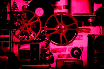
Original:

Color graded:

1. Create a color table using your source image
Open your source image in Photoshop. Go to Image > Mode > Indexed Color…
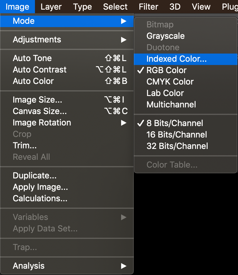
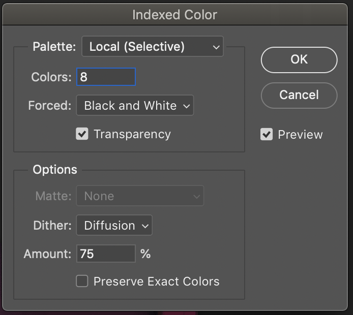
In the “Colors” section, type the number of colors you want to include in your color table. You will use 4-8 colors for the gradient map.
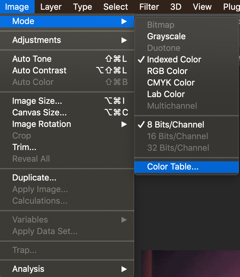
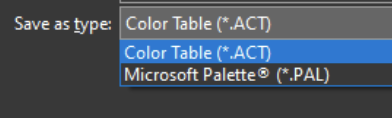
Hit OK, then go to Image > Mode > Color Table… > Save… to save the color table. Title this file using the name of your movie.
Note: If you’re working on a Mac, be sure that the file extension reads “.act”. If you’re using a PC, be sure to select “Color Table (ACT)” for your file extension.
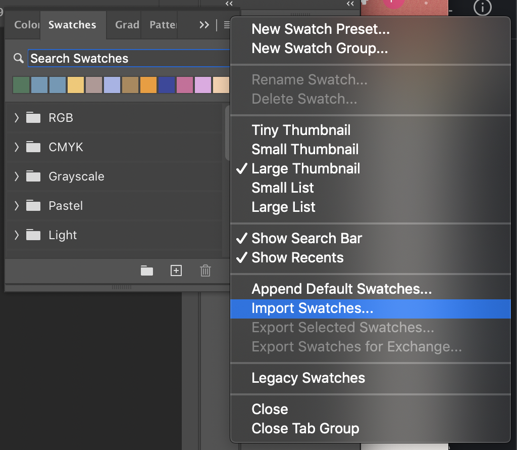
2. Import your color table into Photoshop.
Open the “Swatches” panel in the right toolbar. Click the hamburger icon in the top right of the panel, then select “Import Swatches…” and select your ACT file. This will create a new folder in swatches for your movie color table. (If you’re working on a PC, be sure that the search file type is set to “Color Table (ACT)”; the default may be ACO, and that file is not compatible with Swatches)
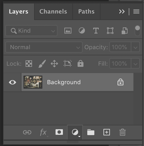
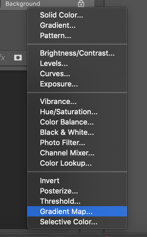
3. Create a gradient map based off of your swatch group.
Open one of your stock photos in Photoshop and add a Gradient Map adjustment layer to the image. Unlock the layer, then click on the half-filled circle at the bottom of the Layers panel and select “Gradient Map…”
Open the properties panel and click anywhere on the gradient bar to open the Gradient Editor window. Open your swatches panel back up. Click on the first “stop” in the gradient window, and click the color bar at the bottom. When the color picker opens, select the first color in your swatch group.
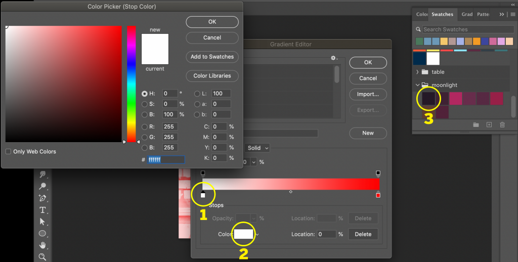
Note the brightness in the color picker, close the color picker, and place that number where it says “Location” in the Gradient Editor. The “stop” will shift accordingly on the gradient bar.
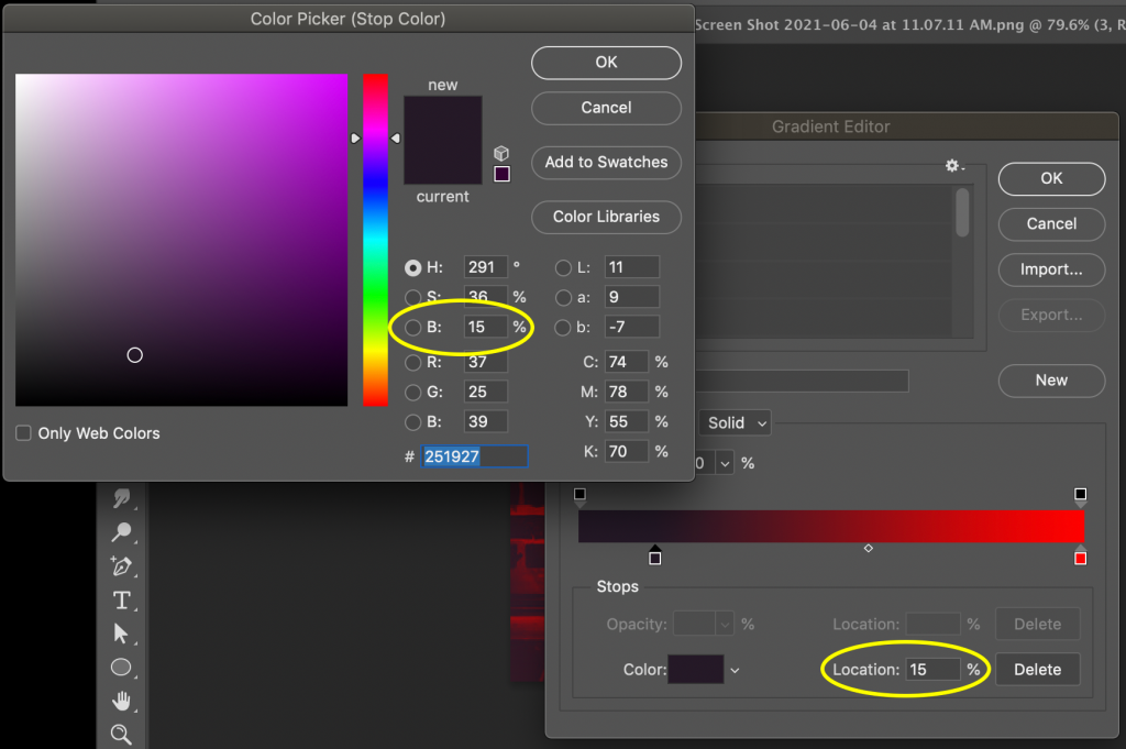
Repeat this process for the remainder of your colors (you do not have to use all of the colors in your color table!). To create a new “stop”, click anywhere directly beneath the gradient bar.
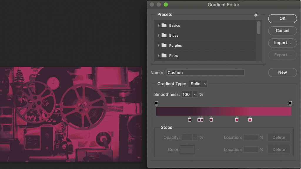
You can adjust the blend mode of the layer to create different color effects. For my image, I chose “vivid light”. Here’s the final product:
Post your original source image alongside three color graded stock photos on Basecamp for review.
Color Grading: Activity 2
Next, we will quickly explore Photoshop’s Match Color tool, which is another way to color grade photos! Pick a source image that you like, then pick another 2-3 target images to match the aesthetic of your source image. (Match Color tool works better with small tone adjustment, so consider that when you pick your photos :))
Example

- Open your source image and target image as separate layers in a single Photoshop file.
Rasterize both images by right clicking on the layer in the layers panel > Rasterize Layer (If the “Rasterize Layer” option is grayed out, your image is already rasterized)

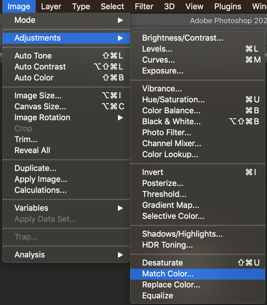
- With your target image selected, go to Image > Adjustment > Match color…
- In the Match color window, select your source image next to “Source”. Make sure the layer matches as well.

- Adjust color luminance, intensity, and fade as you see fit. Neutralize is a good option to tone down the color grade.

Here are the results:
Source image:

Original:

Color matched:

Post your original source image alongside three color graded stock photos on Basecamp for review.
Final Reflections
Color grading is very important when it comes to large scale promotions or projects with multiple artists/teams because it helps us maintain a consistent theme and style. Compare the two color grading methods and share your results and thoughts on Basecamp! (Don’t forget to source your images)