

Here at LAITS, you may be asked by a client to design a logo to help brand themselves, their course(s), or their program(s). Some courses also create printed material on mugs, bookmarks, buttons, etc., which is why we would like for you to familiarize yourself with how to do this.
By the end of this training you will:
- Learn about the history of logo design
- Learn about different styles
- Understand logo design do’s and don’ts
- Brainstorm and create a logo lockup [Adobe Illustrator]
- Use your logo in context through mockups and a favicons [Photoshop]
First of all, we need to define what a logo can be before we get into how to design one.
Logos 101
Logos are graphics/symbols used to identify and set the tone of a brand, a service, a person, or a product. Components of logos include:
- Images
- Text
- Shapes
The history of logos goes back to the Middle Ages, when shops and pubs used signs and drawings to advertise their business. Modern logo designs started in early 1900s with the growing development of mass printing. As more businesses established and grew, logo design became a vital part of one’s success in an extremely competitive field.
Heritage
Brands need time and effort to build up their reputation, this is also known as brand heritage. An effective way to present a brand’s heritage is through visual language such as logo design. A good logo can act as an identification of credibility and tell a brand’s story in a way that increases brand awareness and loyalty.
Timelessness & Adaptability
A good logo should be able to overcome the challenge of time. As trends come and go, a logo carries the brand’s history through decades, a classic example of timeless logo is Coca-Cola. Coca-Cola’s logo started out as a script logo when the company established in 1886, the branding has remained consistent over time and still reflect a distinctive image for the brand in today’s society.
As a brand grows, their logo also needs to adapt to the new scale and trend in order to complement a company’s development. The simplification of Starbucks’ logo is an example of logo adaptability. Although they started out as a coffee beans company, Starbucks steadily earned their name in the field. As they become more widespread and recognizable, Starbucks redesigned their logo to fit current consumer taste while still capturing the spirit of the Starbucks siren.
Styles
Logos can have different styles and forms. Some of the common types of logos includes:
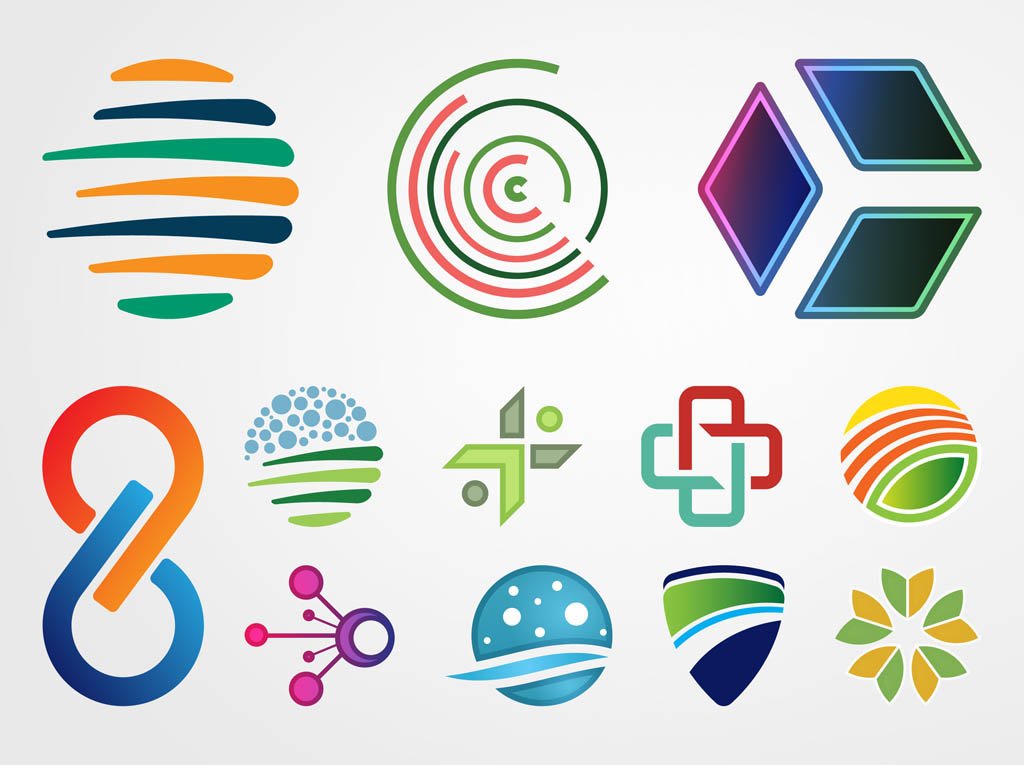
- Abstract logo marks
- logos that consits of abstract images or shapes.
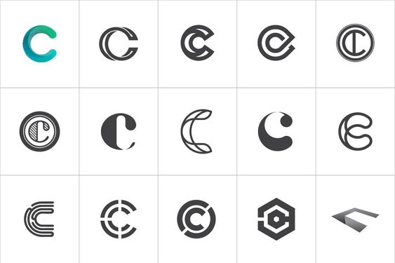
- Monogram/letter marks (ex: IBM, NASA)
- logos that consist of letters, usually brand initials
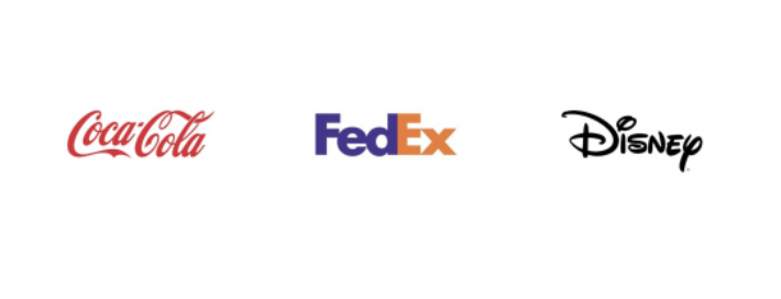
- Wordmarks (ex: Google, Coca-Cola)
- Similar to a lettermark, a wordmark or logotype is a font-based logo that focuses on a business’ name alone
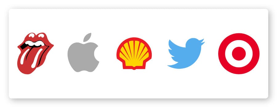
- Pictorial marks (ex: Apple, Spotify)
- an icon—or graphic-based logo
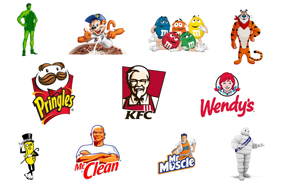
- Mascots (ex: Panda Express, KFC)
- logos that involve an illustrated character
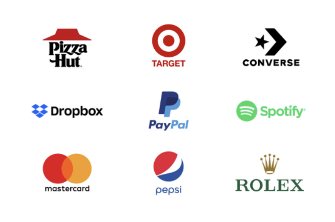
- Combination
- a versatile choice, with both the text and icon or mascot working together to reinforce your brand
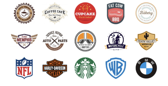
- Emblem (ex: Starbucks)
- font inside a symbol or an icon; think badges, seals and crests
* When communicating with client, make sure to use the correct vocabulary to avoid confusion. Inform the client if needed, reference the template below when offering design options to a client:
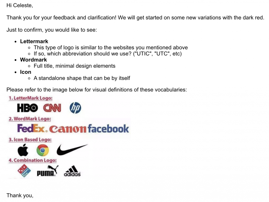
A good logo should be able to adapt to different platforms and still be recognizable with reduced elements or from afar. A good way to test your logo’s recognizability is to create different deviations of the logo, such as favicons and wordmark.
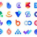
Creating Graphic Symbols Out of Organic Shapes
As you have learned before, a shape is any symbol that encloses a defined amount of space. Organic shapes, however, are those that poses irregular and asymmetrical borders. These are an amazing aid when it comes to logo design, because by using them you can create any symbol you can imagine.
However, a shape –and by all means, a logo– can be interpreted not only by the positive space it takes up, but also by the negative space within and around the shape. Organic shapes are an amazing tool to achieve these kinds of optical effects that can make your brand stand out. Check out the following examples:
Minimalism & Symmetry
The logos you create should be minimal and symmetrical in their design. A minimal design helps maintain clarity when applying to different platforms as well as simplify the process of designing a pared-down version for a favicon (an icon associated with a URL that appears in the browser bar next to the link). Symmetry in design is an effective way to catch a viewer’s eye before they may even register the image before them. It creates balance, harmony, order, and aesthetically pleasing results. Consider all types of symmetrical compositions as well as readability of your logo.
Here are examples of symmetrical layouts:
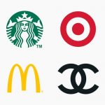
- BilateralSymmetry:
- aka Reflection Symmetry
- A shape reflected side by side –whether vertical, horizontal, diagonal or in any direction– and perfectly mirroring itself with no distortion whatsoever
- Ex. the McDonalds logo
- Radial Symmetry:
- aka Rotational Symmetry
- A shape is multiplied and placed surrounding a predetermined center point
- Ex. the Slack logo
- Translational Symmetry:
- A shape is identically multiplied to be relocated into different positions
- Ex. the Olympic Games logo
Bilateral, Radial, and Translational are shown below respectively.
Here are examples of minimal logo designs:
Feel free to check out the following resource that will teach of a few tools Adobe Illustrator has at your disposal to achieve symmetry in your designs! https://yesimadesigner.com/symmetrical-drawing-in-illustrator/
Proportions
Consider using the Golden ratio as a framework for a logo to make it more memorable and harmonic. Golden ratio is the relationship between 2 or more components, it’s also known as 1 to 1.618, this is the most balanced ratio that can be found in nature and famous artworks such as the Mona Lisa. Use the golden ratio grid to determine the perfect proportions of a logo’s heigh, width, or internal components/shapes.
Check out this video to learn more about how the golden ratio affect visual pattern!
Logo Do’s and Don’ts
- Research
- DO: Do your research! Ask the client questions. Make sure you thoroughly understand the brand’s mission, vision, their purpose, their competitors (if any) etc.
- DON’T: Start a design before fully understanding the brand you are designing for; this will make for a lousy job.
- Trends
- DO: Stay informed about the logo and branding trends that are currently relevant. It is important to stay present and keep up with these trends.
- DON’T: Do not design anything that will be inadaptable to other eras. Logos are meant to be timeless, so don’t follow trends that will rapidly become outdated.
- Typography
- DO: Choose original typography that connects to the brand’s identity.
- DON’T: Choose typography that is either too recognizable and associated to other brands or ideas, or too generic.
- Imagery
- DO: Use imagery that can be associated to the brand’s message.
- DON’T: Use clichéd imagery. Think beyond the initial connection between an image and a message and make your own new relevant connections.
- Abstraction
- DO: Use abstract designs to stand out.
- DON’T: Be too abstract, the logo still has to resonate with the audience.
- Simplicity and Complexity
- DO: Simplicity is key in logo design.
- DON’T: Complexity can help boosting uniqueness, but beyond that, a logo still has to be versatile and adaptable
- Color
- DO: Use colors as a visual tool.
- DON’T: Rely on colors effects that might be too complex. Remember color is an additional tool to relate to meaning, but a logo must first be recognizable by its shape.
- Options
- DO: Provide your client with variations of your design.
- DON’T: Provide your client with too many options and too many directions. Define a single direction for the logo, then provide a few versions of that vision with minimal variants.
- Responsiveness
- DO: Design a responsive logo that is adaptable to different formats.
- DON’T: Design a logo that won’t be adaptable to different formats. Logos must be able to stand out in all kinds of online and printable materials in a plethora of sizes and such. Make sure your design is responsive to those scenarios.
- Follow Up
- DO: Provide brand guidelines.
- DON’T: Skip this step. As the designer you want to make sure your client knows when/where/how to use the design pack you provide.
Activity: Creating a Logo
Now that you are more familiar with the 101 of logo design, the following activity will help you turn that knowledge into action. In this activity you will design a Logo Lockup. A Logo Lockup has two key components: a brandmark and a word/lettermark. You will work on both during this activity.
First, you will make a brandmark, which is an icon/symbol that represents your brand (think of the Twitter bird).
Then, you will work on a wordmark or a lettermark. A wordmark is the design of the brand name (like Google’s logo), whilst a lettermark is the design of the brand’s acronym (like IHOP’s logo, that stands for International House of Pancakes).
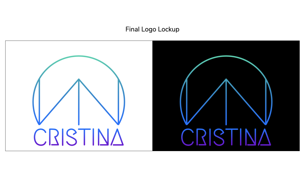
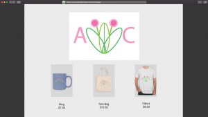
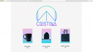
A Logo Lockup is the whole enchilada… brandmark + word/lettermark + misc taglines, all “locked up” in place with one another. In the end, you should get something like this:
Step 1
Chose one of the following situations:
- You are your own client. If you were creating a brand for yourself, what would it look like? How do you want to come across to the people who see your logo? Can line weight and shape make your logo feel bold or delicate?
- Your client is The Fintastic Shack: a newly founded family-owned sea food restaurant. The family is very friendly, fun and loves a good pun, so they would love it if you could incorporate some of that humor into your design.
Step 2
Please spend 20-30 minutes brainstorming and sketching on paper/tablet 10-15 ideas for the logo. Share you sketches on BC with your team lead, along with any reasoning to support them. This will help you narrow down the brainstorming to one idea.
- Don’t feel the need to get attached to any one idea yet, the goal now is to get directions and ideas down on paper.
- Make sure you consider the tone of the brand.
- Do not feel you must include a graphic element. A text-based logo can be just as strong. Remember there are so many different types of logos, you do not need to stick to one in the brainstorming phase.
Step 3
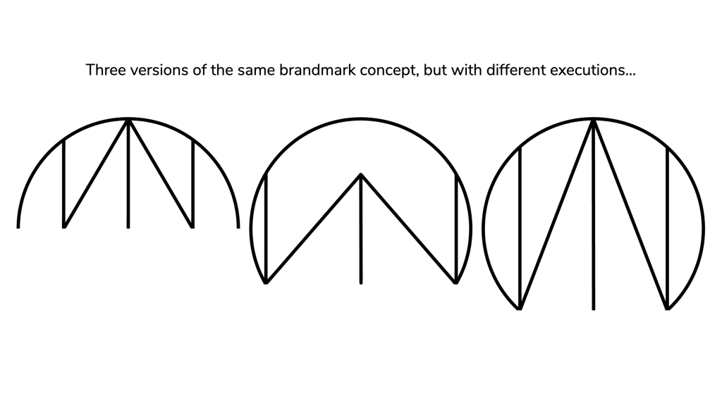
Once you define the vision for your logo, start drafting 3 different versions of a brandmark for your chosen logo idea. Do you have different visions for your chosen concept? This is your time to try them out. Can line weight and shape make your logo feel more bold or delicate? Try out different versions! Make sure you use Adobe Illustrator for this portion of the activity. Spend ~3 hours on this step. When you are satisfied with your three drafts, share them on BC.
- Remember to always draft your logos in black and white! This way you start out simple and reduce distractions for yourself and your client.
- The brandmark must be simple and minimal in appearance.
- The image must also be symmetrical. Symmetry in design is an effective way to catch a viewer’s eye before they may even register the image before them. It creates balance, harmony, order, and aesthetically pleasing results. Consider all types of symmetrical compositions such as bilateral, radial, and translational as well as readability of your logo.
- Layers should be kept unmerged with only a white background on the first locked layer.
- If you want to work on a text based brandmark, make sure you don’t make a word/lettermark, since we will be working on that in future steps. For instance, if you are inspired by their Google logo, don’t do the spelled-out version of it. Rather, you could work on something like their G shaped brandmark…
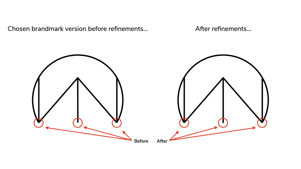
Step 4
After sharing your 3 brandmark drafts on BC, you should be ready to choose one of those as the final version of your brandmark. Make sure to work on refinements and feedback if needed.
Step 5
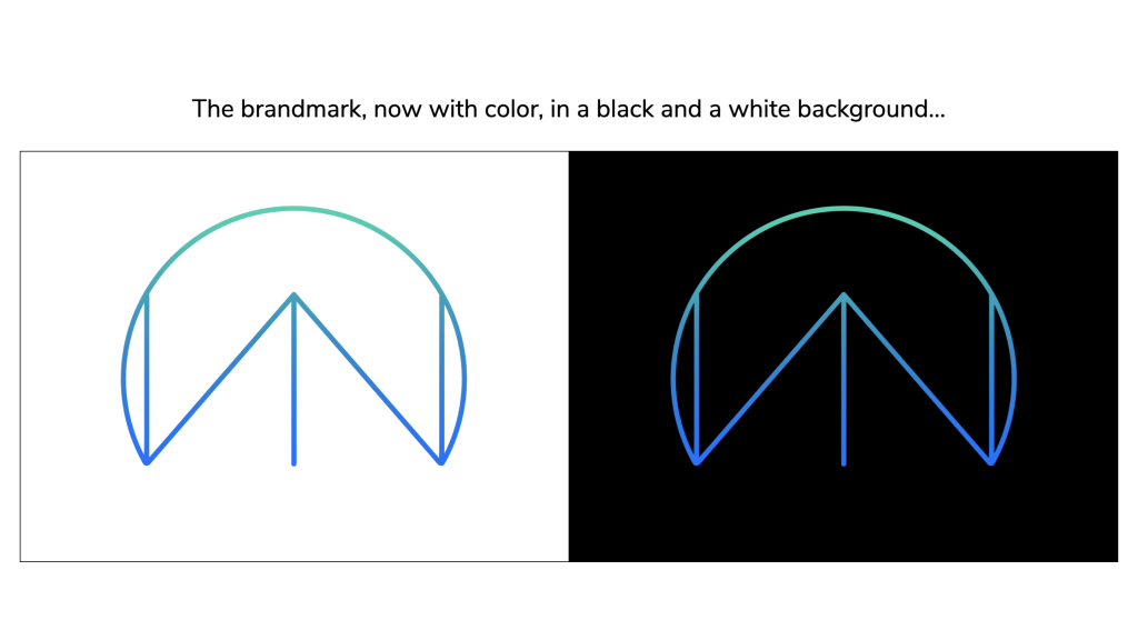
Time to add color! Recall what you learned already about the moods and meaning of color. Apply a minimum of 2 or a maximum of 4 colors to your design. The colors can be flat or have gradients. Also, make sure you demonstrate how the color version of your brandmark appears on both a black and a white background. Share on BC for feedback.
Step 6
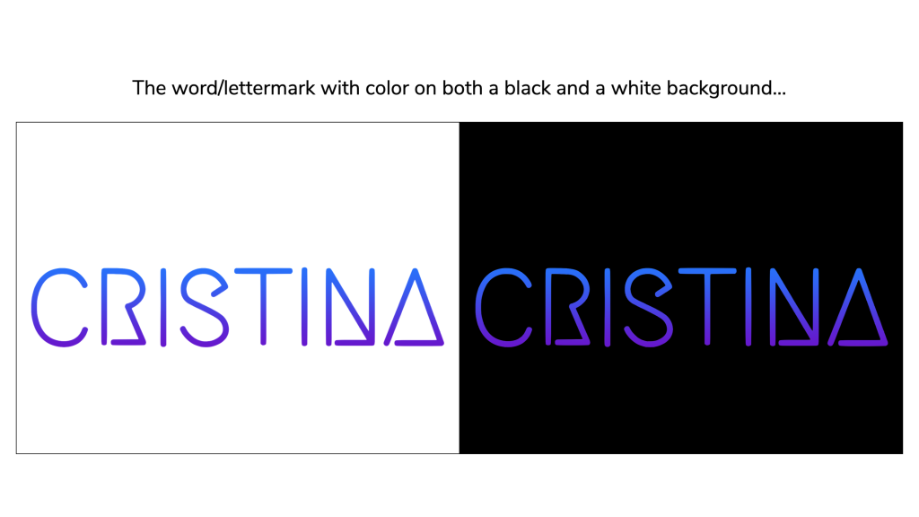
Now it’s time to work on a word/lettermark! Spend ~1 hour on this step depending on the complexity of your design. Find a font that speaks to you and feel free to edit any element of it in AI to better represent the brand. Make sure you demonstrate how the color version of your word/lettermark appears on both a black and a white background. When done, share it on BC.
- Keep in mind, if you designed a complex brandmark you might want to go for a less elaborate word/lettermark, and vise-versa. The point here is for you to learn how to balance these two components of the Logo Lockup and make them complement each other.
- Remember to always draft your logos in black and white! Do not add color until you are comfortable with the shape of your design.
- Gain a better understanding of do’s and don’ts when it comes to word/lettermarks.
Step 7
Make sure your completed Logo Lockup is approved and save your files onto your Box folder.
Step 8
Now that the logo has been created, it is ready to be applied to different types of promotional material! Mock up your design on different products such as mugs, bags, etc. Use PSD Mockup files such as the following to apply it onto 3 different types of products. Save your files with a crop of a 2:3 ratio (this is important for a future step) and share them on BC. Feel free to ask questions too, if needed.
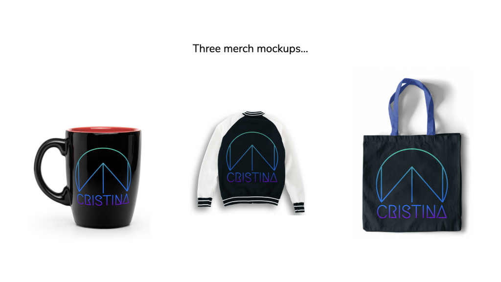
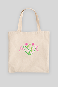
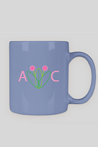
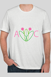
- You can find product specific PSD mockup templates here or here available for saving on Photoshop through Create New [Document] > Print > Templates.
Step 9
For this step, create a favicon to place in a “web page”. Use this template. Remember, a favicon appears at the top of a web browser and serves as a convenient way for people visiting the site to locate your page with multiple tabs open. Create a mock-up on Photoshop of your favicon and insert favicon to the “web page” tab. The promotional material made in the last step should also be included on this page as merchandise for sale as well. Fill in additional areas of the “webpage” as labeled and share the final product on BC.
- These images work best as simple shapes or 1-3 characters of text. Your brandmark design should be great for this purpose. A reduced version Logo must be legible as a “favicon.”
- Make sure your favicon is aligned with the coloring of your logo, a paired down shape of your logo, or contains the letters that were included in your logo.
- The favicon standard size is 16 x 16 pixels for this practice; only square pictures are supported as favicons. (Additionally, favicons can come in sizes of 32×32, 24×24, 48×48, 64×64, 128×128, and 256×256 pixels.)


Once you are done with the activity, make sure you have saved all your files on your box folder!
Read on (optional): Exporting Logos for Clients

Additional Support on Logo Design
For more info on logo design, especially for a client, the following steps are also a great way to achieve a more thorough logo design process.
- Read the client’s brief.
- Do a competitor analysis.
- Applicable if there’s competition at all, for some LAITS projects there won’t be…
- Look at how other similar brands are communicating their values.
- I.e., if designing for a UT client, how are other UT derived brands communicating their values?
- Lay out design elements in an artboard on InDesign.
- Organize them on a spectrum from less to more complex.
- Figure out where on the spectrum you would like to target/be similar to.
- Normally the middle and then a little more progressive.
- Use this also as an opportunity to know what not to do, too.
- Create a related words Mind Map.
- Brainstorm on a journal a bunch of words that represent 3 potentially applicable adjectives to describe your brand.
- Create a moodboard.
- Go back to the mind map, pick out some words, and find images that represent them.
- Check Google, Unsplash, Dribble, Behance, Pexels for inspiration images.
- Organize these images based on similar visual traits.
- Start drawing!
- Brainstorm 10-20 drawings of logo ideas at first.
- Try starting with something obvious then making the design more and more progressive if you are scared to start.
- Start developing! Draft out the technical parts on Illustrator and Photoshop using the available pen tools.
- Trace over scanned images at lowered opacities.
- Communicate with client!
Feel free to check out this link for the explanation of this process: How to Design a Logo for Beginners | BYOL Show EP1