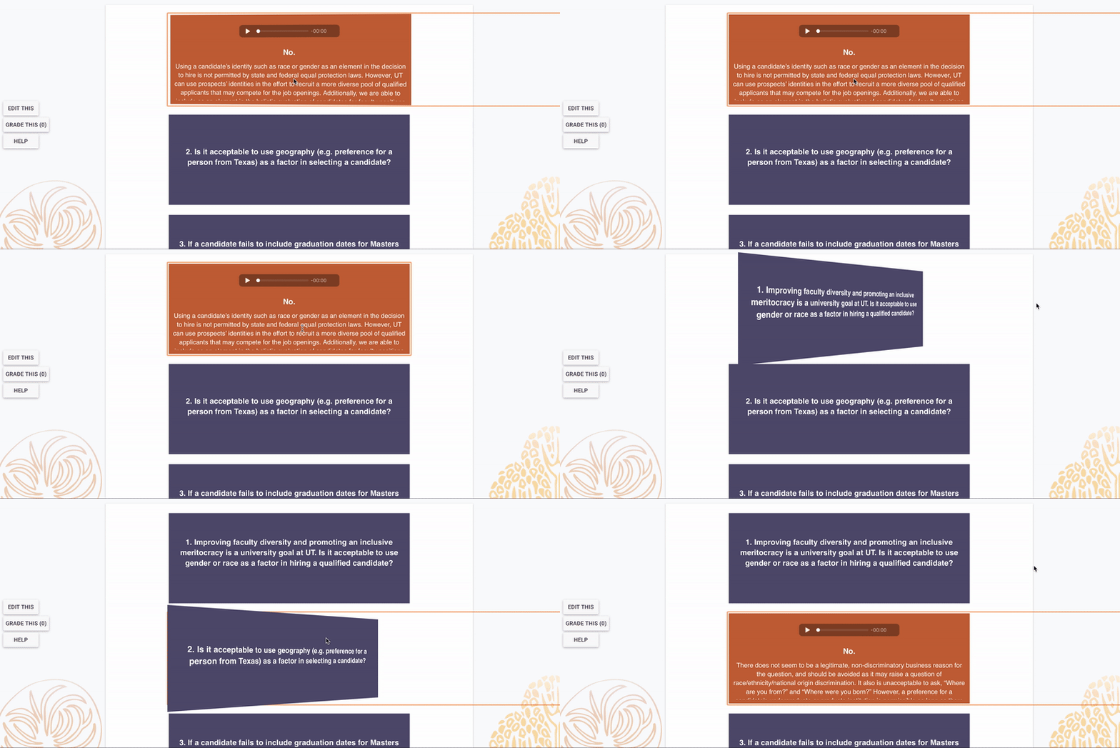
CSS flip cards are a great way to dynamically display Q/A or vocabulary-baed content. You can even add audio and images to your cards, depending on the content from the client.
In this training, you’ll learn how to:
- Create animated flip cards using HTML and CSS within CLIO
- Customize flip cards’ color, text styling, animation, and more
- Experiment with card layouts, like CSS flex box grids
- Make flip cards keyboard-accessible by using a click action instead of hover

The Basic Structure
Paste the HTML at the bottom of this training into the source code section of the CLIO card. Change the HTML text to your content. Click save.
Paste the CSS into the Edit Course section.
In the CSS, change the colors to match the rest of the course. Ask the head STA or the person in charge for the proper HEX codes or RGB values if you’re unsure. Make sure to also change the text color to give max contrast. Change text-aligns and other style elements as you see fit.
The code above is only for one flip card, so if you have multiple, you’ll have to copy the HTML for each flip card you need.
Save your code. Make sure you save frequently.
Making Tweaks
Give each card a unique ID on the <div> container so that we can adjust and style each card individually if need be.
If you want a grid to make more efficient use of space, use a CSS flex box.
Generally, we use a click or enter key command to flip the cards instead of hovering for accessibility purposes. We also typically use a longer animation duration than you usually see for flip cards for this reason — about 1.3 secs.
Go back into the course page and check to make sure everything looks ok. Troubleshoot if not.
This could involve adjusting padding, margins, and animation duration. Different clients might want different things, so be prepared to make edits to card layout and style accordingly.
HTML Code
<div class="flip-card">
  <div class="flip-card-inner">
    <div class="flip-card-front">
     <!-- image if we need one <img src="img_avatar.png" alt="Avatar" style="width:300px;height:300px;"> !-->
      <p>front text</p>
    </div>
    <div class="flip-card-back">
     <p>back text</p>
   </div>
  </div>
</div>
CSS Code
/* The flip card container - set the width and height to whatever you want. We have added the border property to demonstrate that the flip itself goes out of the box on hover (remove perspective if you don't want the 3D effect */
.flip-card {
  background-color: transparent;
  width: 300px;
  height: 200px;
  border: 1px solid #f1f1f1;
  perspective: 1000px; /* Remove this if you don't want the 3D effect */
}

/* This container is needed to position the front and back side */
.flip-card-inner {
  position: relative;
  width: 100%;
  height: 100%;
  text-align: center;
  transition: transform 1.3s;
  transform-style: preserve-3d;
}

/* Do an horizontal flip when you move the MOUSE OVER the flip box container this IN PLACE OF CLICK CODE */
.flip-card:hover .flip-card-inner {
  transform: rotateY(180deg);
}

/* Do an horizontal flip when you CLICK the card or use the enter key when focused on card REPLACES HOVER CODE */
.flip-card:focus-within .flip-card-inner,
.flip-card:active .flip-card-inner,
.flip-card:focus .flip-card-inner {
  transform: rotateY(180deg);
}

/* Position the front and back side */
.flip-card-front, .flip-card-back {
  position: absolute;
  width: 100%;
  height: 100%;
  -webkit-backface-visibility: hidden; /* Safari */
  backface-visibility: hidden;
}

/* Style the front side (fallback if image is missing) */
.flip-card-front {
  background-color: #bbb;
  color: black;
}

/* Style the back side */
.flip-card-back {
  background-color: dodgerblue;
  color: white;
  transform: rotateY(180deg);
}
