

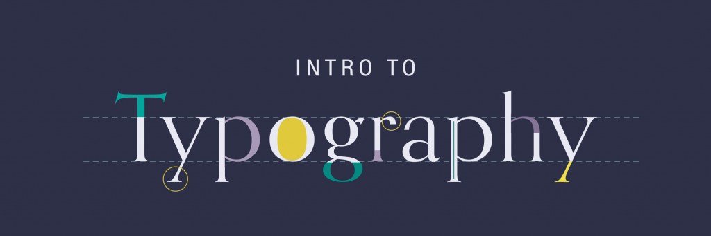
Fonts are an integral part of graphic design. Behind every bit of text that you see – on websites, billboards, and even your phone’s keyboard – lives a designer who spent time choosing the perfect font that fits the texts’ setting and function. This lesson will teach you about the origins of typography and the basic functions of different types of fonts.
By the end of this training you will:
- Learn about popular fonts (and find out why they are popular!)
- Identify types of fonts (serif, sans serif, etc.) and font emphases (bold, italics, etc.)
- Download fonts
- Pair fonts
Let’s get started!
Brief History of Typography
Before Gutenberg created the development of moveable type and the printing press, everything was written by quill and ink on varnished animal skin bounded in books. Our look at typography will go from this point forward.
Here’s a fun visual overview of the development of typography before reading the timeline below.
- 1400s: Guttenberg invented moveable type: hand-carved letters on metal blocks and a press to roll ink over the metal raised letters. The font he created was known as a blackletter.
- 1470: Jenson invented the Roman type, inspired by the Roman text on their architecture. It was more readable than previous fonts, like blackletter.
- 1501: Manutius created italics.
- 1700s: Different variations of the serifs were being experimented with by Caslon and Baskerville (aka the names of the fonts now).
- 1816: Caslon IV created Sans Serif.
- 1920s: Goudy was the world’s first full-time type designer.
- 1957: Miedinger created Helvetica.
- Present: We have new fonts coming out all the time, thanks to the internet!
The Anatomy of Letters
Typography is complex and nuanced, with lots of rules, and a lot of vocabulary. A good starting point is taking a look at the anatomy of letter:
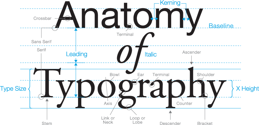
You’ll need to know:
- serif/sans-serif
- bracket
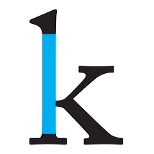
- stem
- terminal
- Serifs are the little extensions on either end of a letter known as brackets. Brackets come in different styles, but when added to any letter, they make that letter serif.
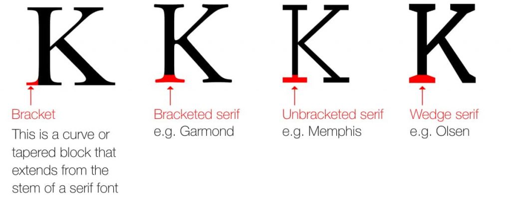
- Sans Serifs are letters that do not have brackets (serifs) on their ends. Sans means “without,” so think of it as “without serifs/brackets.”
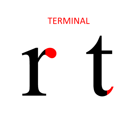
- A terminal is the end of a stroke in a letter that does not include a serif. For instance, some typefaces feature ball terminals on letters or a tapered ending.
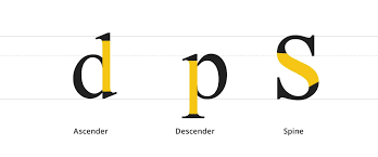
- Stems are the straight vertical lines that make up a letter, however, if that line drops below or above the x-height or like the letter “p” or “d” then they are called a descender or ascender respectively.
Here, the unhighlighted parts are the arm (angled up) and leg (angled down).
The Spacing of Letters and Words
Now that we know the parts of a letter, how do we fit them together? We do it in 3 big general ways. Leading, Kerning, and Tracking.
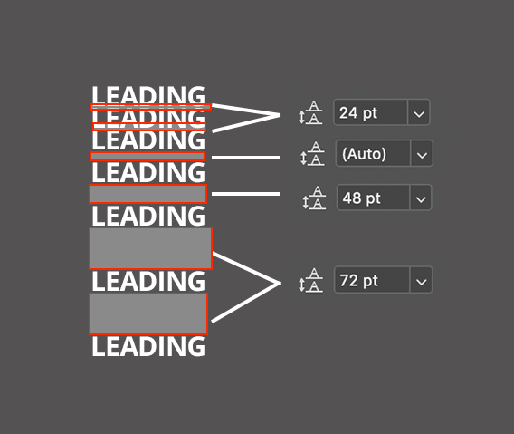
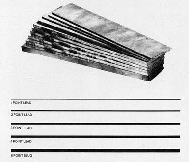
- Leading is a term that comes from traditional letterpress. When creating a paragraph of text out of text blocks one would insert a thick slug of lead between lines to space sentences out vertically.
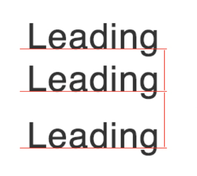
Leading between letters that are too tight or too far apart can ruin a viewer’s ability to read text smoothly. Use tighter leading for Headers and looser leading for Body text.
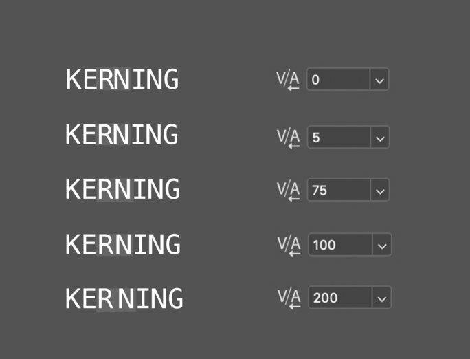
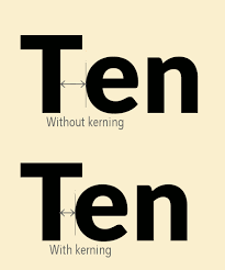
- Kerning is the spacing between letters within a word. You don’t want to adjust all the letters in a word at once. Highlight the two letters where you see an unusually too wide or too narrow of a gap and just adjust that area. They should optically look like they have equal spacing between all letters in a word.
BONUS TIP:
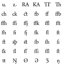
- Ligatures are something that every designer should be aware of. In traditional letterpress, some letters when put together in a word would look extremely spaced out. To solve this problem some typeface had double letters like “ff” or “fl”. Depending on the font you use, you may have to play around with kerning these letter pairs much closer than they are at default.
- Tracking is the spacing of all the letters in a word at once uniformly. This needs to be used very sparingly as too much can make text difficult to read and quickly skewed. “Tracking is generally used to fill a space that’s larger or smaller than currently suits the type’s parameters or to make a single word seem airy and impressive.” – credit

Classic fonts and why they work, when to use them
What’s so great about a font?
Typeface first became an integral part of design during the arts and crafts movement, when William Morris developed bold, visually aesthetic, symmetric typefaces to be used by his printing press. Not soon after this, modernism encouraged designers to think more abstract and create decorative fonts with more flourishes. Now, fonts fall anywhere on the spectrum from strictly readable to decorative.
Fonts are used to…
- Make a brand or design memorable
- Evoke an emotion from the viewer
- Contribute to the ~vibe~ and era of the design
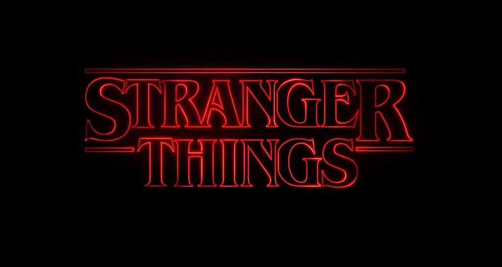
Consider how Netflix has chosen fonts based on their television shows. The Stranger Things font, ITC Benguiat, ticks all three of these boxes. The show’s popularity has made this font instantly recognized and associated with the TV show. The font also fits in well with the 80s time period that Stranger Things is set in, as during this time, bold serif fonts were very popular. In fact, this font was inspired by the font Stephen King novels used for the author’s name. These key features combined with the coloring and animation of the typeface evoke an emotion in the viewer, transporting them into a small town mystery set in the 80s.
Even without looking into the specifics of why a font was chosen, we can see the impact that fonts have on brand aesthetic and recognition. Something about these brand logos seems a little off…
Fonts give a brand a sense of uniqueness and allow them to stand apart from other brands. If everything were the same font, you’d lose this element of differentiation.
Choosing a Typeface
There are five basic styles of typefaces.
Serif
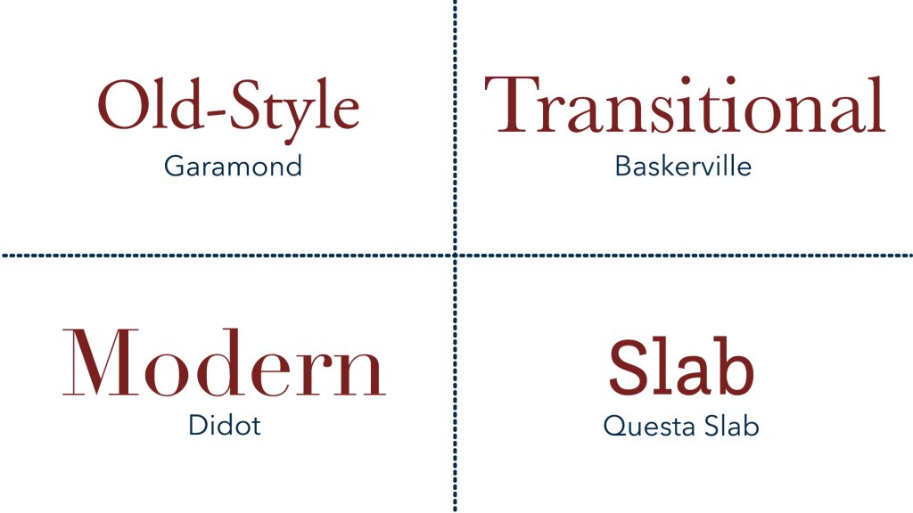
Serif typefaces have extended features at the ends of character strokes. These typefaces are seen in traditional mediums such as newspapers, books, and scholarly journals. Serif typefaces give a brand a sense of tradition, structure, and refinement. Some common examples of serif typefaces are Times New Roman, Georgia, and Garamond.
Sans Serif
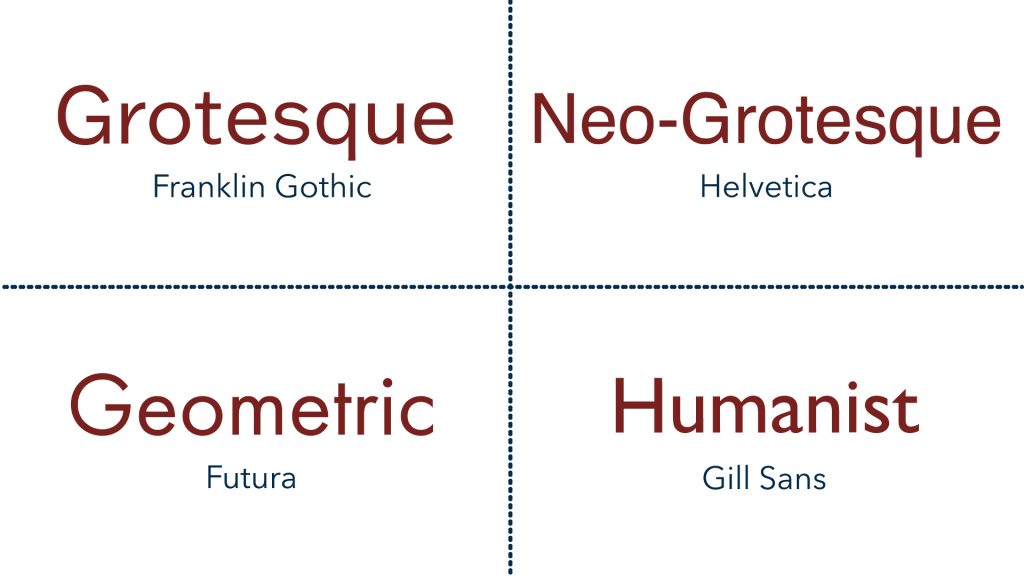
Sans serif typefaces do not have any extensions on characters. These typefaces are seen most in digital mediums. Sans serif typefaces give a brand a sense of modernity, cleanliness, and approachability. Some common examples of sans serif typefaces are Arial, Helvetica, and Geneva.
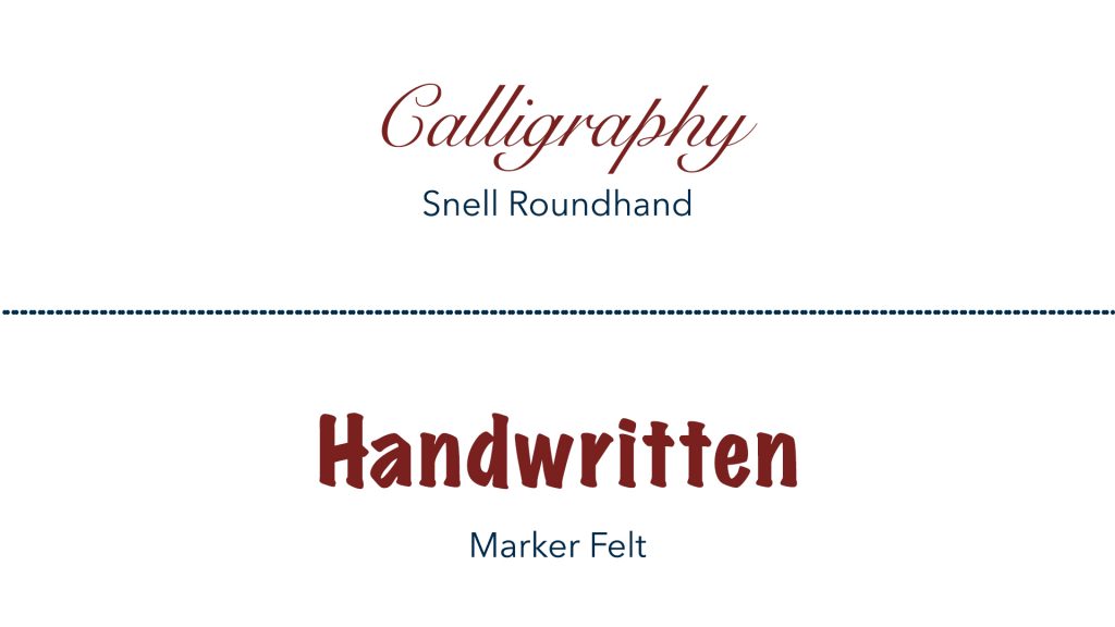
Script
Script typefaces are designed to imitate cursive or regular handwriting. These typefaces are used in conjunction with more readable serif or sans serif typefaces, intended to be more decorative than functional. Some common examples of script typefaces are Edwardian script, Lucida Calligraphy, and Papyrus.
Monospace
Monospace typefaces feature characters that all take up exactly the same horizontal space, and the spacing in between the characters is symmetric as well. These typefaces are most commonly used in coding but have been seen in graphic design websites and advertising. Examples of monospace typefaces include Courier, Lucida Console, and Monaco.

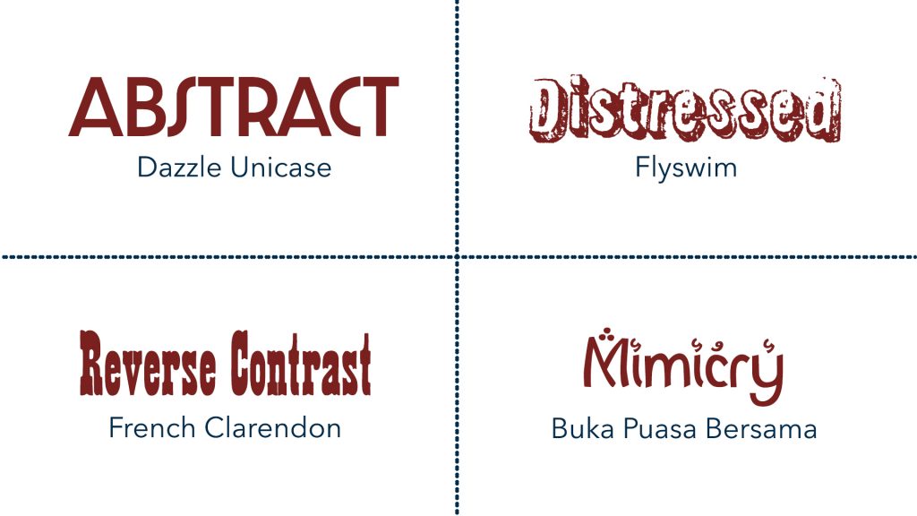
Display
Display typefaces feature more eccentric, abstract character designs and are intended to be used at large sizes for headings. These typefaces are used everywhere — billboards, print ads, website headings — but never in body text. Some examples of display typefaces are Broadway, Curlz, and Algerian.
This designer provides a list of his 10 favorite fonts and 9 least favorite fonts, explaining what he likes and dislikes about fonts:
Using Font Emphases
Font emphases are the variations (in boldness, serif, italics, etc.) of a typeface within its font family.
A few things to keep in mind when using font emphases:
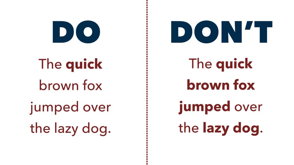
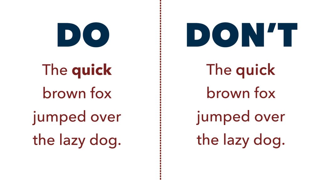
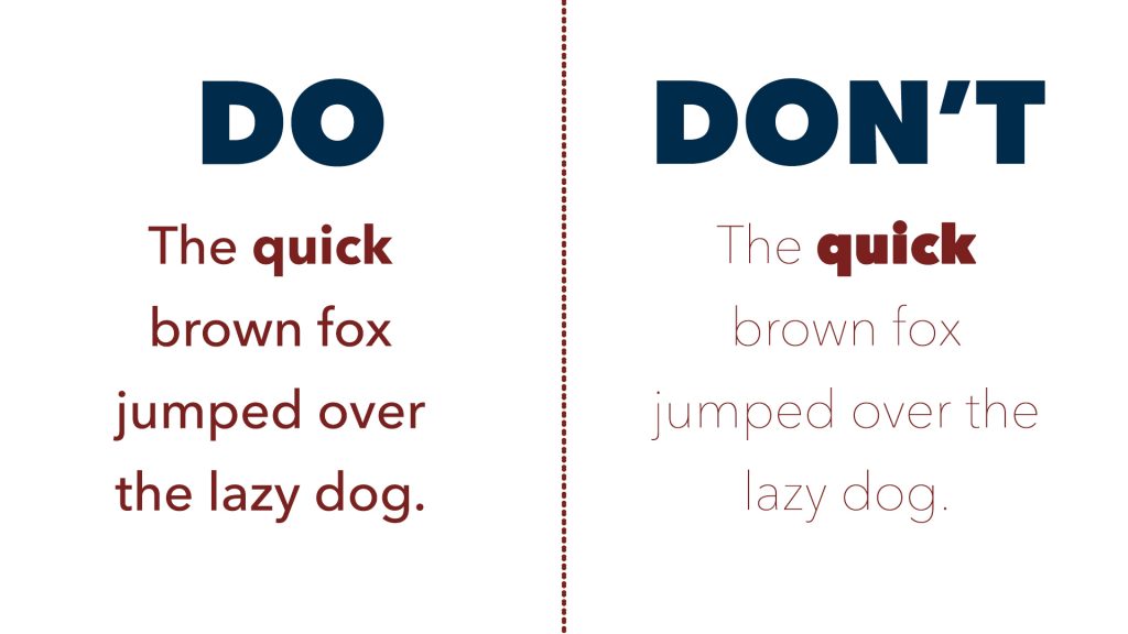
Use them with strong intent. If you’re using an emphasis on specific words, use it sparingly. If you bold half of the text, that boldness loses its meaning.
True emphases > Software emphases. If your chosen font has an emphasis typeface, always use that emphasis as opposed to your software’s emphasis (hitting CMD/CTRL + B). This font emphasis was created for a reason and will pair better with the regular version of your font. This is particularly important with italics, as the software italicization will simply slant all of your letters, whereas the font italic version may curve the letters to be more script-like.
Watch the contrast. Be cautious when pairing the heaviest version of a font with the lightest version. Too sharp of a contrast between font emphases will make it more difficult for your readers’ eyes to adjust between words.
How to pair fonts
From 99 Designs:
Combining two different fonts from the same family generally won’t provide any contrast and the design is likely to feel boring or weak. But different weights of the same font can be used in harmony—like a sans serif in a demi-bold paired with a light italic. A combination like this will have a subtler effect than one that utilizes two totally different fonts.
In any good font pairing, there should only be one font with a lot of “personality.” So, don’t go overboard. If your logo uses a beautiful handwriting font, stick to something classic and clean for your second one. Two wildly interesting fonts will feel disconnected and out of sync with one another.
Finally, pay attention to legibility. A classic serif or clean sans serif can both work for long paragraphs of text, while a heavy sans serif will be better suited for headlines.
Web tools can help suggest or generate pairings to get you started:
The Ultimate Collection of Google Font Pairings (Displayed Beautifully with Classic Art) — SOO COOL
Font Joy Pairing Generator
How to download fonts
There are many free and paid typefaces available for you to download.
The easiest way is to activate fonts via Adobe Fonts (through your Adobe CC account). The fonts are downloaded to the cloud and will be available to you on any desktop so long as you’re logged in Adobe.
Google Fonts is another great resource because these free fonts can easily be added to any web design code, even when they aren’t a “standard” web font like Arial, Georgia, etc.
Other free font download sites include: DaFont, Font Squirrel, 1001 Free Fonts
Type foundries, companies who design fonts, are another good resource though usually cost money: Pangram, Klim, Creative Market
Required: Download these must-have fonts for STA design work, plus any other fun ones you see. These may already be installed on your LAITS machine.
Helvetica
Benton Sans
GT Sectra
Roboto and Roboto Condensed and Slab
Futura
Open Sans
Montserrat
Libre Baskerville
Only download fonts from Google and Adobe on your LAITS machines.
Activity
This is a short one where we want to hear your thoughts on type so far.
- On Basecamp, share 2-3 font pairings you like and why you think they work. They can be from the resources linked, a pairing you saw in the wild, or a pairing you made yourself.
- Share a font for each typeface outside of the required list. Why did you pick them, and what kind of ~ vibe ~ do they give off? Maybe you have a project in mind that they’d work well for? Let us know!
- Share any other thoughts, questions, or ideas you had while reading through this lesson.