

Creating an effective Icon
The purpose of this basic training is to go over how to create an effective icon. You will be using Adobe Illustrator to create your icons.
Icons are symbols used to communicate an idea, actions, or object without using words. Readability at first glance is really important to create a successful icon. Not only are icons represented as apps on our devices, icons are also navigation tools, warning signs, trigger actions, and communicate status.
When creating a functional icon consider asking yourself, does this design effectively portray the idea this icon is supposed to represent? The following instructions will go over the tools used to create an icon and helpful tips to create an effective one.
By the end of this training you will:
- Learn what makes an icon successful and universally understood
- Research and develop a set of 5 icons for 1 of 2 clients with unique style guides
6 Keys to a Successful Icon
When creating an effective icon, these are some key ideas to keep in mind:
- Clarity:
Icon’s primary goal is to communicate a concept quickly. Use objects or metaphors that already represent the icon’s meaning. For example, when representing time, the typical icon used is a clock.
When an object doesn’t already have an existing metaphor, you can create a more abstract design. However, you still want the design to clearly represent the object.
Here is an example. These are icons used for driving to be used as warning signs when something happens in the car. As you move along the list, the icons become more confusing on what the possible metaphor could be.
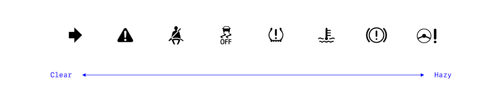
The “seatbelt reminder light” (3rd from the left) is literal and can be understood quickly. However, the “electric power steering system warning light” (far right) is hard to understand at first glance without some guidance.
We want to create icons that are easy to grasp to create a more enjoyable experience for the design audience.
- Readability:
When considering the readability of an icon, we want to ask ourselves a series of questions. Does the icon read what it is supposed to mean? Are the lines too thin and complicated that the design gets lost? Or are the lines to bold that the lines blend together?
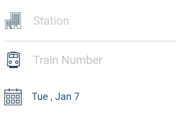
This station icon for the Amtrak app has too fine details that makes it hard to read.
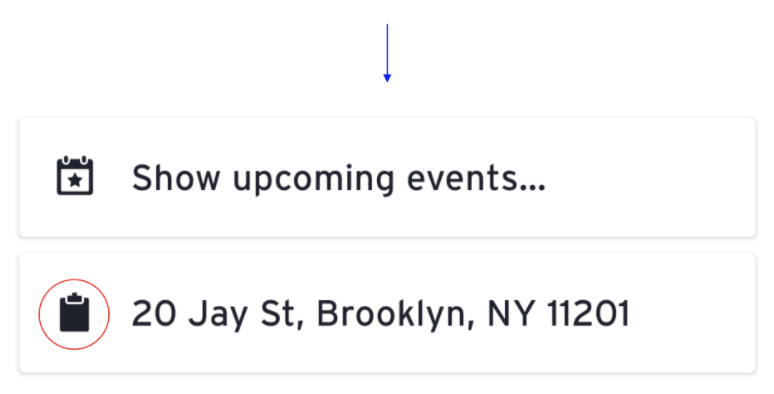
In addition, the clipboard icon on the transit app appears as a blob because the spacing is incorrect. Simple adjustment could make these icons more readable.

To highlight a good icon set, Google maps does a good job of executing very readable icons. They are easy to understand and the audience can grasp them at a glance.

- Alignment:
Alignment for icons means that you want to make sure the icon feels balanced. Sometimes that means offsetting some part to provide that feeling.
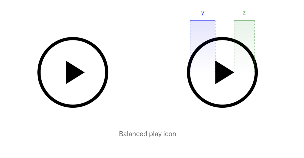
For example, within this play icon, the triangle is centered within the circle. However, the weight of the wider part of the triangle makes the icon feel heavier on that side.
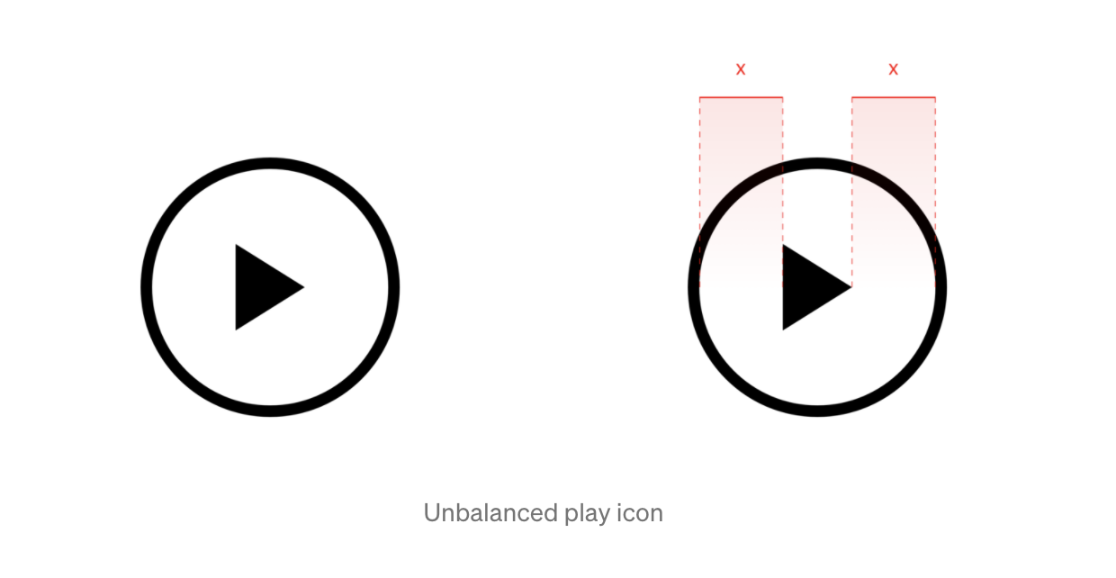
To fix this problem, the icon will have to be shifted towards the lighter side to create balance.
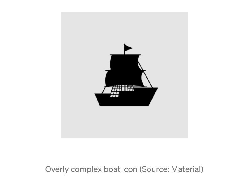
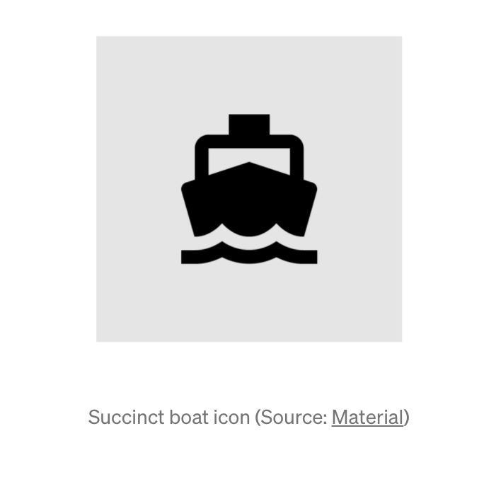
- Brevity:
When designing an icon you want to create a simple design that captures the same meaning without all the details. Icons are created for small areas and still need to be clear and readable. Try to keep your design short and simple.
Here is an example. The icon to the left is an image of a ship but it is too complex with all the details. In contrast, the icon to the right is also a ship but it has a lot less details and still portrays the same meaning as the overly complex one.
- Consistency:
It is really important to maintain the same style throughout all the icons. This is considered when using fills, strokes and shapes. You want the icons to fill a part of the same family.
When considering using fills or strokes, only use one or the other. Don’t use both at the same time. Filled icons typically represent higher recognizable items. Think of filled icons as the shadows of those items. Strokes allow you to add in tiny details. However, when using strokes, all of the lines need to be the same weight and spacing.
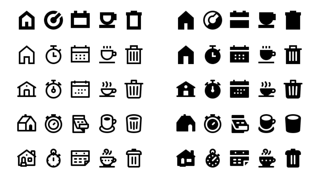
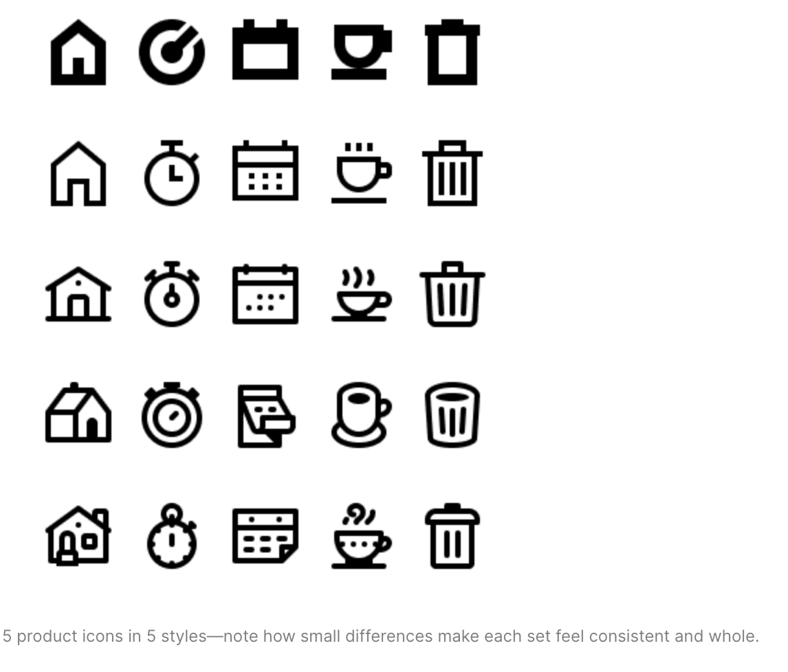
In this example, there is a great variety of icons. Each family, row, are similar in design and weight and the corresponding filled icon mimics the shadow of the stroked icon. Notice how each column showcases a different way of capturing the same icon. Even though the metaphor for an object is universal, there are always different ways of representing it.
- Personality:
When creating an icon, it’s important that the design represents the brand it is going towards. What mood do you want the icon to capture? When considering personality, you must also think about color, size, and style choices.
Typically, icons only use solid black or white to create the icon. However, it is ok to use a max of 2 colors when creating an icon. When you start adding in 3 or more colors the icon becomes illustration instead.
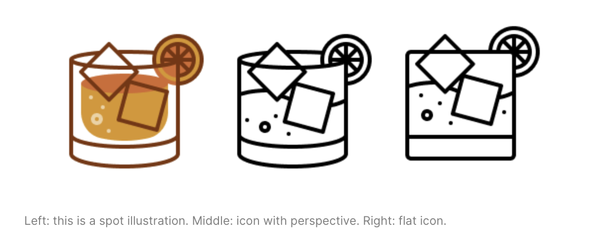
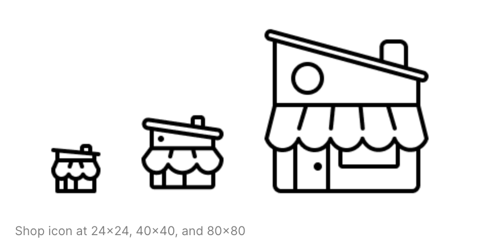
In addition, sizing is also really important. Depending on the size of the icon dictates how detailed it can be. Typically, if you have to create the same icon at different sizes, the bigger icon would have slightly more details. You still want the design to be simple, but you have more room to add in more personality.
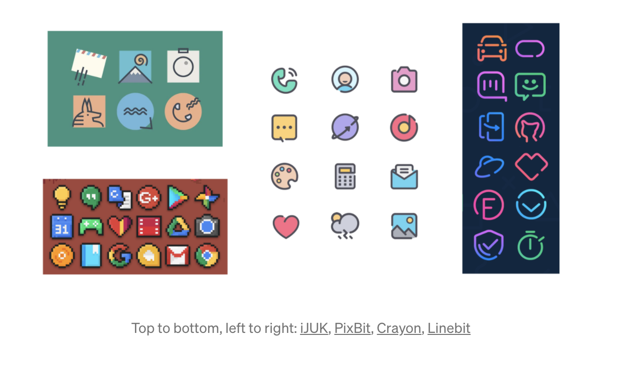
When considering style choices, ask yourself what kind of design are you trying to create? Do you want it to be hard or soft? Do you want it to be literal or abstract? In this example, each icon is of the same item but provides a different style.
In this example, there are a variety of different icon styles and personalities. The top left icon is more of an abstract design. The bottom left is more pixelated. The middle design has a bubbly appeal and the right icons are designed as neoned lights.
There are a lot of possibilities when creating an icon. As long as the design is consistent and readable, there are multiple possibilities.
Refer to these article for more information on creating an effective icon:
- https://uxdesign.cc/7-principles-of-icon-design-e7187539e4a2
- https://www.designsystems.com/iconography-guide/
Activity
- Choose a College
First, choose from the two UT Colleges available for this tutorial. Review each college by exploring their design briefs. You must read over the icon design request thoroughly to understand the design meaning.
- Option #1: McCombs School of Business
- Option #2: College of Fine Arts
Based on the design brief you have selected, you will be creating 5 distinctive icons based on the design request of your college.
Icon Topics:
- Communication
- Videos
- Readings
- Networking
- Deadlines
- Research
Use the link below or browse the internet for similar icons based on the same topic. Use those as references to shape your idea.
https://fonts.google.com/icons?selected=Material+Icons
Refer back to the “things to consider” section when drafting your icons. Consider what is the branding for this icon? What mood are you trying to portray?
You want to make sure the icon contains these 3 attributes.
- Form
- All of the major shapes in icons are the primary geometric shapes – circles, square, and triangle – to make a visually stable foundation for the icon
- Aesthetic
- Consistency is everything. Across your icon set there should be unity in the design. This includes, but not limited to:
- rounded or square corners
- size of corners
- line weight
- color palette
- Consistency is everything. Across your icon set there should be unity in the design. This includes, but not limited to:
- Recognition
- Easy comprehension of the object, idea or action that the icon is supposed to represent.
- Matches with the rest of the icon set.
Once you have an idea on what icons you want to create, sketch the design and upload an image on Basecamp. Please also include which course option you will be choosing. Once you have received approval, you will move onto designing your icons in illustrator.
- Create Icons
Once a direction is approved, begin drafting out mockup icons on illustrator.
Create icons that are simple, readable, and capture the mood of the designated design brief. They should never be overly complicated and hard to understand.
- Open Illustrator:
- Create a New project
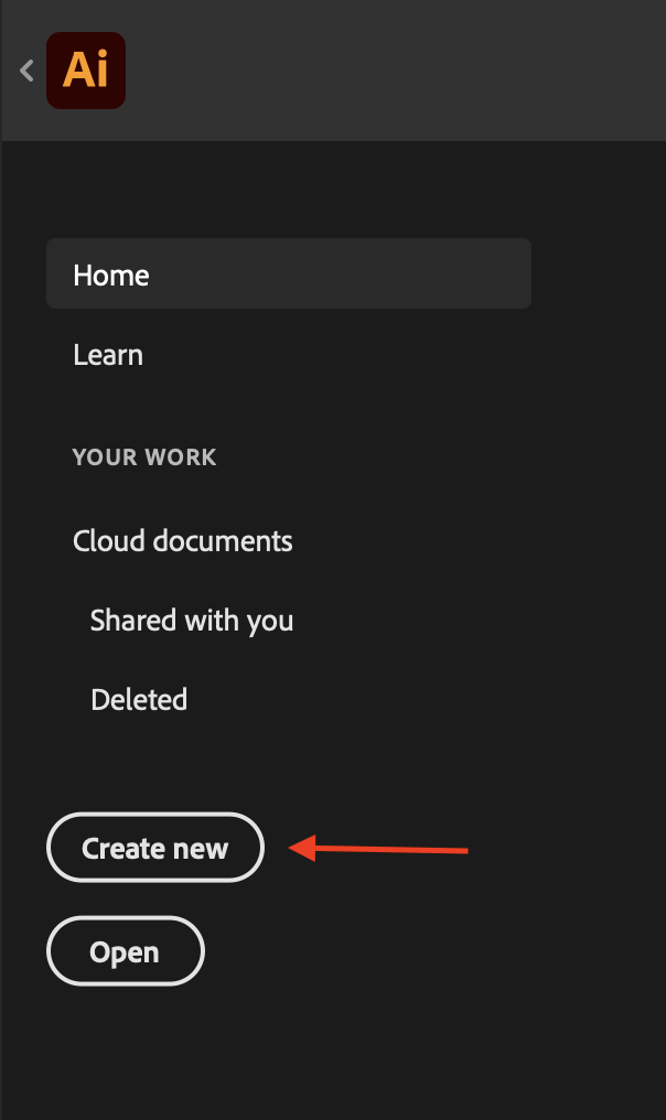
- Select the “Web” tab at the top
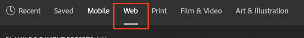
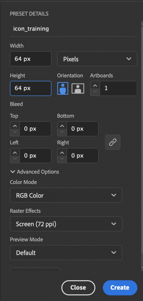
- The dimensions should be 64×64 Pixels, then select “create”
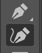
- Use the pen tool to create your icons
6 Additional Steps to Follow:
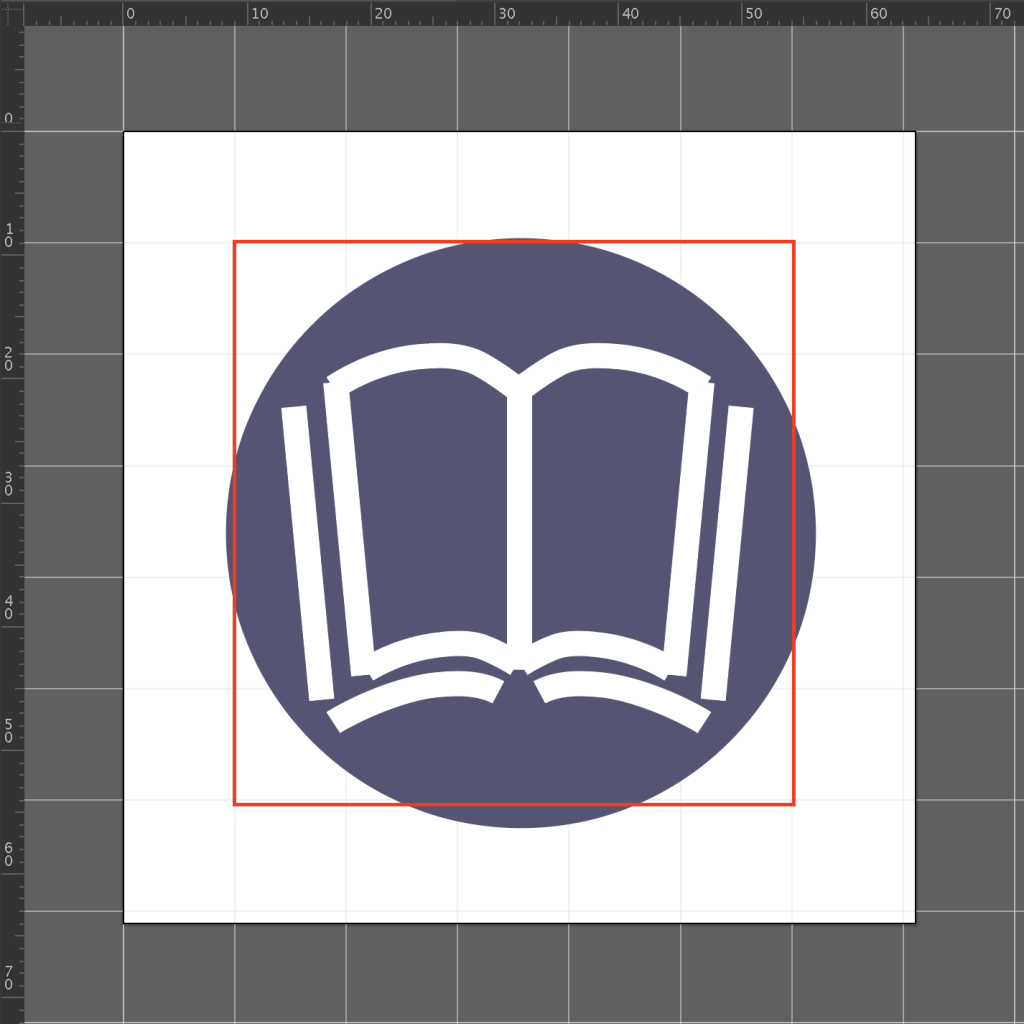
- Create a grid to follow
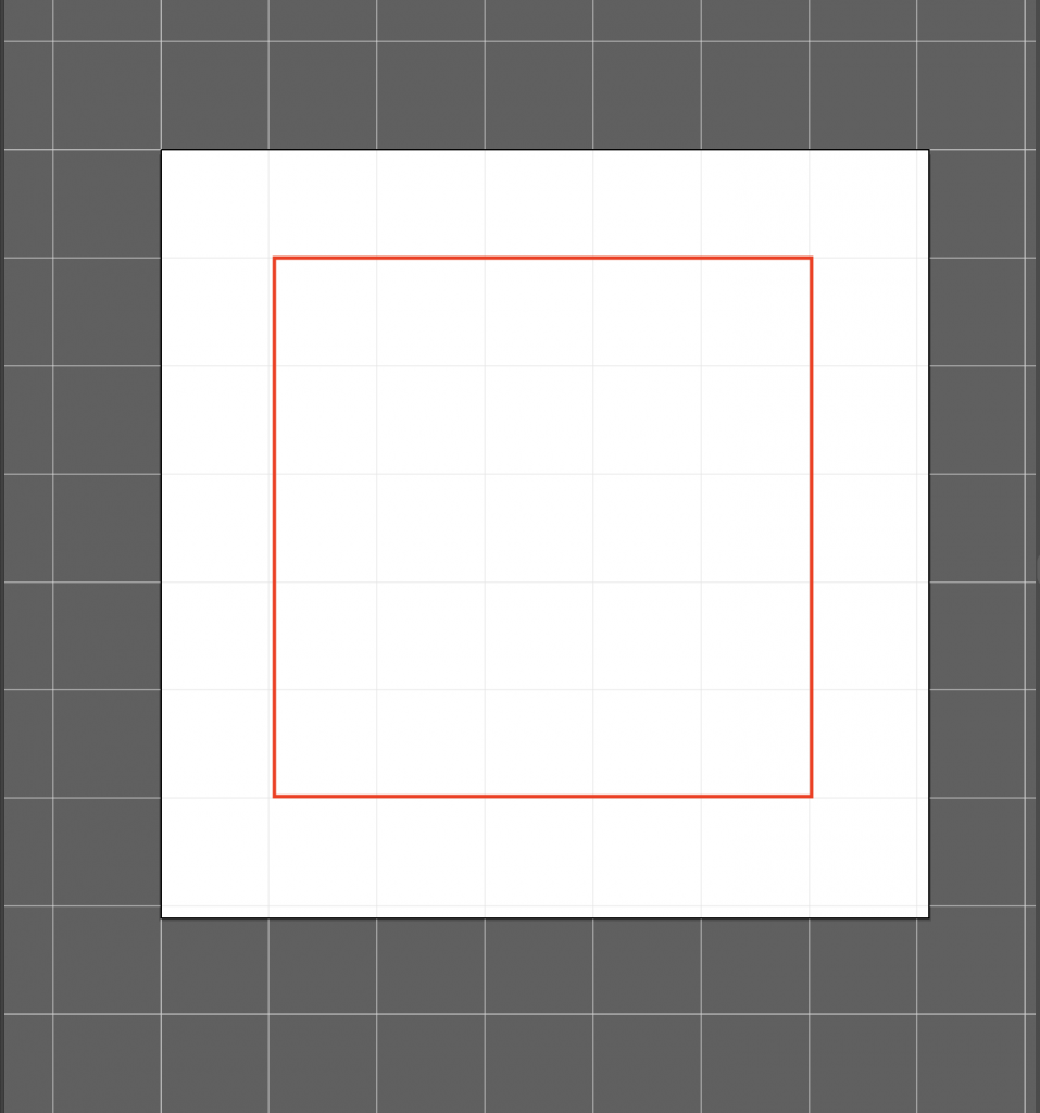
Leave 1px border for “No Go Zone”. This will allow the icon to have breathing room.
- Start with simple Geometric shapes
- Watch the edges, lines, corners, curves, and angles used
- Have consistency throughout all of your icons
- Use details and decorations sparingly
- Make something unique!
- Mockup Icons
When mocking up your icons, consider the level of importance of the icons. Should one icon be larger than the others because it is more important? What order should the icons be arranged in?

- Share your final Icons on Basecamp