
Typography can be an effective design all by itself.
By the end of this training you will:
- Learn how to set up an InDesign document
- Create an event poster for a particular brand using only type
- Direct the reader’s gaze using visual hierarchy
- Learn how to use Paragraph and Character Styles + alternative characters
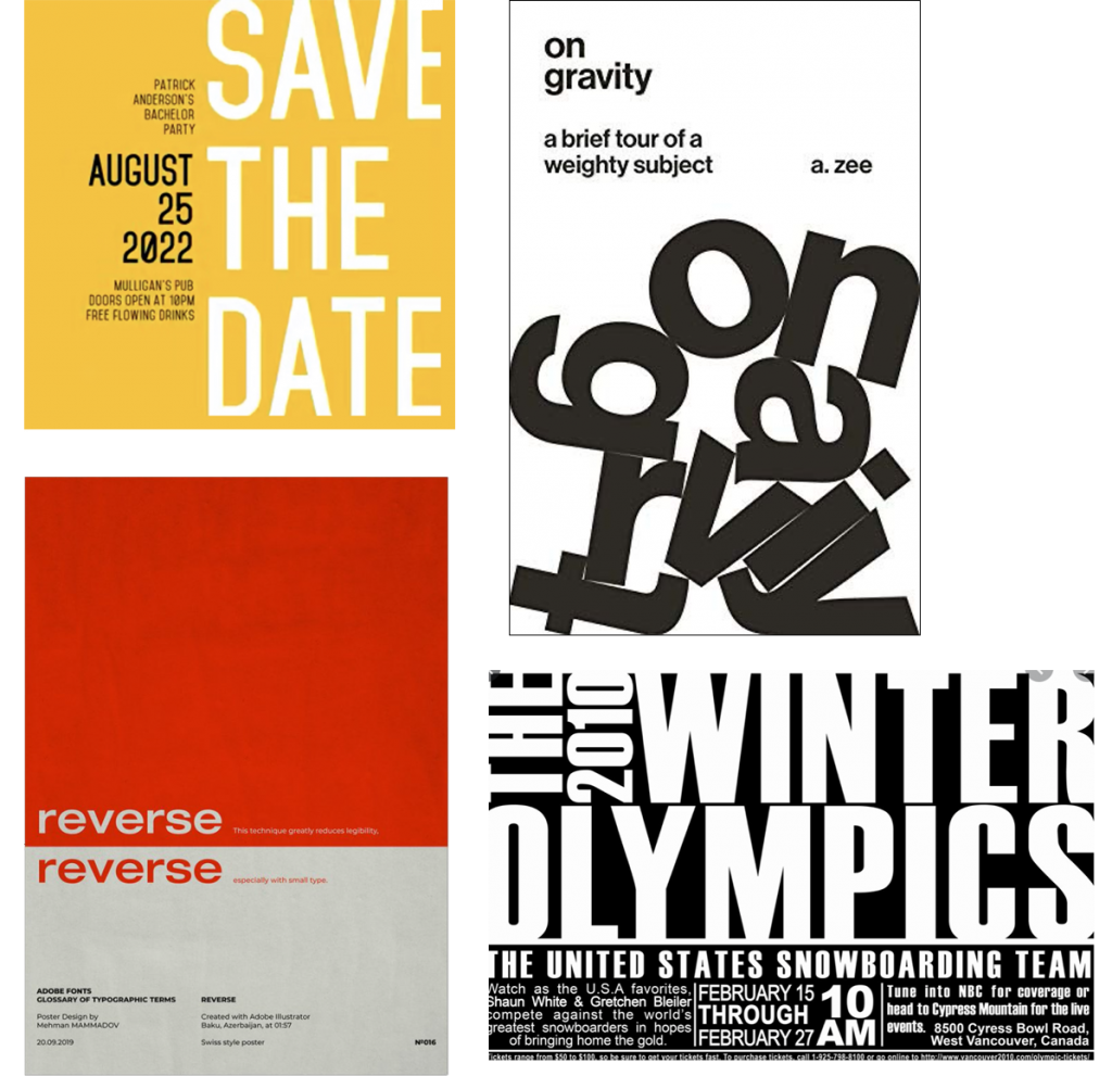
Here are some examples of typography-only posters:
Getting started in InDesign
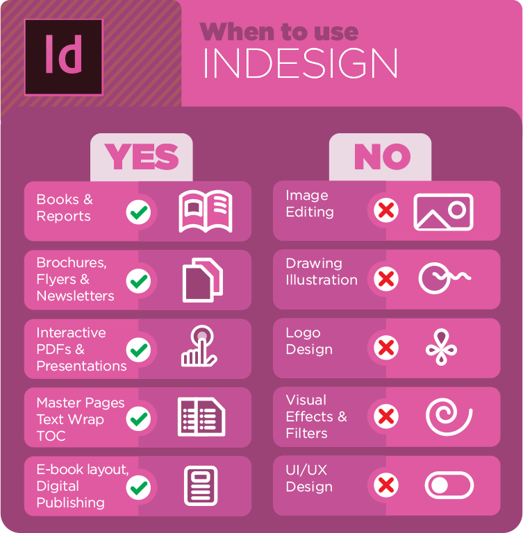
InDesign is a powerful tool for typesetting (arranging type) and document creation. It is best for creating books, brochures, flyers, and magazines.
Many of the text tools you’ll learn in InDesign are also in other applications, like Illustrator and Photoshop.
Creating a Document
- Go to “File > New Document” and select these basic settings (# of columns is optional). Make sure you have Print and Letter as the document intent and size, respectively.
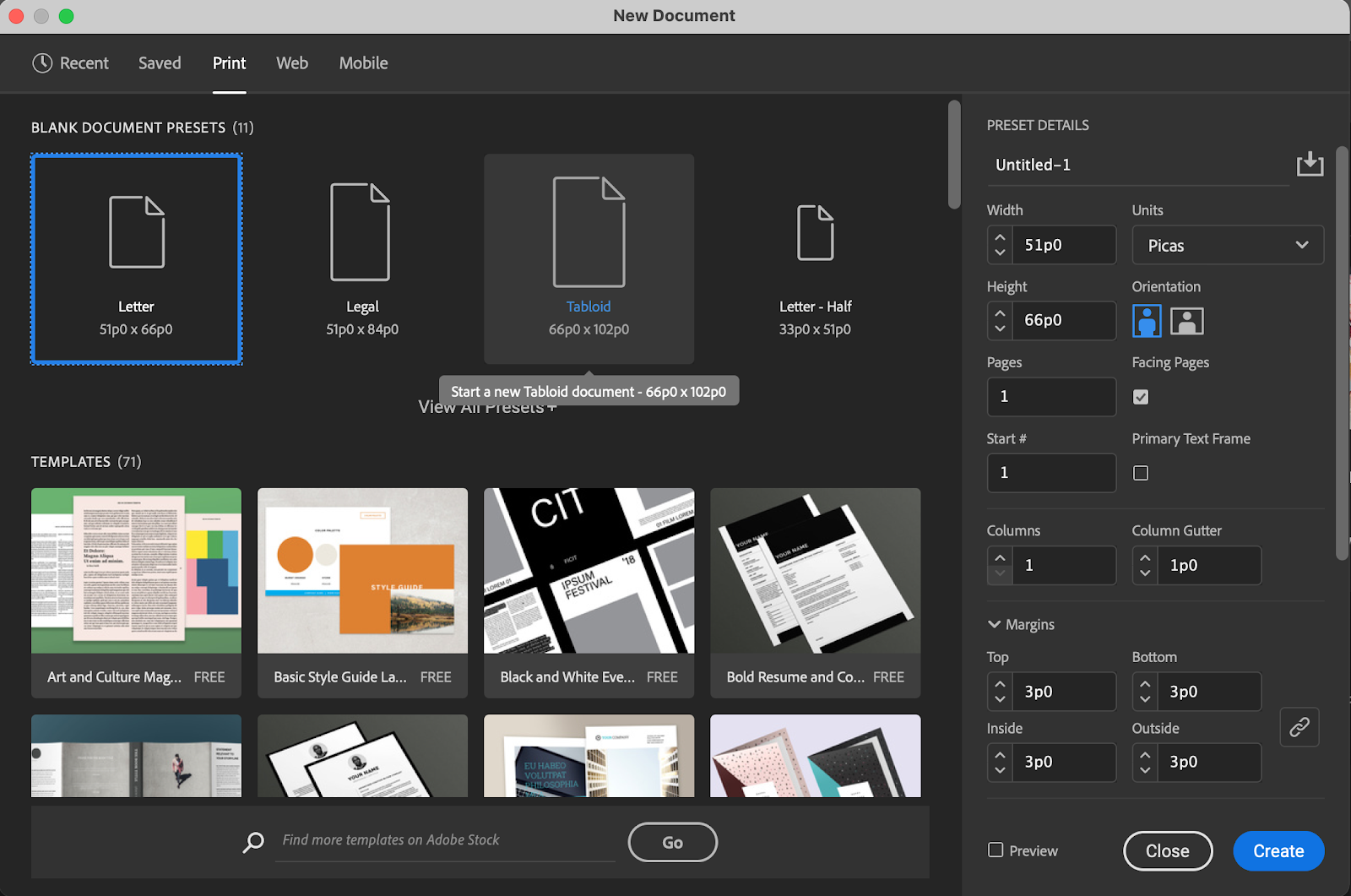
For the poster, we’ll use the Letter preset — and 8.5 x 11 inch page. You’ll notice that the units here are in picas. Picas are a commonly used unit in print design, signifying ⅙ of an inch. There are 12 points (not pixels) in a pica. Increase the column setting to 5 and click Create.
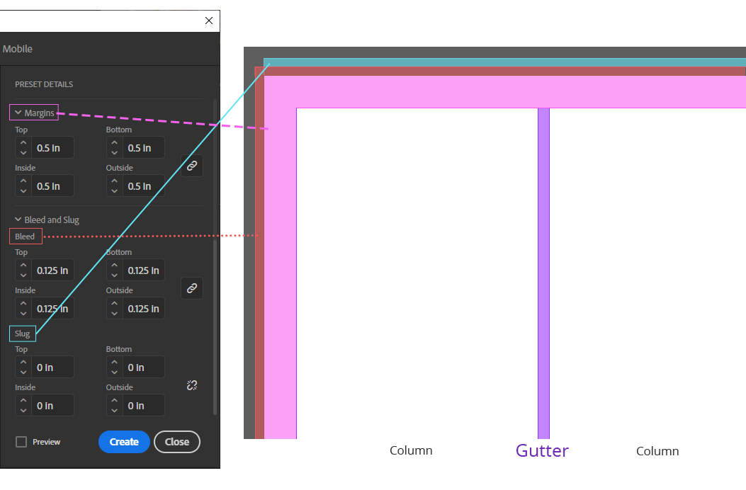
2. Then under detailed settings, choose these settings for your Margins, Bleed, and Slug. These are standard settings.
- Margins are the empty space on the side of your document. They give the text room to breathe.
- Bleed may be required if the document is going to print. It prevents anything placed at the edge of the document from misalignment while being printed or trimmed. However, do not count on anything in the bleed space showing up in the final.
- Slug is an extra space beyond bleed where you can leave special notes to the printer – it will also be trimmed off. Don’t worry about this unless specified by the printer.
3. Set your workspace to “Essentials Classic” for now, though your preference may eventually shift to another workspace set up.
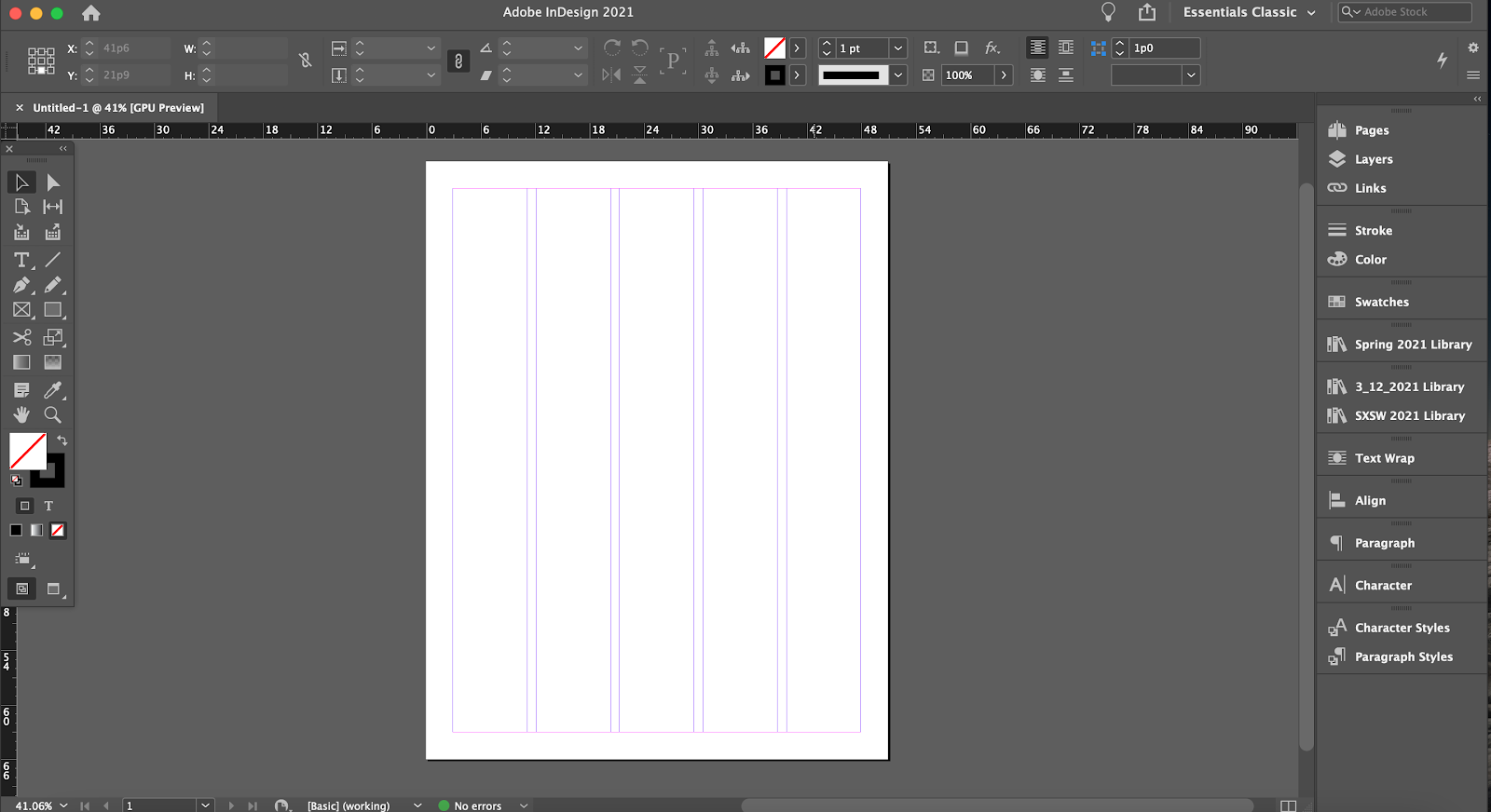
- On the doc, you have five columns, automatically with a 1 pica (abbreviated 1p) to separate content.
- On the right-hand bar, you have certain controls, like Pages (if we were in a multi-page doc), Align, Paragraph, and more. If you want to add a tool to this toolbar, go to Window >> whatever you want.
- On the left hand side, you have a toolbar, similar to the one you’d have in Illustrator or Photoshop. Here, you can add shapes, photo frames, text, and color.
Preparing your document
Grids, guides, and master templates are key to using InDesign to its full potential.
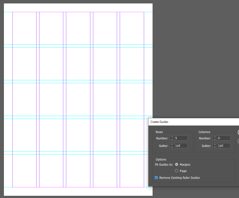
1. Create a grid for your master template by going to “Layout > Create Guides…”

The grid you need will vary on your design, so feel free to choose your own settings here. If you aren’t sure what you want to design yet, it can help to Google “typesetting grids” and try to recreate one that inspires you. A good grid will spark creativity and answer design questions.
For this example, we’ve chosen 3 rows and 0 columns aligned to margins. Gutters are default 1 pica.
Side note: If you are interested in typesetting grids, take a look at the famous unigrid system by world-renowned designer Massimo Vignelli – people spend their life collecting National Park Service documents that use the unigrid!
Learn about HIERARCHY!
Use these tips and principles while designing your poster. A grasp on visual hierarchy (emphasizing information for the reader via design) is one of the basic tools in any designer’s toolkit.
Design the poster
1. Get your content. Your client will often provide the text and images to lay out.
For this project, please download the Box assets for our Basket Weaving event.
2. Begin to sketch out how you may lay these assets out within your grid lines.
3. Insert the speaker’s photo. InDesign photo resizing tool is sort of funky, watch this short video to understand how to resize photos:
4. Insert the type (aka “copy”). Similarly to PS or AI, use the Text tool (“T”) to paste your text, or copy as we say in the biz, into textboxes.
5. Text Styling. Aside from font, you can adjust width, tracking, underline styles, hyphenation… the list goes on. InDesign is a complex type editing software and there is a lot you can do. Unlike other Adobe softwares, the idea is that InDesign type tools are so robust you should never have to edit text by hand – there is always a setting or style button you can create instead. This just comes with getting to know the program, so it’s totally okay to not know every feature now. Try to use a new tool while styling your body text!

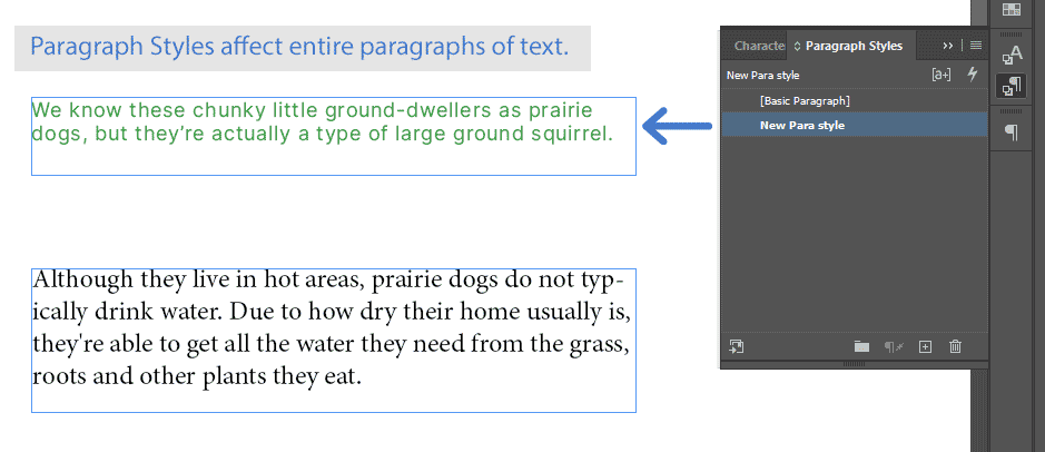
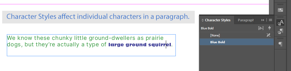
6. Make and Use Paragraph and Character Styles. It’s recommended to use no more than 2-3 fonts/font styles for a typical design. Paragraph and Character Styles allows you to recreate styling of a text across your doc with the click of a button.
Once you are happy with your text styling, create a Paragraph Style for it. Press “F11” (or “Window > Styles > Paragraph Styles”) to open the panel. Highlight your text and press “Create New Style.”
Use that Paragraph or Character Style elsewhere in your poster to draw the reader’s attention and create unity in the design.
7. Design Considerations:
- Make sure to create an obvious hierarchy — what should my eye be drawn to first?
How do I know the most important information?- Think about a book cover. Is the author name bigger than the title? Is the fact that it’s a NYT bestseller more important than the author’s name? Use this logic for figuring out hierarchy.
- The name of the event and how to attend the event are very important info, wouldn’t you agree?
- Tone: Consider the title and the subject matter when you pick fonts; make sure they match the mood and tone of the event.
- Legibility: Make sure the text on your poster is legible (easy to read from a distance)
- Colors: For colors, you can use coolors.com to quickly generate color schemes. You can create a free account to save them. Use color/shape/non-type elements sparingly.
- Brand Guidelines: Your client for this training is COLA — follow the UT brand guidelines. Familiarize yourself with UT’s rules for on-brand design, like colors and the desired fonts you downloaded in the last typography training (Benton Sans Book and Benton Sans Black, GT Sectra).
8. Alternate Characters: Many fonts also have a feature called alternate characters, which allows you to select an alternative feel for your type while keeping the font style.
Use at least one alternate character in your poster design.
To use alternate characters, go to Type >> Glyphs in InDesign. A window will pop up. I’m using Raleway Semibold for this tutorial.
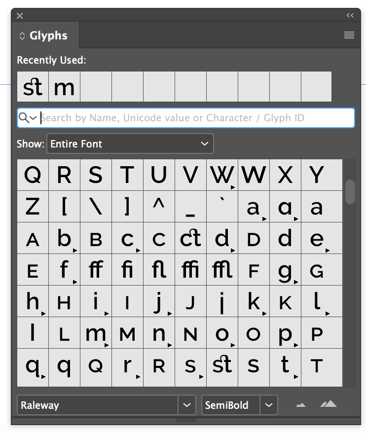
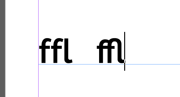
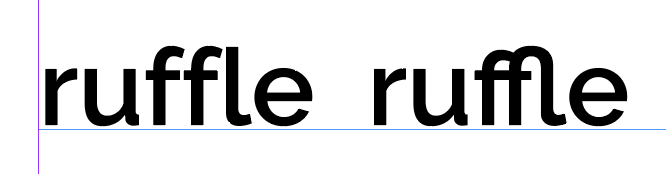
You’ll see some alternate characters. For our purposes, I’ll show you how different the default styling of “ffl” looks from the alternate characters. To insert the special character, double click on the desired square.
Alternate characters aren’t just for aesthetics. You can also use this panel to insert accented letters or characters from languages with different lettering systems, like Russian.
Not all fonts have alternate character options, either, so make sure to do your font research.
9. Check how your design is coming along by zooming out (Ctrl/Cmd++/-). Turn off grids (Ctrl/Cmd+;) and turn on Overprint Preview (View > Overprint Preview).
Continue editing until you are happy with the outcome. Consider styling subtitles, adding a drop cap design, or whatever you like (Google tutorial)
Adding hyperlinks for online versions
Sometimes, we publish online versions of print flyers and posters to reach even more people, and it can be helpful to have direct links to RSVP forms or other information.
You can any element in your InDesign document to an external web page, an email address, or another internal place in the document itself.
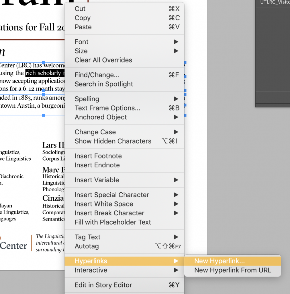
To add a link, click on the element you want to hyperlink. If it’s a piece of text, highlight the specific text. Right click and select Hyperlinks > New Hyperlink.
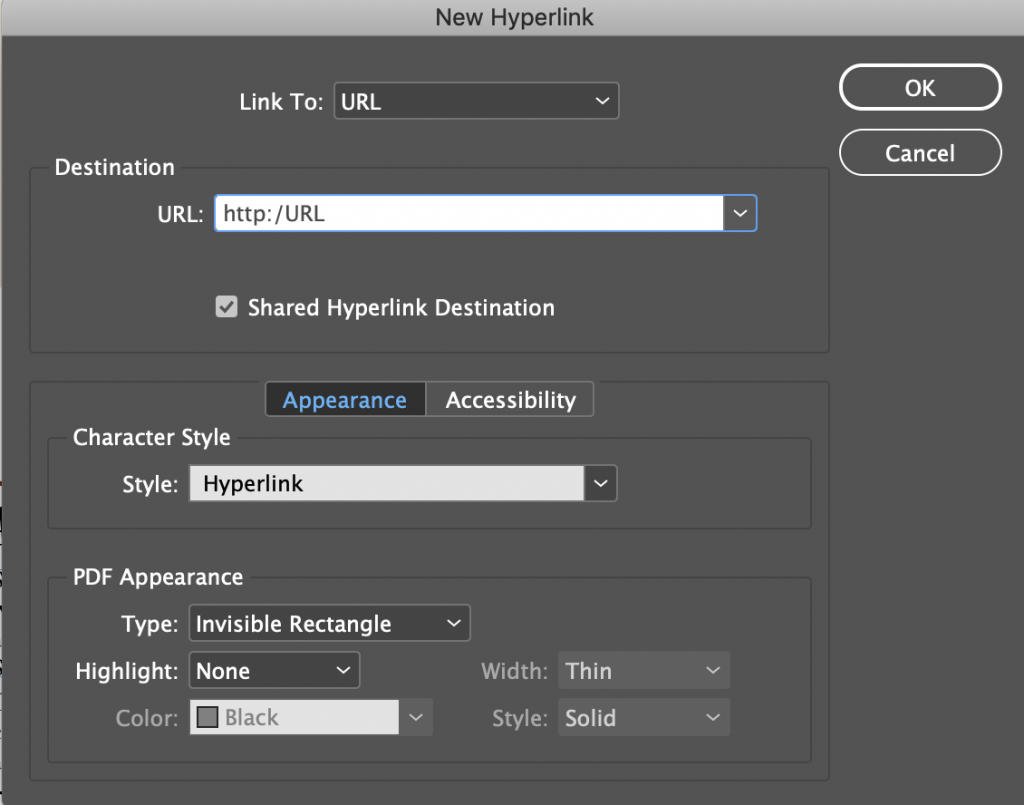
This panel will pop up. Paste in the URL in the URL box and click OK.
If you want to link to an email address to somewhere else in the document, click that option from the dropdown menu.
Exporting your document
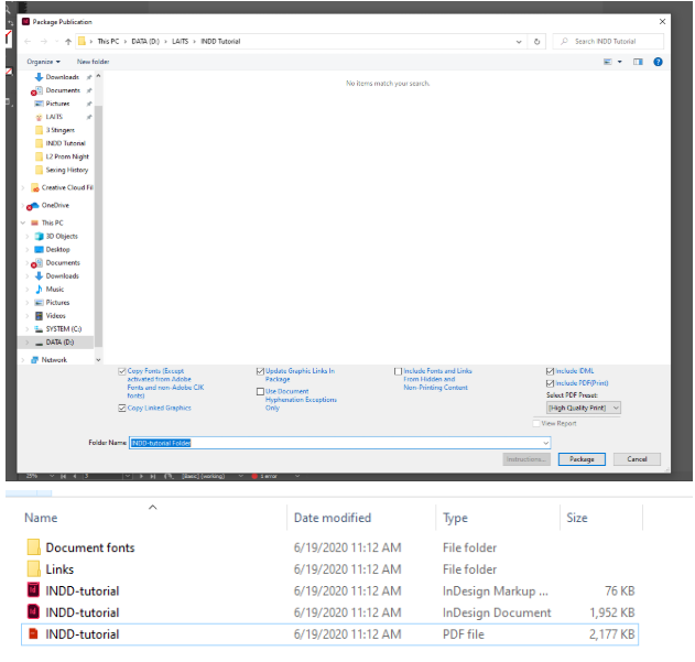
1. Go to “File > Package” and select “Package…”
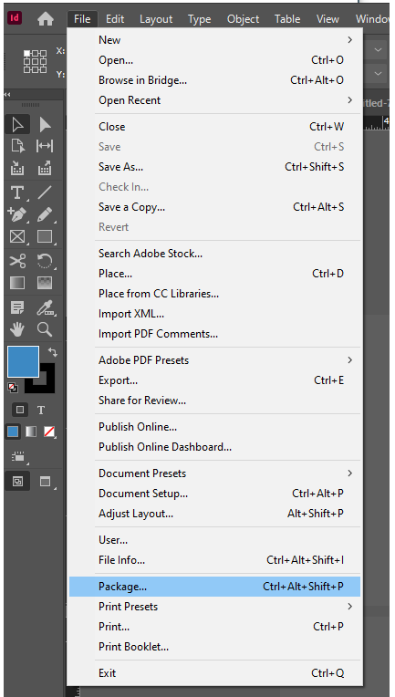
Select “Package” again. This will create a folder which includes your .indd file, a PDF, as well as any linked photos and fonts. Packaging is necessary if you want to share your .indd with another designer, as they may not have the same images and fonts you do.
2 If all you need to do is export a final PDF to send to print, you can simply go to “File > Export…” and save as Adobe PDF > [High Quality Print].
Congrats! You’ve learned the basics of InDesign and hierarchy!