

In this training, you will be creating a Custom Wordmark for a Logo using the Bezier Curve in Adobe Illustrator. By the end of this training, you will:
- Be able to manipulate anchor points and handles to achieve the desired effects on text.
- Be comfortable yourself with merging paths, shapes as well as cleaning them up.
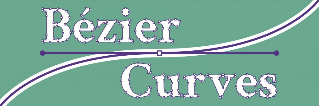
Here is a before-after example of how a Wordmark logo is customized with Bezier curves:

You can then use this custom wordmark to make a logo:

What are Bézier Curves?
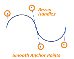
The concept of a Bézier Curve was coined by the French engineer Pierre Bézier. These curves can be generated by the manipulation of at least three points: two endpoints that are called “anchor points,” which define the span of the line segment, and at least one additional point called a handle to control the bend of the curve.
Bézier Curves can be used in Adobe Illustrator to accurately create and/or trace curved shapes with the Pen Tool to create paths. The shape of a path is controlled with Anchor Points, which define line segments within the path. There are three types of anchor points:
1. Corner Points: Connect straight-line segments to straight-line segments and do not need Bezier handles.

2. Smooth Points: Create line segments that join in smooth, continuous curves.
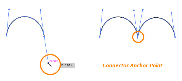
3. Connector Points: Connect straight line segments to curved ones, or connect curved line segments that meet at an angle.
Learn for yourself!
The Bézier Game is a website in which you can learn the process of adding anchor points and using bézier curves to create custom shapes through paths. Use the link below and try 10 levels before moving on.
Turning Text into a Path
One of the easiest ways to create a custom wordmark is by using text from an existing font and turning it into an editable path that can be modified through bézier curves. In order to do this:
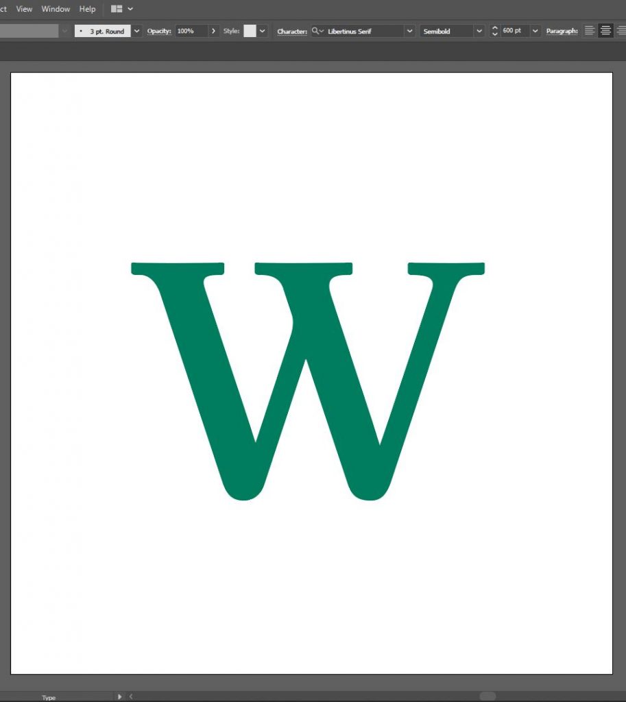
- On a new file in Illustrator, create a text box (type in T)
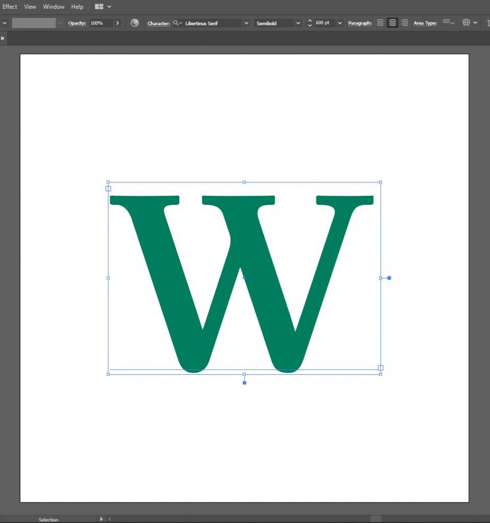
- Choose a single letter, a font, and a color of your choice. The example used here is a green W and the font Libertinus Serif:

- Select the text box. The letter should be enclosed inside a blue box:
- Once selected, go to Object > “Expand…” and make sure the box for “Object” is checked. Then click on OK.
- A shortcut to this is selecting the text and typing (ctrl + shift + o) in Windows or (⌘ + shift + o) in Mac.
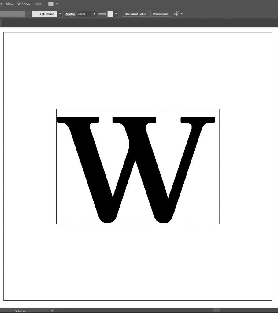
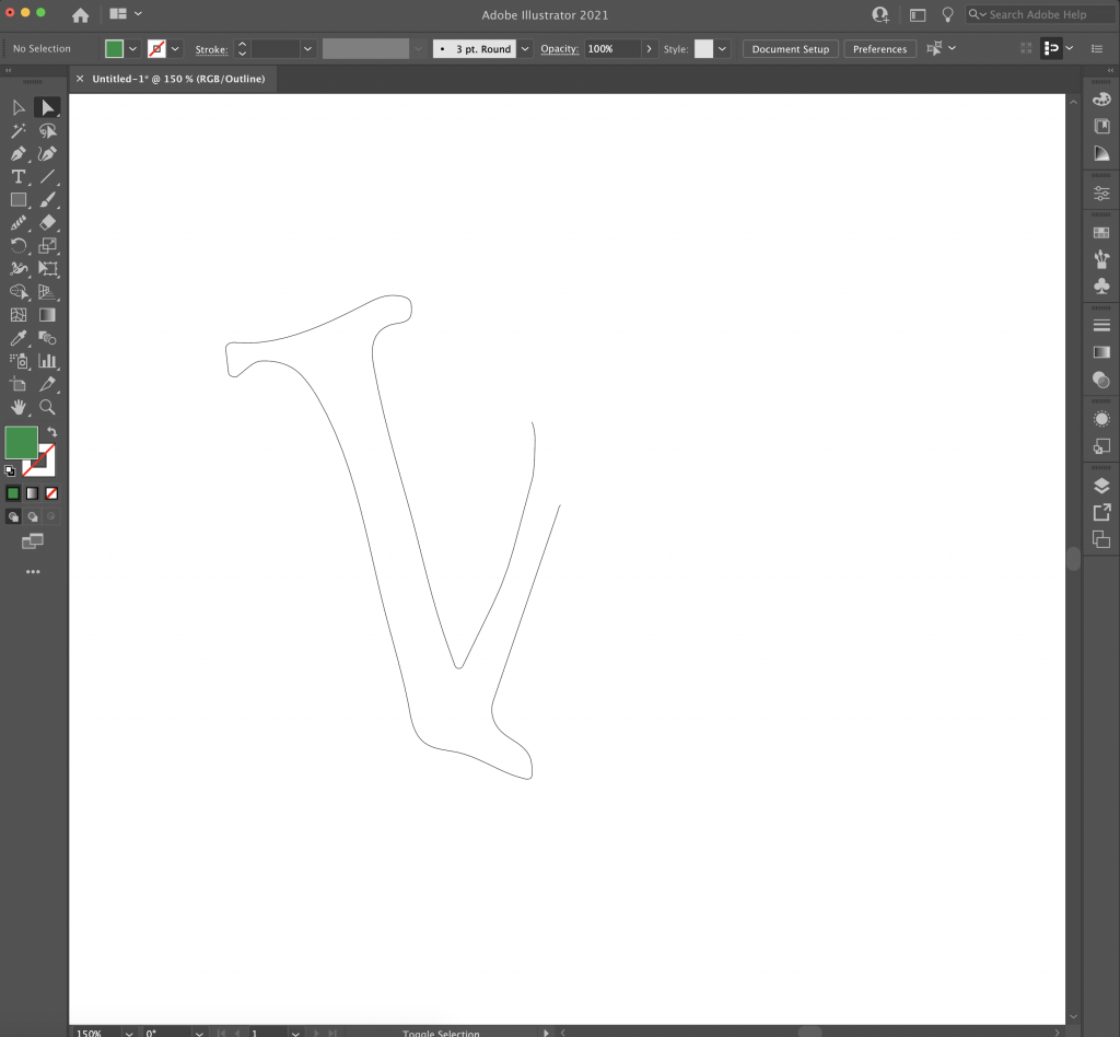
- A way to know if you have successfully turned the text into an object is by setting Outline View. Go to View > Outline or type in (ctrl + y) or (⌘ + y).
- Outline view shows text as black-filled objects, like so:
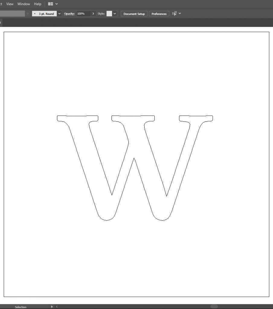
while editable paths/shapes are shown as objects with white fill and black outlines, like so:
- Go back to Regular View by typing (ctrl + y) or (⌘ + y) again.
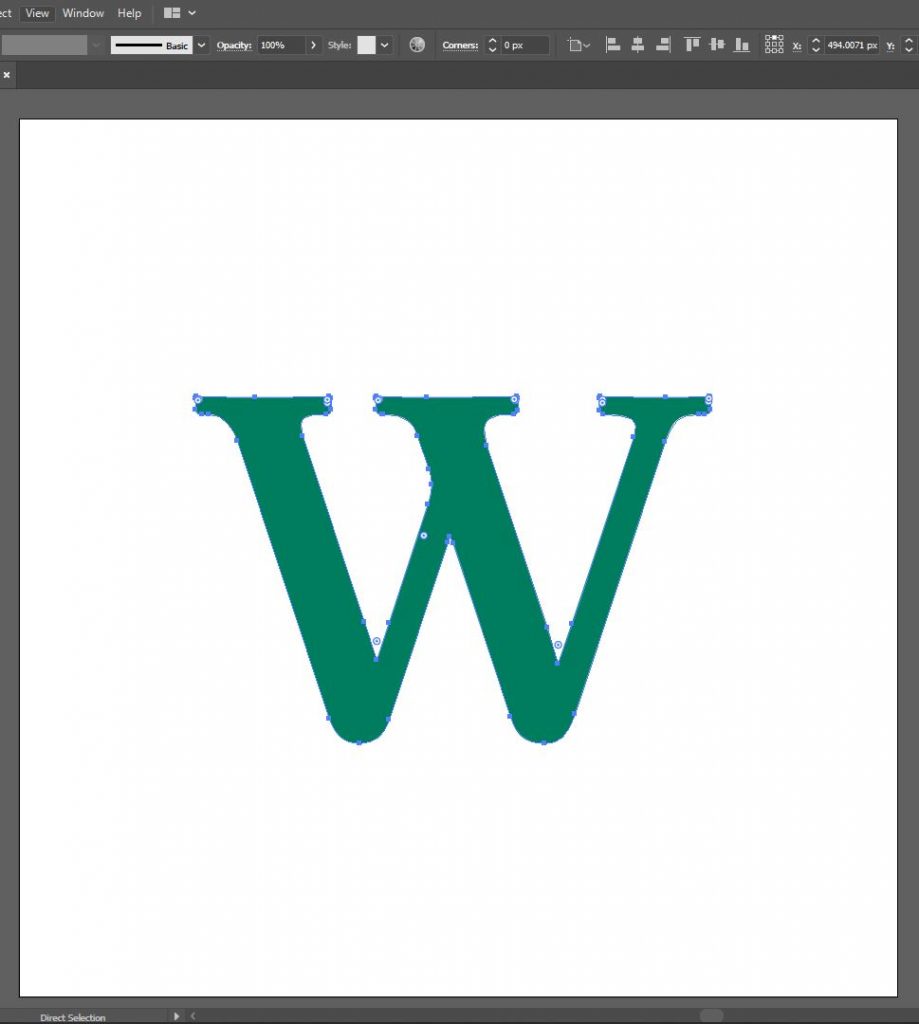
- Use the Direct Selection Tool (type in A) and select the letter. You’ll notice that the shape becomes outlined in blue and blue-filled anchor points are shown:
- To select a single anchor point, use the Direct Selection Tool again and click on one point. The selected point will be filled with blue, while the rest will be filled with white:
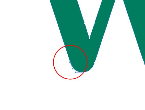
If an anchor point is using a bézier curve on its path, you will see either one or two bézier handles on either side. The example above has one bézier handle on one side, which means that the other side is a straight line leading up to that anchor point.
- To edit the bézier curve, drag the bézier handle in whichever direction you want the curve to follow.
- If you want to add a point inside a path, you can do so by right-clicking the Pen Tool and selecting the Add Anchor Point Tool (+). Similarly, to remove an anchor point, you can use the Delete Anchor Point Tool (-).
On the example above, I have added two anchor points on either side of the bottom section of the curve.
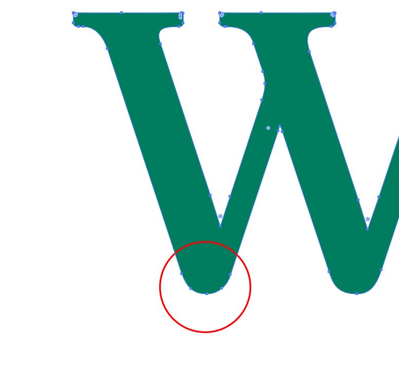
- The best way to make a path with smooth curves is by deleting anchor points with sharp corners and using the Curvature Tool (shift + ~) to make a new curve. Note: This tool works when the selected path is incomplete (an anchor point has been deleted using the Delete Anchor Point Tool).
In the example above, most of the left side of the letter has been edited through bézier curves and using the Curvature Tool.
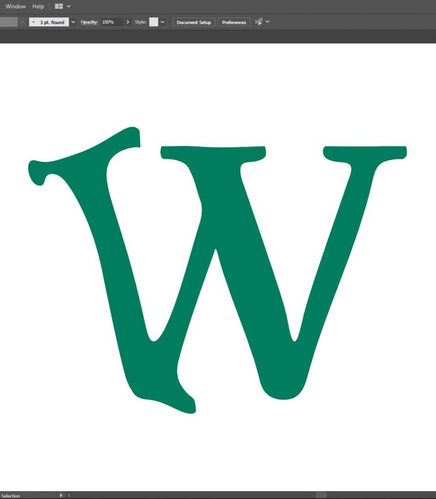
- If you have a wordmark with repeating elements, you can duplicate them and use the Pathfinder Tool to join copies. This will guarantee consistency in the language across your wordmark. The example below shows how I created a copy of the first stem of the W and moved it over twice:
- First, select and delete the unwanted parts of the W using the Direct Selection Tool.
- Then, select and duplicate the original part you’ve made. Here I’ve duplicated it twice.
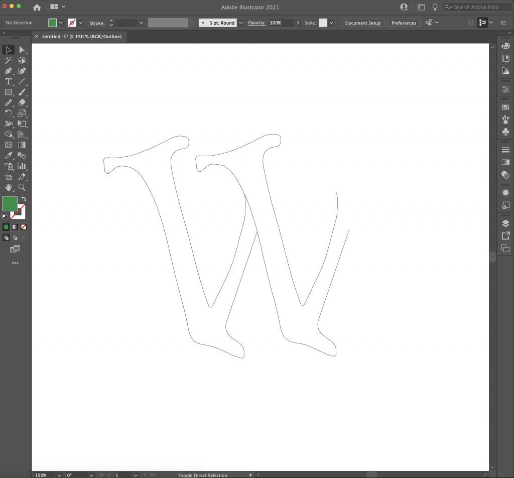

- Then, select and delete the last extra part to complete the W.

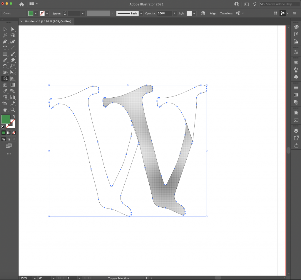
- Depending on your design, you’ll notice that there might be some gaps / overlaps between line strokes.
- If there are line gaps use the Pen tool to connect them. Click on each anchor and draw a line between them.

- We will go over how to handle overlapping lines a little bit below.
- If there are line gaps use the Pen tool to connect them. Click on each anchor and draw a line between them.
- You might notice that your letter might belong to different shapes (see example below, you can see that the shaded gray part is a different shape of its own). You’ll need to merge these shapes together.
- To begin merging shapes, follow these steps below:
- Select the entire object either with the Selection Tool or the Direct Selection Tool. Make sure you don’t leave any anchor points / paths unselected.
- Use Shift + M to activate the Shape Builder Tool. If you hover on the letter, different shapes will be gray-shaded. Click and drag across these shapes to merge them together.
- If you’re having trouble with this part, watch this tutorial: https://www.youtube.com/watch?v=izi0mtItHh4
- First, select and delete the unwanted parts of the W using the Direct Selection Tool.
This is how the semi-finished version looks like:
Optional: Offsets and More
Once you have a path you are satisfied with, you can play with the Offset and Pathfinder tools to add complexity to your wordmark.

For my example, I came up with an alternate logo of the Wimbledon tennis tournament, since the W and the green I used reminded me of it:
This is the official Wimbledon logo, for reference:
More Information:
- How to Work with Bezier Curves in Adobe Illustrator:
https://www.webucator.com/how-to/how-work-with-bezier-curves-adobe-illustrator.cfm - Computer Graphics Curves:
https://www.tutorialspoint.com/computer_graphics/computer_graphics_curves.htm
Related YouTube Tutorials:
- Adobe Illustrator: Quick and simple method for drawing bezier curves
- Design a Custom Wordmark in Adobe Illustrator. Amazing Typography Tutorial
- How to Master Bezier Curves to Vectorize Your Logotype