

The purpose of this lesson is to get a full understanding of how color works and interacts for the purpose of improving design.
By the end of this training, you will:
- Learn the history behind color theory as we know it today
- Understand the basics of color theory
- Consider how different colors can each have meaning
- Learn how to create a fitting color scheme
History of Color
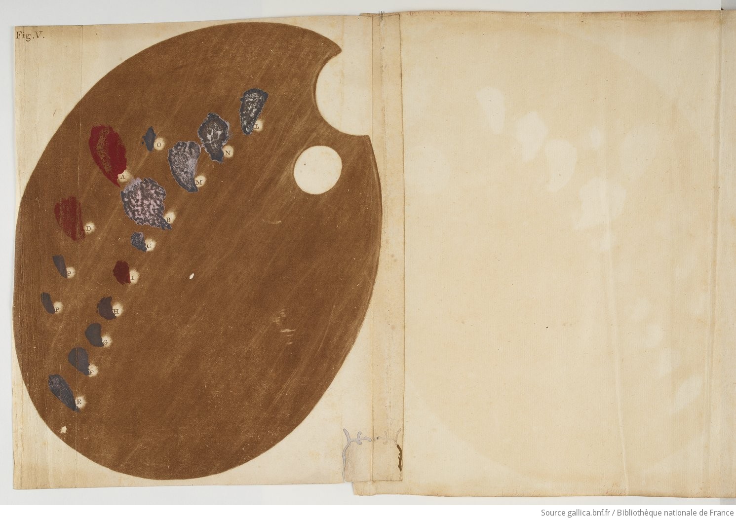
One of the first people to be recognized for developing a theory on color was Aristotle. His theory suggested that all colors came from lightness (white) and darkness (black) and related these to the four elements – water, earth, fire, and air. Aristotle’s theory held up for quite some time till it was expanded upon by Sir Isaac Newton. Newton started experimenting with light and prisms and identified the visible color spectrum as composed of red, orange, yellow, green, blue, indigo, and violet – a rainbow.
For many people today, color is something we take for granted. But centuries of research in art and science have evolved color theory as we know it in order to understand the nature and behavior of color.
Moreover, this is a brief version of the History of Color.
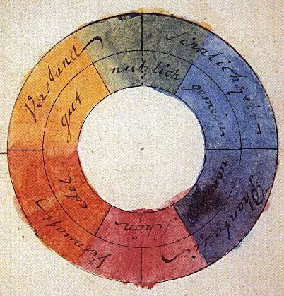
Another important influencer to color theory was J. C. LeBlon, who shifted the path of color research away from focusing on the interaction of color and light. LeBlon is credited as the creator of the RYB (red, yellow, blue) primary color palette.
Later on, Josef Albers introduced the idea that “color is the most relative medium in art” and that “in visual perception a color is almost never seen as it really is – as it physically is.” Albers revolutionized color theory by arguing that the perception of a color is heavily dependent on the colors surrounding it, its brightness (or the intensity of the color), and its lightness (the intensity of the light reflected).
Ultimately, we thank these historical advancements in the theory of color because they allowed artists to better understand and manipulate color and light in unimaginable ways.
| Fun Fact Here at UT, you can find Ellsworth Kelly’s Austin, also known as the little white chapel-like building at the Blanton Museum. Kelly specifically placed this building in a spot with a lot of accessible sunlight so that the sun would hit the various stained glass windows at different intensities throughout the day therefore highlighting the multiple tones a single color can embody just by changing the light reflected through them. 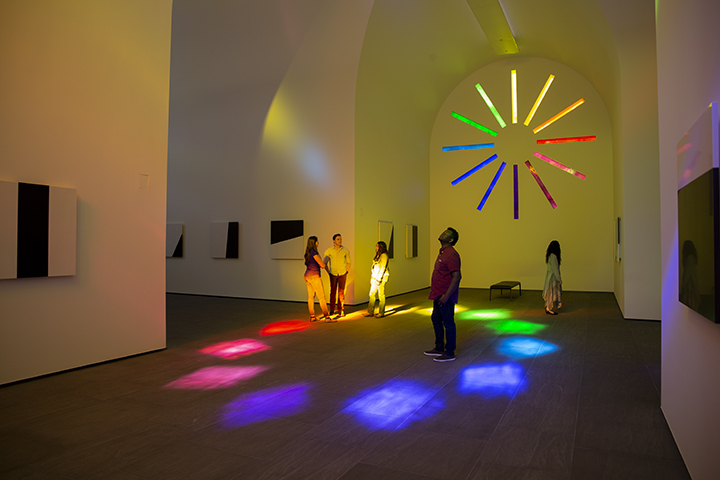 |
So why is it important to learn about the history of color?
As a Design Student Technology Assistant, learning about color theory, how it works, and how it was developed will allow you to develop your own perspective and understand how to better apply color into your designs.
Color Theory
Color theory is a guideline that designers use to determine which colors look good together, and why. Through color theory, we strive to achieve color harmony.
From this section of the lesson, you will learn color terminology, understand how colors interact with each other, and familiarize yourself with the relations of colors.
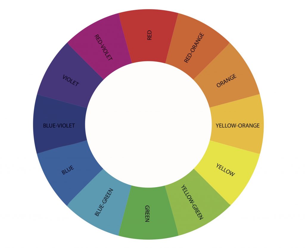
Primary Colors
- Red / Yellow / Blue
- The primary colors are what you typically would start out with.
- These three colors make up the rest of the color spectrum.
- When combining either two of these primary colors you get a secondary color.
Secondary Colors
- Orange / Green / Purple
- These three result from the combination of any two primary colors.
Tertiary Colors
- Red-Orange / Yellow-Orange / Yellow-Green / Blue-Green / Blue-Violet / Red-Violet
- These are the six colors that result from mixing a primary and a secondary color.
More Important Vocabulary
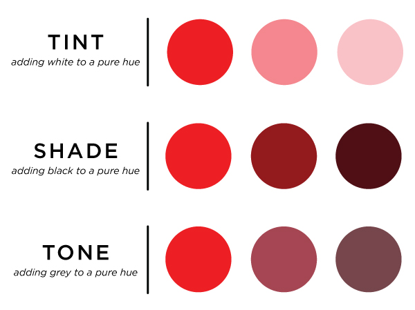
- Hue: The pure and unaltered state of the color. There are 3 main ways a hue can be manipulated: tint, tone, and shade.
- Tint: A tint will make any hue look brighter. Tinting can be done by adding small percentages of white to an existing hue. Eventually adding 100% tint will turn the color pure white.
- Shade: A shade will make any hue look darker. Shading can be done by adding small percentages of black to an existing hue. Eventually adding 100% shade will turn the color pure black.
- Tone: A tone will mute any hue or dull it. Toning can be done by adding small percentages of gray to an existing hue. A tone is different from a shade or a tint because –since gray is a mixture of black and white– it adds a neutral tone to a hue.
Take a look below at how the red hue changes as we add a tint/shade/tone.
A/Chromatic Colors
You might be wondering, where do black, white, and gray fit into color theory? These three are known as achromatic colors because they lack a hue to them.
In other words, there is no way you can get these three colors as a result of mixing other colors like you could with secondary and tertiary colors. These three colors are only defined by the presence or absence of light in them. Conversely, the rest of the hues are called chromatic colors.
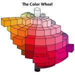
Color Wheel
Color wheels are very self-explanatory in theory, but they do more than just display colors in a circular manner. Color wheels are excellent tools to visualize the composition of colors and how they interact with each other.
Furthermore, there are various types of color wheels. There are different primary colors of light and pigment; respectively these are additive and subtractive colors. Each produces varying secondary colors of their own.
Different color wheels and slightly different color theory is required for different formats of media such as lighting, print, and digital. You can see this in the example below.
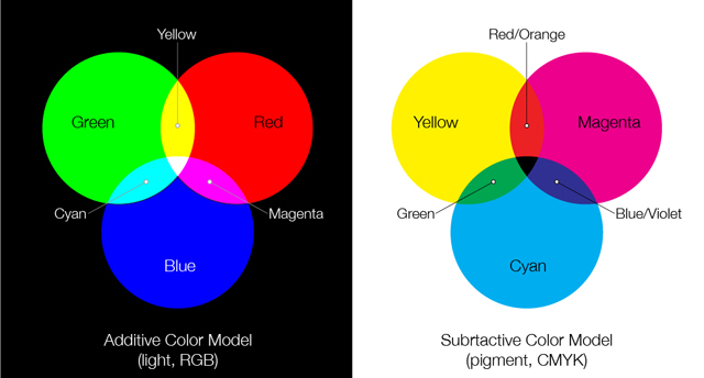
An additive primary color wheel (RGB) is mostly used in projects involving a screen to display images; think of a television, a projector or a phone/tablet/laptop/computer. This primary color palette is unique because light intervenes with our perception of color.
A subtractive primary color wheel (CYMK) is mostly used in printing projects. This primary color palette is unique because pigment intervenes with our perception of color.
| Ex. If you use an RGB color wheel to determine the colors you’ll use for a project, you will get a wider variety of hues for you to use (due to its additive nature). But if you were to print that work, you’d notice that your hues would get altered due to the subtractive nature of the printer’s CYMK color wheel. |
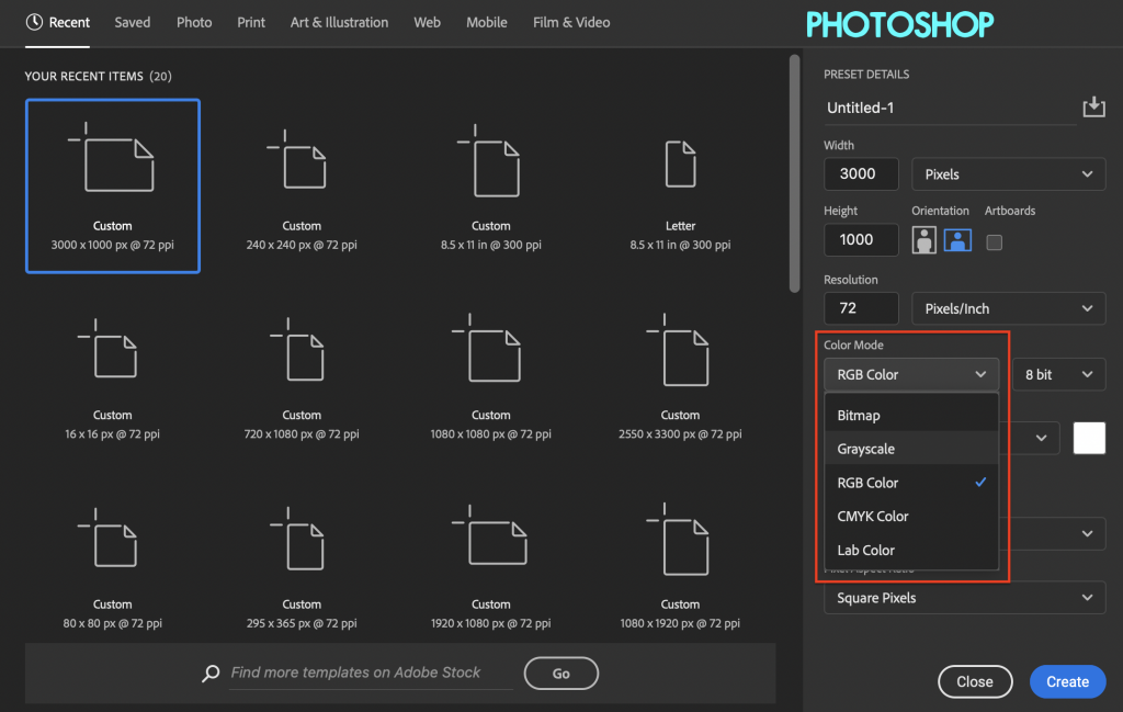
Here’s how to adjust for those on Photoshop and Illustrator:

For a more detailed explanation of when to use which color wheel, check out the following resource: Neglia Design – What’s the difference between PMS, CMYK, RGB and HEX?
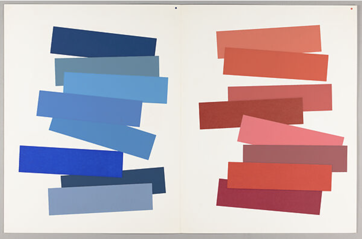
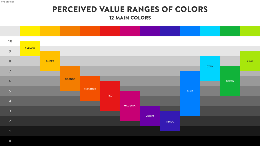
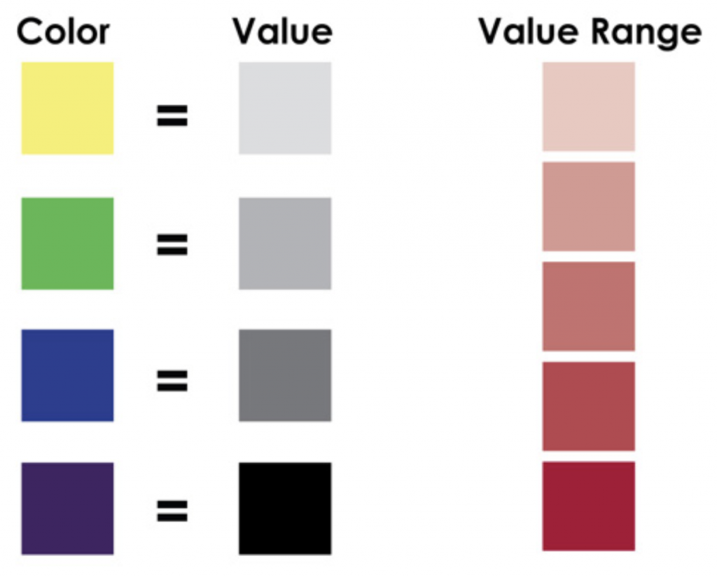
Value Key
What you will also include in your color wheel is a value key. Value is the color’s lightness or darkness in relation to black and white. You can make your value key in a gradient like the top rectangle or you can make it in steps like the bottom rectangle.

Additionally, tints are light values that are made by mixing a color with white. For example, pink is a tint of red, and light blue is a tint of blue. Shades are dark values that are made by mixing a color with black.
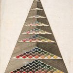
Activity #1: Creating your Color Wheel
Now that you have learned about color theory and studied the very basics of this type of color wheel you will make your own in either Adobe Illustrator or Adobe Photoshop.
Your color wheel must contain:
- Hue
- Tint
- Shade
- Tone
- A Value Key somewhere on the side in achromatic colors
Your color wheel does not need to be plain and basic. Have fun playing around with the layout. Refer to some of the images below for inspiration. Spend around 1-2 hours working on this.


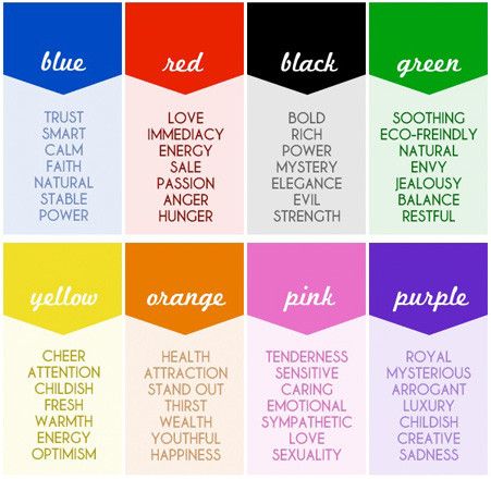
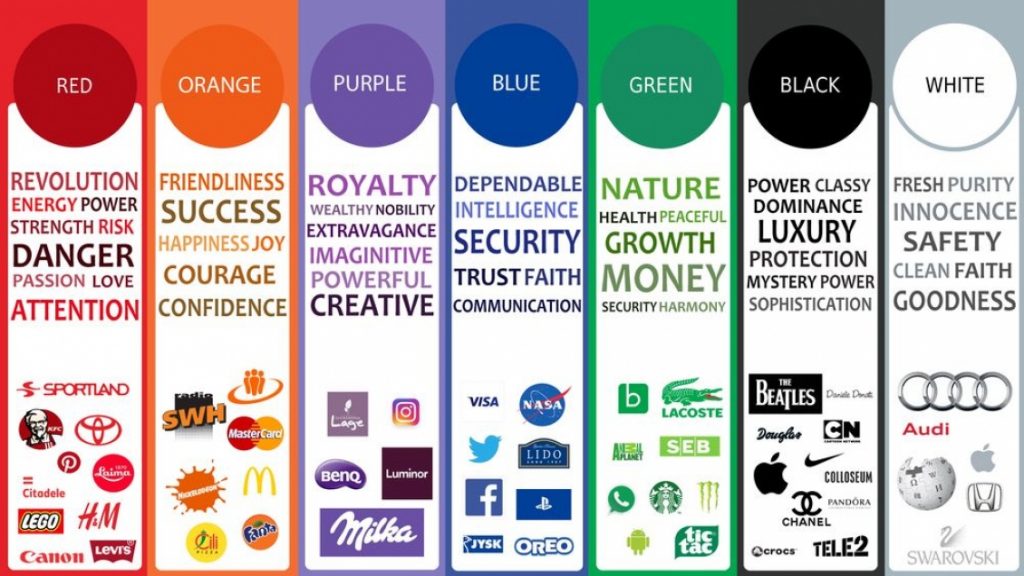
The Psychology of Colors
Now that you understand color theory, it’s time to learn about the meanings of colors.
As a society, you might have noticed that we usually associate specific colors with a variety of meanings or values. For example, the color green can represent nature, money, or safety. However, the meanings we assign to colors can be all over the map, that’s why it all depends on the context of the situation.
Take a moment to reflect on the meanings and values you personally tend to place on color and review the following images to understand how these colors and their meanings are represented in different brands.
Check out the following links to learn more:
- Ignyte – The Psychology of Color in Branding
- Canva – Color Meanings and Symbolism
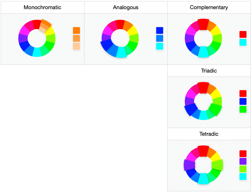
Color Schemes
Once a designer defines a color that best reflects the message they want to transmit through their work, the next step is to create a color scheme to best accompany that base color in the setting of the design. The following are examples of the most common techniques you can define a color scheme.
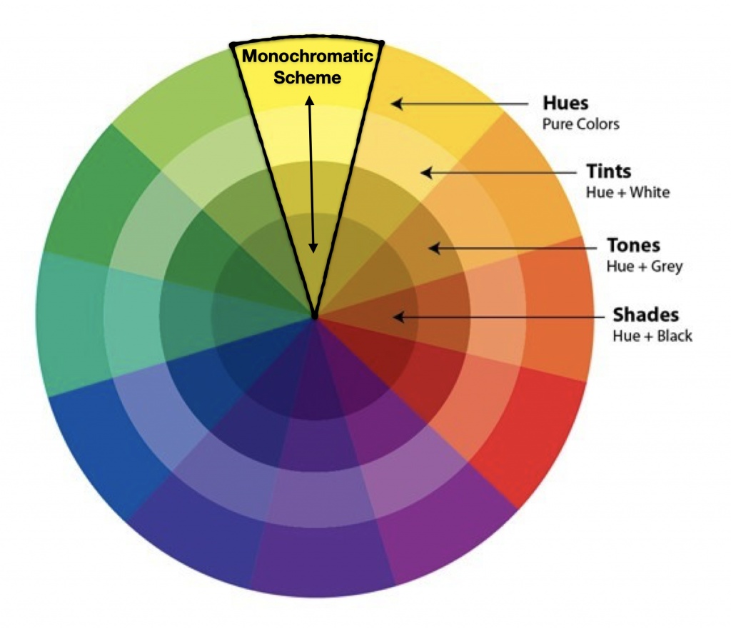
Monochromatic
These palettes are based on a single color. Once a color is defined, the scheme can be formed by using the hue and its tints, shades, and tones.
- Advantages: A monochromatic scheme reduces distraction and prevails color harmony. It is good for designs where an external element is the focal point.
- Disadvantages: It might be too plain for designs where the focal point is part of the design, or designs that require a very dynamic ambiance.
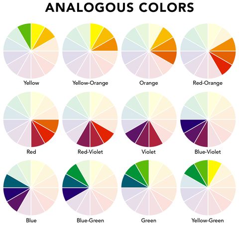
Analogous
These palettes have a main color and are supplemented by the main color’s closest neighbors. These schemes are usually either predominantly cool or warm-toned. For example, if the main color for your scheme is blue, you could complement the scheme with blue-green and blue-violet.
- Advantages: Schemes with analogous colors can reduce distraction and add more color variation than the monochromatic whilst still preserving color harmony.
- Disadvantages: It might not be as vibrant as a complementary color scheme.
Complementary
Complementary color palettes are formed by colors on opposite sides of the color wheel.
- Advantages: These are good for situations where the design itself is the focal point or that require a dynamic ambiance. Also, they have the most amount of color variation, especially if using more than one set of complementary colors.
- Disadvantages: not good for backgrounds, might be too distracting.
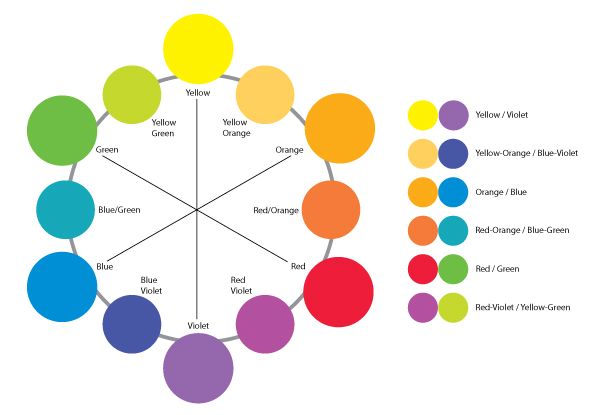
In like manner, Triadic palettes are those with three colors on opposing sides of the color wheel, and Tetradic schemes are those with four colors on opposing sides of the color wheel or two sets of complementary colors.
- Advantage: These color schemes are very dynamic and eye-catching.
- Disadvantages: These can get very tricky because the more opposing colors you add to a color palette, the harder it gets to balance them out. Maintaining a single color as the dominant one and having the others supplement it is the most effective way to manage these palettes.
This source is a great tool to help you figure out the exact hues to supplement a main color in any of the color palettes described above: Sessions College – Color Calculator
| Game Time! Check out the following game to test your knowledge of hues, saturation, and analogous, complementary, triadic, and tetradic color schemes. Method of Action – Color |
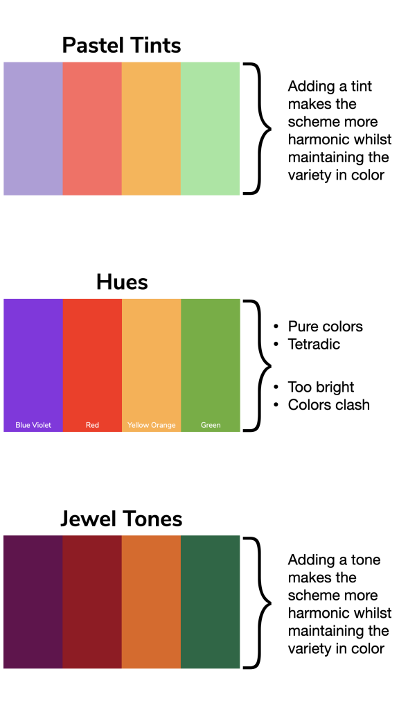
REMEMBER: For any color scheme you are planning you can always change the Tint, Shade, and Tone to best suit your purpose. For example, you can improve the color harmony in a tetradic color scheme by increasing the tint to get pastel colors, or you could alter the tone to get a jewel-toned scheme.
 |  |
| Hues Hues are a great way to bring vibrance to the design. Their brightness is a tool you can use to emphasize objects. However, at times hues can be too aggressive due to their saturation (notice the carpet and wall art). | Muted Tones Therefore, muting down the colors by adjusting their tone can help balance out the saturation and provide color harmony. |
Check out this other example:
Activity #2: Choosing Colors and Making a Color Scheme
Now that you have learned about the meanings of color and the different types of color schemes it is time for you to transfer this from knowledge to action. Spend about 45 minutes working on this activity, where you will be tasked to make a color scheme to best fit the situation at hand.
Remember, depending on the purpose of your design you want to pick colors that reflect your vision.
Step 1: Read through the following three situations. You will be creating a color scheme for each one of them.
- Your client is COLA’s History department here at UT. They are starting a new podcast on the Civil War and they need your help to define a color scheme that will be used for the branding. They want a palette that reflects the setting of the Civil War without favoring either side.
- 🗝 = In context, colors can have specific or strong connotations.
- You are your own client. Pick a color palette that best fits your personality! What color palette would you want to define yourself as a brand?
- 🗝 = Colors can set a mood, and expectations.
- Your client is COLA’s Mexican American and Latina/o Studies department here at UT. A professor is trying to revamp their PowerPoint presentations for the Mexican-American Literature and Culture course they teach. They ask for your help in choosing a color palette that reflects their mission to “understand the daily lives, resistance, exploitation, and rebellions within Mexican Americans and Chican@/xs in the United States.”
- 🗝 = Popular colors and their meanings can vary by culture.
Step 2: Recalling what you learned from The Meaning of Color, pick a single color to begin the color scheme for the first situation and answer the following questions on Basecamp:
- What meanings or values is that color usually associated with?
- Which one of those meanings/values is the reason you chose this color?
- If originally undecided, which other colors did you have in mind to be the dominant color? What made you consider them? Why didn’t you pick those?
- Which type of color scheme are you considering making? (monochromatic, analogous, complementary…) Why?
- Will you focus on hues or will you modify the color’s tint, shade or tone? Which one and why?
Step 3: Once your color and plan are approved, choose between 2 and 5 more colors to complete the color scheme (there should be 3-6 colors, total depending on your vision). Post a picture of your final color scheme on Basecamp for feedback or approval.
Step 4: Repeat all necessary steps for the other two situations. Your final product should be three different color schemes, one for each of the situations.
