
“But consider for a second that all design is fundamentally assistive.” — Margaret Andersen
Good design provides for its users. Every step of the visual design process considers how best to make its content both beautiful and understandable. On a basic level, accessibility just involves enriching the skills you already possess with the knowledge that there are users that may not have the same abilities you do. You already can design beautiful things, you just need to keep some things in mind.
In this training, you will learn:
- The basics of accessibility laws and guidelines and how they pertain to your work here
- How and when to implement resources to check your design
- How to write alt text
- Strategies to incorporate accessibility into all phases of the design process
- Concrete ways to improve accessibility in your designs
At-a-Glance
For more detailed explanations and background, read this full article.
| Graphic Design | • Captions, descriptions, alt text where applicable • Color contrast of 4.5:1 for regular sized text (non logos or purely decorative text) or 3:1 for large text • Clear, easy to follow hierarchy • For infographics, don’t use color as the sole signifier of information • Keep animations to a minimum |
| UI/UX Design | • Clear page hierarchy, both visually and in the markup • Consider responsiveness • Alt text • Descriptive link text • Color contrast applies here, too |
WHY ACCESSIBILITY MATTERS
Overview of Laws & Regulations
For many organizations, compliance is a chief concern as well. In this context, compliance means according with all applicable laws set out for your organization. Applicable laws include the American Disabilities Act of 1990 (commonly referred to ADA) and Section 508 of the Rehabilitation Act of 1973.
Laws at a Glance
Section 508:
- Pertains specifically to digital content (or ICT, information and communications technology as they are called by the Department of Homeland Security)
- Applies to agencies of the federal government as well as any institutions that work with or receive funding from the federal government (this includes UT!)
ADA:
- Most expansive law protecting people with disabilities from discrimination
- Applies to all members of public & private industry
Compliance is very real, and data shows there are a growing number of lawsuits pertaining to digital accessibility. Recent defendants include Rite Aid, whose portal for accessing COVID vaccine appointments was reported inaccessible for screen reader users. This 2021 report from UsableNet shows some of the data behind accessibility lawsuits. Almost three quarters of Fortune 500 ecommerce companies were sued for noncompliance last year alone.
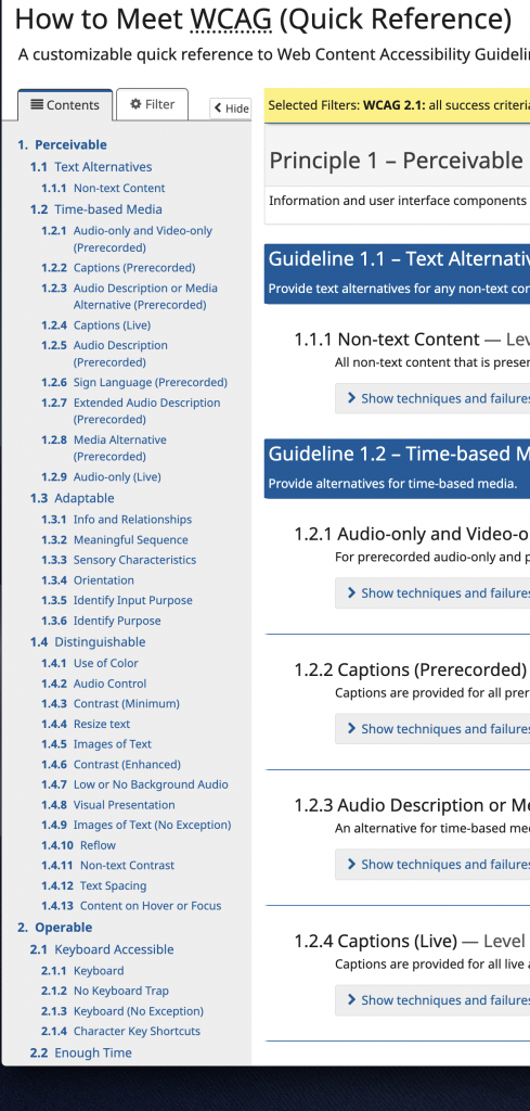
WCAG Guidelines
The Web Content Accessibility Guidelines for Level AA Conformance, although not written into US law, are also regularly referenced by plaintiffs.
The Web Content Accessibility Guidelines (WCAG) are developed by the World-Wide Web Consortium (W3C), a group of industry professionals that create guidelines for various people working in the digital content sphere, including designers!
You can view the current working standards checklist here.
These standards are a great starting point for emerging designers.
Accessibility Principles
This all may seem especially complicated, but we can basically divide accessibility into four important principles:
Perceivable:
Designs should have options for people to perceive in whatever way they are able
Operable:
UI designs should be keyboard accessible and designs should not cause seizures
Understandable:
Designs should be readable and structured in a way that makes sense
Robust:
Designs should be compatible with all devices + assistive technologies
Types of Disability
What comes to mind when you imagine a disabled user?
This training won’t serve to enumerate all kinds of disabilities, especially in the ways we might like to delineate them in a medical sense (e.g. physical, cognitive, etc.). Instead, the following demarcations will assist us in beginning to understand the differing abilities of users, and how we might prevent ourselves from excluding any of them in our designs.
Permanent:
A person has one arm.
Temporary:
A person’s arm is injured.
Situational:
A person is working from home and has to hold their infant in one arm.
When considered in this way, ensuring accessibility doesn’t just make life a little bit easier for the millions of people in the US alone with a federally recognized disability, but also the vast majority of us who have been situationally disabled at some time. Not only this, but many of the things we will discuss (e.g. good color contrast, clear hierarchy) make things more usable for all users.
RESOURCES FOR DESIGNERS
In a perfect world, all web designs would undergo accessibility testing and reviews; however, this is not always possible. This is where automated accessibility checkers come in handy.
Please note that you should always check your content manually first, as these tools tend to detect only about a third of possible accessibility issues.
It may be a good idea to bookmark some of the most useful sites
Browser Tools
WAVE Web Accessibility Tool: Best for web designers, this site allows you to input a URL for any public site and see errors related to things like contrast, alt text, and hierarchy.

Coolors Color Contrast Checker: there are several good contrast checkers available online that allow you to input foreground and background colors to see if it meets WCAG color contrast guidelines.

Text on Background Image Checker: for times when you are designing for web and overlaying text over an image, use this online checker to see if your design has sufficient contrast. It’s best to go by AA standards and make sure your design passes.

Apps
Microsoft Office Accessibility Checker: all of Microsoft 365 apps have an internal accessibility checker. Utilize this when you’re deciding word documents, Powerpoints, or other content.
Color Proofing in Adobe CC: For Photoshop and Illustrator, you can see how your designs look for users with color blindness by proofing the colors (View > Proof Setup > Color Blindness). For any colors that are hard to see or appear significantly different, adjust accordingly.


ALT TEXT
First, watch this video of a user using a screen reader to understand why non-visual elements like alternative text and other markup are useful:
Screen Reader Demo for Digital Accessibility
You may be asked to write alternative (alt) text in your tenure as an STA.
Alt text, as it’s usually called, or alternative text, is text included as an alternative to any images on a site. They are usually short descriptions of any relevant information than an image conveys.
Why is alt text used?
Images are often some of the most widely used components on websites. If people cannot access these images, this can create major barriers. Alt text can:
- Help orient people with disabilities who are using screen readers or dictation software to orient themselves on the page
- Display information for an image that might be blocked due to internet connectivity or various software
- To improve search engine optimization (SEO)
How do I write alt text?
Is an image decorative (a banner, for instance, or a stock image with no real informative purpose) or includes information already found in the text content of the page? If so, no need to include alt text! Logos are also not recommended to have alt text.
Although alt text is sometimes needed, too much alt text can actually impede accessibility improvement as it may clutter users’ screen readers.
Quick reference for cases you should not use alt text:
- Logos (branding)
- Decorative images (What are decorative images?)
- Complex charts or graphs (How should I handle these?)
- It already has a caption
If it includes information not otherwise found, such as an image that demonstrates or supplements something found in the text, it might be best to add some alt text.
The key for writing good alt text is to keep things concise and clear. Never begin your alt text with “image of” or make assumptions about what’s in the image.

Does this image need alt text? It’s not a graph or a painting; however, it does add supplemental meaning to the page. If this was simply a color overlay image with the page title, “LA 101,” this would qualify as a decorative image.
Therefore, it should have alt text. Click on the image and, navigating to the sidebar where the gear icon is highlighted, click into the “alt text” field.
First attempt:
Students in LA 101P classroom learning and collaborating with one another, a collage
Although this alt text is well-intentioned, it’s pretty verbose. Let’s try to condense it. Also, notice how it’s not one image, but 4 in a collage. Let’s take note of this format to try to convey this to the user.
Second attempt:
A collage of LA 101P students working together in the classroom.
This is a little better, but still makes some assumptions. Are these LA 101P students? Likely, maybe, but we have no way of knowing for certain; there’s no sign or information in these images to suggest these aren’t just a collage of ordinary classroom shots. Also, are they working together? Maybe, that’s a pretty sweet thought, but it shows interpretation.
Best attempt:
Collage of students in class
It’s short, succinct, and doesn’t suggest that these are students in any particular class with any particular collaborative aspect.
Alt text isn’t just used in web editing. You can add alt text to images in Powerpoints, InDesign flyers, and on most social media platforms.
Here’s an example of where you add alt text in WordPress:

Also, here’s an example of what alt text looks like when you inspect element:

VISUAL + GRAPHIC DESIGN
We’ve already indicated that design can be beautiful & accessible. It can also be transformative. Consider the Accessible Icon Project, a design activism project that is inspired by past design activism projects during the AIDS crisis. Beginning as a street art group trying to shine a spotlight on marginalization of disabled groups, they created a markedly different version of an icon we’re probably all accustomed to seeing on parking spaces, signs, and in other public spaces.

It may just be an icon, but how does this change affect our conception of people with disabilities?
Another example of the intersections graphic design can have with accessibility is evident in Uno’s recent release of a colorblind exclusive deck.
https://www.theverge.com/2017/9/6/16262046/uno-colorblind-accessibility-inclusiveness-46-years

Uno has long been known as an extremely difficult game for colorblind people, so this realization of a colorblind-friendly version is another example of the power of graphic (packaging) design in action!
Here are some concrete examples of steps one can take in order to make graphic design content more accessible:
For informative graphics, use more than one signifier. For instance, if you are using color, also use numbers or words.
Know the difference between informative and decorative images and follow the corresponding guidelines. Either way, your graphic is important and matters :~) but as we clarified above, informative images add or supplement text-based information or meaning, so it’s extra important to make sure that informative graphics are accessible. What does this mean?
Informative graphics need:
- captions, descriptions, alt text where applicable
- sufficient color contrast
- to not rely slowly on color as a signifier
- Use other signifiers like an underline, italic, bold, uppercase, size, border/background box, etc.
- a clear hierarchy that can easily be followed

Some people wouldn’t be able to interpret this graph above based solely on color.

This is better: using shapes to mark different lines, as well as color (multiple modes).
Activity 1:
Find 2-3 infographics. Pinterest, Instagram, as well as Google are good starting points.
How well do they abide by the directives above, as well as any other considerations you think should be important? There is no real objective way to analyze this, but note if there’s anything you would have changed/remediated (low contrast colors, confusing layout, tiny text?). If they seem pretty accessible, explain why.


UX DESIGN
As a reminder, UX design refers to the design of user interfaces, such as websites or apps. It’s also probably the ripest area for success (or failure) in accessibility, and is thus a critically important area for designers in focusing web accessibility efforts. In user interface design, the final product of your design is, by definition, interactive.
As a reaction to decorative web design, one software engineer outlined what he calls Brutalist Web Design. While this may seem like an extreme response, it also makes an interesting point, that our desire to beautify the web or decorate it can sometimes come at the cost of accessibility. This does not, however, mean that a beautiful site cannot be accessible. However, ease of use and accessibility should always be considered imperative. This also relates to ideas of access in a grander, more global sense, and making sure we create sites that can be accessed with even basic technology.
So how can we guarantee accessible sites? You may remember the principles of design from a previous design KB, and one way to start is to simply make sure you are enacting these principles as best as you can. What do I mean?
Hierarchy
Hierarchy is how you organize content elements to draw the eye. So to keep your design accessible, have a clear hierarchy. HackerNews, for example, is an incredibly simple HTML based site that is still inaccessible, one of these reasons being poor hierarchy.

Consider also tab order, which ensures that people who have to use a keyboard rather than a mouse can navigate your page. This usually means ordering things roughly from left to right and top to bottom.
Font Size
Minimum font size should be 16px.
Color Contrast
Again, color contrast is very important! Please use a checker like the Coolors one linked in the RESOURCES section.

This screenshot of Craigslist showcases the very low contrast between text and background, a lime green on white background, that does not pass WCAG contrast checks (see below).

If you’re running usability tests, consider swapping out “normal” users with users from this alphabet of disability.
Meaningful Links
For interactive content, like buttons or links, avoid meaningless signifiers “CLICK HERE”. Instead, for hyperlinked text or a button, have a preview of what to expect, such as hyperlinked text that reads “view more information about onboarding here” or even, “onboarding information”. Incorporating subtle hover functionalities, such as underlining or bolding of text upon mouse hover, can also be a great signifier.
Activity 2:
- Download an accessibility extension like axe or refer to WAVE, and visit some sites in your recent browser history to run one of these automated accessibility checkers to scan for especially salient issues. Jot some of these down and take screenshots, sharing any thoughts you have.
- Pick a site to help remediate.
- Go to Figma. If you don’t have a Figma account yet, register with Figma for students and educators, which allows you to create a free account.
- Once logged in, navigate to your profile icon in the upper right corner, click the dropdown and select “plug-ins”. Find and download the “Figma to HTML, CSS” plug-in from the browse community link.

- Create a new design file and right click to select “plug-in” and click on the one you just downloaded. Paste the URL of the site you’ve selected into the text box provided.


- The result won’t be perfect, but should resemble the site fairly closely. Recall any errors you saw reported (e.g. color contrast, link text, etc.) that has to do with the design, and fix these!
- Don’t feel like you need to remediate everything, but feel free to play around a bit and post any screenshots to Basecamp.

For example, here I just added overlays to the images to create more sufficient contrast.
CLOSING REMARKS
Accessibility is a large and constantly growing field, growing in complexity as more kinds of disabilities are recognized, and designers and researchers refine approaches to web accessibility. We can’t expect to make perfectly accessible content, graphics, or sites all the time, especially under time, money, and subject matter knowledge constraints. What matters ultimately, just like so many other things in life and work where the welfare of people is involved, is that you made an effort. 🙂
Thank you for looking at this training and I hope it helped you!