
Introduction
This tutorial will cover how we can use CSS in order to style a CLIO page and improve students’ learning experience.
While styling CLIO, make sure that your visuals complement the overall material that’s trying to be taught. For example, if the page teaches about the precipitation cycle, the visuals can support it with the use of brighter colors to complement any diagrams and text. On the other hand, if your CLIO page is teaching a dense topic like war crimes, the visuals might support that through darker and modest styling.
For the sake of this tutorial, my course page will be teaching students about splash pads, so we’ll try to support the content with splashy visuals!
What is a Card?
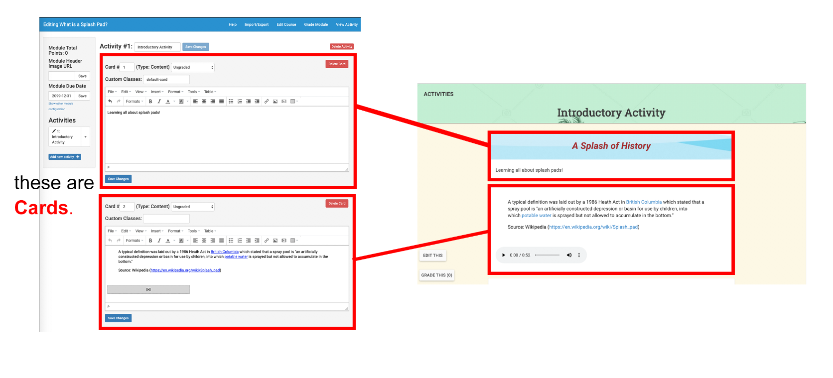
A card is a container you, the instructor or web editor, can put content (text, hyperlinks, videos, mp3s, images) into and have represented as a physical card when a student uses your module. With a bit of fiddling, you can give each card a styled banner that helps give definition to the structure of your content.
What We’re Making
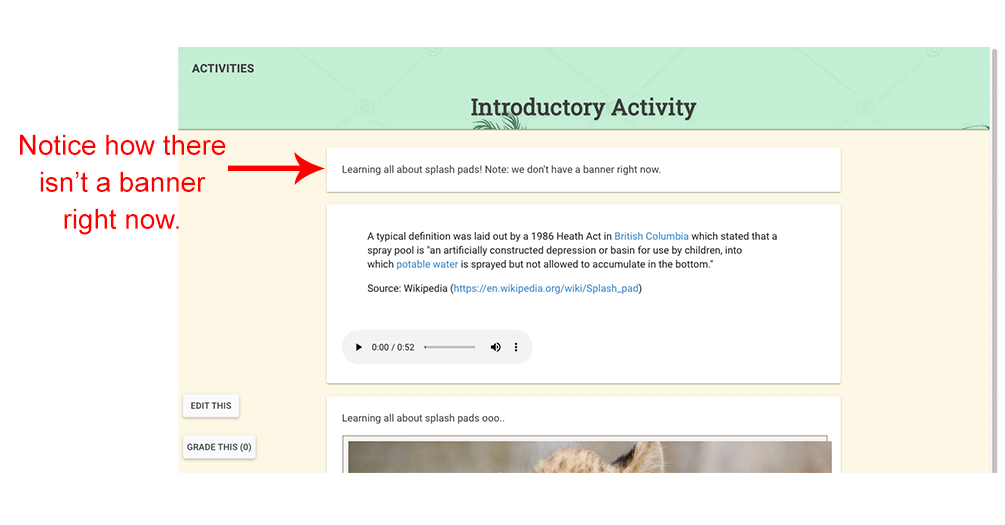
Here’s what we start with – a plain card without a visually-supported banner:
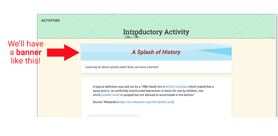
Here’s what we’ll end up with at the end of this tutorial:
What kind of styling is involved here? Let’s break it down.
Observing the Styling
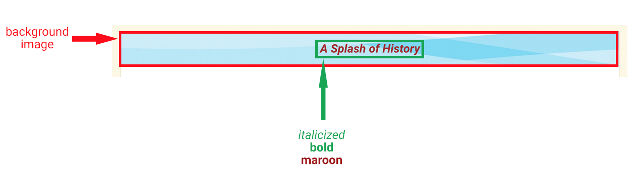
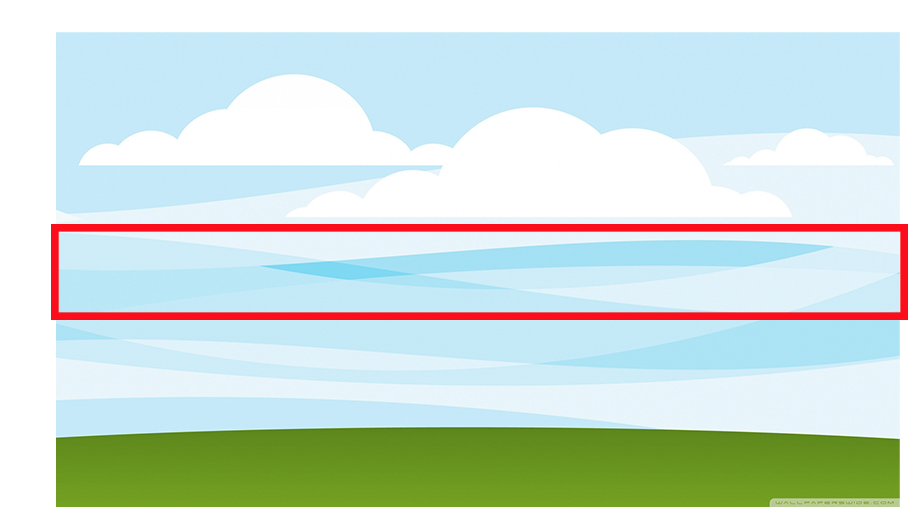
First off, we’re using a background image for the banner, namely this one:

You can download it here: http://wallpaperswide.com/download/minimal_landscape-wallpaper-2560×1440.jpg
Feel free to use your own background image and be creative with your visuals! For our case, this image obviously won’t fit into the vertically-thin card banner on CLIO, so we’ll only be using a snippet of it.
We also see that the text has a larger size, it’s italicized, and maroon.
Let’s dive into the CSS!
Show me the CSS Code!
Every time you create a new card on an activity, it contains a header div called card-header.
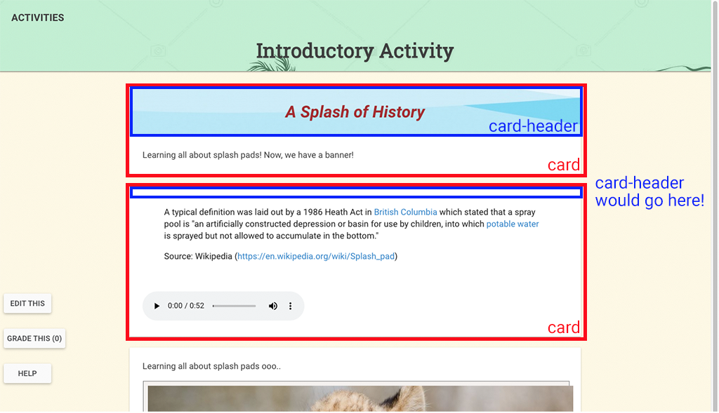
As you can see, if you don’t specify what content goes into the card header (as demonstrated in the second card), the card header will just hide itself until it has something to show.
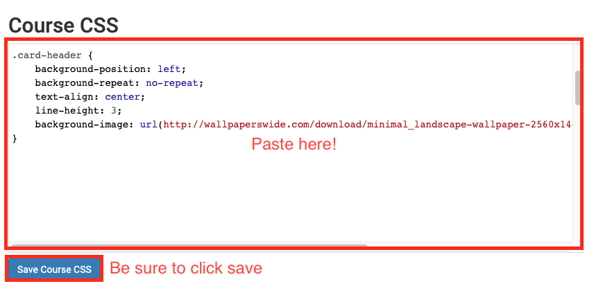
First off, let’s specify how we want card headers to be styled.
.card-header {
    background-position: left;
    background-repeat: no-repeat;
    text-align: center;
    line-height: 3;
    background-image: url(http://wallpaperswide.com/download/minimal_landscape-wallpaper-2560x1440.jpg);
}
What does this all mean?
- .card-header { … }: since each card always has a div called card-header, we’re telling the browser “hey, for every div that’s called card-header, give it the following attributes!”
- background-position: specifies where the background image will start. For our case, we put left, which means that it will start on the left and vertical center of the image. So, this area:
- background-repeat: this one’s self-explanatory, repeat the image if it’s smaller than the canvas its fitting into. In our case, we don’t want it to repeat.
- text-align: align our text whenever we add it to the header. We’ll want it to be center.
- line-height: specifies the minimum height of our card-header div.
- background-image: here you can specify a URL of an image or a locally stored one. The entire background of our card-header div will be this image.
Let’s go ahead and paste our code snippet into the CLIO module editor and see what happens. We should be able to see the background image in the card header now, right?
Let’s look at our card…
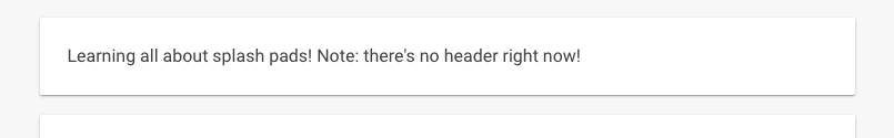
It’s still not there! How could this be?!
Remember, as mentioned before, you need to add content into your card header before it will show up.
Let’s do that now. We’ll need two more CSS snippets here, one that will style the banner text, and one that actually contains the text.
.card-header:after {
    color: maroon;
    font-style: italic;
    font-weight: bold;
    font-size: 1.9em;
}
- .card-header:after: tells the browser “after you’ve finished rendering the card-header with the background image, positioning, and everything else, style everything afterwards with this CSS”
- color: the color we want the text to be
- font-style: styling the font (to italicized in our case)
- font-weight: density of each character (bold, normal thickness, etc.)
- font-size: the size of the font. em is a relative unit that applies to the font-size, so if you say 2em, the result will be 2 * the normal font-size of the element.
Now, all we need to do is specify the content we want in the header!
.default-card .card-header:after {
    content: "A Splash of History";
}
- .default-card: this is the “type” we’re giving to our card. It’s what makes it unique from other cards who have a different types. So, every card that has this type will have “A Splash of History” as its content.
- content: the banner text for this card type.
Let’s paste these snippets into the same location we did before, and check the result.
Darn! We’re forgetting one more step…
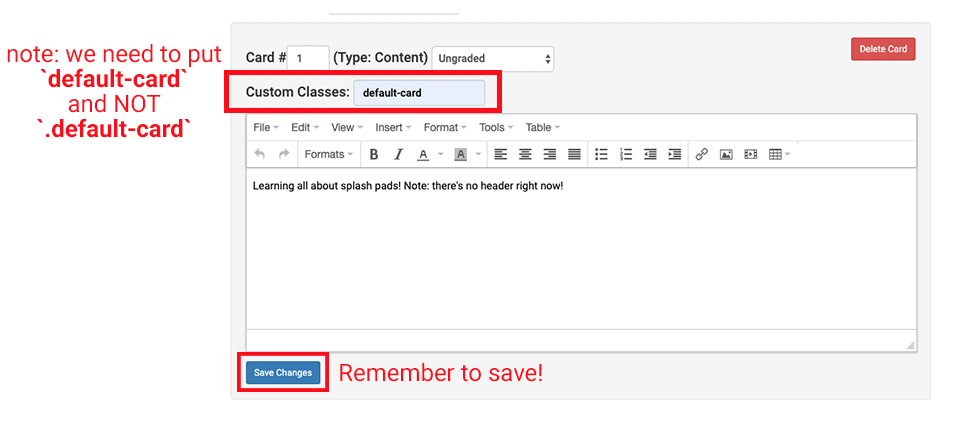
Whenever we created the card in CLIO, there was a field named Custom Classes, which basically lets you specify the type of each card. In our case, we called our type default-card, so let’s go ahead and put that in. Note, whenever you enter the type here, you do NOT add . in front of the card type. . is used in CSS to identify that something is a class, but in this input field, we only need to pass in the name of the class.
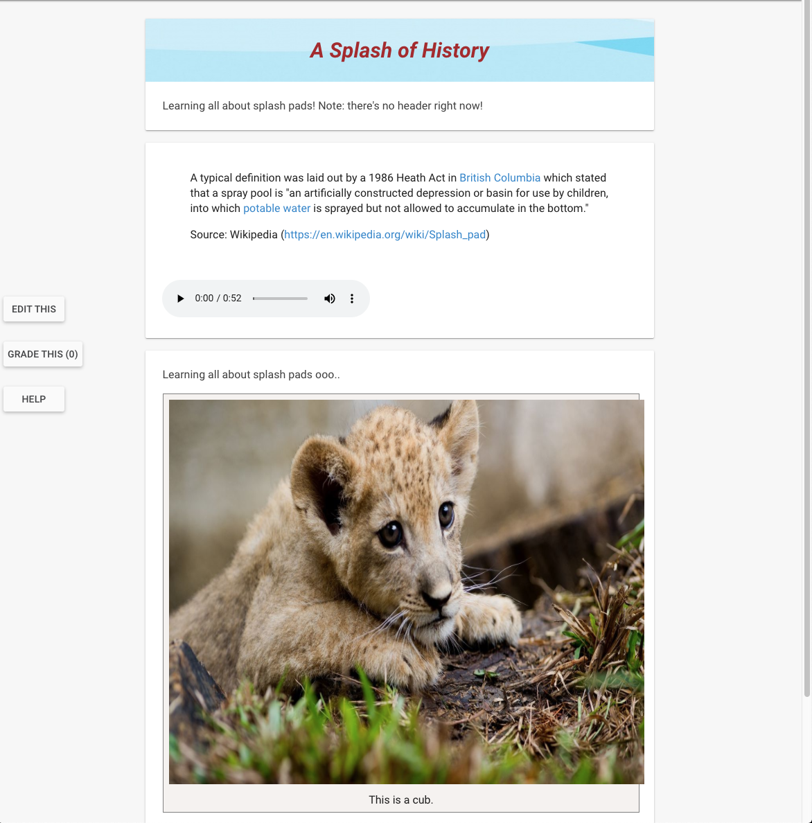
And…

tada!
Change background color of activity pages
Having card banners is a great way to aid visual learning, but what if you wanted to change the entire background color of your CLIO pages to match the look-and-feel of the material?
This is completely possible with just 3 small sections of CSS!
The default white background on an activity.
Modified activity background color to a cream color.
:root {
    --material-cyan: rgba(77,208,225,0.7);
    --material-cream: rgba(255,248,220,0.7);
    --the-name-of-your-color: #your-color-in-hex;
}

.content-container {
    background: var(--material-cream);
}

md-content {
    background: inherit;
}
- :root { … }: this is the area in your CSS code where you can declare global colors using rgba/hex and reference them anywhere else in your code, hence the name global.
- The variable name HAS to begin with two dashes (
--) and is case sensitive! - To reference it, use
var(--the-name-of-your-color).
- The variable name HAS to begin with two dashes (
- .content-container { … }: all the activities, cards, images, text, you name it, fall under this container. Here’s a visual of what that means:
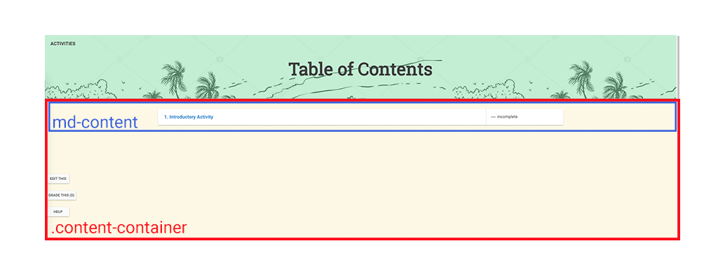
- So, this means that content-container contains a div called md-content. As long as we set the background for content-container, md-content should inherit the background color from its parent container (content-container).
- md-content { … }: child div of content-container.
- background: the inherit keyword makes this div adapt the parent div’s background style, which we’ve already set to our cream color.
Change styling of navigation banner
Cool, now our page is styled to match the look-and-feel of our course. But wait, what about this big orange banner at the top?
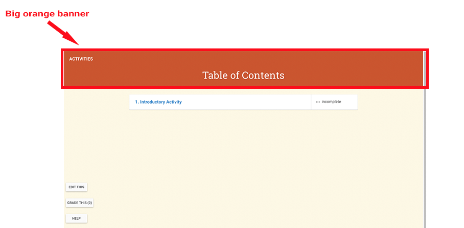 School spirit is great and all, but there might be times where these colors don’t align with your course content. Can we re-style this navigation banner? Yes!
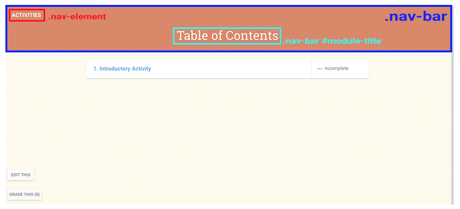
Here’s how the navigation bar divs are laid out. The entire banner is contained in a div called .nav-bar. Inside that, there’s a button to access all the activities, and that div is called .nav-element. Finally, there’s the title of the banner which is called #module-title.
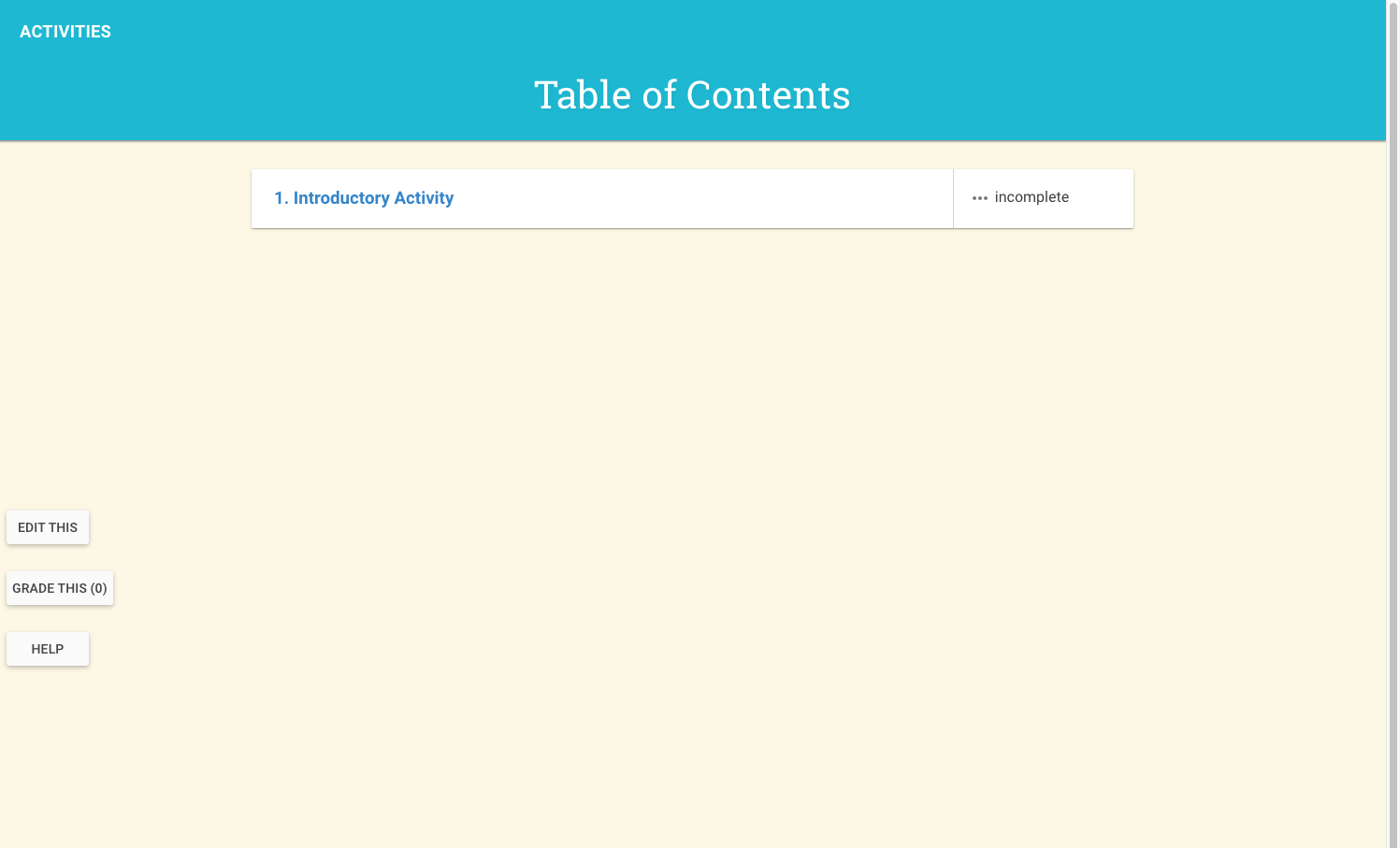
First off, let’s change the background color of our navigation bar. Since my course revolves around splash-pads, I’ll color it to a tint of cyan. Using what we learned before, this should be doable!
.nav-bar {
    background: #00B8D4 !important;
}
- .nav-bar {}: tells the browser to style this div in the following way…
- background: our preferred background color. Notice how we use !important, the reason for this is because we want to override the current styling of the banner. Exercise caution when using this keyword, but because of the way CLIO is set up right now, this is required.
Ahh, that’s much better! How about changing the text color of the title and the Activities button?
.nav-bar #module-title {
  color: #d32f2f;
  font-weight: bold;
}

.nav-element {
  color: #d32f2f;
}
- .nav-bar #module-title {}: styling the title of our banner. Why are we using a
#symbol here? In CSS, you use.to refer to classes and#to refer to IDs. The difference between those is that a class can identify more than one element, while an ID represents one unique element. Learn more here. - color: new color of our text in HEX or RGBA.
- font-weight: the boldness of our font.
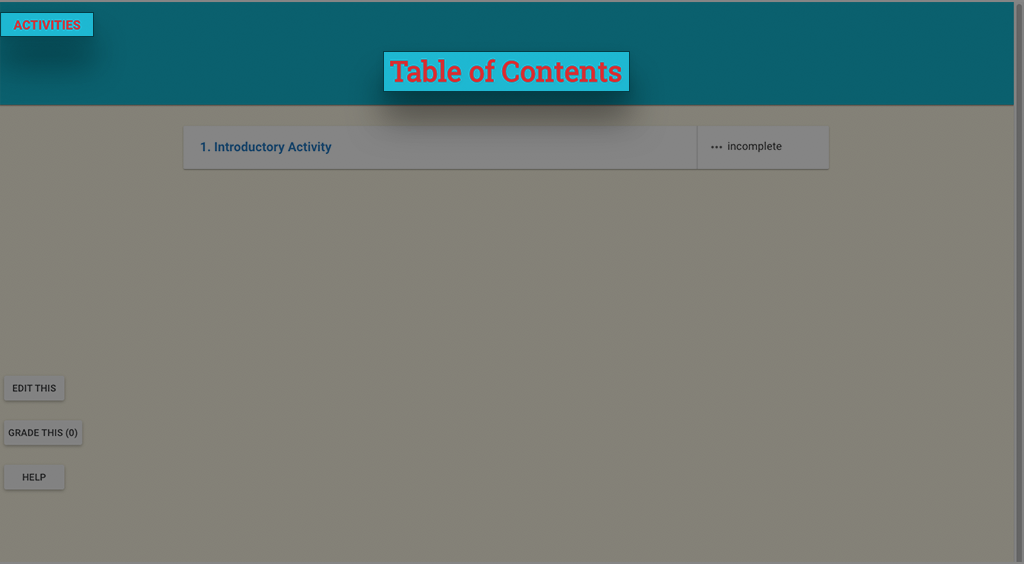
Yay!