![]()
In this training, you will go over color terminology and relationship to understand how colors interact with each other. This training will help you familiarize yourself with the basic relations of colors by placing them creatively in a re-invented color chart of your choice after studying the basic layout of the wheel.
Step One: Study the Components of the Color Wheel
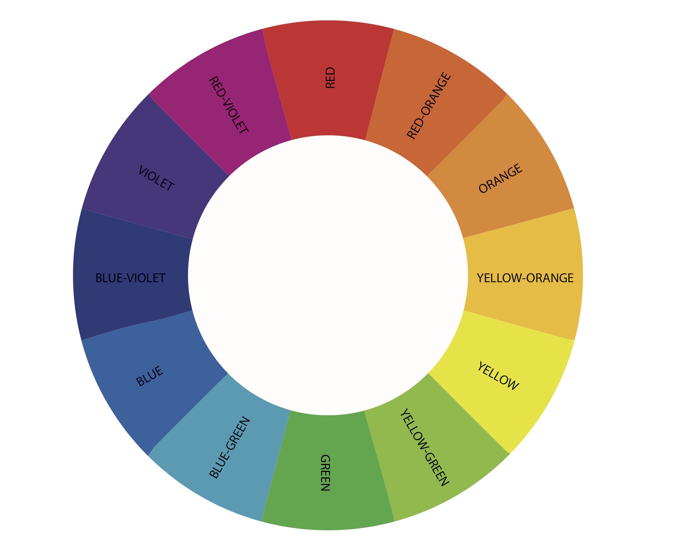
Above are the basic hues of a color wheel. A. hue is another word for color but refers to it more specifically as the pure state of the color without any tinting or shading.
The primary colors are what you typically would start out with. They are red, yellow, and blue. When primary colors are mixed together they make the secondary colors (orange, green, and purple). When you mix a secondary and a primary color you get tertiary colors (red-orange, yellow-orange, yellow-green, blue-green, blue-violet, and red-violet).
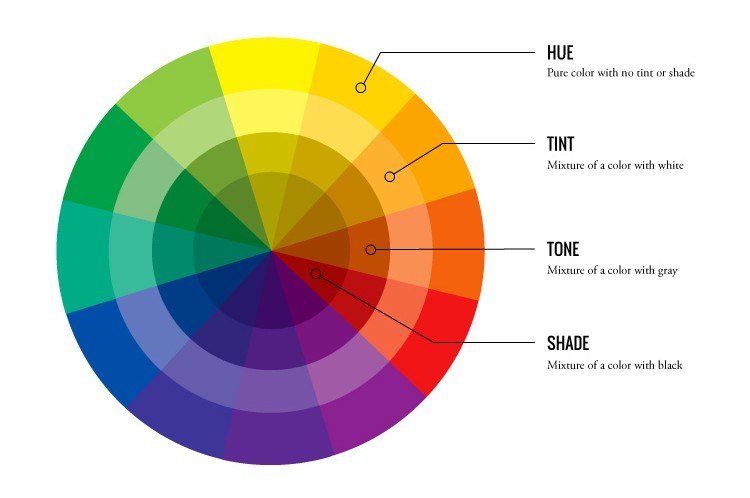
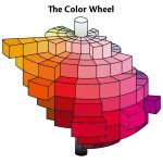
Now that we have looked at what the hues are we will take a look at ways the hue is manipulated. There are three main ways that you can change the hue: tint, tone, and shade.
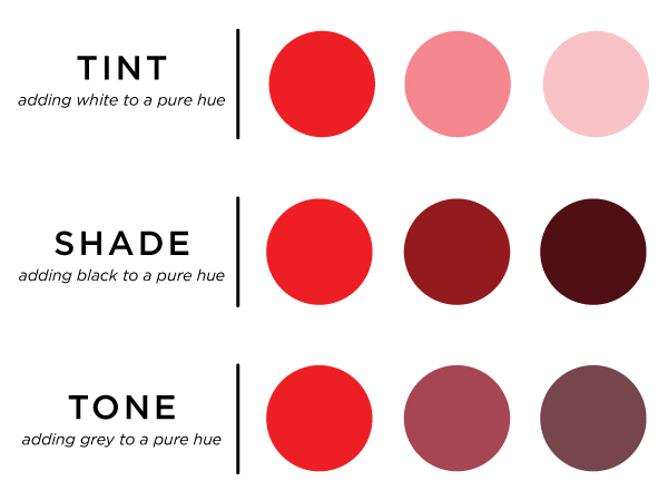
A tint will make the color look brighter by adding more white, eventually adding 100% tint would turn your color white. A tone will mute your color or dull it, and this is done by adding gray. A shade will darken your hue. It is different from tone because it brings the color closer to black and does not have a mixture of white like gray does. Take a look below at how the color red changes as we add a tint, tone, and shade.
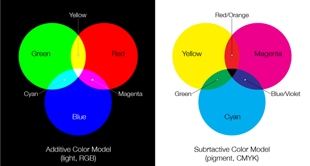
Make note that this is not the only type of color wheel that exists. There are different primary colors of light and pigment, they are additive and subtractive colors respectively. Each produces varying secondary colors of their own. Different color wheels and slightly different color theory is required for different formats of media such as lighting, print, and digital. You can see the example image below for what I am referring to. We are using the wheel above for this training because it is the most utilized for the work we do here in the office for design projects.
What you will also include in your color wheel is a value key. Value is the colors lightness or darkness in relation to black and white. Black, white, and gray are known as achromatic colors while the rest of the hues are chromatic colors. You can make your value key in a gradient like the top rectangle or you can make it in steps like the bottom rectangle.
Step Two: Create your Color Wheel
Now that you have studied the very basics of this type of color wheel you will make your own in either Adobe Illustrator or Adobe Photoshop. Your color wheel must contain:
- Hue
- Tint
- Shade
- Tone
- And a Value Key somewhere on the side in achromatic colors.
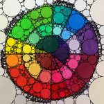
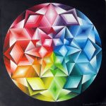
Your color wheel does not need to be plain and basic. Have fun playing around with the layout. Refer to some of the images below for inspiration.


