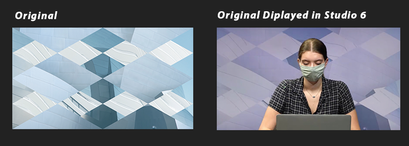
Online courses produced by the LAITS Video Team are recorded in studios that have a variation of lighting properties. These differences create discrepancies in the studio backdrops’ coloring.
The variations in the color display are caused by the temperature of the lights, measured in degrees Kelvin (K). When designing a backdrop, you’ll need to create different final versions that work for both studio lighting options.
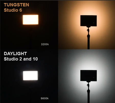
What Studio Lighting do we have?
- Studios 2 and 10 have lighting resembling daylight temperature (5600 K)
- Studio 6 has tungsten lighting, which is lower in temperature (3200 K)
What colors can we use for backdrops?
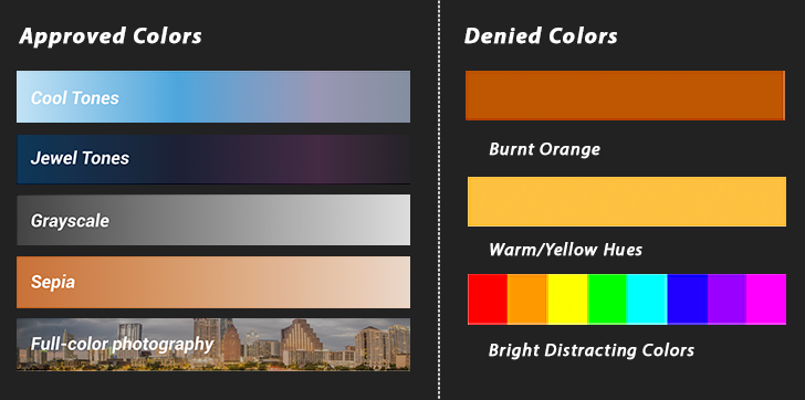
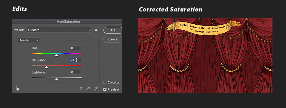
Below are recommended and discouraged color ranges to use in backdrops. On the left are colors that work well in studios. On the right are colors that don’t. Colors on the right look off-putting and, well, bad in our studios.
- Approved: Cool Tones, Jewel Tones, Gray-Scale, Sepia, Full Color Photography
- Denied: Burnt – Bright Oranges and Yellows, Full Hue, Neon, Bright White

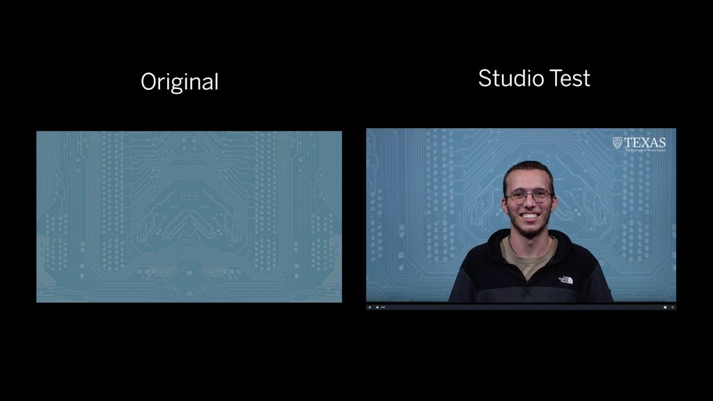
Cool Tones
Light Blue and Medium Blue
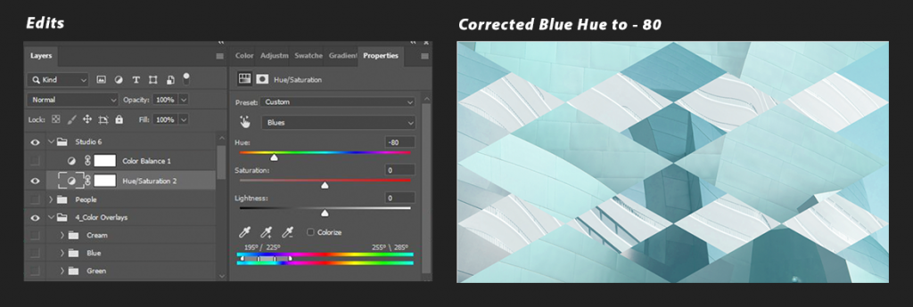
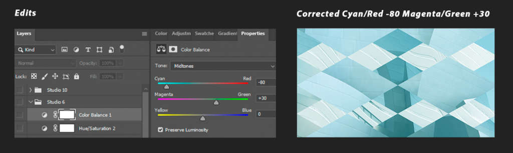
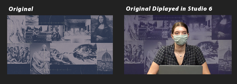
Studio 6: The tungsten lighting displays cool tones with a strong purple tint.
Solution LIGHT BLUE: There are a couple ways to adjust the purple appearance from the tungsten lighting.
- Option 1: Add a Hue/Saturation adjustment layer at the top. On the “Blues” category, dial the Hue slider down from -20 to -80.
- Option 2: Add a Color Balance adjustment layer at the top. On the Midtones, adjust the sliders to one of these values as needed:
- Cyan/Red: -20, Magenta/Green: +10 (usually comes out best)
- Cyan/Red: -40, Magenta/Green: +20
- Cyan/Red: -80, Magenta/Green: +30
Solution MEDIUM BLUE: The blue comes out too purple in Studio 6.
- In the Hue Adjustments select blues and lower to -40 or -20
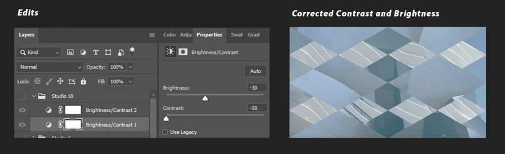
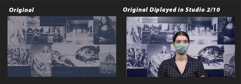
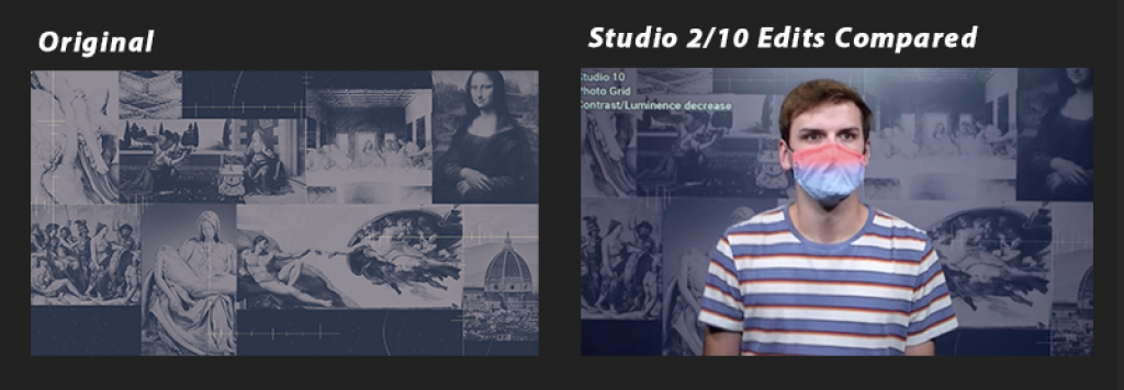
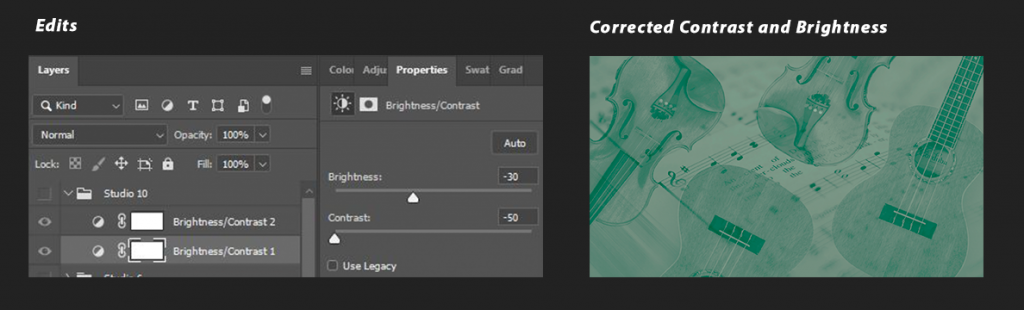
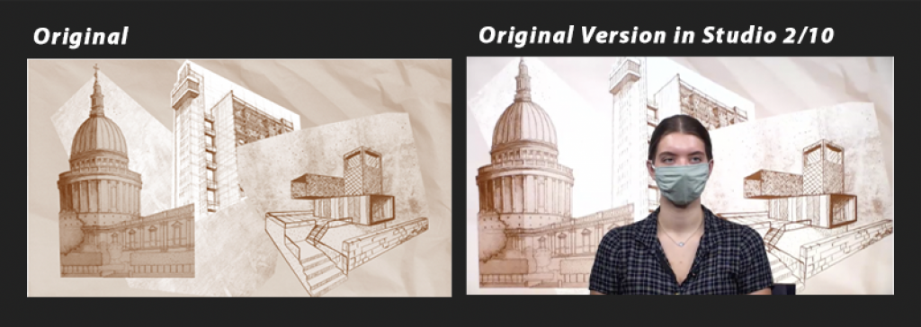
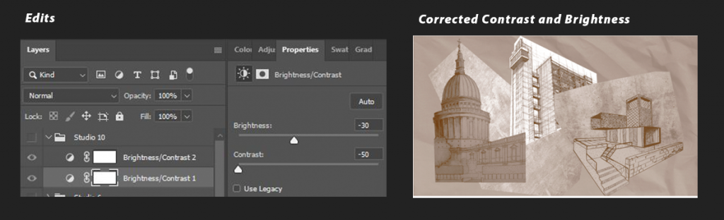
Studios 2 and 10: Light blue hues are too bright and high in contrast.
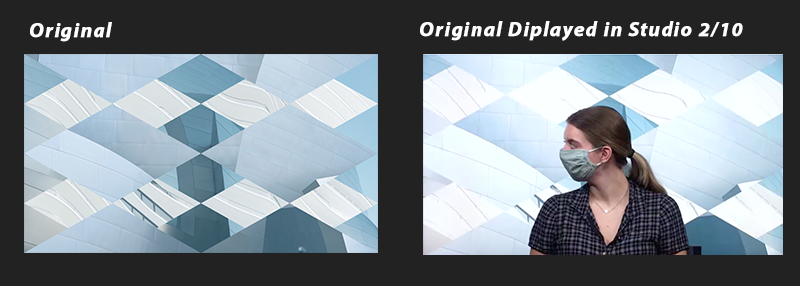
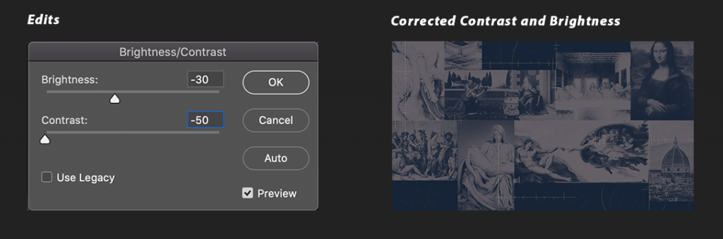
Solution: once you have finished the digital backdrop to your liking, add a Brightness/Contrast adjustment layer at the top with the following range of values:
- Reduce Brightness: 0 to -30
- Reduce Contrast: -30 to -50
- Sometimes a second Contrast reduction of up to -30 may be needed
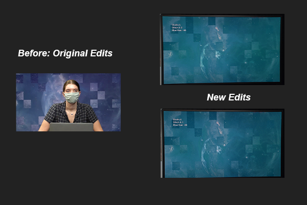
These corrections should get your backdrop to resemble the original image as close as possible:
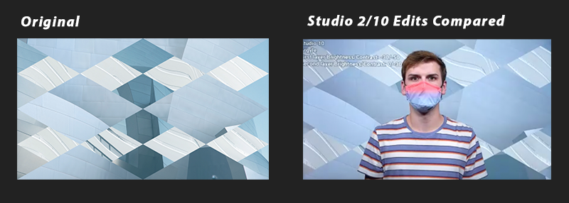
Below are some examples demonstrating how the colors are skewed in the studio like that of medium blue:
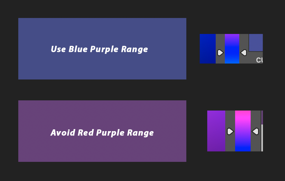
Lavenders and Purples
Studio 6: The tungsten lighting displays purples tones with a red/purple tint.
Solution: There is one way to adjust the red/purple appearance from the tungsten lighting.
- Use more blue-purple instead of red purples when editing if you want your background to appear more true to the purple hue rather than too red.
Studios 2 and 10: Purple hues are really bright and high in contrast.
Solution: once you have finished the digital backdrop to your liking, add a Brightness/Contrast adjustment layer at the top with the following range of values:
- Reduce Brightness: 0 to -30
- Reduce Contrast: -30 to -50
- Sometimes a second Contrast reduction of up to -30 may be needed
These corrections should get your backdrop to resemble the original image as close as possible:
Soft Green
Studio 6: The tungsten lighting displays cool greens with a blue tint.
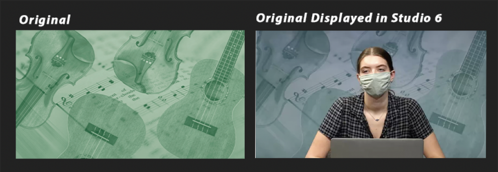
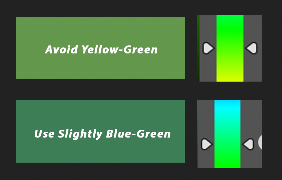
Solution: For Studio 2/10 edits, use a more blue-green instead of yellow-green. Do not do this for Studio 6 edits: it already adds a blue tint to greens. We want the yellow-green stronger for Studio 6 (more yellow than green).
Studios 2 and 10: Light green hues are really bright and high in contrast.
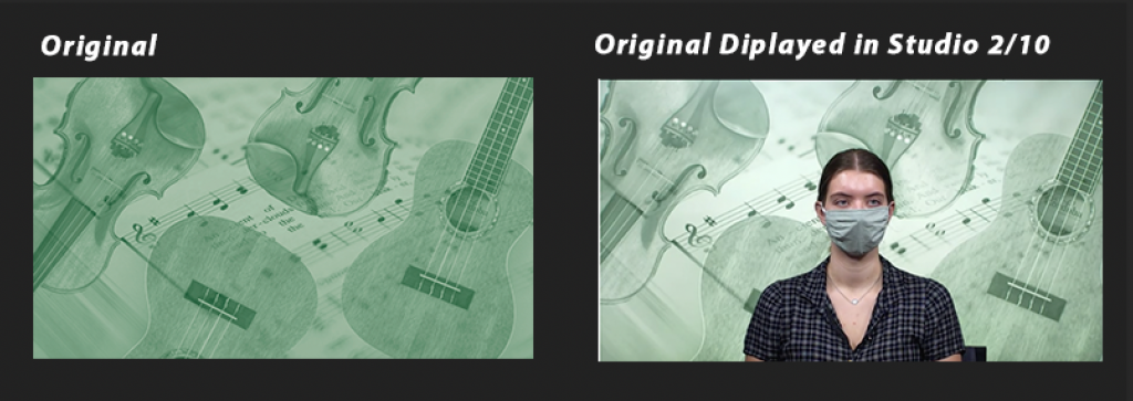
Solution: once you have finished the digital backdrop to your liking, add a Brightness/Contrast adjustment layer at the top with the following range of values:
- Reduce Brightness: 0 to -30
- Reduce Contrast: -30 to -50
- Sometimes a second Contrast reduction of up to -30 may be needed

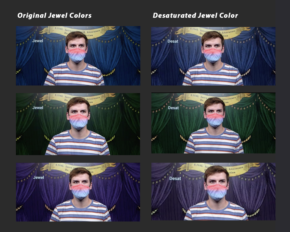
Jewel Tones
Ruby, Emerald, Sapphire, and Amethyst
Studio 2, 10, and 6: Jewel colors come out very saturated and contrasted against the person.
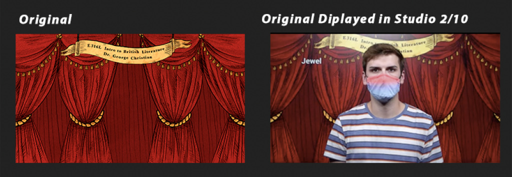
Solution: Rich/jewel tones look best once desaturated.
- Apply a Hue/Saturation adjustment layer
- Change the Saturation slider from -30 to -70, depending on the color.
- Blue and green tones look very neon, so you might need to desaturate those more.
- Another approach for blue and green is sticking with -30 Saturation and lowering the brightness.

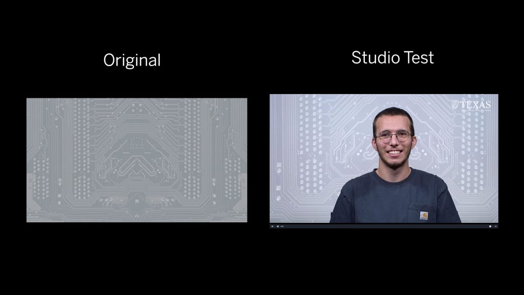
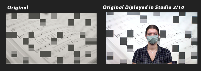
Grayscale
Black, White, and Gray
Studio 6: Whites appear to have a pink-ish tint
Solution: This is might be caused by issues of blooming along with light color.
- Try to slighter underexpose your white no more than 10%
- Add a slight teal tint but no more than 10% as well.
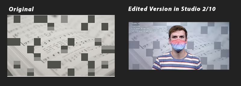
Studio 2/10: White hues are really bright and high in contrast.
Solution: once you have finished the digital backdrop to your liking, add a Brightness/Contrast adjustment layer at the top with the following range of values:
- Reduce Brightness: 0 to -30
- Reduce Contrast: -30 to -50
- Sometimes a second Contrast reduction of up to -30 may be needed
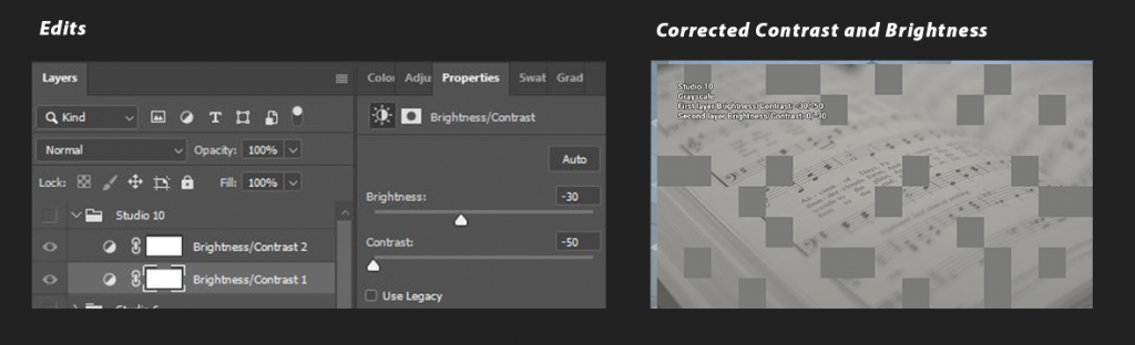
These corrections should get your backdrop to resemble the original image as close as possible:

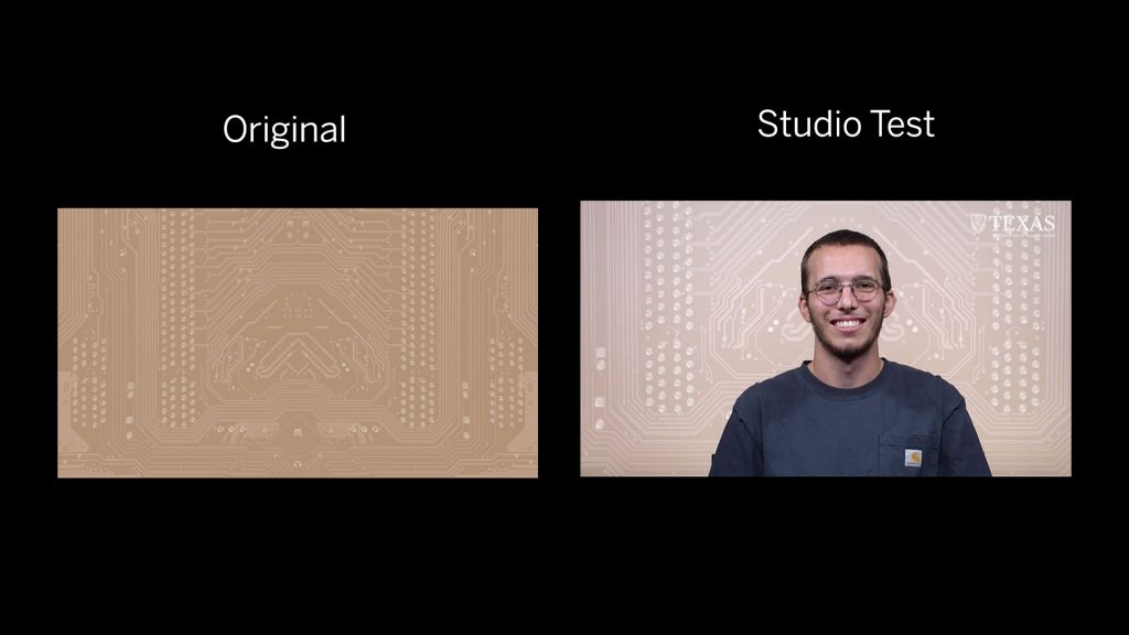
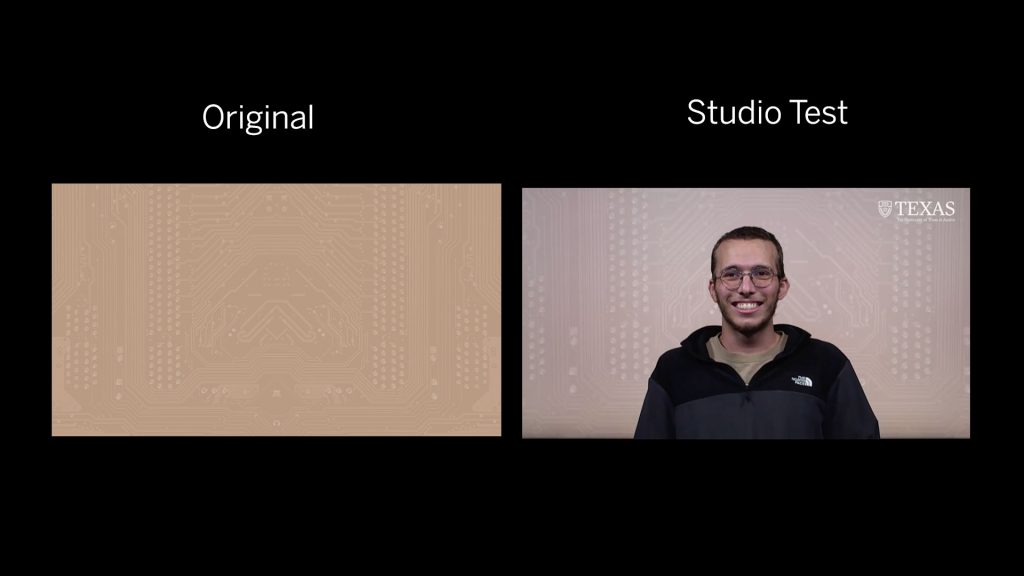
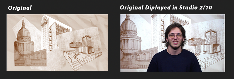
Sepia
#C87128
Sepia tones should be around hex code #C87128.
Studio 6: Original edits generally display well in Studio 6 if you use the recommended hex code.
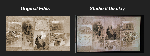
Solution: After layering all your edits and adjusting the opacities to your visual desire you can further adjust with two filter edits.
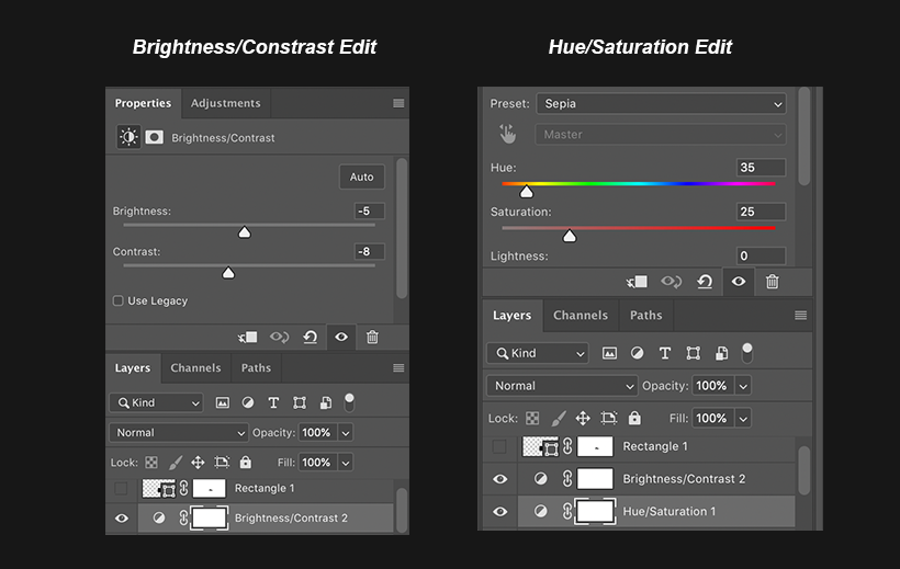
- Brightness/contrast: -5 and -8
- Hue/Saturation 35 and 25
Studio 2/10: White hues are really bright and sepia are high in contrast.
Solution: once you have finished the digital backdrop to your liking, add a Brightness/Contrast adjustment layer at the top with the following range of values:
- Reduce Brightness: 0 to -30
- Reduce Contrast: -30 to -50
- Sometimes a second Contrast reduction of up to -30 may be needed
These corrections should get your backdrop to resemble the original image as close as possible:

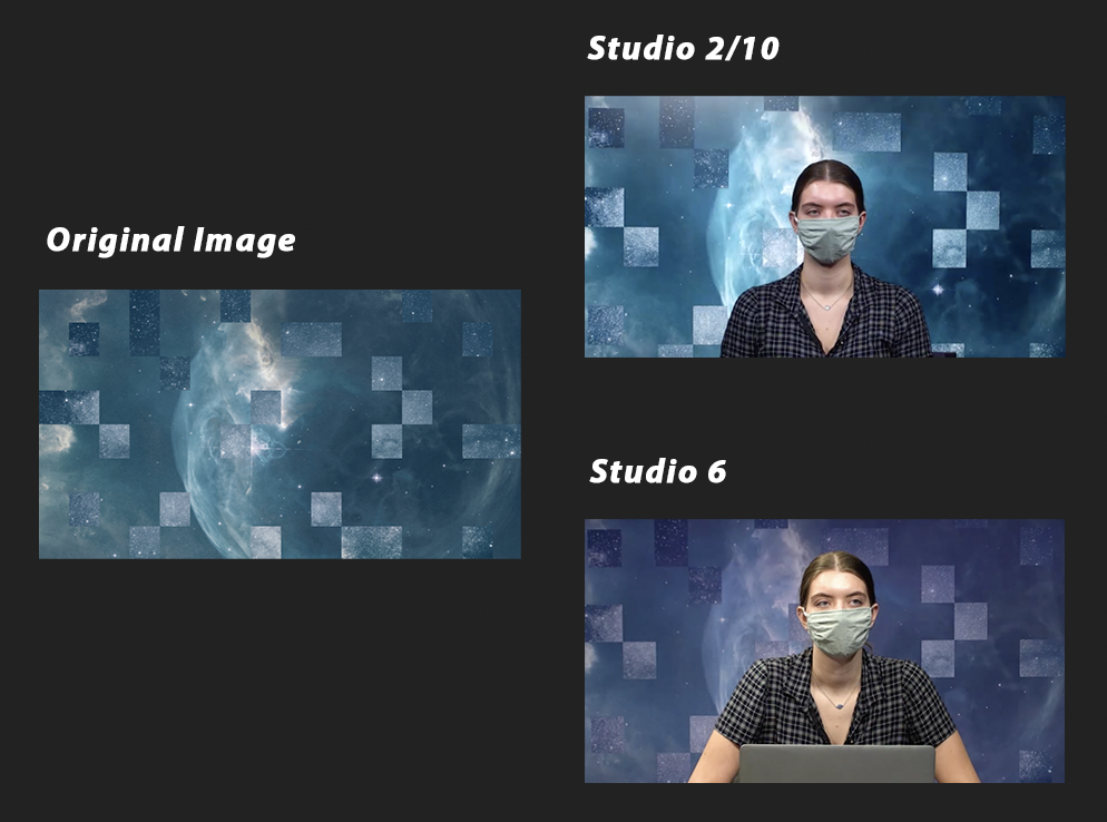
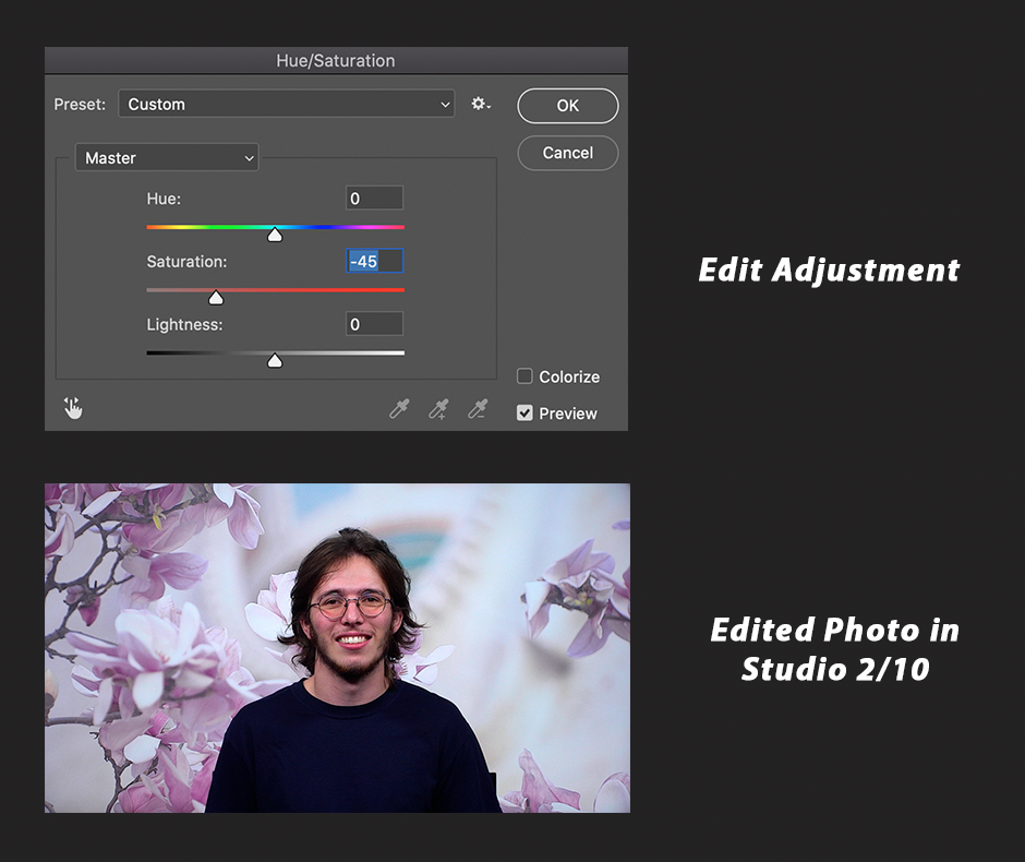
Full-Color Photography
FULL COLOR
Studio 6: No edits needed for full colors in Studio 6.
Studio 2/10: The colors come out a little high contrast. There are two ways we can go about editing full-color photos for this studio.
Solution One: Lower the saturation on the image. Don’t lower it more than -45.
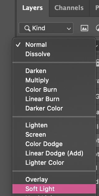
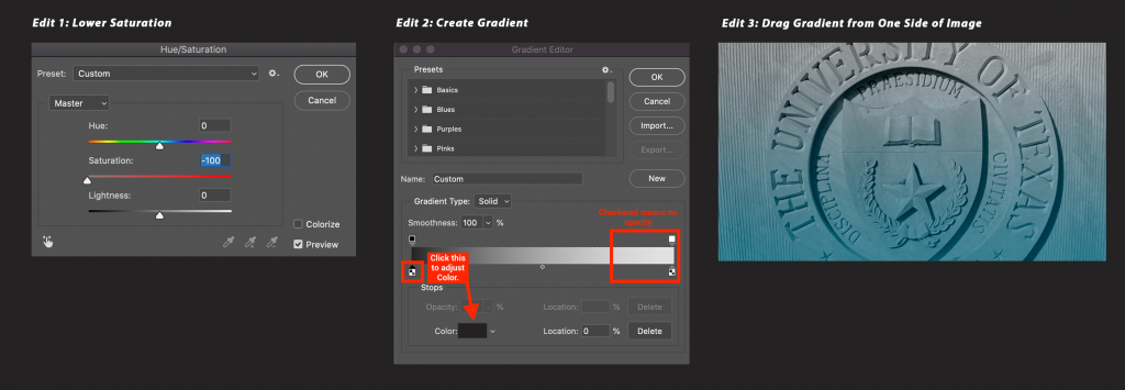
Solution Two: Lower the saturation all the way down and add a gradient.
- Lower saturation down to -100
- Add a new layer and click the Gradient Icon

- Add a color to your gradient
- Drag it across the image from one side (play around with opacity and how far up the color goes)
- Set blend mode to soft light if needed

Discouraged Colors and Layouts
- Burnt orange appears too dark and muddy on the screen.
- Warm/yellow hues look greenish and murky as well.
- Bright shades are distracting and take away attention from the speaker
- Pure white appears too intense and has a blue tone.
- Frames, straight lines and 90 degree angles are hard to align with the video shot and end up looking crooked/slanted most of the time.
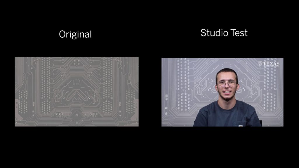
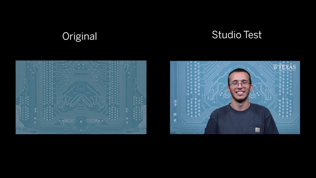
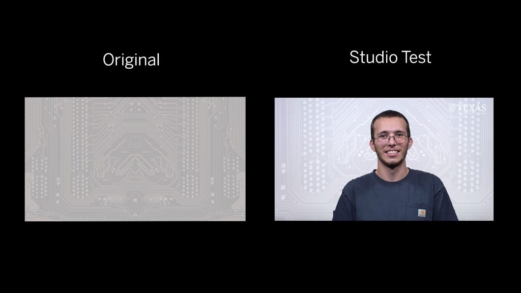
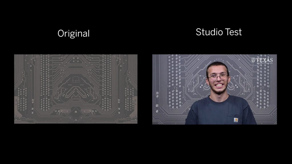
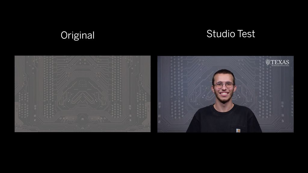
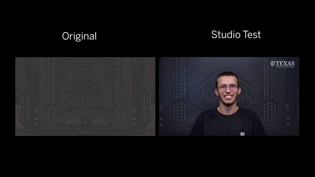
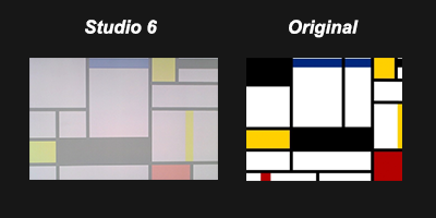
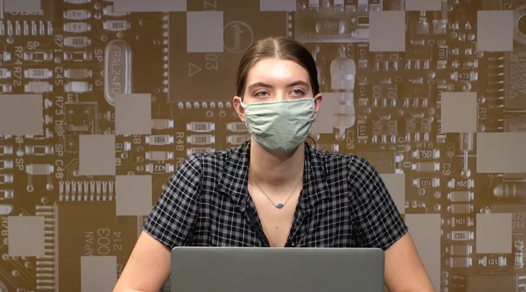
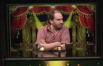
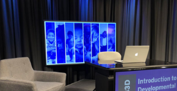
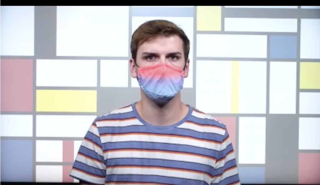
CSMS Studio Test Examples
When creating a course studio backdrop, sometimes it will take multiple iterations and variations to create the best graphic for the course.
You want to use a design and colors that will complement the professor and not cause a distraction with the students.
colors like light tan, orange and grays can wash out the professor and not make an appealing look.