Businesses have started to realize the importance of having an enjoyable customer experience in the last few years. UI/UX design is now a valuable skill for any designer to have.
UI/UX — in some form — has been around since the 1980s. Back then, it was called human-computer interaction and stood at the intersection of computer science, design, and behavioral science.

To start, look at this graphic to understand the difference between UX (user experience) and UI (user interface). The two are very different jobs and skill sets, though they often get squished into one.
Another task at the bottom of the iceberg is user research. User researchers use various techniques to expose user needs and paint points.
The mindset you need as a UX designer is always keeping the user’s needs at the forefront of your design. You can be objective about this – if an element of the design does not address a user need or fix a problem they experienced, it doesn’t need to be there. Your goal is to make the experience seamless and enjoyable.
Furthermore!
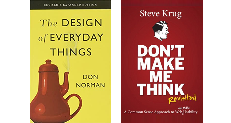
If you’re interested in learning more about designing for users on your own time, check out these books. Though they are both a couple of decades old now, their principles are solid which is why they are considered THE books for baby designers.
Goals of this training
- Learn fundamentals of UX design
- Get hands-on experience with Figma
- Wireframe and design a 3-page website
- Consider user needs while conducting a user test
Step 1: UX Principles
- We don’t read pages. We scan them.
How do people really use the web? In less than a second, users evaluate the design of a website. Why? We are usually on a mission to get something done and done quickly. We know we don’t need to read everything on the page, just picking through for what is relevant to us right now. What we see depends on what we have in mind.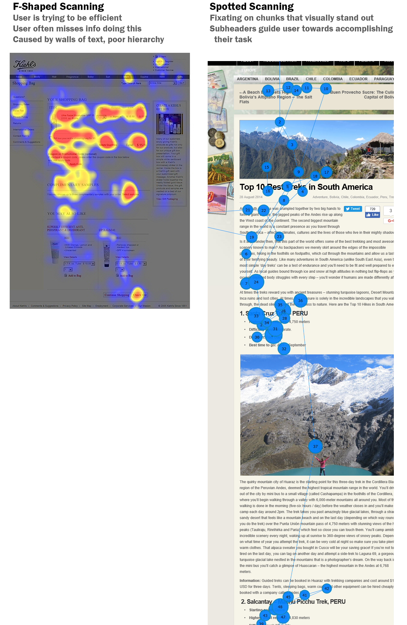
So, sure you designed a full website for Spectrum.com with a nice splash page, but an upset customer with an internet outage will only be looking for the customer support number.

True story.
- We don’t make optimal choices. We satisfice.
As designers, we assume users will scan the page and choose the best available option. In reality, most of the time we don’t. Instead we choose the first reasonable option and click that link using a strategy called satisficing (satisfy + suffice).
We do this because usually we are in a hurry and don’t have time to compare all possible options. Since there’s not much penalty to guessing wrong, we can just click the first thing that looks good and keep going back if that wasn’t right.
Making a clear and well-sorted site will help users find the best answer with minimal effort. - We don’t read the instructions.
When was the last time you read a terms and services agreement? Never! Instead, we choose to rely on our own past knowledge and muddle through problems. It’s just not efficient for us to understand the right way to do things every time.
This facet of human nature can be troubling for a user experience designer. Being concise in your design will give users a better chance at getting their task done, and they’ll even feel smart and competent using your site. - Common design elements vs. creativity
Conventions are your friend. When design elements are common elsewhere, don’t reinvent them with your creativity. Users will not take the time to figure them out. Your site should have links that stand out as links and login info in the top right.
For example, think of stop signs. They are always red octagons. This is because they need to stand out to protect drivers in every type of weather and lighting. Therefore, we do not need the TxDOT intern getting creative with blue circle stop signs (“but our brand color is blue!”). NO!!
- Know your audience
It’s necessary to identify who your audience is, as they put the users in user experience. Knowing them will help you determine their goals and priorities for using your site.
If you were designing a site for elderly folks
Not sure what they need? Be a researcher and go ask them! - Visual Hierarchy
To help users understand your site in a hurry, make it obvious what things are important, what things are similar.
For important things, make them more prominent. Make them bigger, bolder, a distinct color, or give them more white space… or some combo of these.
For things that are similar, logically group them together. You can do this by putting them under a heading, styling them the same, or placing them in a clearly defined area (like a sidebar). - User experience qualities according to the US Government
Steve Krug’s definition of usability is:
“A person of average (or even below average) ability and experience can figure out how to use the thing to accomplish something without it being more trouble than its worth.”
Ask usability.gov though, and you will get the following:
Useful: Your content should be original and fulfill a need
Usable: Site must be easy to use
Desirable: Image, identity, brand, and other design elements are used to evoke emotion and appreciation
Findable: Content needs to be navigable and locatable onsite and offsite
Accessible: Content needs to be accessible to people with disabilities
Credible: Users must trust and believe what you tell them
Step 2: Choose Your Client
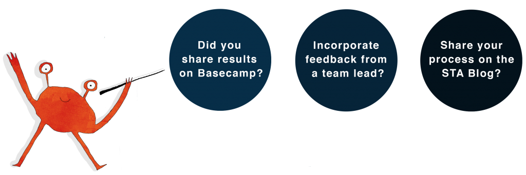
Let your lead know which you choose in the Basecamp comments.
- Option 1: Small Business Shopfront
Your audience: You’ve been hired by Sadie, a florist who is starting her own business, “Spicewood Floral.” Her audience is primarily luxury weddings and young couples. Sadie is a charismatic salesperson, and knows the sooner she can get web clients contacting her through email or phone, the better.
View more specs and her brand guide here: https://utexas.app.box.com/folder/125037355592 - Option 2: Personal Portfolio Site
Your audience: You are designing for a Craig. Hypothetically, he’s a 34-year-old designer, but if you ask him, he’s a “creative who doesn’t like labels.” YES, he likes craft beer. He’s a senior designer at a biotech company you’re applying to — basically, he’s the guy who HR passes portfolios to before hiring junior designers. So he sees a lot of portfolio sites. Craig wants to be wowed by examples of your design work, but he values simplicity. Any gimmicks on your site are an automatic No. He’ll spend about 3 seconds on your homepage before he’s got his mind made up and your fate is sealed.
Step 3: Wireframe your site
With your client chosen, sketch out ON PAPER ideas for your site’s 3 pages, starting with a homepage. This is a low fidelity skeleton of your website. Colors, font, specific images do not matter right now. The focus now is visual hierarchy and the user flow.
User flow is the way a user would go through your site to complete a task. If you are getting stuck on how to create a user flow, imagine you are the user who needs to buy flowers or find good graphic design work. Where would you expect to look, and what would you want to be shown when you click it? Where would you logically want to go next? And so on…
Enter site → I want nice flowers, I’m in a rush → OK, what options can I choose from? → I have questions I want to ask before ordering → Contact info
Enter site → I want to be impressed → Click interesting looking project → Scan for images, subheaders → Looks good, who is this person? → About me page
Read 27 research-backed web design tips — this is a pretty good article worth a read as you design your first few sites.
Don’t forget to design the universal elements of your design: the header, navigation bar, and even a footer.
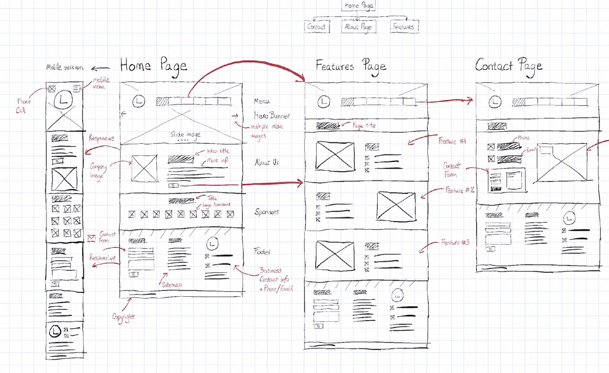
A rectangle or square with an “X” through it is shorthand for an image.
Lines are shorthand for text
Label things as needed to improve the clarity of your sketch. Share your sketches with red arrows for user flow on Basecamp.
Step 4: Practice in Figma
Once your layout and user flow is approved (The UX!! You are a UX designer now!), you will want to design the site. Eventually, this mockup would be shared with a product manager and developer who will create it.
One of the best ways to design UI/UX mockups is with Figma, a free online wireframing and UI tool. It also has a live collaboration feature. Other well-known UI/UX tools are Sketch and Adobe XD. We are using Figma because it’s currently THE tool, and will look most impressive on your resume.
Create a free account here: https://www.figma.com/
Follow through with the default tutorials in your account:
- Figma Basics
- Wireframing in Figma
- Prototyping in Figma
More Resources on Figma:
Watch tutorial videos on Figma through LinkedIn Learning
Figma Shortcuts (you can also hit Shift+Ctrl+? in Figma to pull up a shortcuts menu)
Step 5: Design your UI
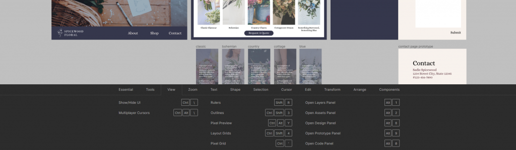
Finally! Create your UI design. Create 3 webpages in Figma and lay out your wireframe, then begin populating it with colors, fonts, images, etc. This is the “Design” function.
Share your progress on Basecamp periodically.
When you are happy with your UI, begin working in the “Prototyping” portion, to make your mockup interactive. Note that your prototyped site may not be 100% fully functional. The goal of this is to get an idea of what the site should do, and be functional enough for a user test (in step 6).
Step 6: Test your site
Next, you will need to test your prototype to determine if it a) met your client/users’ needs and b) needs any improvements. You will act as the usability researcher, and choose another STA who hasn’t seen your project yet to be the user.
For this practice, you will conduct a Think Aloud Test, although there are many types of usability tests. You will explain to your user STA to use your site while continuously thinking out loud – verbalizing their thoughts as they move through the site. Tell them that every thought counts, from “If I want to find the contact info, then I would definitely look at the top navigation bar” to “Oh that shade of blue looks nice/distracting” – all this info is helpful relating back to your goals. Ask if you can record the zoom call to listen to to.
Here is how to conduct a think aloud test:
- Re-identify your initial goals and note the ideal user flow to accomplish them – aka the “happy path” a user should follow to achieve the initial goal(s). Write these down.
- Based off the goals and happy path, list 2-5 tasks you will ask your user to complete.
- I.e., “Find my resume,” “How can you contact this business?”
- Recruit your STA, ask politely for 10-20 minutes of their time to test your site. When they say yes, send them the link to your Figma prototype.
- Set up a Zoom call and ask them to screenshare your prototype while you read them the tasks. Ask if you can record the meeting.
- Read to them,
“This is going to be a think aloud test. Basically, I will give you some tasks and you will follow your best logic to complete them. As you work, speak out loud every thought that comes to mind like a stream of consciousness. There are no right or wrong things to say, and don’t worry about looking a certain way. Everything you brain dump to me, from thoughts about a button style to confusion on where something is, is helpful to the test.” - Read the first task then BE QUIET! Do not interrupt or influence their logic. When they complete a task successfully, say thank you and move on.
- Observe not only what they say, but what they do. Does their mouse immediately move to a part of the screen when you say something? Do they satisfice?
- Once the tasks are done, you can ask them general questions about the site if you have any final questions.
- Rewatch and take notes, see how you can update your design to be more user friendly.
For more details about think aloud tests, read here.
IRL, you would probably incentivize the participants with money, gift cards, or food. You would also test about 5 people total, but surprisingly that is all user tests require.
Step 7: Reiterate
Make any adjustments to your site based on your user’s feedback.
Share your final site to Basecamp. Congratulations, you have now taken feedback from users and clients, wireframed and designed a site from scratch in Figma, and successfully run a user test yourself.