
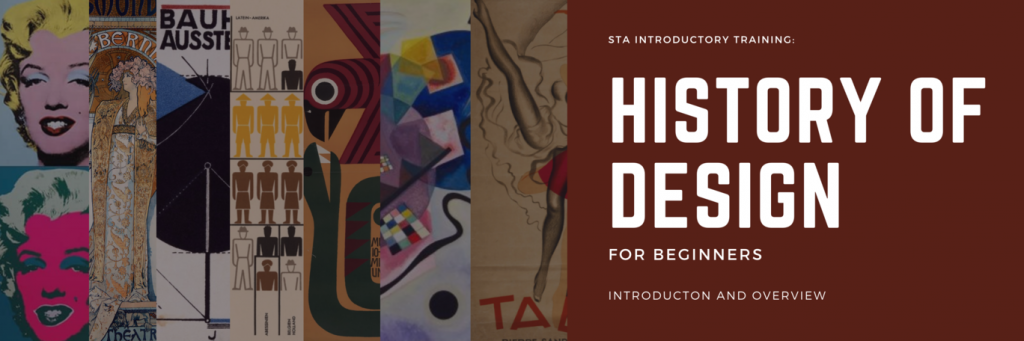
Introduction
This is an introductory lesson that elaborates on the different movements, eras, and styles that influenced graphic design and designers throughout history until the present day. The aim of this lesson is to introduce STAs to the beginnings of graphic design and how it evolved throughout the years. After completing this, STA’s will have:
- learned about the movements, eras, and styles that influenced graphic design and designers throughout history until the present day
- gained an understanding of the key characteristics for each movement and what makes them unique
- made connections between two or more movements throughout borrowed qualities, ideals, and philosophies
- identified specific art and graphic design (past and contemporary) as relating to a certain movement, era, or style
- created a design of their own using qualities of a specific movement, era, or style of their own choosing
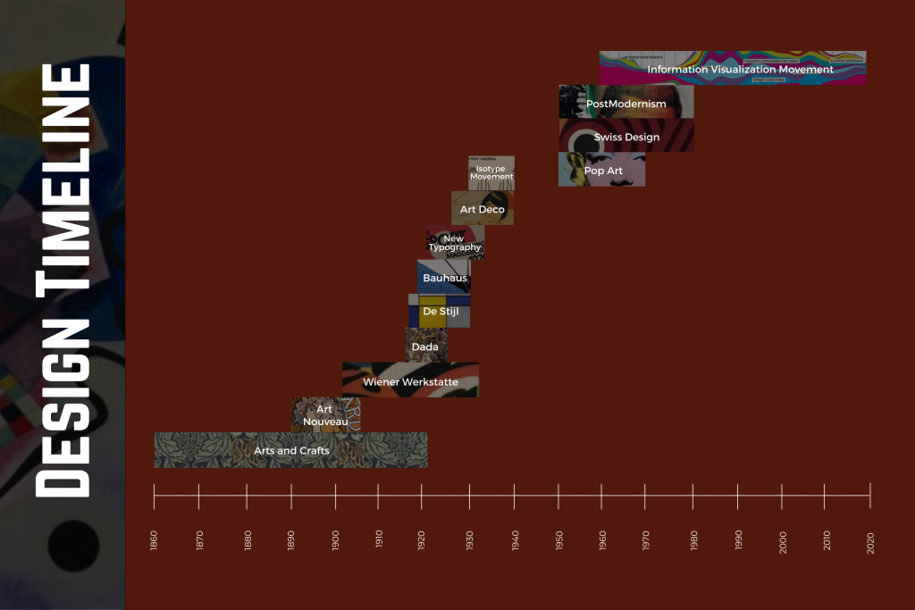
38000 BC – 1700 CE: Visual Communication
The origins of graphic design can be traced back to cave paintings dated around 38000 BC. These cave paintings featured drawings of animals and people and often depicted hunting. The exact message that these paintings delivered cannot be known, but one thing is clear: This was the first sign of graphic communication.
Communication took a turn with the development of written languages, dating back to the Sumerian glyphs circa 3300 BC. Early forms of writing involved symbols and pictographs, and overtime these symbols became the alphabets we know and learn today. In the 6th century CE, China invented printing using woodblock stamps, making mass communication of ideas more feasible. In 1439, Johannes Gutenburg brought printing to Europe with the invention of metal printing blocks. This marked an end to the lengthy process of reproducing books by hand and led to an increase in mass-marketing and advertising using graphic design.
From here, the development of graphic design fast-forwards to the industrial revolution of the 18th century. A manufacturing process called lithography, in which designs are inked into a surface and transferred to a sheet of paper, increased the efficiency of mass printing.
Examples:
1860 – 1920: Arts and Crafts Movement
The Arts and Crafts movement was both an art and social reform movement that encouraged creators to combat the mass-production and cheap quality aesthetics brought on by the Industrial Revolution. This movement emphasized attention to detail and hand-craftsmanship. William Morris is credited with being the leader of this movement, and in 1888, he founded a printing press that used rich ink and handmade paper. His development of bold, legible typefaces led typography to become an integral part of graphic design. With an increase in attention to print design came an appreciation for visual proportion regarding margins, type sizes, and spatial positioning.
Key Characteristics:
- Craftsmanship that emphasizes material
- Nature as inspiration
- Simplicity, utility, beauty
- Exposed beams in architecture
Key Designers:
Further Reading:
- Britannica – William Morris and the private-press movement
- The Art Story – The Arts and Crafts Movement
- UX Collective – A brief history of graphic design
1890 – 1905: Art Nouveau
Art Nouveau began in the 1890s and was considered the first “modern” style promoted through mass communication. Art reflected the innovations and emotions of society at the turn of the century, with inventions such as the telephone, electricity, and religion being questioned. Nature scenes and female bodies were prominent in design at this time, and sharp curves often called whiplash were a key feature. Art Nouveau reached mass audiences through advertising posters, made more appealing with the invention of the multiple-color lithography. Artists continued to grow their appreciation for typefaces that began with the arts and crafts movement, utilizing more ornate and abstract typefaces that were great for display work.
Key Characteristics:
- Undulated symmetrical line
- Linear rhythm
- Vine tendrils, insect wings, other delicate nature
Relevant Art and Artists:
Further Reading:
1903 – 1932: Wiener Werkstatte
Wiener Werkstatte, founded by Koloman Moser and Josef Hoffman in Austria in 1903, was the first graphic design agency dedicated to modern decorative arts. This agency worked to create unified design aesthetics across a single designed environment, incorporating aspects of both the Art Nouveau and Arts and Crafts movements. The signature letterhead of the movement featured geometric elongated text characters with symmetric spacing and boldness.
Key Characteristics:
- Unified aesthetics across design
- Craft-based production
- Artistic freedom
- Emphasis on geometry and linear design
- “Square-style” of design
Key Designers:
Further Reading:
1916 – 1924: Dada
Dadaism began as a response to World War I, and it questioned the merits of technological advancement and religion. This movement focused on rejecting convention and tradition in art, literature, and political thought. Marcel Duchamp painted a mustache and goatee on a print of the Mona Lisa, intending to reject both classic art and cultural authority. The origin of the term “Dada” is largely unknown and intentionally nonsensical; The word means ‘yes yes’ in Rumanian, ‘hobby horse’ in French, and was a sign of foolishness in German.
Key Characteristics:
- Humor, irrationalism, satire
- Against beauty, laws, purity, reason
- Use of everyday objects
Key Designers:
Further Reading:
1917 – 1930s: De Stijl
De Stijl, which means simply “the style” in Dutch, emerged largely in response to the horrors of World War I and the wish to remake society in its aftermath. Viewing art as a means of social and spiritual redemption, the members of De Stijl embraced a utopian vision of art and its transformative potential.
Among the pioneering exponents of abstract art, De Stijl artists espoused a visual language consisting of precisely rendered geometric forms – usually straight lines, squares, and rectangles–and primary colors. De Stijl’s continuing fame is largely the result of the enduring achievement of its best-known member and true modern master, Piet Mondrian.
Key Characteristics
- ideas of spiritual harmony and order
- simplified visual compositions
- straight lines – vertical, horizontal & diagonal
- square & rectangular forms
- primary colors – red, blue, and yellow
- primary values – black, white, and grey
- asymmetrical
- geometrical form and shape with very technical construction
Relevant Art and Artists
Further Reading
- The Art Story – De Stijl
- 99designs – A brief visual history of the utopian De Stijl movement
- Medium – 100 years of De Stijl
- On Art and Aesthetics – De Stijl
1919 – 1933: Bauhaus
The Bauhaus, named after a German word meaning “house of building”, was founded in 1919 in Weimar, Germany by the architect Walter Gropius. It was influenced by 19th and early-20th-century artistic directions such as the Arts and Crafts Movement, as well as Art Nouveau. It aimed to reunite fine art and functional design, creating practical objects with the soul of artworks.
Bauhaus design’s impact on today’s graphics is hard to overestimate. Associated with primary colors, thick straight lines slashing across white space, and that emphatically modern trilogy of the circle, triangle, and square, the movement’s legacy has now become easier to trace due to an online tool via Harvard Art Museums.
Key Characteristics
- minimalist
- geometrical
- handcrafted (but looks like it is mass-produced)
- anti-ornament
- apolitical
Relevant Art and Artists
Further Reading
- The Art Story – Bauhaus
- Eye on Design – Examples of Bauhaus Graphic Design that Shaped the Movement
- Harvard Art Museums – Chronology: Introducing the Bauhaus
- 99designs – Everything you need to know about Bauhaus: an infographic
- Wikiwand – Bauhaus
1920s – 1930s: New Typography
The New Typography movement brought graphics and information design to the forefront of the artistic avant-garde in Central Europe. Rejecting traditional arrangement of type in symmetrical columns, modernist designers organized the printed page or poster as a blank field in which blocks of type and illustration (frequently photomontage) could be arranged in harmonious, strikingly asymmetrical compositions.
Almost overnight, typographers and printers adapted this way of working for a huge range of printed matter, from business cards and brochures to magazines, books, and advertisements.
Relevant Art and Artists
Further Reading
- MOMA – The New Typography
- A Timeline of Design History – 1920s: New Typography
- Reniscow – Jan Tschichold and the New Typography
1925 – 1940: Art Deco
The Art Deco style originated in Paris during the 1920s, with the greatest popularity of the style lasting for about 15 years. Art deco took off in part due to a culture where advertising was gaining popularity. It is a modern art style that attempts to infuse functional objects with artistic touches. This movement is different from the fine arts (painting and sculpture) where the art object has no practical purpose or use beyond providing interesting viewing.
Practitioners of Art Deco utilized parallel lines and tapering forms that suggest symmetry and streamlining. Typography was affected by the international influence of Art Deco and the typefaces Bifur, Broadway, and Peignot immediately call the style to mind. In terms of imagery, simple forms and large areas of solid color are reminiscent of Japanese woodblock prints.
Key Characteristics
- Strong use of geometric shapes, particularly triangles
- Large areas of unused space
- Strong lines, often with thick strokes and even zigzags
- Strong color palettes with one or two saturated hues
- Typography with thick strokes or strong ornamentation
- Fonts: Anna, Bifur, Broadway, Cormier, Coquette, Mostra Nuova
- Hard edges and rectangular shapes
- Chevron patterns
- Mosaic styles and stylized florals
- Images with an almost flattened look that more artistic and less realism
Relevant Art and Artists
Further Reading
- The Art Story Art Deco
- Design Shack – Art Deco Graphic Design: A Classic Trend
- The Atlantic – The Best Art Deco Designer Who Almost No One Remembers
- The Met Museum – French Art Deco
1930s – 1940s: ISOTYPE Movement
In the 1930s, Austrian sociologist, philosopher, and curator Otto Neurath and his wife Marie pioneered ISOTYPE — the International System Of Typographic Picture Education, a new visual language for capturing quantitative information in pictograms, sparking the golden age of infographics in print.
“The Transformer: Principles of Making Isotype Charts” is the first English-language volume to capture the story of Isotype, an essential foundation for our modern visual language dominated by pictograms in everything from bathroom signage to computer interfaces.
Relevant Art and Artists
Further Reading
- BrainPickings – The Invention of ISOTYPE: How a Vintage Visual Language Paved the Way for the Infographics Age
- Design History – ISOTYPE
- Information is Beautuful – ISOTYPE
- Infographics for the People – The Isotype revolution
- Dialectic – Tip of the Icon: Examining Socially Symbolic Indexical Signage
1950s – 1970s: Pop Art
By creating paintings or sculptures of mass culture objects and media stars, the Pop art movement aimed to blur the boundaries between “high” art and “low” culture. The concept that there is no hierarchy of culture and that art may borrow from any source has been one of the most influential characteristics of Pop art.
Some critics have cited the Pop Art choice of imagery as an enthusiastic endorsement of the capitalist market and the goods it circulated, while others have noted an element of cultural critique in the Pop artists’ elevation of the everyday to high art: tying the commodity status of the goods represented to the status of the art object itself, emphasizing art’s place as, at base, a commodity.
Key Characteristics
- recognizable imagery
- bright colors
- irony and satire
- innovative techniques
- mixed media and collage
Relevant Art and Artists
Further Reading
- The Art Story – Pop Art
- Medium – 35+ Most Famous Pop Art Artists & Their Best Works
- MoMA – Pop Art
- ThoughtCo. – Explore the History of Pop Art: 1950s to the 1970s
1950s – 1980s: Swiss Design
Often referred to as the International Typographic Style or the International Style, the style of design that originated in Switzerland in the 1940s and 50s was the basis of much of the development of graphic design during the mid 20th century. The style emerged from earlier design styles like De Stijl, Constructivism, Bauhaus, and The New Typography, though without the political and historical contexts of those movements.
They saw designers as communicators, not artists, and believed that design should be grounded in rational universal principles discovered through a scientific approach. Their ideal of design was to achieve clarity and order and they saw no room for eccentricity or personal expression. They also saw design as something socially worthwhile and a serious profession to pursue. Their attitude toward design was to make it socially useful, universal, and scientific.
Key Characteristics
- simplicity, minimalism
- order, clarity, grids
- geometric, abstraction
- typography, legibility
- sans serif fonts: Akzidenz-Grotesk, Univers, Helvetica,
- rational, objective
- universal, unity
Relevant Art and Artists
Further Reading
- Design is History – Swiss Design
- Medium – What is Swiss Design?
- Vanseo Design – Swiss (International) Style Of Design: The Guiding Principles That Influence Flat Design
- Print Magazine – Swiss Style: The Principles, the Typefaces & the Designers
- Inspiration Feed – 100 Magical Examples of Swiss Graphic Design
- Smashing Magazine – Lessons From Swiss Style Graphic Design
1950s – Present: Postmodernism
Postmodernism is an umbrella term as a movement that questioned, or reacted against, common notions of the modern period: the notion that all technology and progress is positive, the idea of artistic development as goal-oriented, the notion that only men are artistic geniuses, and the colonialist assumption that non-white races are inferior.
Postmodernism overturned the idea that there was one inherent meaning to a work of art or that this meaning was determined by the artist at the time of creation. Instead, the viewer became an important determiner of meaning, even allowed by some artists to participate in the work as in the case of some performance pieces. Other artists went further by creating works that required viewer intervention to create and/or complete the work.
Relevant Art and Artists
Further Reading
- The Art Story – Postmodern Art
- Open Text BC – Graphic Design and Print Production Fundamentals: 1.8 Post Modern
- The Collector – 10 Visual Examples That Define Postmodern Art
1960s – Present: Information Visualization Movement
The development of information technology in the latter half of the 20th century created a boom in information visualization which is still continuing to this very day. Many forms of statistical representation would emerge in the early 1970s, including the Fourier function plot, Chernoff faces, start plots, clustering and representations, and biplots using multi-dimensional scaling.
Relevant Art and Artists
Further Reading
- Interaction Design Foundation – Information Visualization – A Brief 20th and 21st Century History
- York University – A Brief History of Data Visualization
- Scenario Journal – Visualizing Information
Design Today
Below are some examples of how the numerous movements keep influencing present-day design.
Activity
Now that you have become familiar with most of the movements in art and design history, it is your turn to create a graphic that takes inspiration from a specific style.
- Choose a tutorial linked below from your favorite movement to follow. Note there is a mixture of PS and AI tutorials, so if you are a Photoshop expert consider trying a tutorial in Illustrator, and vice versa – or maybe you want to stay in your comfort zone, all good!
- Follow along with the tutorial, making sure to put your own spin on the techniques shown. This could be altering the composition, choosing your own fonts, colors, wording, imagery, etc. while still maintaining the essence of the movement
- Share your work on Basecamp, noting which tutorial/design movement you chose. In your comment, reflect on these questions:
- How does your design fit into the movement you modeled after? Review the KB notes if you need to. Note specifics if you can – i.e. typefaces, line style, illustrative style, colors, subject matter, etc.
- Did you stray from that style in any way?
- How might you use elements of this style in the future in your own design toolkit?
- Did you learn any new techniques in Photoshop/Illustrator while following the tutorial?
You should spend about 2-2.5 hours on this activity portion of the training, so consider making your design up to a certain level of complexity.
Note: The ISOTYPE and Information Visualization Movements have not been included below because they mostly relate to the visual representation of information, which is best done through an Infographic. You will be making one of these later on through a different basic training!
Arts and Crafts
- How to Create a Stained Glass Window Effect (Illustrator & Photoshop Tutorial)
- How to Vectorize an Acanthus Scrollwork Sketch in Adobe Illustrator
- How to make a seamless pattern in Adobe Illustrator
Art Nouveau
Wiener Werkstatte
Dada
De Stijl
Bauhaus
- Photoshop Tutorial: Part 1 – How to Design & Create a Vintage, Bauhaus Poster (Design #1)
- Hidden Treasures Bauhaus – Poster Design Tutorial | Adobe Creative Cloud
New Typography
- ONE Technique To Make Neat Typography Posters (Illustrator Tutorial)
- How to Create Circular Distortion Typography Poster | Photoshop Tutorial | Lineworks
- Redmi Note 10 Banner | Typography Posters Design In Photoshop
Art Deco
- Create Art Deco Typography in Adobe Illustrator
- Photoshop Tutorial: “Gatsby” Art-Deco Poster Effect (Part 2 of 3)
Pop Art
- Photoshop Tutorial: How to make a POP ART portrait from a Photo!
- How to Create Pop Art Photo Effects With Photoshop Actions
Swiss Design
- Photoshop Tutorial: How to Design & Create a Vintage, Swiss-style, International Typographic Poster
- Swiss Style Poster Design | Designing a zine for Typography class
Postmodernism
- Photoshop: How to Design and Create a Vintage1970s, NEW WAVE, PUNK-ROCK Poster
- Modern Poster Photoshop Action Guide