
In this training, you will learn how to make an environmental background in Adobe Illustrator. Whether you’re an experienced artist, a beginner, or want to be a more effective designer in Illustrator, there’s something in this tutorial for you! Because Illustrator has the capacity of many shape-warping and layering options, you do not need to be experienced with drawing by hand and can rely on the wide range of tools that Illustrator offers.
As this is a more advanced tutorial for Illustrator, you may want to follow the How to Manipulate Shapes training before starting this one.
By the end of this training, you will learn:
- Ways to brainstorm artistic ideas with or without sketching
- How to layer or arrange basic shapes to create a more complicated piece
- Tools and shortcuts that will make designing in Illustrator more efficient and effective
Though these steps are geared towards an environmental background image, the same concepts can be applied to any project you might do in Illustrator.
To clarify expectations, here is a gif of the design process of the example background that was created in this tutorial (if the gif is not playing, click to open in its own tab):
As you can see, at it’s core this tutorial is about design thinking, how to layer shapes, and ways to create visual interest in an image.
Without further ado, let’s start designing a background!
Step 1: Finding Inspiration
First, choose an initial idea to pursue for this project. This tutorial will follow the creation of a rooftop terrace.
To start the project, first find realistic inspiration photos, which can be accomplished through a simple search on your browser:
Next, find vectorized images from other graphic designers online. After all, there’s no need to reinvent the wheel! Chances are another designer in the past has done something like you want to make. So you want to create a background of the mountains, or even your bedroom? Find something online that has already been vectorized. Search up your key words with other words like “vector” or “graphic” attached on Google. Compile a few images from different artists that you enjoy.
Once you’ve done your research, now create an inspiration board with the images that you’ve found. You can also add color palette ideas, or whatever your want to get started! It’s simple to drop in images to your Illustrator file, but any kind of photo arrangement or collage application will do the trick. You probably won’t find the perfect image to trace over, so you’ll usually want to find multiple images that have different values or ideas that you’d like to embrace. Here is an example:
Step 2: Break it down
Break down what you like about your different inspiration images and what elements you want to put in your new image.
Let’s say you’re making a beach background… there’s a million different ways to make a shape that looks like a palm tree, but you need to choose one way that you want to embrace. Your inspiration images will help breakdown things that you were drawn to and help decide on what shapes you want to make. You can make mental notes of what you like or don’t like, or you can write down your thought process. As an example, here is the terrace inspiration board with thought annotations:
Step 3: Sketch
This sketch can be as rough or as formal as you want, this is just to hone in your ideas in a place that you can visualize a little more. It can be anything from a rough sketch outlining platements of objects, or something more detailed that you’ll be able to trace.
Step 4: Take a step back
At this point, think about and consider the following questions to form your design plan:
- What shapes will be in the background of your image, in the foreground?
- How will those shapes layer on top of each other to create a whole?
- What will be the basic shapes of the image versus details?
If you’re ever stuck or feel like your image just isn’t looking how you want, come back to these questions!
You’ll want to choose the dimensions and color mode of your Illustrator file at this stage. For this tutorial, the example is a 1920x1080px image with RGB color. RGB colors are great for digital usage and provide more range, but CMYK is better for printed items. To choose this and the dimensions, think of where and how your image might be used — especially if it is for a client.
At this point, share your inspiration, sketch, and plan of action on Basecamp for feedback!
Step 5: Basic shapes
Let’s get started on your image! Where does the land end and the sky begin? Is there a particular entity that is important, like a building or a desk? Create and manipulate flat, basic shapes to represent them. This creates that first color layer on your blank canvas.
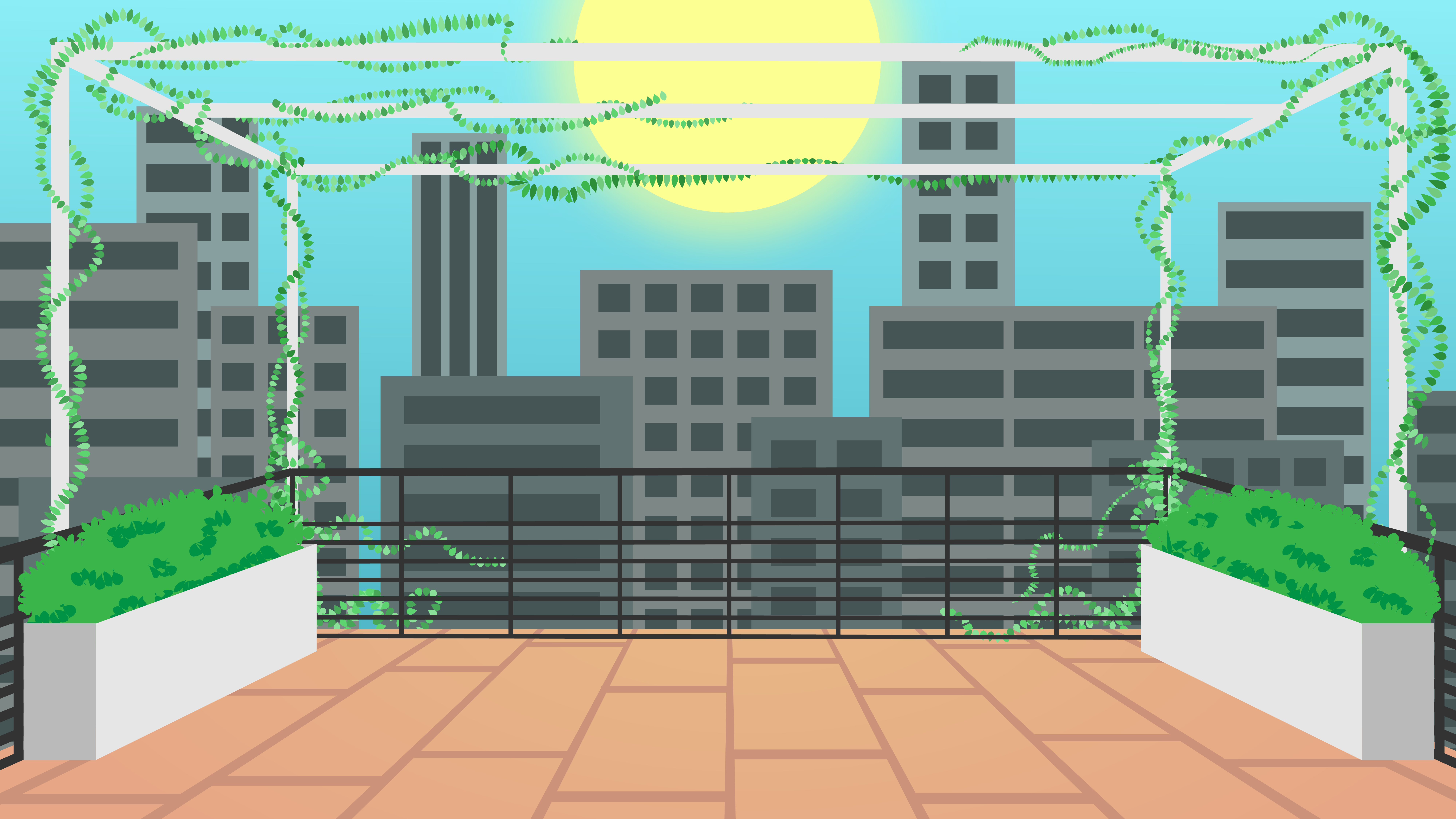
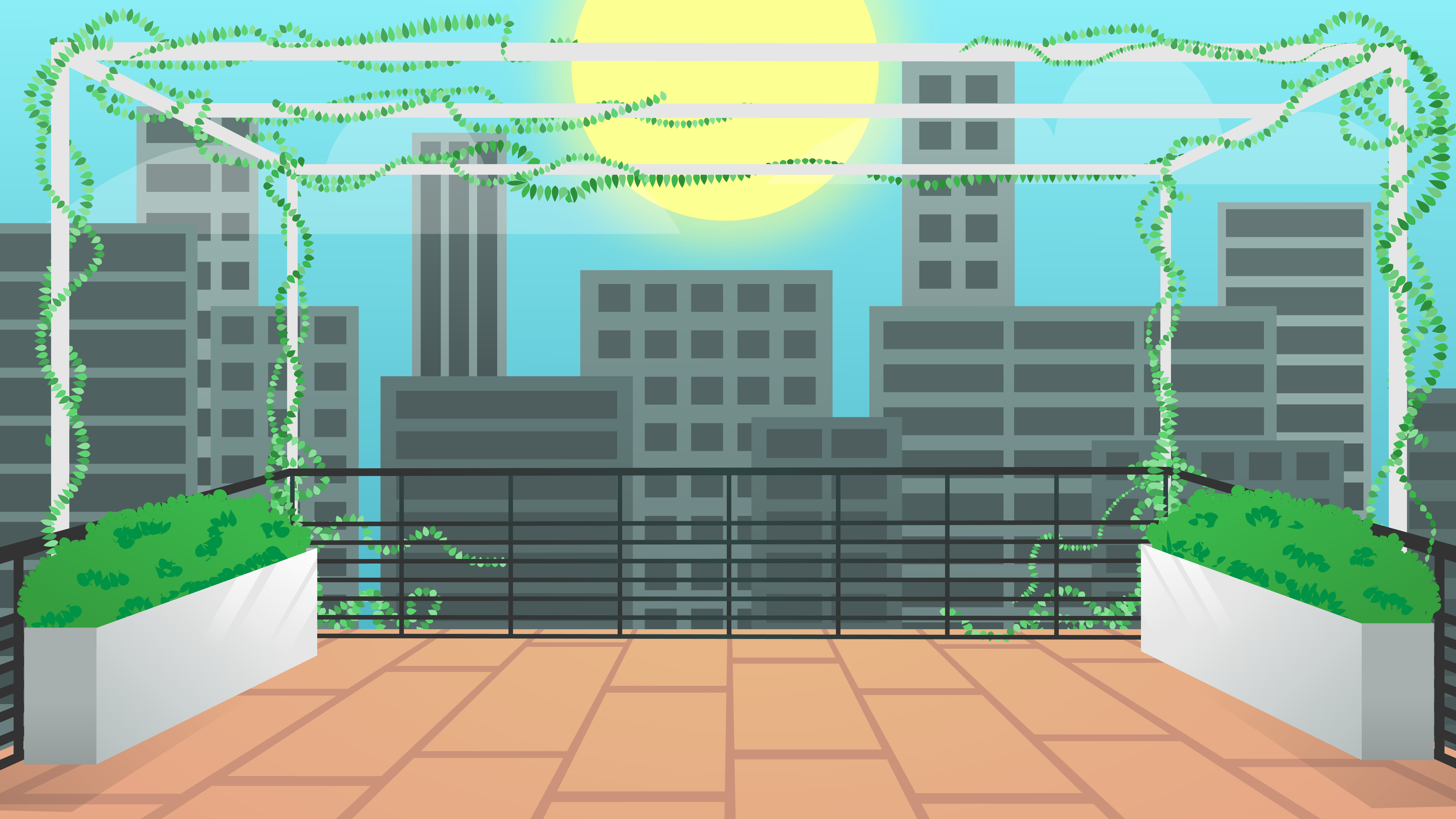
To start the rooftop terrace image, a blue rectangle was created for the sky, a bunch of grey-blue shapes for the start of my buildings, and a orangey trapezoid for where the terrace will be.
Step 6: Layering
Once you have your base layer, begin layering and manipulating more shapes on your image.
This is also where your inspiration images come in! Feel free to trace or take inspiration from things from those images. If you trace your inspiration images at all, change them up using the pen tools or warp them to make them more custom or uniquely yours.
At any point in this step, post on Basecamp for feedback or help!
Here is a list of helpful video tutorials you can reference to supplement these tutorial steps:
- How to Manipulate Shapes – https://sites.la.utexas.edu/kb/2020/01/14/basic-training-ai-shape-manipulation/
- Shape and Pattern Tutorial – https://sites.la.utexas.edu/kb/2021/06/03/4-shape-shape-and-pattern/
- Draw inside tool (video tutorial link)
- Line Width Tool (video tutorial link)
- Blend Tool (video tutorial link)
- FX panel (video tutorial link)
- Anything like the Warp Tool, Pucker Tool, etc (video tutorial link)
- Free Transform Tool, which is great for warping objects to add perspective (video tutorial link)
Jumping back into the rooftop terrace, the railing was created using the line width and blend mode tools:
This was accomplished by using the following design process:
Next up was creating depth for the floor of the terrace. The same process was used as above with the combination of the line width, blend mode, and additionally the draw inside tool to make the lines sharp on the edges my original shape.
The draw inside tool can be used with the following steps:
Next was the structure that vines were later added on, the line width and blend modes tools were used for.
This is looking like it needs a little greenery. Next up: vines and shrubbery!
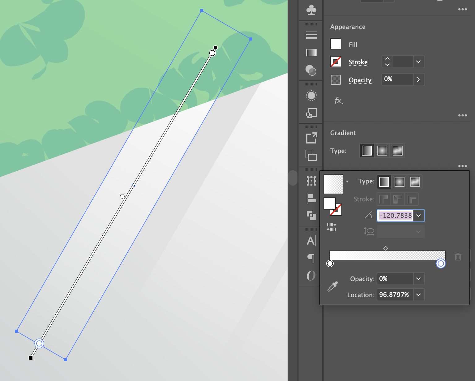
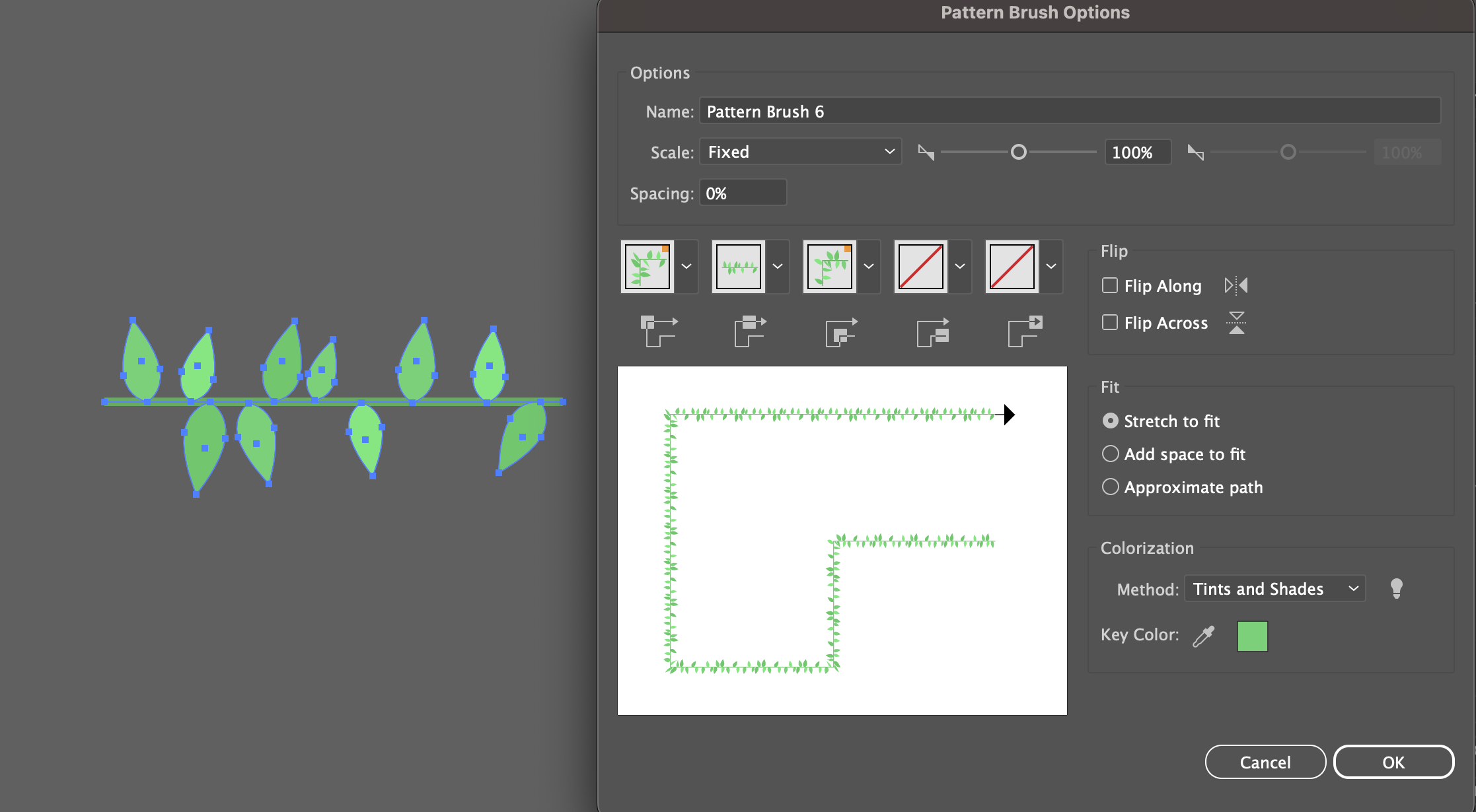
Though this vine pattern was changed later in the tutorial, here’s the process for creating a pattern brush to use:
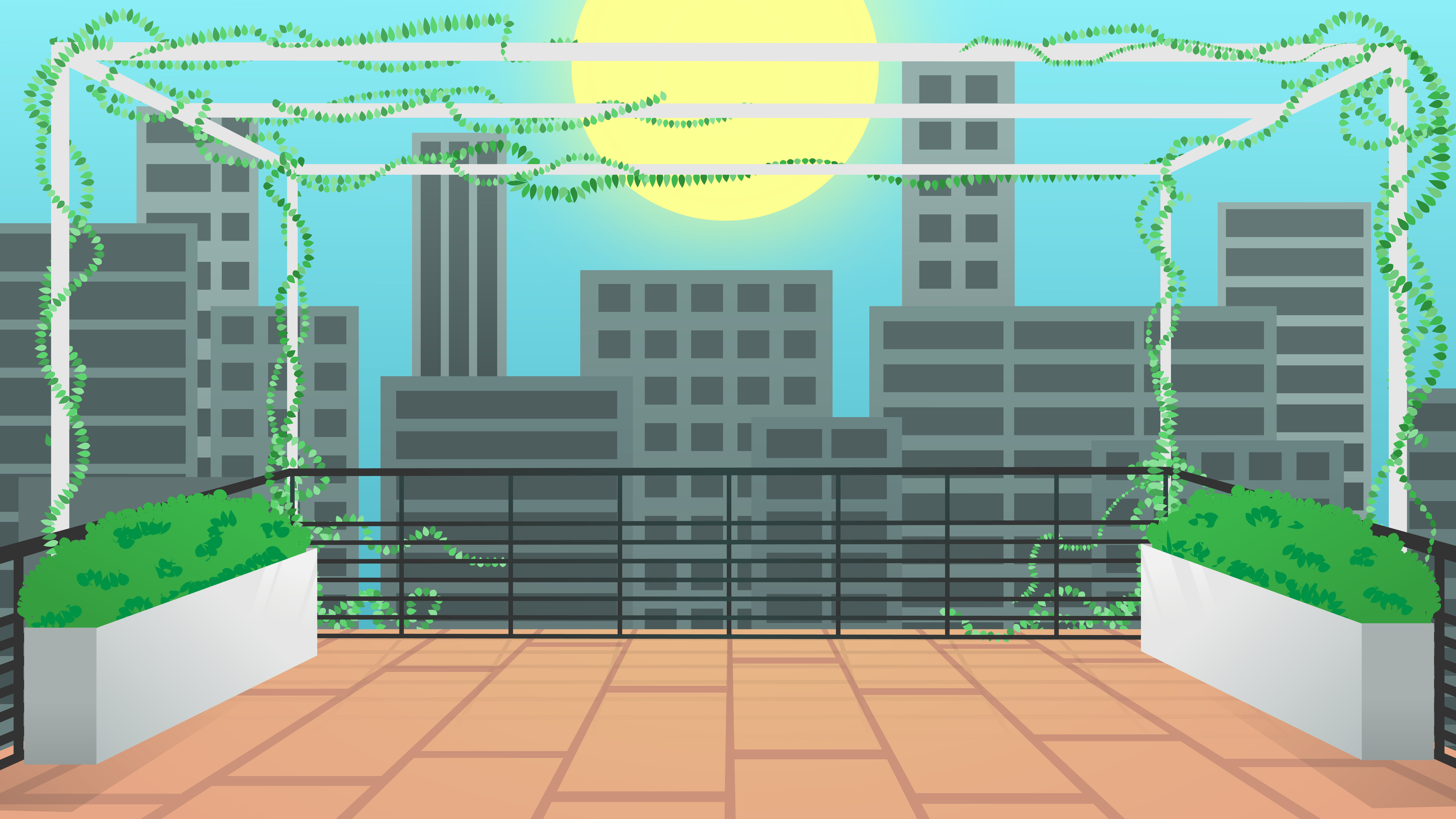
The line width of the ends of the pattern lines were also changed to create a sense of variation. Here is what the vines looked like at this stage:

The blend tool is also a great option to avoid copying a bunch of the same shapes over and over. Here the blend tool was applied to the window columns, which saved me time creating new shapes and also makes them easily editable for one to change later.
Though not many warp effects were used on this rooftop terrace, they can be really useful to add simple but structured variations to objects, add curves to things, etc!
Additionally theres also other ways to warp objects, these tools can be found under the line width option. These are super useful to add texture to items without having to add anchor points by hand, big time savers!
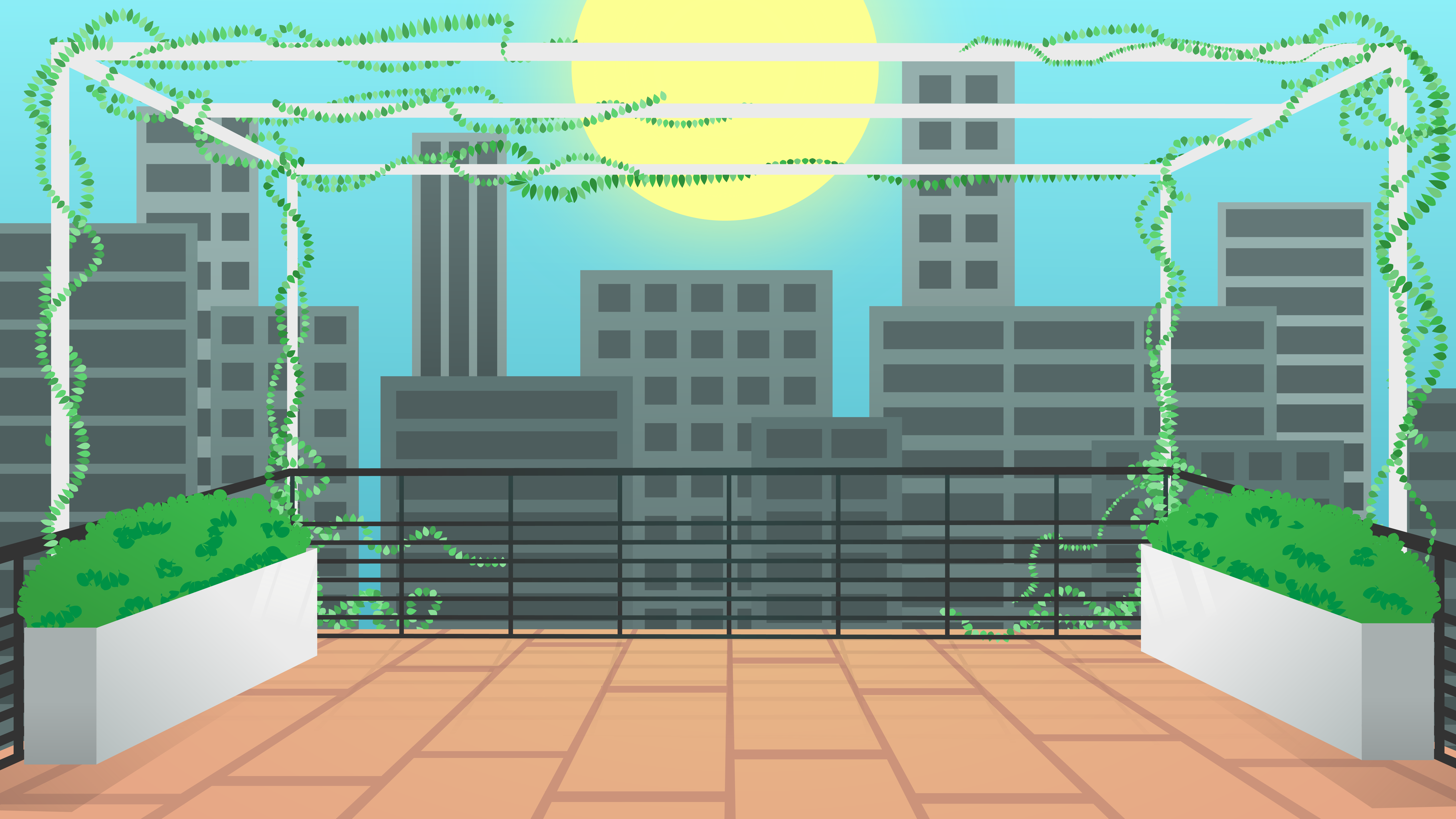
After making all these new layers and shapes, the image is now at this place:
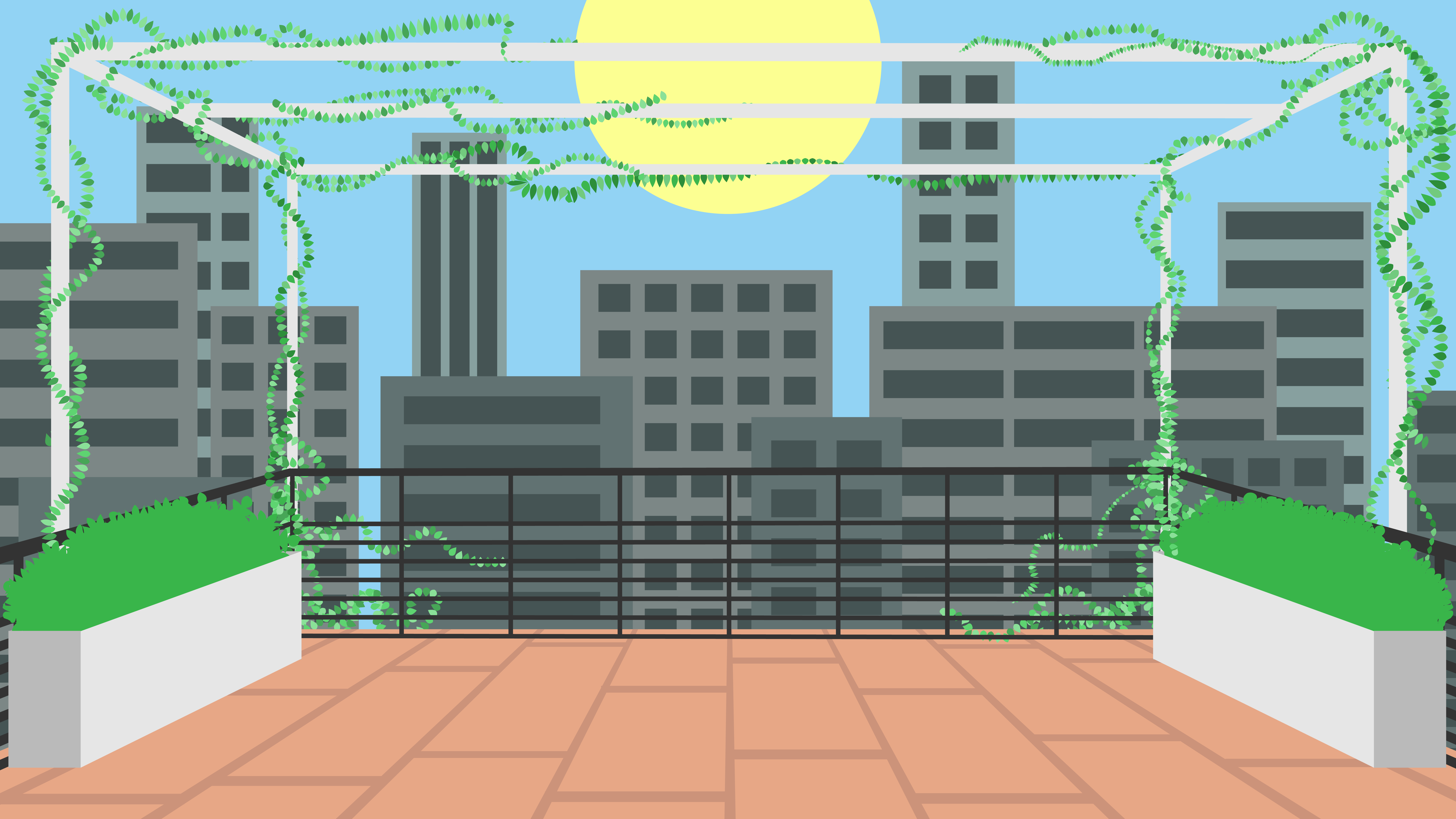
Step 7: Detailing
Does your tree have leaf outlines? Does your mountain have jagged rocks? This step can be done before or after step 8, or feel free to go back and forth between them!
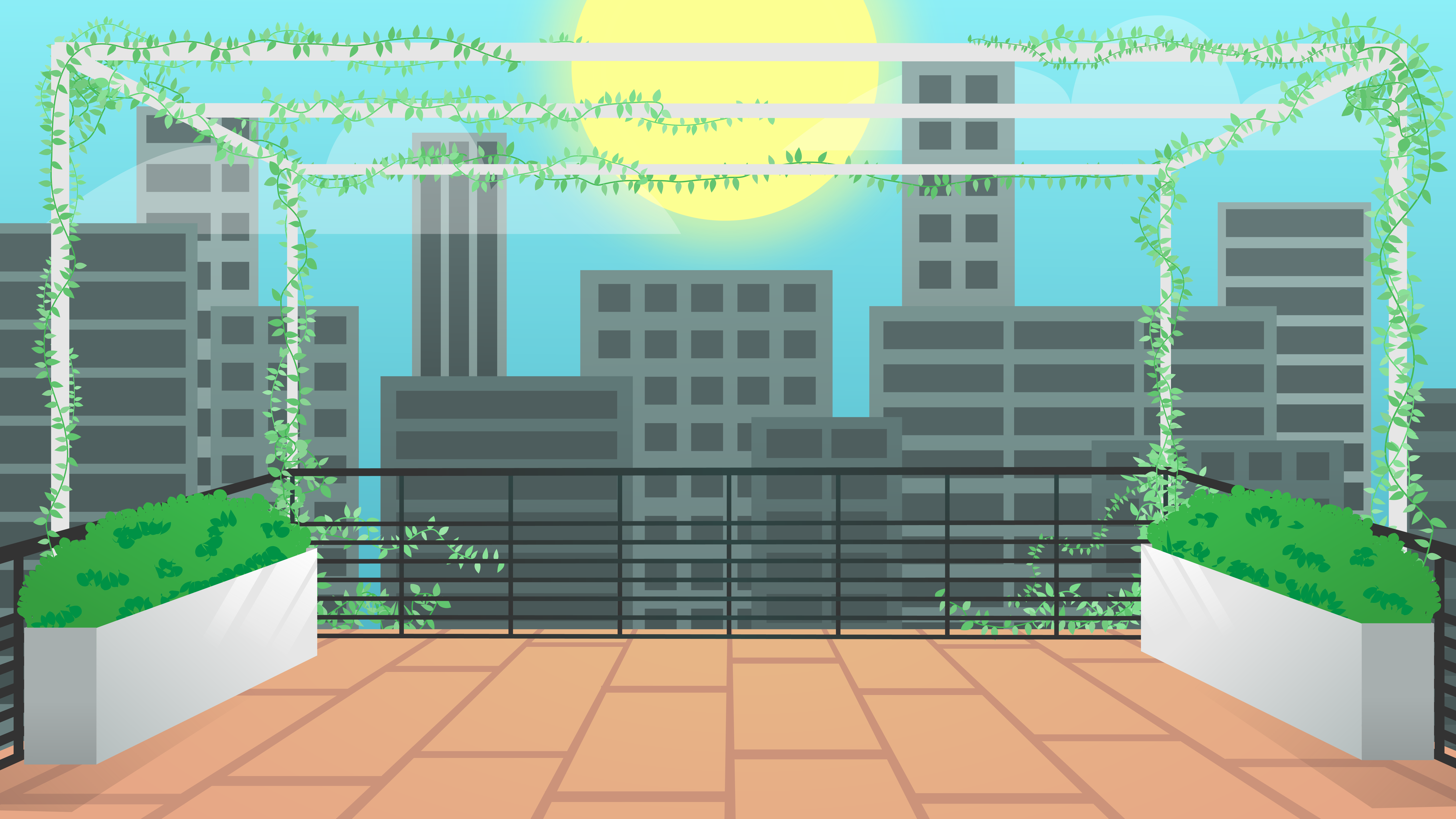
For the rooftop terrance, only bush details were added for now with the intention of circling back to this after figuring out colors. You can use the same tools and thought processes here an in previous steps of this tutorial.
Post your work on Basecamp to check in and get a little feedback!
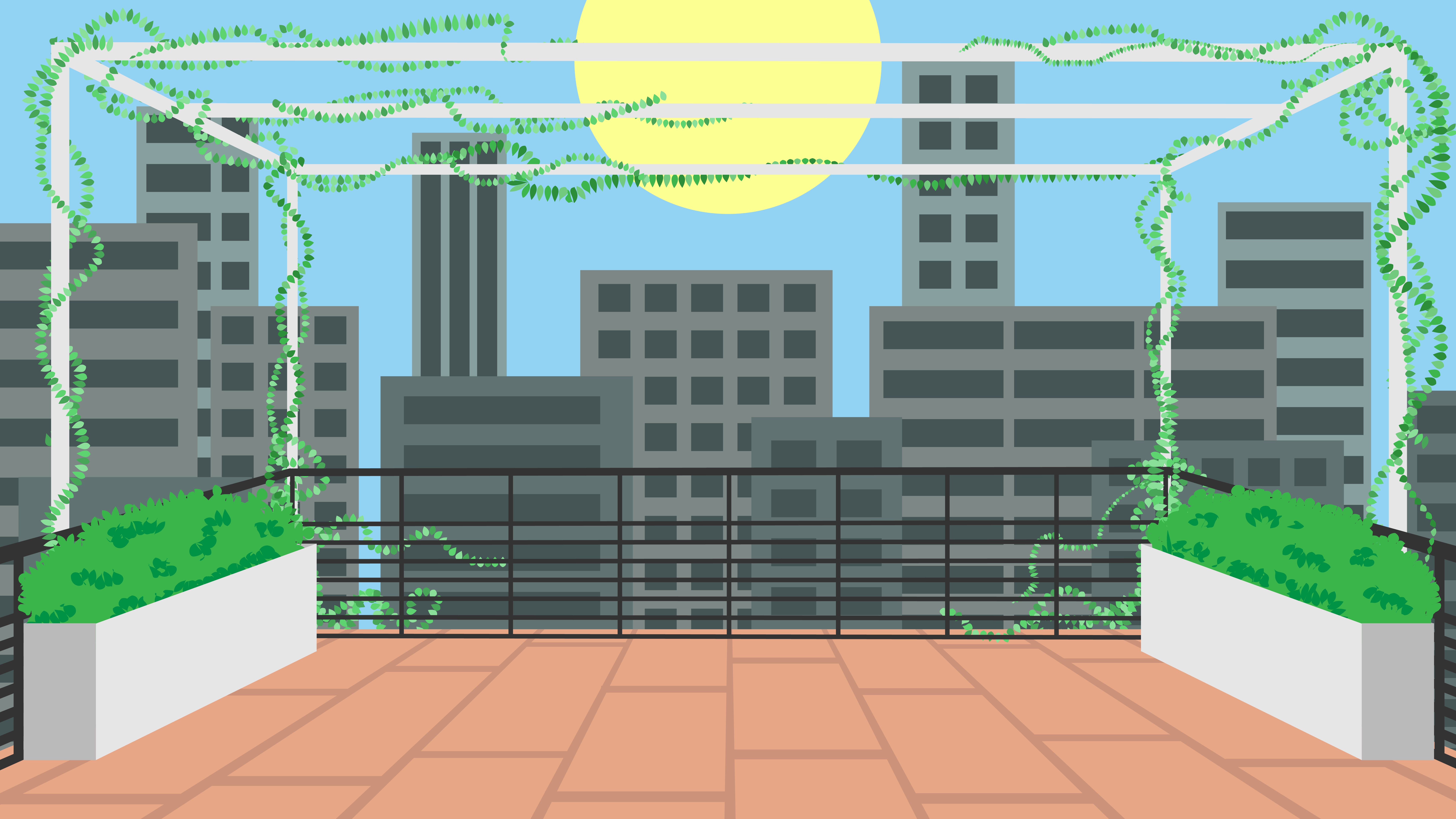
Step 8: Shading
At this point you should have a flat vector image. From this point now you can add things like shadow effects, highlights gradients, changes in opacity, etc. Here are a few aspects to consider:
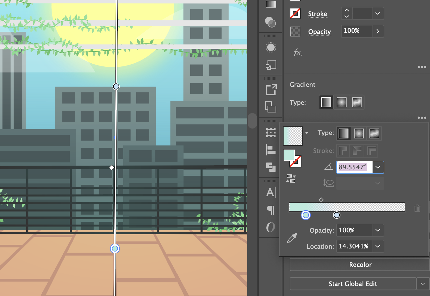
BASIC GRADIENTS: This can allow depth and interest to an image that had looked flat. Consider where light is on the objects — based on where the sun is, where is the darkest or lightest point on the object? Does an object have two different colors that blend together?
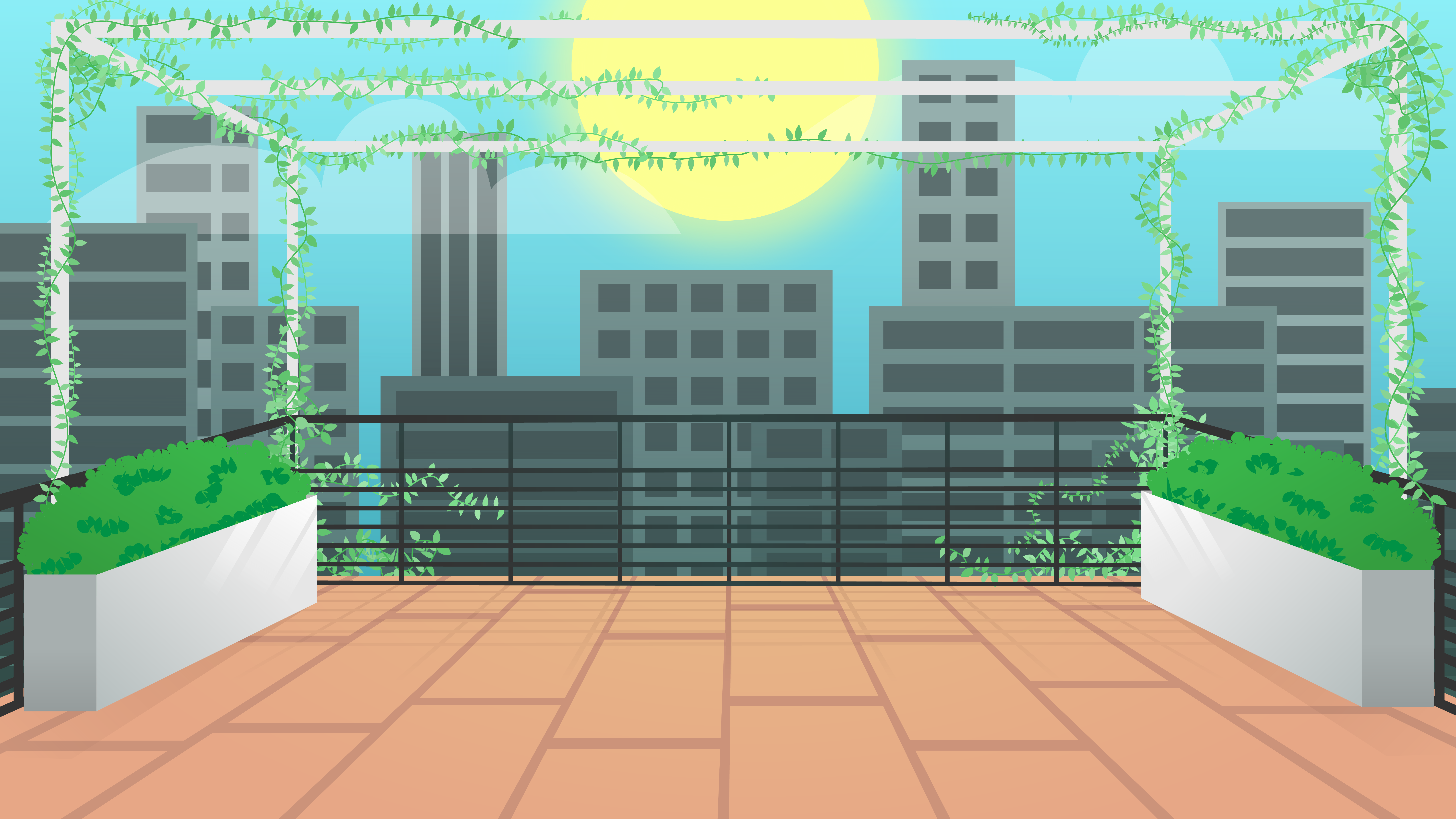
Here you can see a gradient was added to the sky and flooring to increase visual interest.
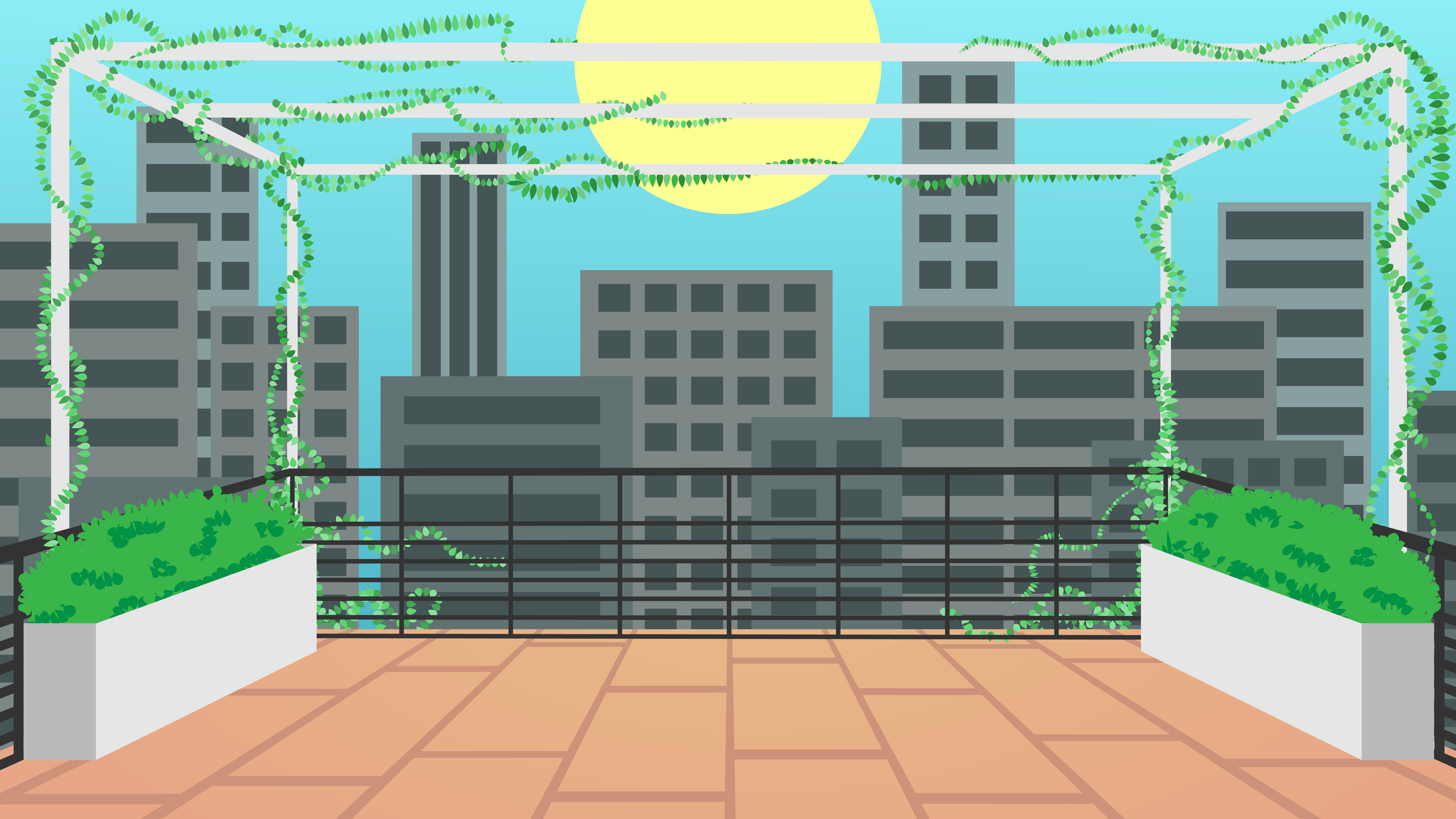
SHADOWS: This one depends on if you’re looking for a pop-out effect or an in-image effect. You can use the shadow tool or even create shapes behind objects with varying opacities that look like shadows.
Here shadows were added to the potted plants and the railing features, which were created with gradient fills of varying opacities.
HIGHLIGHTS: To make an object look like it’s glowing, like the sun here, you can add an Outer Glow, found under the Effects menu.
In the same vein as shadows, you can also use gradients with varying opacity combined with a shape to have the effect of a glimmer/sun ray. The Draw Inside tool is also helpful to create a sharp cut off at the edge of base shapes (as detailed in Step 6), though here a shape with a gradient fill of differing opacities was used.
Now your image should be at a point similar to this:
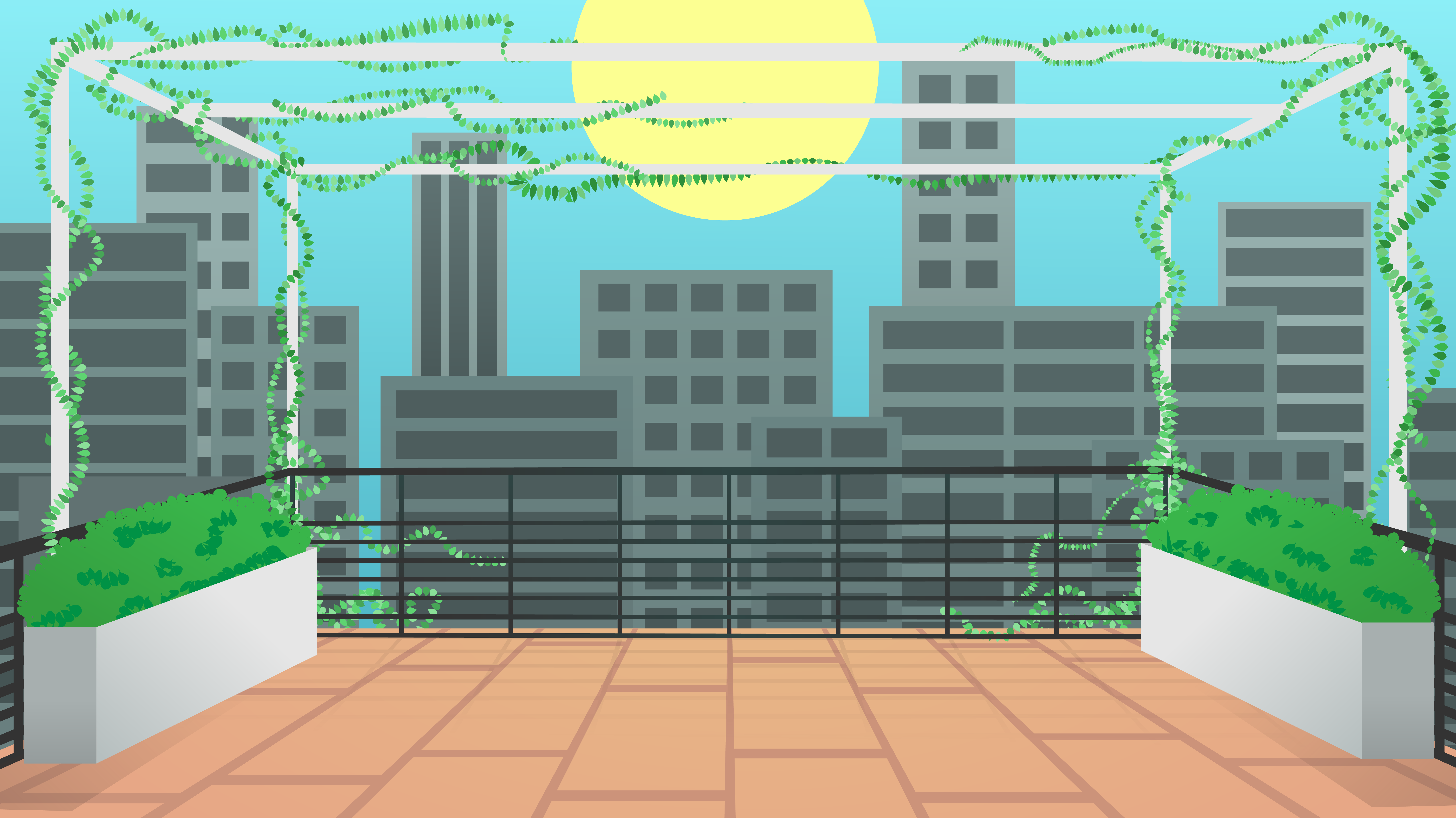
Step 9: Color
Let’s say at this point you realize that you don’t like a color that you’ve chosen to use, but it’s so much work to change it… do not fear, there’s a short cut!
Check out this great tutorial to learn how to recolor artwork easily: https://www.youtube.com/watch?v=JxyZmvcx5oU
As mentioned in the above, you can use the Direct Selection tool to select similar objects or edit all colors via the Recolor Artwork Panel.
Now post on Basecamp to get new feedback on your additions, which will also help to focus on specific edits in the next step…
Step 10: Make Changes
By this point your image should look relatively finished. Take a step back and think of things you liked and things you didn’t — what is your background missing, what does it have too much of? Sometimes things in a real-life image won’t quite transfer right to your design work, and that’s ok! But how can you fix it or replace it with something more effective for what you want to create?
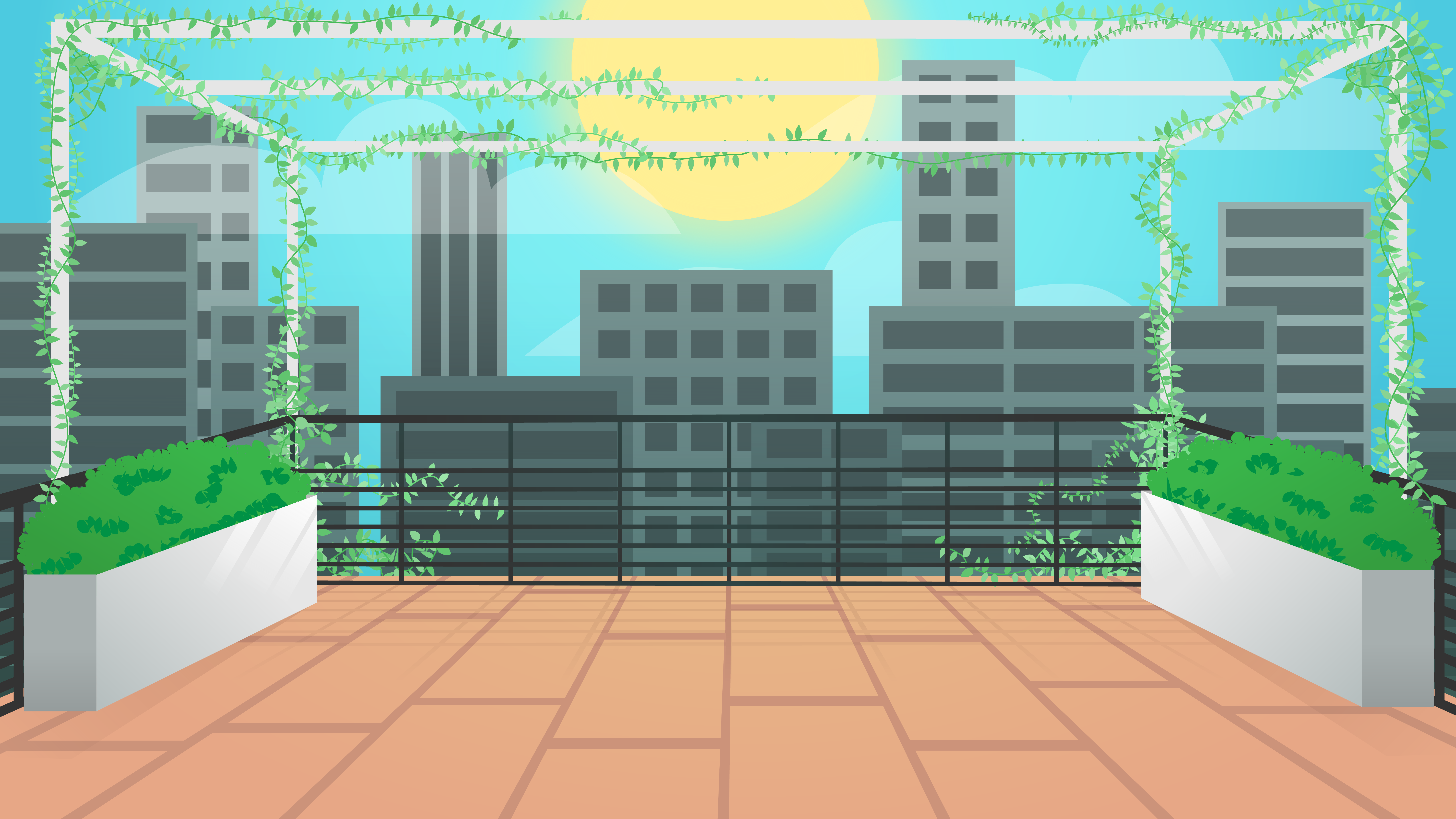
The first thing that was added to the rooftop terrace example was clouds in the sky. Two white shapes were warped and then their opacity was lowered to make clouds:
The vines could also use improvement, so a new pattern was created using the same process as the vines earlier on in this tutorial:
After swapping out the patterns on the vines, the lines were then threaded through and anchor points updated to be smoother and flow well together. This is what it ultimately turned out as:
Then it was decided to add blue in the background buildings, so a shape layer was added over them with a gradient fill, opacity variance, and the multiply effect. This added a little more depth and color to the image.
Turning back to the shadows… they just weren’t realistic! The shadows along the plant boxes and railings were edited until the angles and opacity looked like this:
Then a few more edits to the sky were made, including editing the sun, adding a cloud, and changing up some colors:
Lastly, the image could use a little more visual interest. Two shapes were added with “overlay” for their opacity and radial gradients on them to create a slight vignette effect. This would look like this shape when laid over a white background:
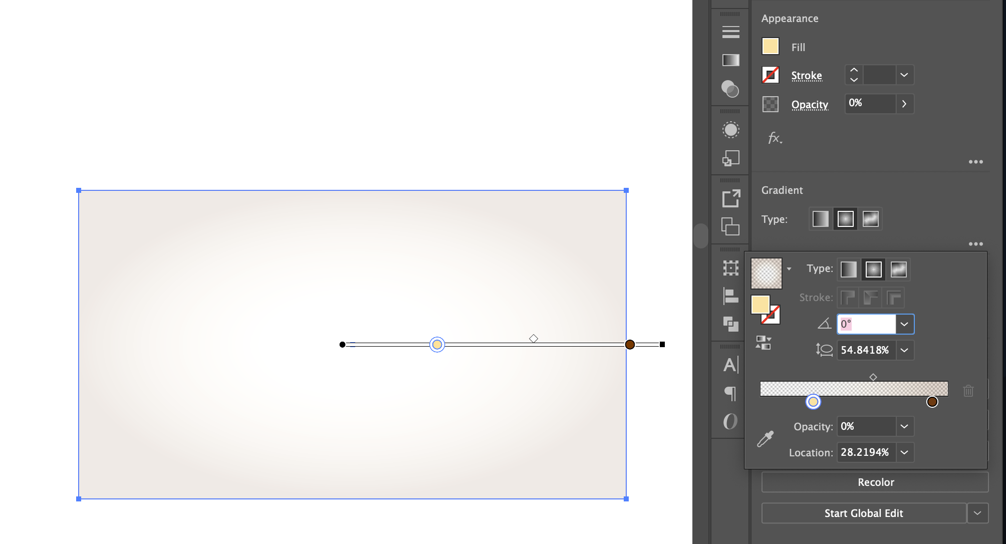
In total two gradients were added, one on the background itself, and then a brown-orange radial gradient on the top of the entire image. This increased the depth of the image and also made the colors richer.
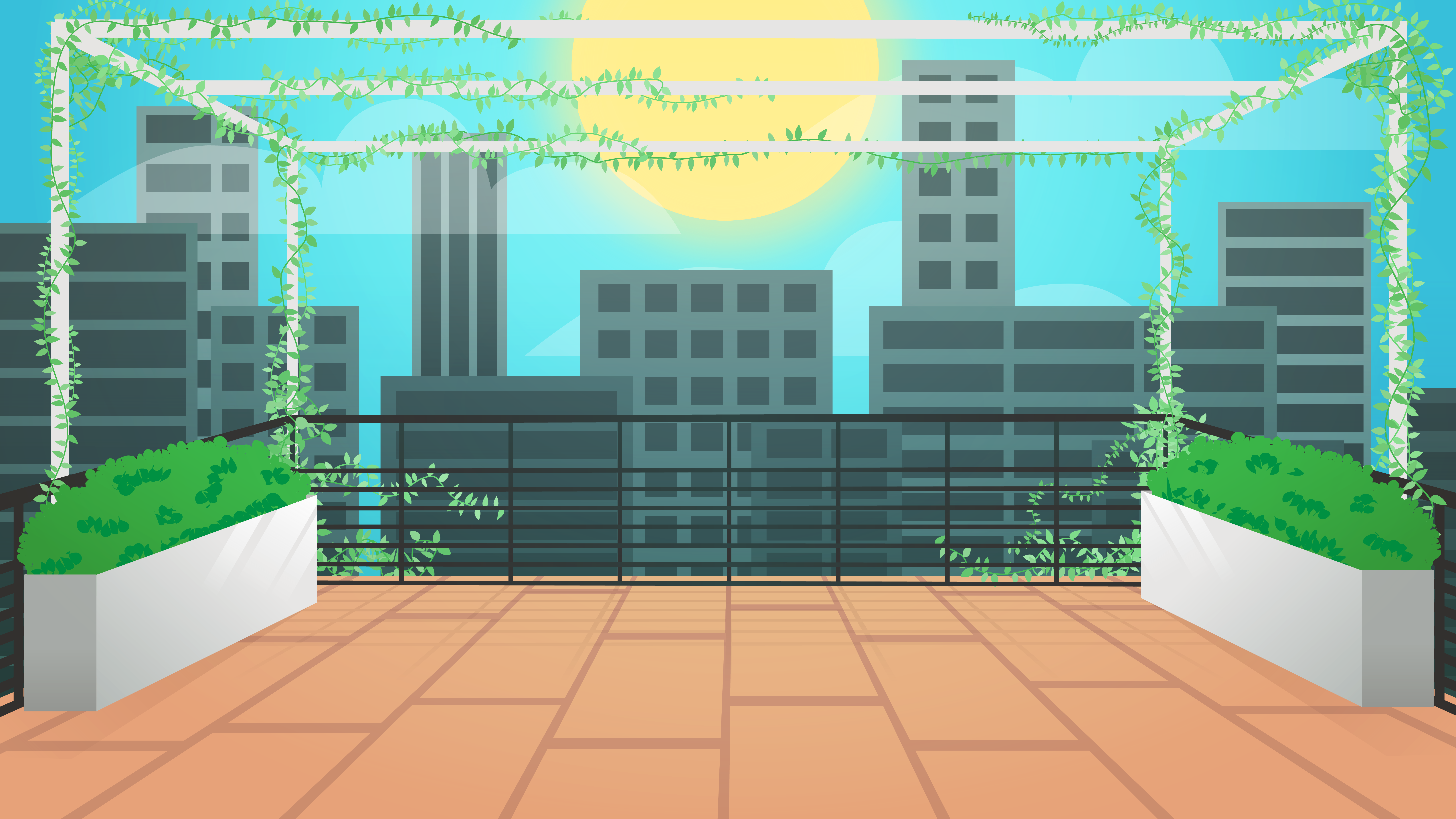
Final Version
Once you think you’re done, take a step back and admire you’re work. Post on Basecamp and show it off! This was a challenging tutorial, so even if it doesn’t look perfect still take pride in your work! It’s all a building process, and the skills that you learned here will get better with practice.
Depending on the projects that you could be assigned as an STA, from here you could be ask to add a central point of interest like a character or text, or even animated the background using After Effects.
Interested in how you can use or build upon the background you designed? Here are some tutorials you can check out: