
In this training you will be creating a full Studio Set Design for an Online Course. This Set Design is used for an in-person livestream course, produced in the LAITS Development Studio. For creating remote online course requests, please refer to this KB instructions instead.
There are several parts to this training: Theme Art Design, Set Design, Canvas Graphics, PowerPoint Design, and iPad Design.
Here are some examples of works done by the STAs:
- PSY 352 Abnormal Psychology – Thuy H Nguyen: https://sta.laits.utexas.edu/wp-content/uploads/2020/01/final_collection5.png
- HDO 301 Introduction to the Human Dimensions of Organizations – Maddy Kaniewski: https://sta.laits.utexas.edu/?s=hdo301
Part 1: Theme Art Design
This theme art will be the center of most of the designs.
- Take some time to choose a color palette. Keep in mind that this palette also depends on the Professor’s / Project Manager’s request. Here are some resources for choosing a palette:
- UT Color Palette: https://brand.utexas.edu/identity/color/
- Color Palette Generator: https://coolors.co/
Use this palette throughout the design process to ensure cohesiveness. In addition, the colors of the artwork might be different when projected onto a monitor. Often, blue-tinted colors appear more accurate when projected as opposed to red, orange, or yellow. Here’s how the burnt orange looked like when projected. You can see that there is a slight blue tint that changes the appearance of the color.
- If the Professor or Project Manager has some visual references, do some research for inspirations. These references can be photographs, design examples, or concepts.
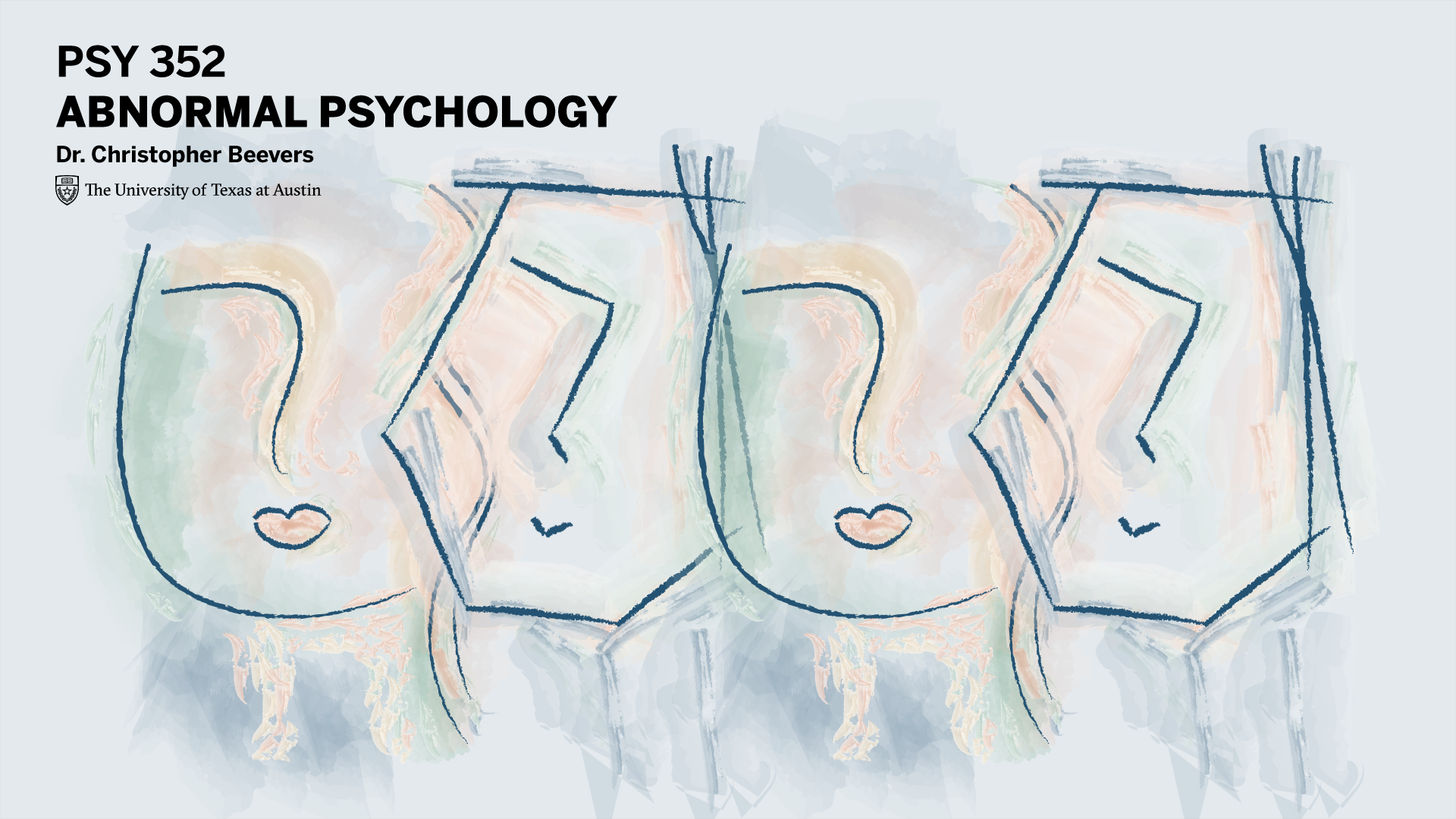
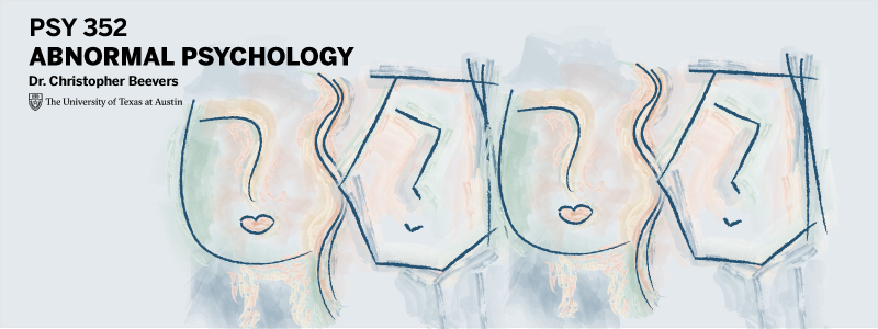
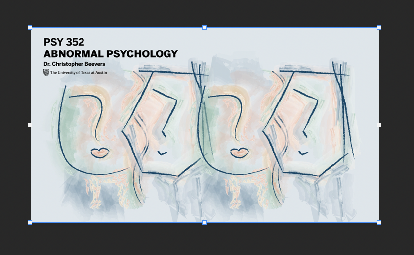
- For example, the PSY 352 reference is the Rorschach inkblot test:

- Here’s how the Theme Art design looks in the end:

- For example, the PSY 352 reference is the Rorschach inkblot test:
- Check-in with the Design Specialist / Project Manager / Team Lead / Professor for final approval before moving on to the next part.

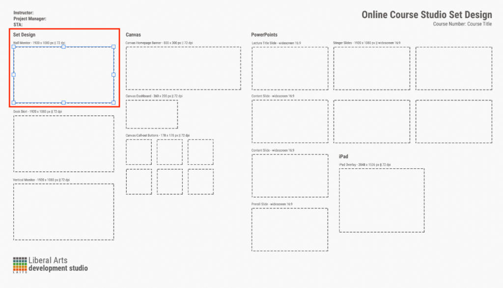
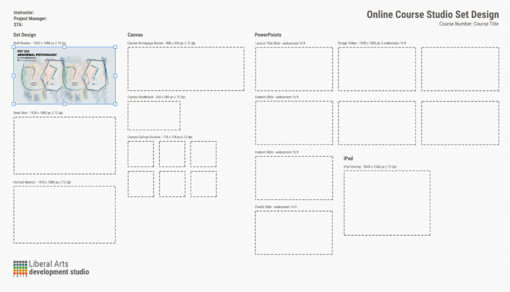
Part 2: Set Design
The Set Design consists of the Wall Monitor, the Desk Skirt, and a Vertical Monitor. The steps to composing these elements are very similar:
- Start with a blank 1920 x 1080 px, 72 dpi Photoshop or Illustrator file.
- Include the Theme Art, or elements that reflect the Theme Art.
- Include course information:
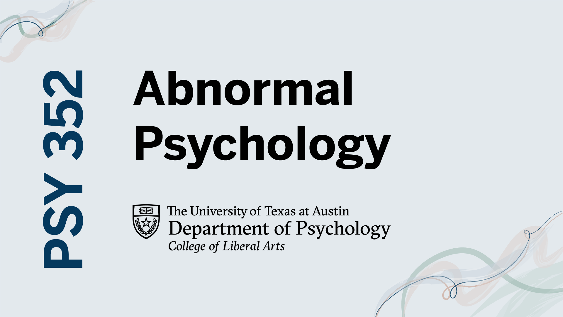
- Course number and Title (i.e. PSY 352 Abnormal Psychology)
- Instructor’s title and name (i.e. Dr. Christopher Beevers)
- UT Branding. Depending on the Project Manager’s / Prof’s request, you may choose department branding (https://liberalarts.utexas.edu/public-affairs/branding-guidelines/department-branding.php) or general UT branding (https://liberalarts.utexas.edu/public-affairs/branding-guidelines/)
- Export as JPG.
Below are some specific guidelines native to each element to consider while you design.

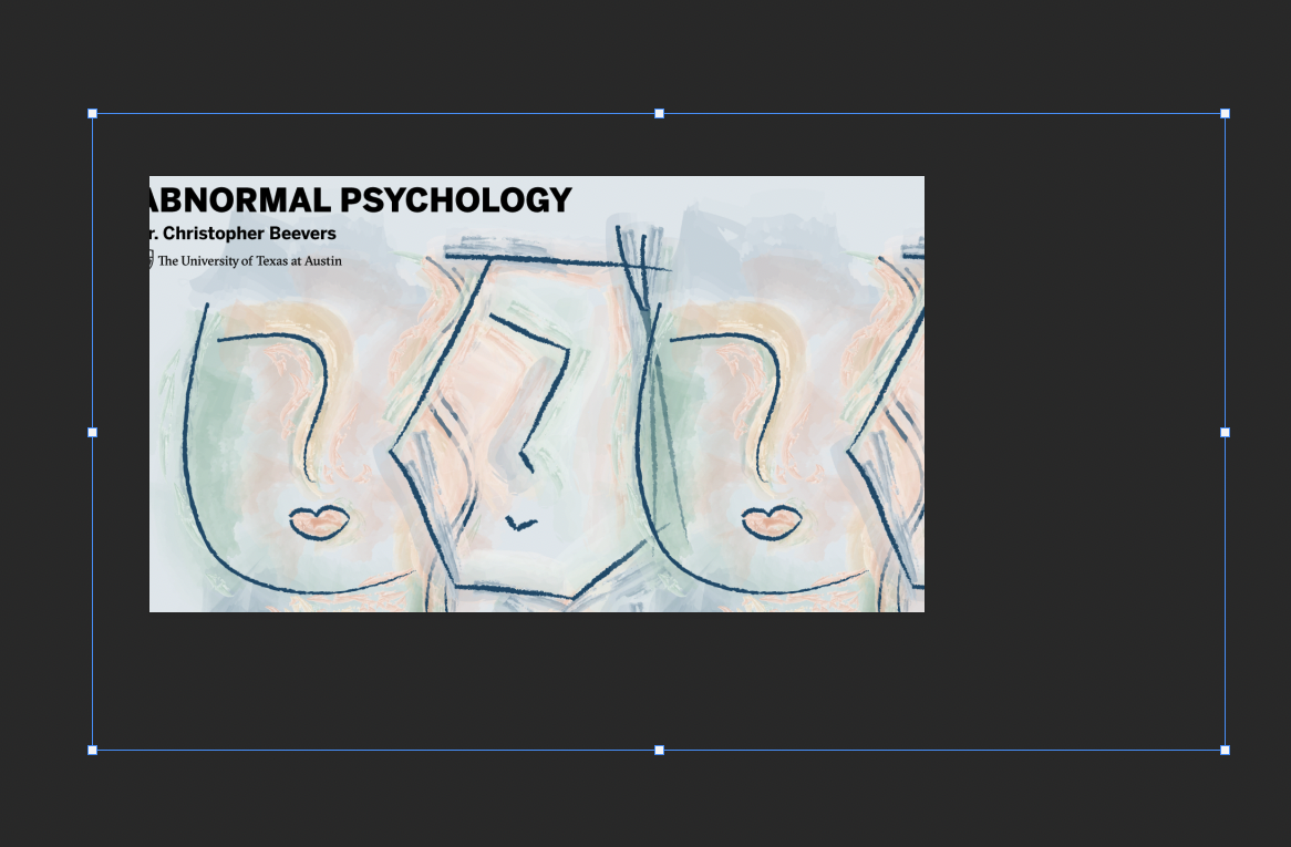
Wall Monitor (1920 x 1080 px || 72 dpi || JPG)
This monitor is directly behind the speaker (Professor or TA).
- The monitor should not distract the viewer from the speaker.
- The text on the monitor should be visible and not obstructed by the speaker (i.e. head, hair, hand gestures, etc.). In the PSY 352 example image above, you can see that the course information is placed on the top-left corner.
Desk Skirt (1920 x 1080 px || 72 dpi || JPG)
This monitor is directly underneath the speaker.
- This monitor is not visible too often. It is generally a good place to compose a simpler, less busy design. Consider including only elements of the Theme Art and not the full Theme Art.
- The most important pieces of information for this monitor is the course number and title.
- Consider using the full department branding for the course, since there will be more whitespace.
- For example, the desk skirt for PSY 352 only contains the brush strokes from the main Theme Art while keeping the focus on the course number and title.

Vertical Monitor (1920 x 1080 px || 72 dpi)
This monitor is a regular 1920 x 1080 px monitor placed vertically at the TA’s corner.
- For ease of design, set your canvas to 1080 x 1920 px.
- The most important pieces of information for this monitor is the course number and title.
- Consider using the full department branding for the course, since there will be more whitespace.
- Export.
- Export your art in JPG, either from Photoshop or Illustrator.
- Open up the JPG file in Photoshop.
- Select the image, then click Image > Image Rotation > 90° Counter Clockwise.
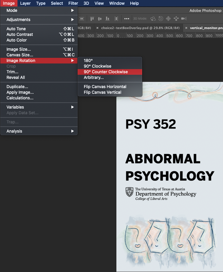
- Save.
Obtain reviews from the Project Manager / Team Lead / Design Specialist before continuing on the next part.
Part 3: Canvas Graphics
The Canvas Graphics will be very similar to the Set Design. Again, you will be utilizing the Theme Art and Theme Art components throughout. Pay attention to the dimensions and specs of the exported file.
Canvas Homepage (800 x 300 px || 72 dpi || JPG)
This is the banner image the student will see when they access a course through Canvas. Here’s a placeholder of where the graphics will be placed. 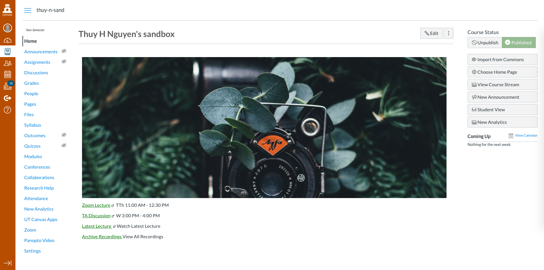
Since this graphic is placed within Canvas, the course number, title, and the Professor can be omitted. You might still want to include the UT or Department branding.
Canvas Dashboard (360 x 200 px || 72 dpi || JPG)
This graphic appears as a thumbnail on the Canvas Dashboard.
This graphic is relatively small, so text info can be omitted as well. 
Canvas Call-out Buttons (177 x 177 px || 72 dpi || JPG)
Refer to http://sites.la.utexas.edu/kb/2020/06/04/psd-canvas-button/ for the Basic Training as well as the templates for these buttons.
For the colors of the buttons, keep in mind your chosen color palette / theme art palette.
Part 4: PowerPoint Design
You will need to create 3 different types of slides: main PowerPoint Slides, Stinger Slides, and Preroll Slides.
Main PowerPoint Slides (widescreen 16:9 || PPTX)
These slides are used by the professor to present their lecture information. Here are some things to keep in mind while designing lecture PowerPoints
- Background
- Keep it simple, with minimal design, for maximum readability.
- It is recommended that it be kept white.
- Text
- Use Helvetica across the slides
- Use reasonable font-sizes.
- Keep the font-sizes consistent across the slides. For example, fix the font-size for the Title and Text / Subtitle.
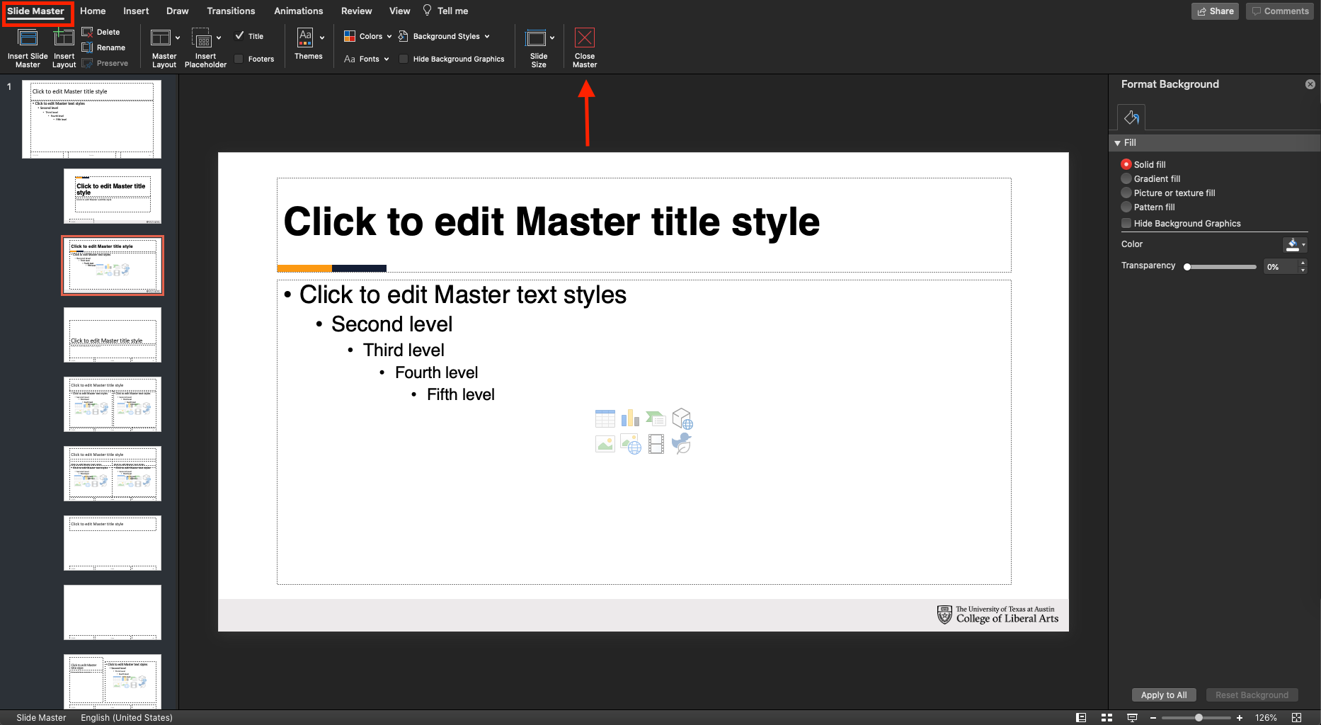
In order to create a template for these PowerPoints, you will need to use the PowerPoint Slide Master.
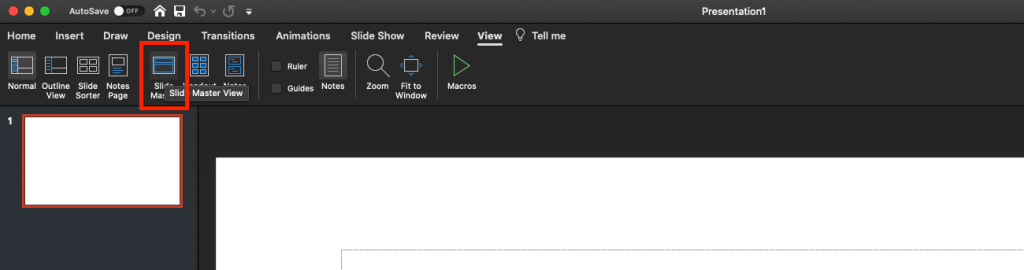
- In PowerPoint, click on the “View” tab in the top Tool bar.
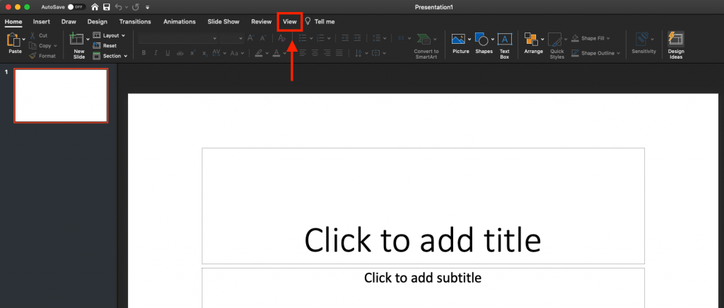
- Then click “Slide Master.”
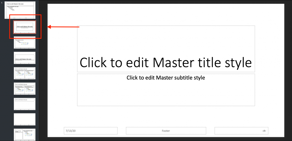
- Take some time to explore this editing view. Changes that you make to this will affect all slides of that kind.
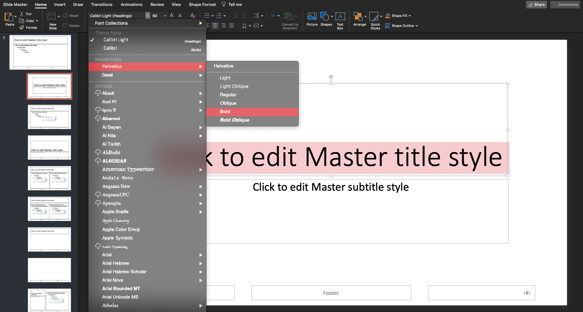
- For example, I’d like to change the font of the Title Slide to Helvetica. Click on the Title Slide.
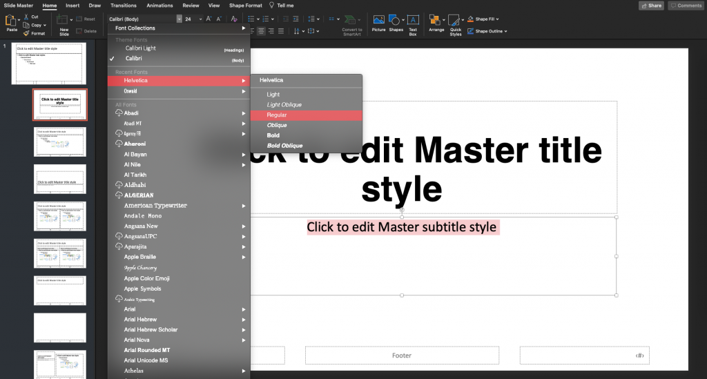
- Change the Title font to Helvetica.

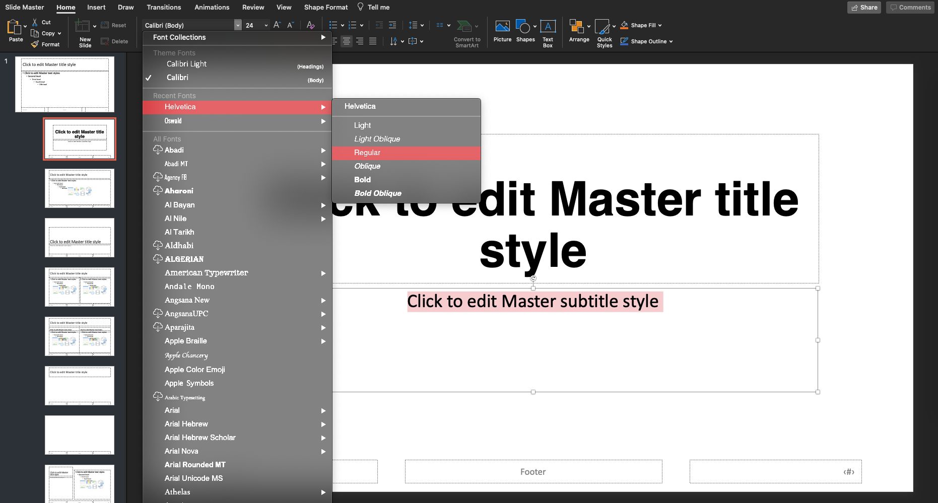
- Then do the same thing for the subtitle.
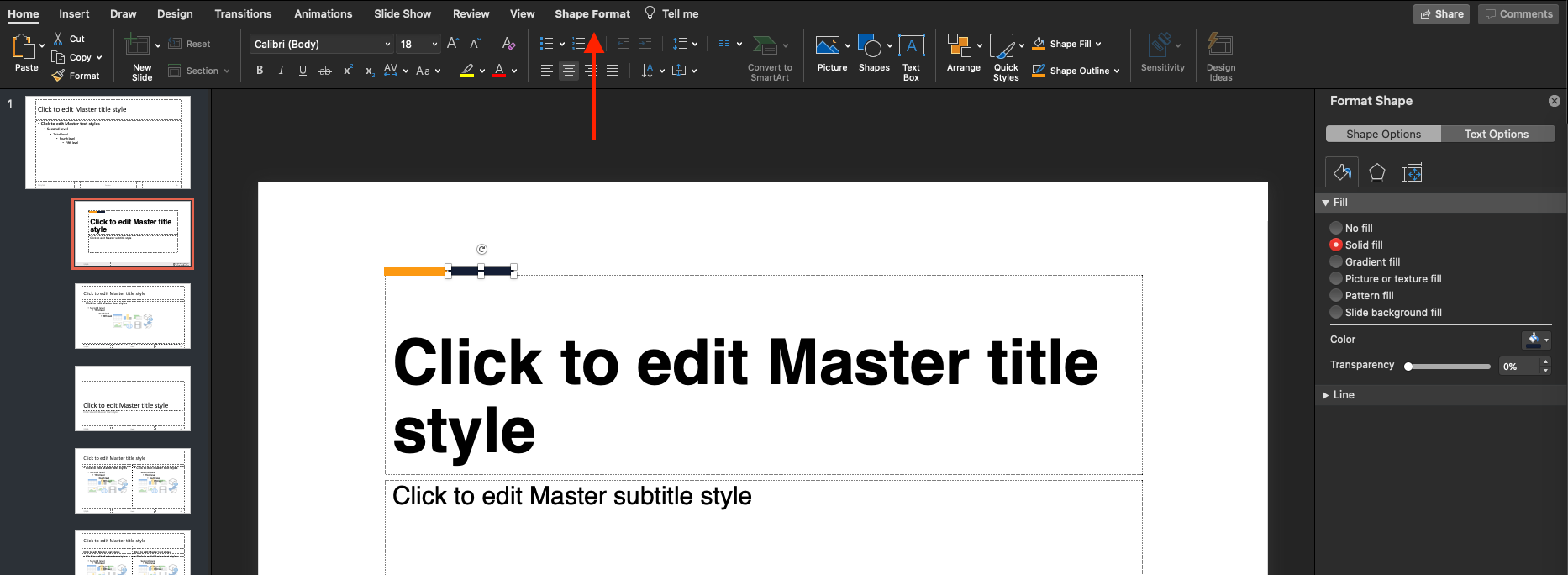
- Now add a simple design to this. I left-aligned the Title and Subtitle. I also wanted to add a 2-color bar on top of the Title. Click Insert > Shape > Rectangle. Then style the color / outline under Shape Format
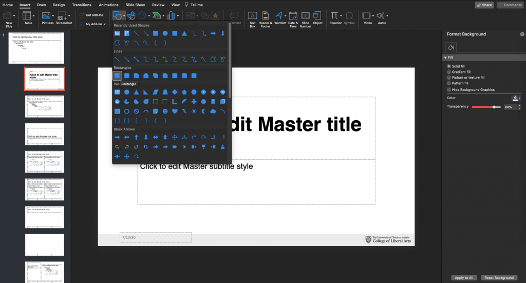
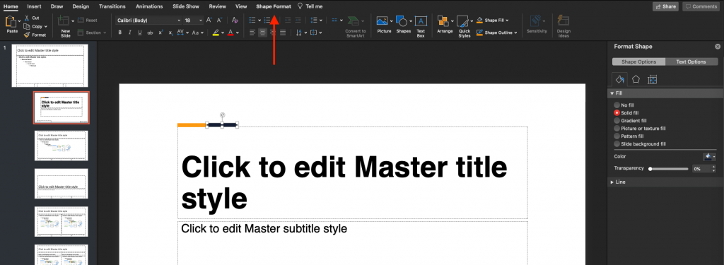
- My color bar look like this.
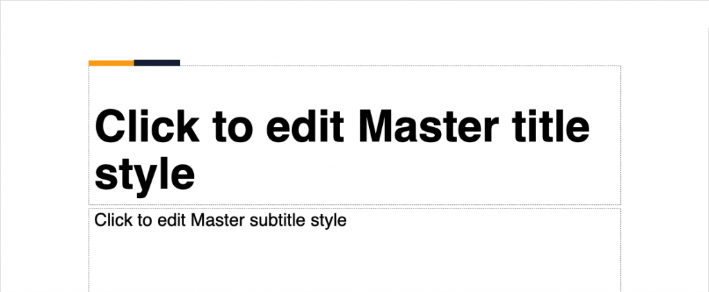
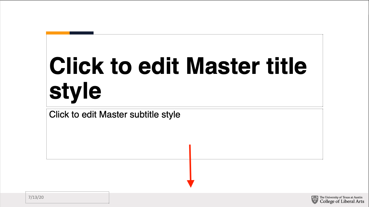
- Lastly, add this bar to the bottom of the page. Use #EFEDEE for the background. Then add a branding.

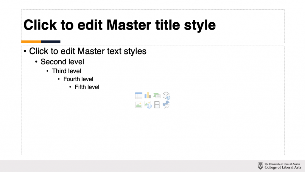
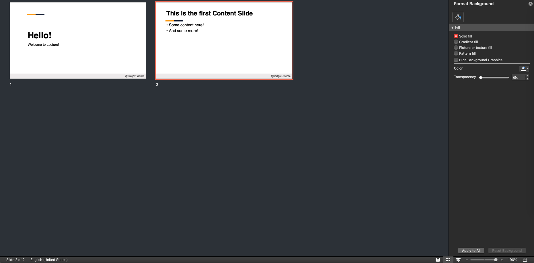
- Using the same principles, I styled my Content Slide like this.
- You’ll most likely only need these two main slides. When you’re done editing the template, switch to the “Slide Master” tab and click “Close Master.”
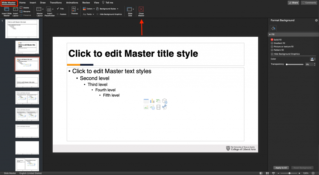
- Now, you’ll notice that your Title and Content Slides are styled consistently with the template.

- For more practice / information on using PowerPoint SlideMaster, check out this Training here.
- For example, I’d like to change the font of the Title Slide to Helvetica. Click on the Title Slide.


Stinger PowerPoint Slides (widescreen 16:9 || 72 dpi || JPG)
These slides are used as transitions from the main lecture to other activities such as Survey, Quiz, Chat, and TA’s Discussion. Please note that additional activities may be requested by the professor / Project Manager.
Although these slides will be displayed in PowerPoint, you might want to consider designing them in Photoshop / Illustrator.
- Ensure that the branding in these slides is consistent with the Main PowerPoint.
- You might want to consider adding vector icons or copyright-free images, with colors consistent with the palette / theme art.
- For example, for PSY 352, I picked some copyright-free images, desaturated them slightly, then added the theme art brush strokes at low opacity as the background texture. I also added some brush strokes as the “banner” background for the text.

- For example, for PSY 352, I picked some copyright-free images, desaturated them slightly, then added the theme art brush strokes at low opacity as the background texture. I also added some brush strokes as the “banner” background for the text.

Preroll PowerPoint Slides (widescreen 16:9 || 72 dpi || JPG)
These slides are used by the Video team as the “on-hold” video when the students are waiting for the lecture to begin. In other words, the students will be seeing this animated slide if they log-on early and are waiting for lecture to begin.
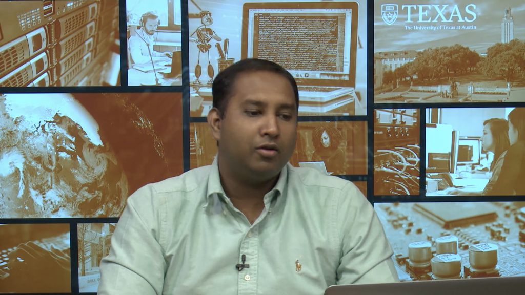
This is a good place to include the Professor’s image. Here’s an example from PSY 352.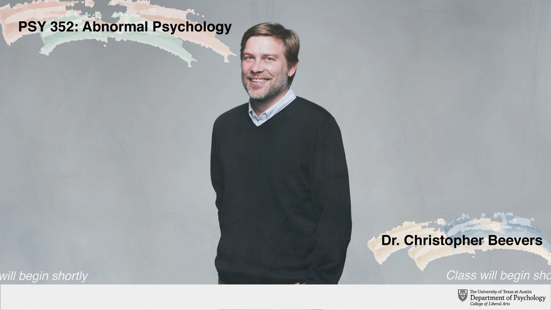
Note: the “Class will begin shortly” will not be added to the final Preroll slide. Video team will add and animate it. This text is only for mockup purposes.
Part 5: iPad Design
iPad Design (2048 x 1536 px || 72 dpi || PNG)
- Use this template here: https://utexas.box.com/s/9cz7gxxgm00oo586oq27171n8ch9gf6n
- You might change the color of the text box to match your color palette, and add some elements of your theme art in the blank section, as long as it is not distracting. Below are the iPad design with mockup text and without.


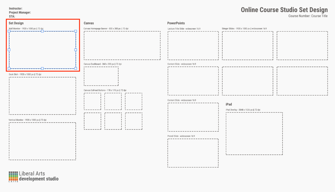
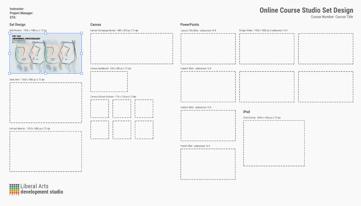
Part 6: Layout all the Set Design
Once you’re done with all of your assets, download this template here. You will be inserting all of your designs into the template.
Each of the placeholder frame is a Smart Object. Here’s how you would insert your designs into the frames.
- Click on the placeholder you’d like to replace with your art.
- Then click Layer > Smart Objects > Edit Contents.
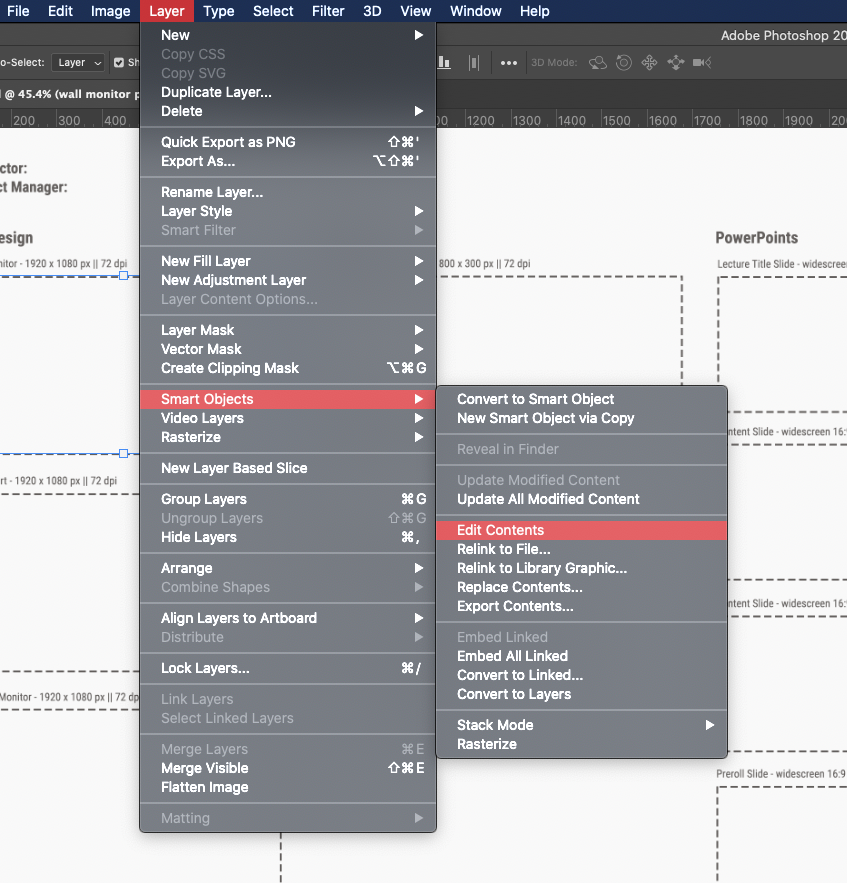
- A new .psb file will open up with just this placeholder. Drag in your design.

- Resize it to how you’d like it to appear.
- Click Save, or Ctrl / Cmd + S, and close this .psb file. When you come back to the Menu .psd file this will automatically be inserted.
That’s it. This is a long but fun project. Utilize Spreadsheets, BC, or any tool of your choice to help you organize and keep track of your work.