Photoshop Color Correction
The purpose of this basic training is to go over the various ways in photoshop to manipulate the light and color of a digital photo. When editing a photo for work, we tend to mostly want the image to be color corrected to natural lighting, clean, visible, and as close to true colors as possible. This is especially important when it comes to editing photo IDs or other images of people. When working on graphic design projects however, photos can be manipulated to be different from normal coloring and lighting to fit the style and color scheme for your designs.
By the end of this training you will:
- Learn best Photoshop tools for color correcting photos
- Practice editing photos to certain standards
- Use selections and masks to edit only certain areas of a photo
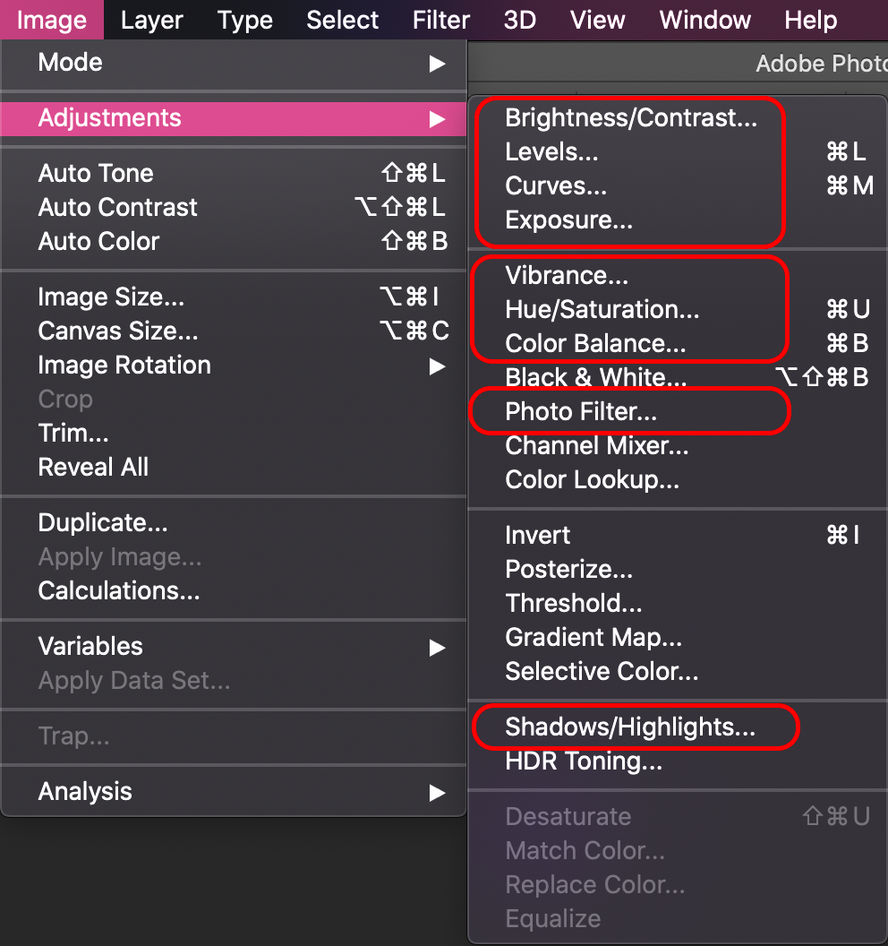
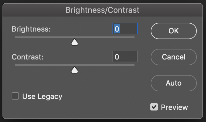
Brightness/Contrast
Under brightness, you can adjust how light or how dark your overall image will look. Within contrast, you can further increase or decrease the intensity of the bright and dark areas of a photo simultaneously. The edits you make under this tool affects the entire image all at once. It is a good starting point to slightly adjust the overall brightness and contrast of an image before using other tools to specifically adjust the highlights, mid-tones, and shadows in an isolated setting.
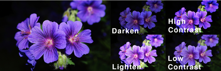
Take a look at how this image of a flower changes when its brightness is darkened or lightened and when its contrast is higher or lower.
Brightness/Contrast Mini Practice
- Save the following image to import into photoshop.
2. Lower the brightness all the way. Quick Export as PNG.
3. Revert to original. Higher the brightness half-way. Quick Export as PNG.
4. Revert to original. Higher the contrast all the way. Quick Export as PNG.
5. Revert to original. Lower the contrast all the way. Quick Export as PNG.
6. Post on Basecamp the original photo along with the four edits. Label them appropriately.
Levels
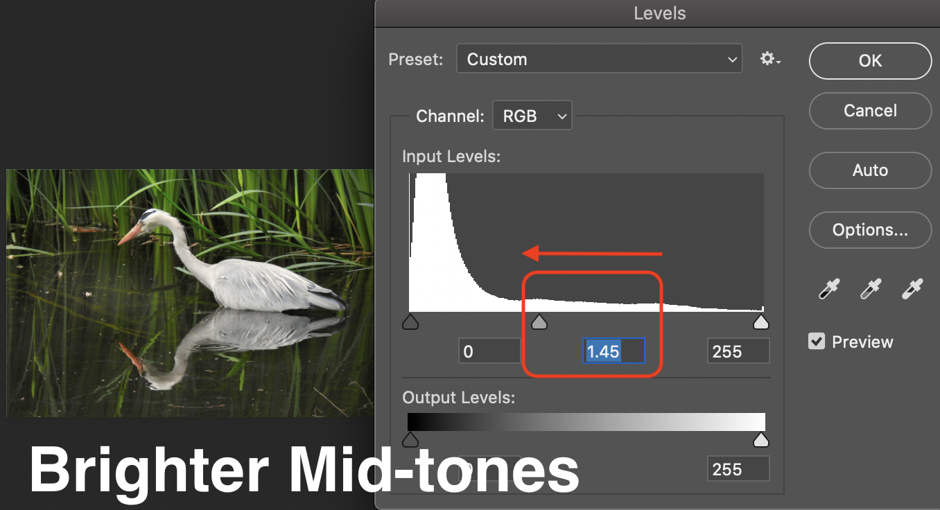
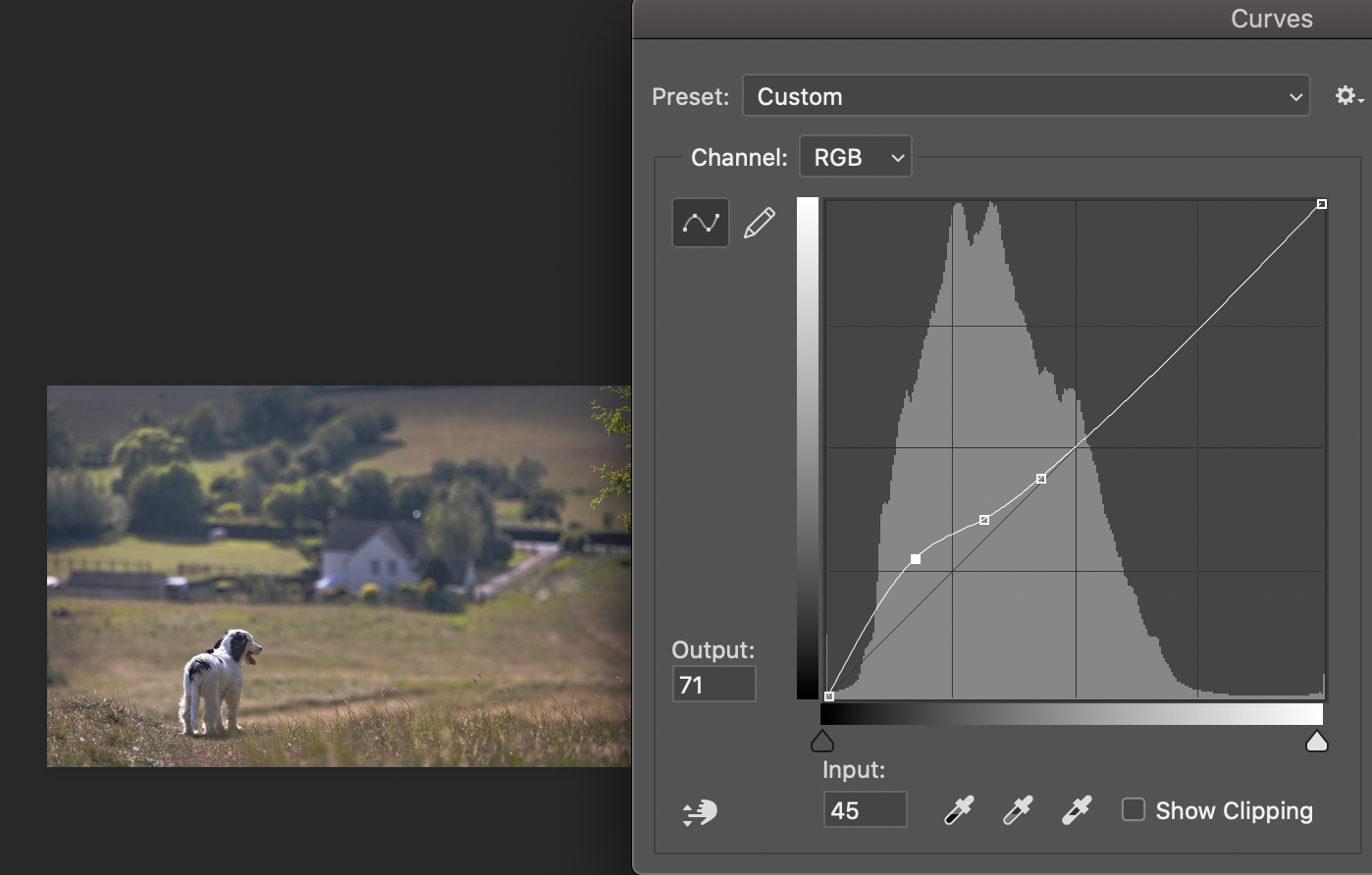
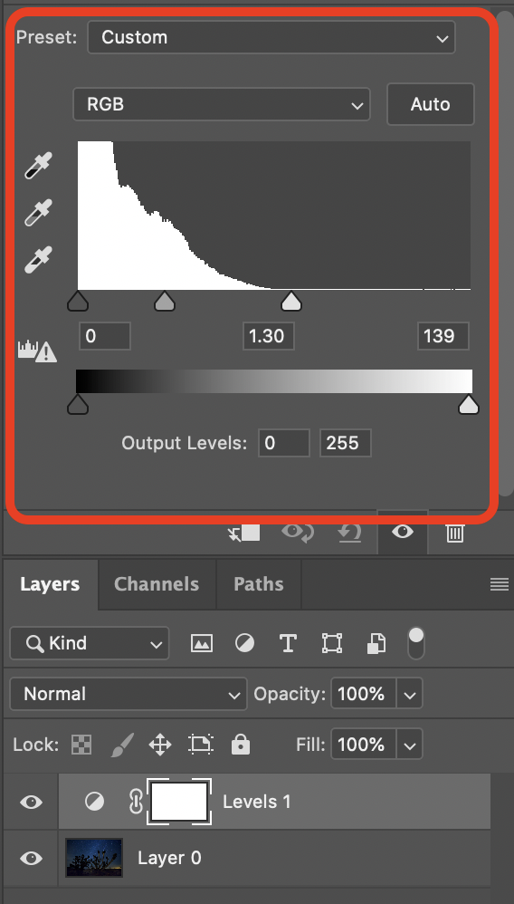
Under Levels, you can correct tones and alter color balance through adjustment of the intensity levels of shadows, mid-tones, and highlights in a photo (aka values). The histogram (graph looking chart below) is used as a guide to adjust the image values. The three arrows individually adjust the different types of values. Left is shadows, the middle is mid-tones, and the right is the highlights. You will not use output levels as it can aggressively adjust all the lights and darks of an image at once in an unnatural way.

Notice that the right side has lower levels than the left. This means that the image is slightly underexposed.

If you want the shadow to be darker in your image move the black arrow on the left towards the right. This will darken all the shadows in your image.

If you move the white arrow to the left you can bring out more light in the photo. You only want to move it to a point before the levels start to get higher in the histogram to avoid clipping or loss of pixel detail in the photo.
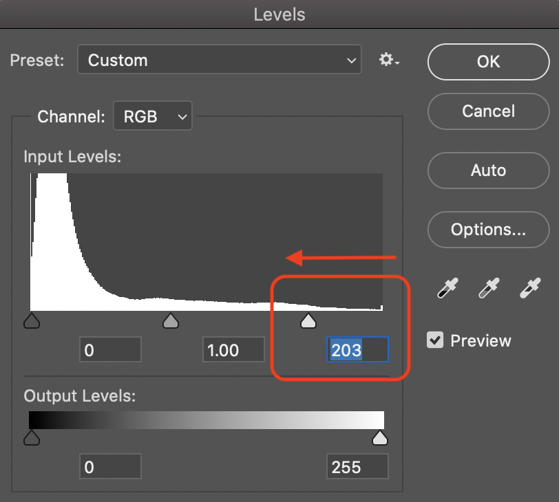
If the image is still too light or too dark you can adjust the gray arrow in the middle to lighten or darken mid-tones of the image. Sliding to the left will make the image brighter and to the right darker.

Levels Mini Practice
- Save the following image to import into photoshop.

2. Brighten the image by bringing out the highlights. Quick Export as PNG.
3. Revert to original. Darken the image by lowering the shadows. Quick Export as PNG.
4. Revert to original. Brighten the whole image by adjusting the mid-tone only. Quick Export as PNG.
5. Revert to original. Darken the whole image by adjusting the mid-tone only. Quick Export as PNG.
6. Post on Basecamp the original photo along with the four edits. Label them appropriately.
Curves
Curves are very similar to levels but differ in their ability to allow even more precise control over the individual elements of value in your image. This tool requires careful and minimal edits at a time as to not over-edit your image. You will use the line that goes across the graph to adjust the values. To start adjusting click anywhere along the line to create a new point to drag. For now, leave the top-most and bottom-most points in the corners alone. If you click a point that you do not want, drag it off the window or click on it then click delete on your keyboard.

To increase contrast using curves drag the lower part of the line down into the shadows to darken them and the upper part of the line into the highlights to brighten them. To decrease contrast do the opposite adjustment.
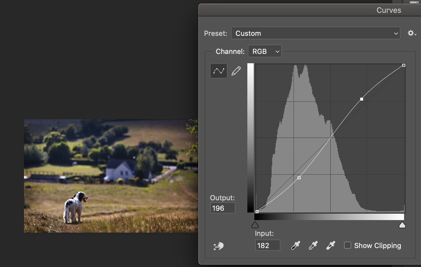
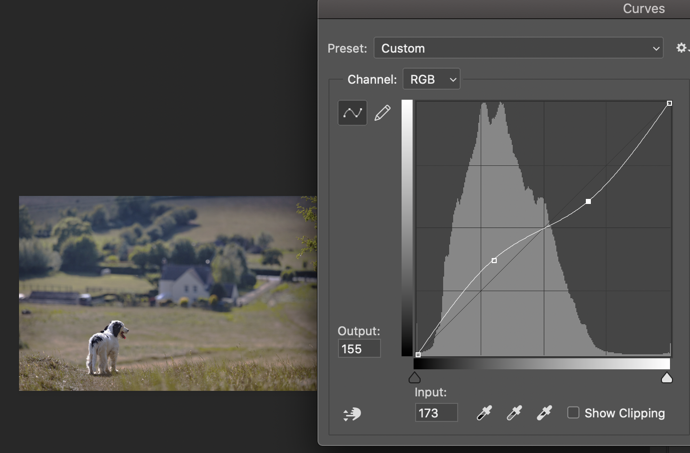
To adjust only the shadows, bring the bottom point up or down to lighten and darken the shadows while slightly adjusting the other points back into a straight line to not affect the mid-tones or highlights.
If you over adjust the curve to be very “S” like it its wave you may lose natural lighting, create clipping, and wash out the mid-tones making your image flat.
Curves Mini Practice
- Save the following image to import into photoshop.
2. Bring up the contrast of this image. Quick Export as PNG.
3. Revert to original. Lower the contrast of this image. Quick Export as PNG.
4. Revert to original. Brighten up the shadows but leave the highlights and mid-tones alone. Quick Export as PNG.
5. Post on Basecamp the original photo along with the three edits. Label them appropriately.
Exposure
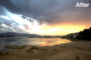
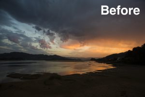
Under the exposure, you can adjust the exposure, offset, and gamma correction. Exposure mostly affects all the light in your image which as a whole will make your image lighter or darker. Gamma correction helps you adjust how an image is displayed on a monitor by adjusting both light and dark tones with the greatest influence being over the mid-tones of your image. Offset controls the dark tones of your image and this needs to be adjusted slightly because too much offset can quickly wash out the dark areas in the photo or make them too dark.
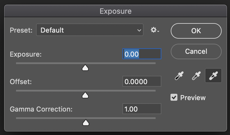
You might have noticed the three eyedroppers. These are used to select certain values from your image. Remember not color – value! This is the dark or light spots you are grabbing to adjust. The white and gray droppers adjust the exposure slider and the black dropper adjusts the offset.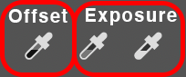
If you want to make your image overall darker: with the black dropper select a dark value, with the gray select the most middle value, and with the white select the brightest value.
To make your image overall lighter: select a value that is a little off-white, not as bright, for the gray select a darker gray looking middle value, and for the black select the most black point in the image. From there you can adjust the offest to make your image appear natural.
Check out this video starting at 1:20 to see a visual representation of this: https://youtu.be/uYsP5EZ7iF8
Exposure Mini Practice
- Save the following image to import into photoshop.
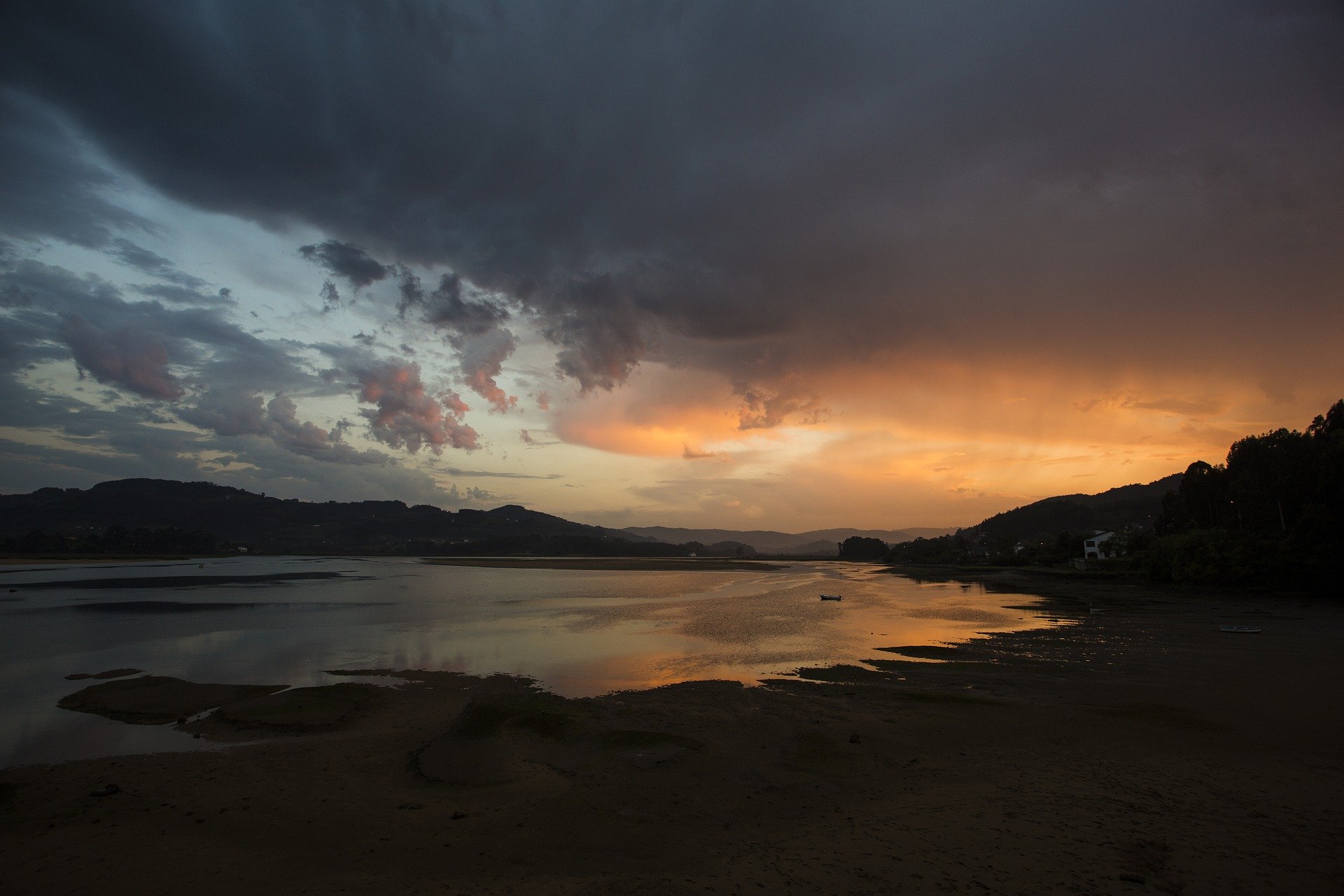
2. Use the selection tool to pick the land out in the photo. Then raise the exposure while adjusting the gama and offset to make it look natural.
3. Press Shift, Command (or windows key), and “I” to invert the selection to grab the sky and water. Then raise the exposure while adjusting the gama and offset to make it look natural.

4. Post on Basecamp the original photo along with the new edit. Label them appropriately.
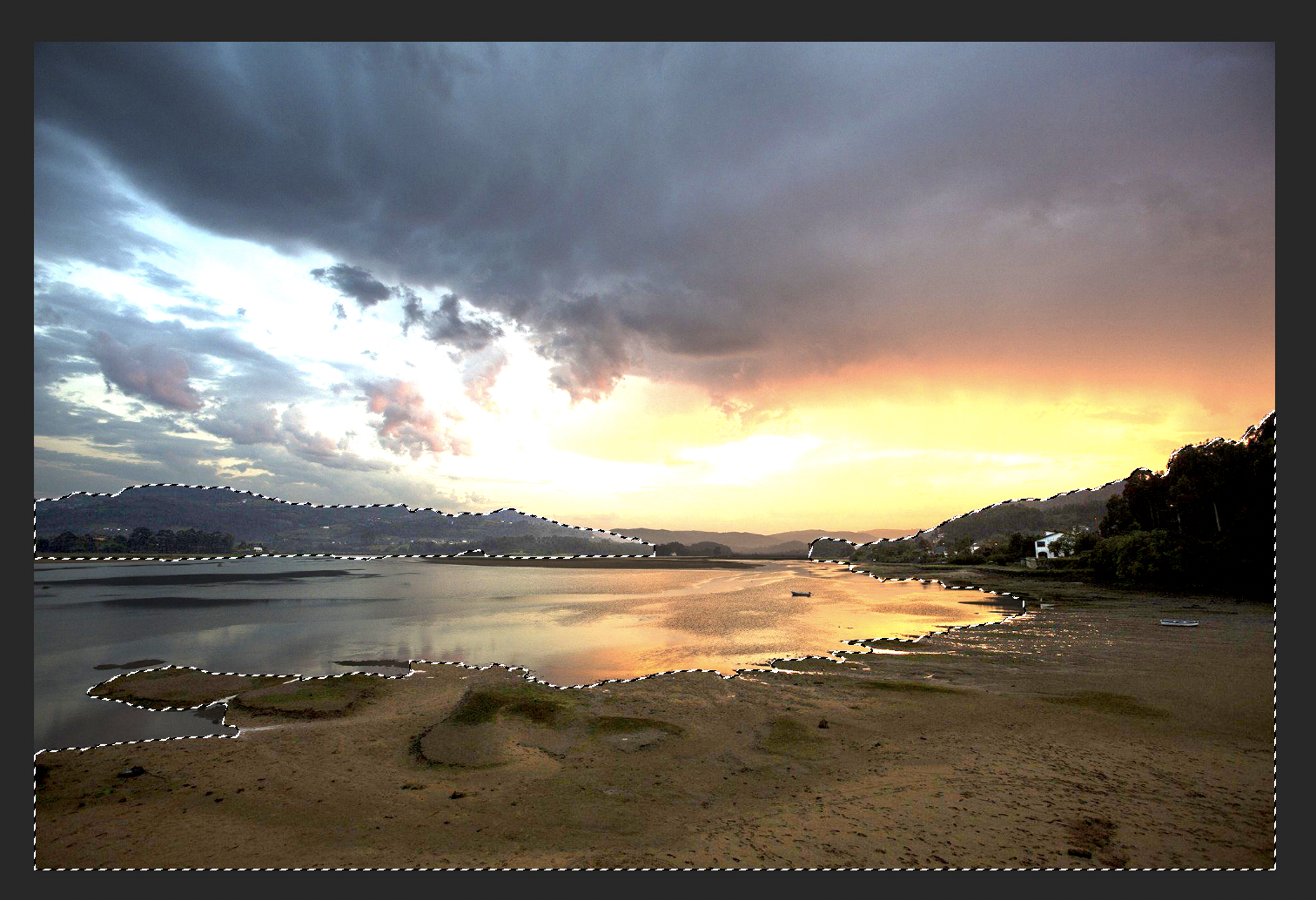
Selection Help:
Sometimes, using the Lasso or the Quick Selection Tool does not produce clean borders, this can lead to rough “choppy” edges to your color correction.
This can be corrected through selection refinement. Photoshop initially displays your selection area with “marching ants” -a dashed line where the dashes seem to move slowly sideways and up and down. You can instead preview your selection borders more clearly by right-clicking on your selection and hitting “Select and Mask…” this will generate a new editing window where you can change edit your selection active area.
On the right side of this window, there is a “properties” panel that has many ways in which you can edit your selection. I recommend changing the view mode to “Overlay (V).” This action applies a color overlay to the areas not selected. TIn the example below, you can see how I have used a red overlay to more clearly see my selection for editing.
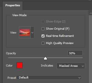
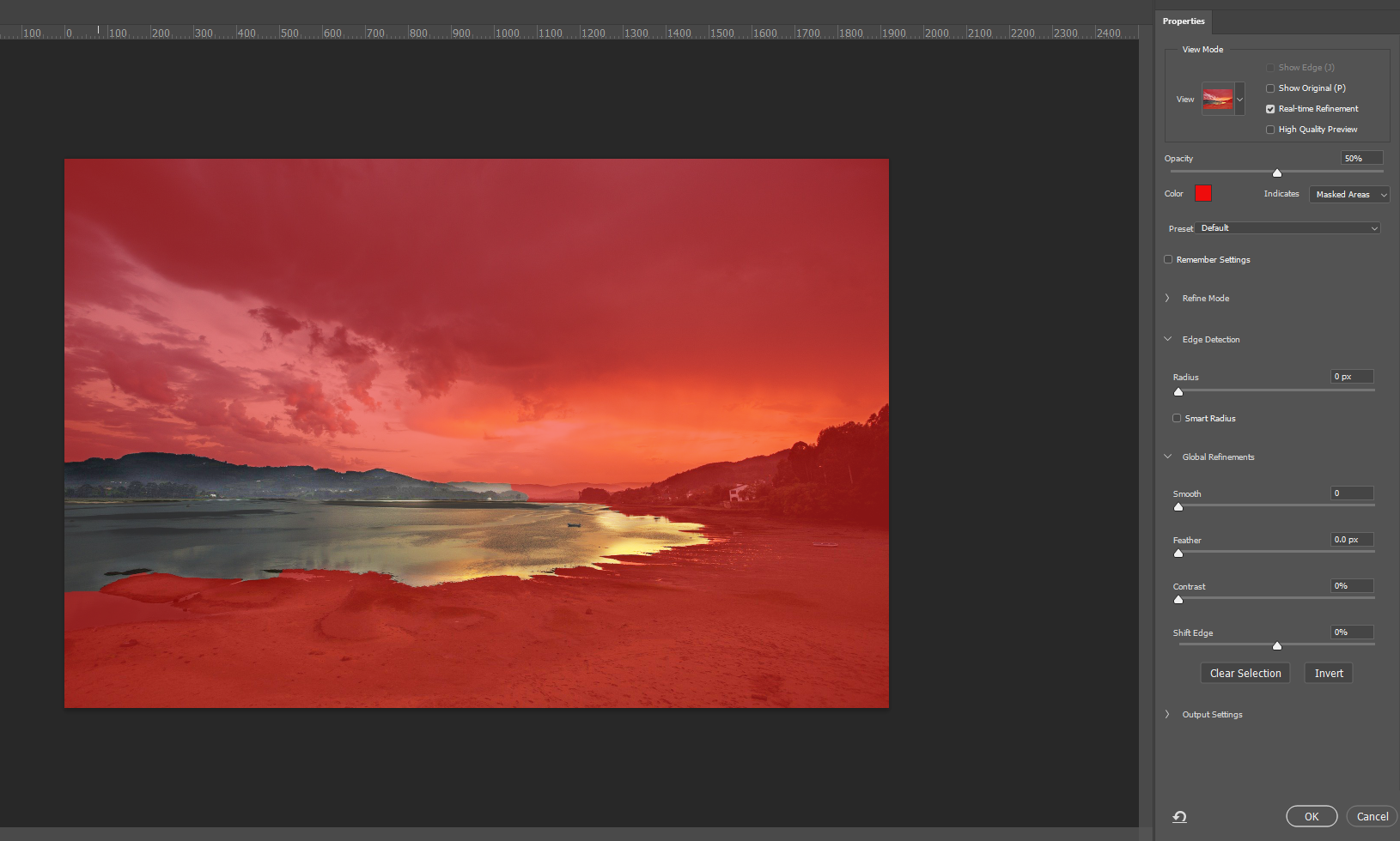
You can then adjust your selection with the edge detection and global refinements settings in the property panel. You can also use the brushes on the left workspace bar to add and take away areas from your selection.
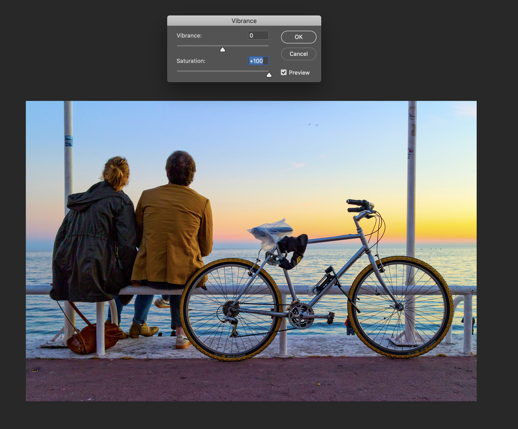
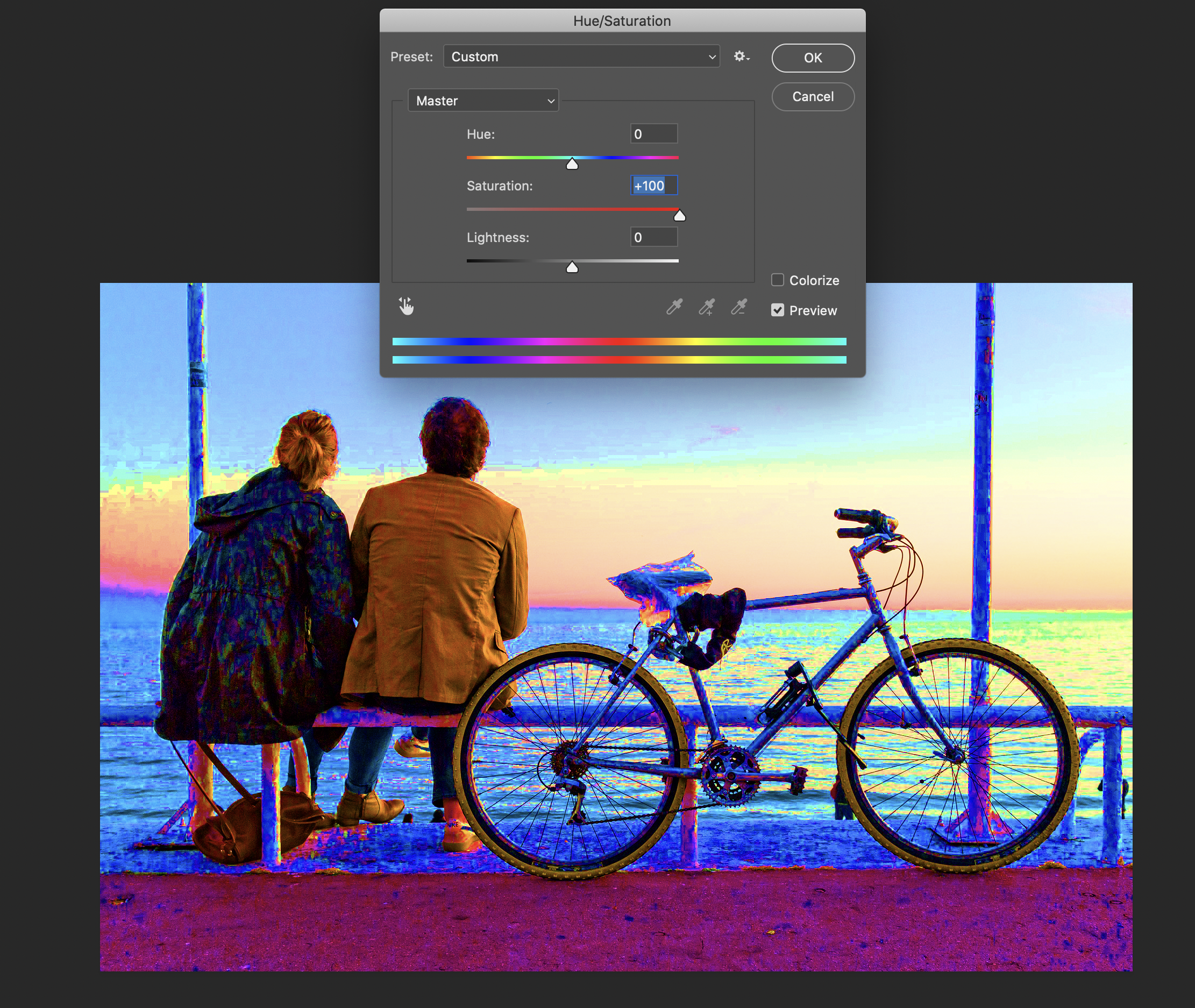
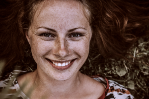
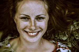
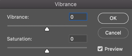
Vibrance
Vibrance will adjust the saturation lightly so that contrast and loss of pixel information is reduced as colors get to their full saturation. The lower saturated areas of the photo are what’s affected most in the image rather than the more saturated areas. If you are working on skin tones it keeps them from looking unnaturally orange/red/yellow/black (or deep-fried).

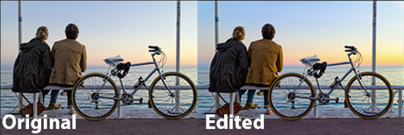
It may not seem obvious what the difference is between the saturation tool in vibrance does vs. the saturation tool under hue/saturation. The images below compare how 100% saturation under each tool affects the photo of this person. Hopefully it makes clear the point above that it reduces this “clipping” or deep-fried look of the image.
Vibrance Mini Practice
- Save the following image to import into photoshop.
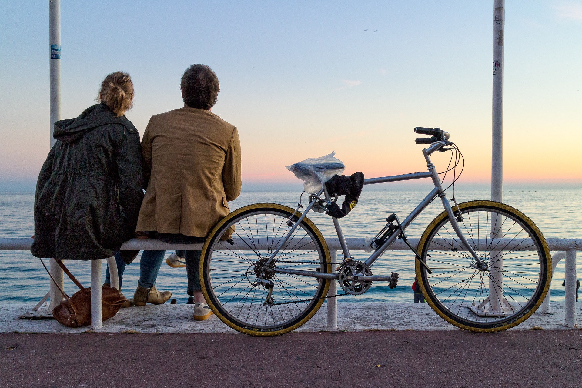
2. Adjust the vibrance and saturation in conjunction with each other to turn this lower saturated images into a more colorful, warm, but natural image like so:
3. Post on Basecamp the original photo along with the new edit. Label them appropriately.
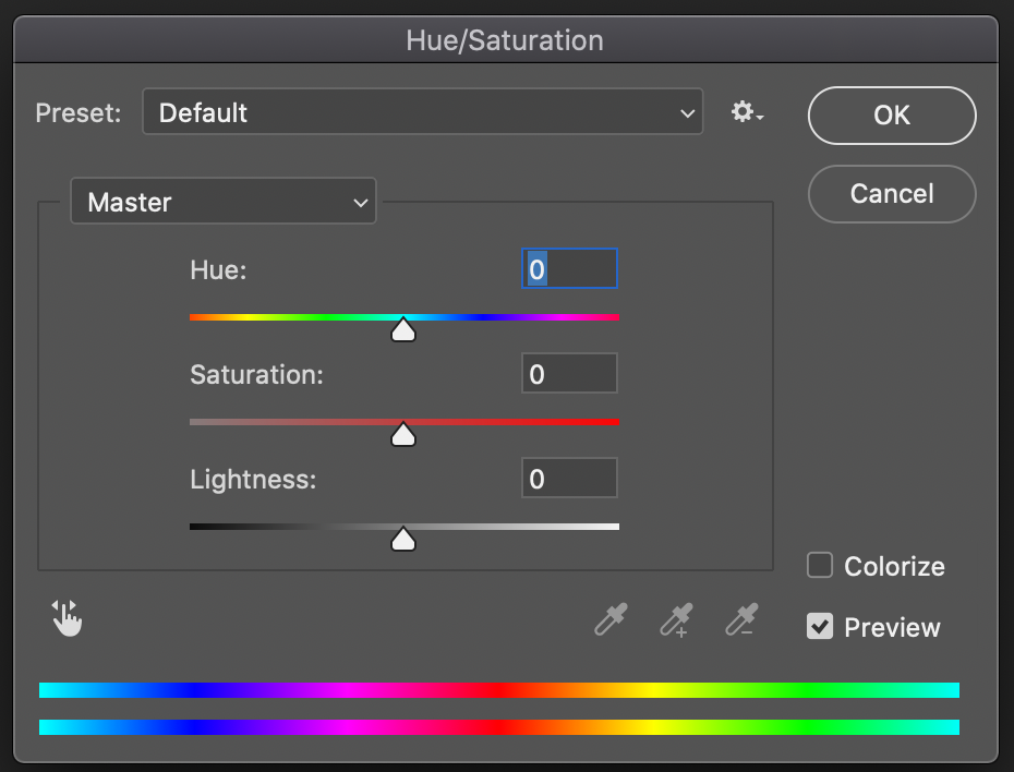
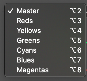
Hue/Saturation
Under hue and saturation, the colors of your image can be entirely recolored. You adjust the entire image at once or change certain groups of color in your photo. Adjusting the Hue bar under Master will recolor the entire image but clicking on color groups beneath Master will allow you to pick what color group you want to change specifically while the other colors remain unchanged. The lightness and darkness are similar to the brightness tool except in this window it has a more extreme range where you can get to total black or total white. You may find it useful to adjust the lightness of the image as you mess around with saturation and hue.
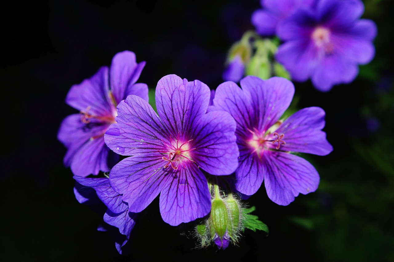
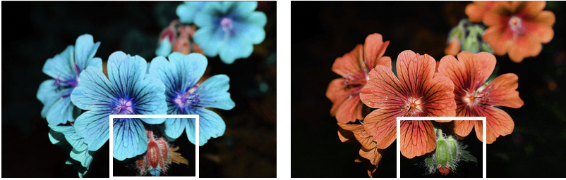
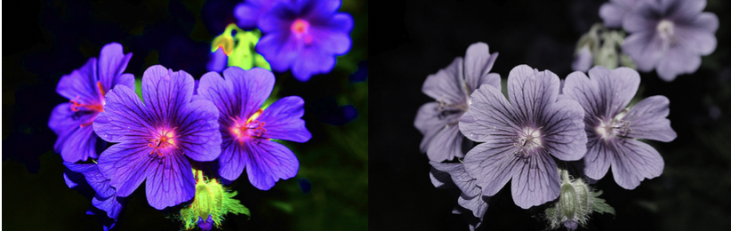
Let’s take a look at how the originally purple flowers look when the when we adjust the hue bar under master (left) and what happens when specific colors are targeted in the photo (right). Notice on the left the green of plant changes to an unnatural color whereas on the right I was able to keep the green and only change the color of the petals.
The saturation of the image can also be adjusted in this window. Saturation will determine how intense your hue will look. It can make your image a more vivid looking or washed out. You can mess around with Saturation if you find that your colors look too dull or too intense.
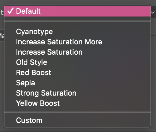
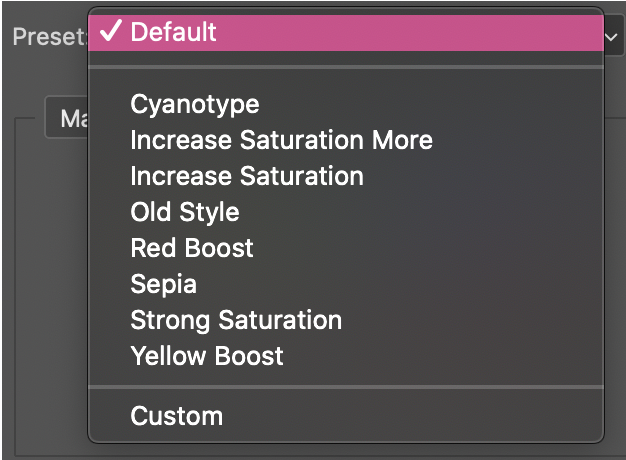
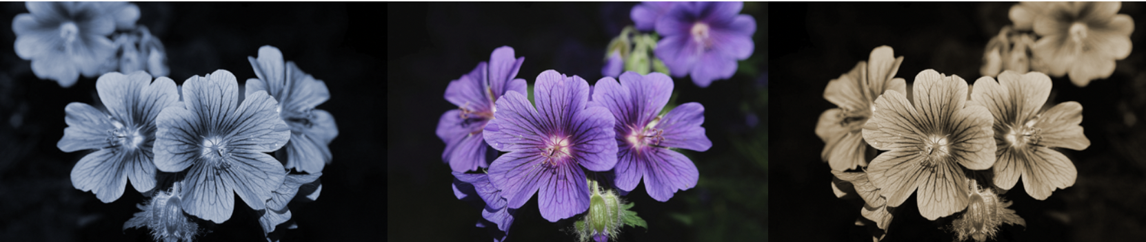
Under presets in this window you can also change the colors of your photo, but these are not often used. Below are how the cyanotype, old style, and sepia look respectively.
Hue/Saturation Mini Practice
- Save the following image to import into photoshop.
2. Turn the petals red, yellow, light blue, or pink.
3. Make sure that the greens of the plant stay true to their color. You may adjust the intensity or shade of green as long as it looks natural.
4. Post on Basecamp the original photo along with the new edit. Label them appropriately.
Color Balance
Typically, we use color balance if a photo tends to have a tint that is off from what would be naturally seen. Such as green-yellow tints, very blue cool tints, or warm yellow lights from indoor photos. Or it can equally be adjusted to create effects of natural, warm, cool, or colored tints if we desire it for the look of our design.
In the color balance window, you can adjust the shadows (darker areas), the highlights (brighter areas), and the mid-tones (middle-not too dark not too light areas) of your CMYK layers. Colors of print are known as CMYK and digital photos are built up in single layers overlapping to produce all the colors in a photo. Here you can adjust the cyan, magenta, and yellow colors that make up a digital photo.
Take a look at this image below. By adjusting the color balance in the shadow, mid-tone, and highlight layers I am able to create both a warm and a green-foresty tone to the image. It is recommended that you start in the mid-tone layer for an overall color adjustment and then move to the shadow and highlights to tweak the colors to look natural and enhance the filter you are going for.
Color Balance Mini Practice
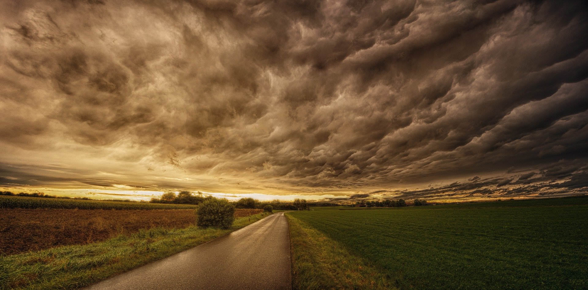
- Save the following image to import into photoshop.

2. Adjust the photo to have a warm-fall like filter. Quick Export as .PNG.
3. Revert to Original. Adjust photo to have a green-forest like filter. Quick Export as .PNG.
4. Revert to Original. Adjust photo to have a blue-cold like filter. Quick Export as .PNG.
Your three edits should look somewhat similar to this:
5. Post on Basecamp the original photo along with the new edits. Label them appropriately.
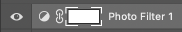
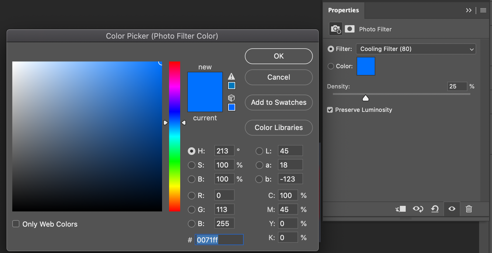
Photo Filter
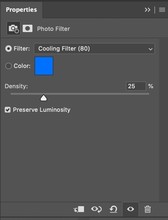
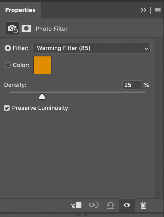
Under the photo filter, you can add cool and warm filters over your entire photo. You want to start this off by clicking the half-filled circle icon in the layers section. Then click the photo filter and tap on the layer that gets created. You can pick from many different filter styles to edit the warmth and coolness of the photo or click on the color box and manually pick from there. Make sure that the Preserve Luminosity box is checked on so that the brightness of the image remains the same.
 .
. 
 .
. 
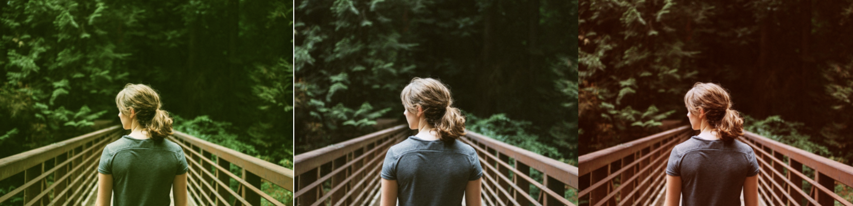
Let’s take a look at how the warmth and cooling filters affect this copyright free image of a person at the beach.
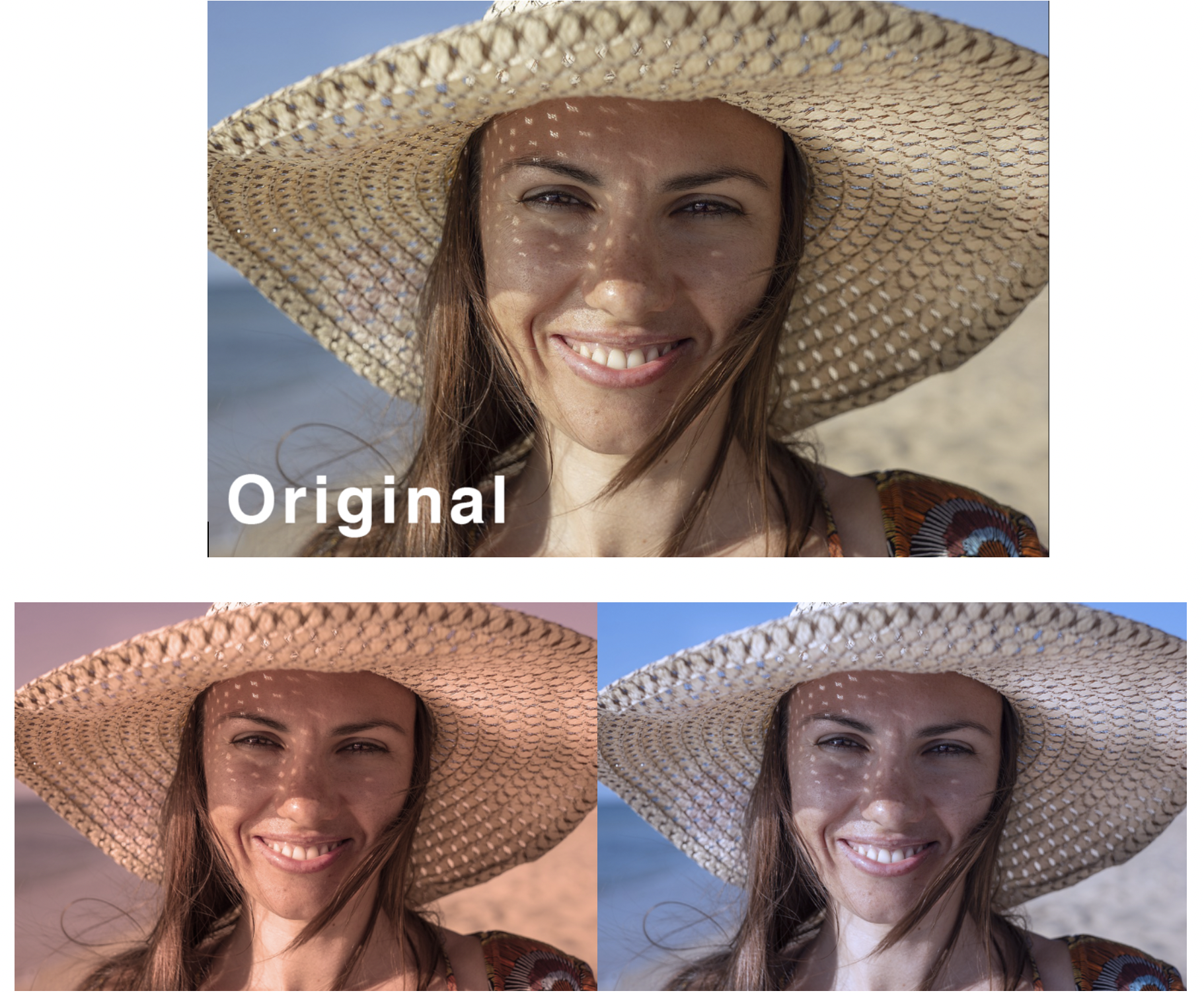
Photo Filter Mini Practice
- Save the following image to import into photoshop.
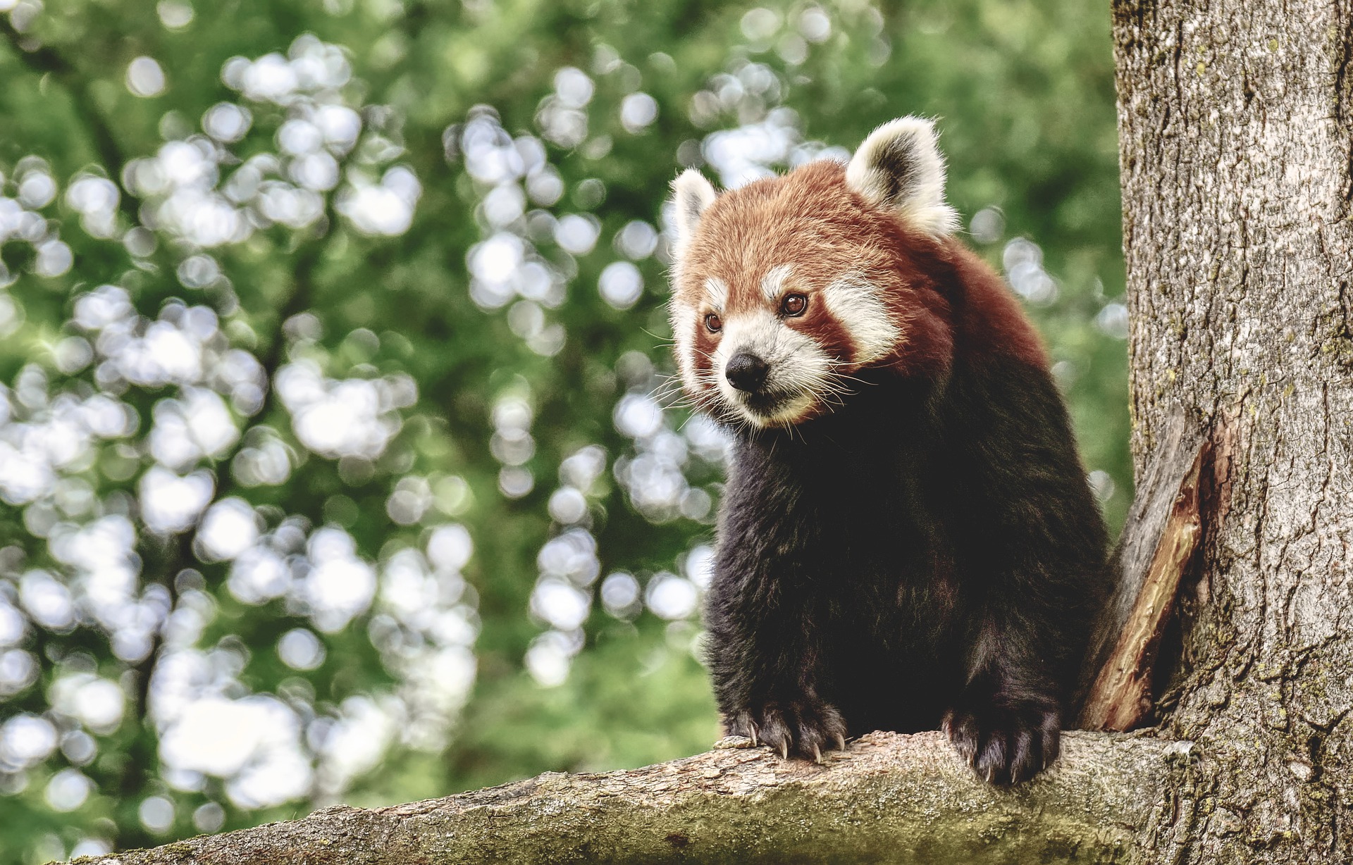
2. Duplicate the background layer. In the highlighted new layer click the half circle icon below and select photo filter.
3. Quick Export .PNG both a warm filter and cool filter version of this animal.
4. Post on Basecamp the original photo along with the new edits. Label them appropriately.
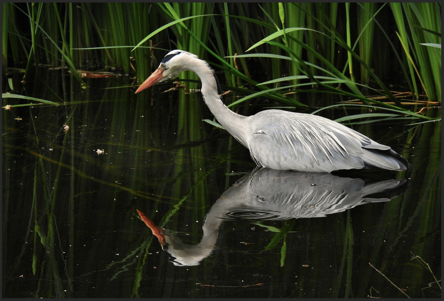
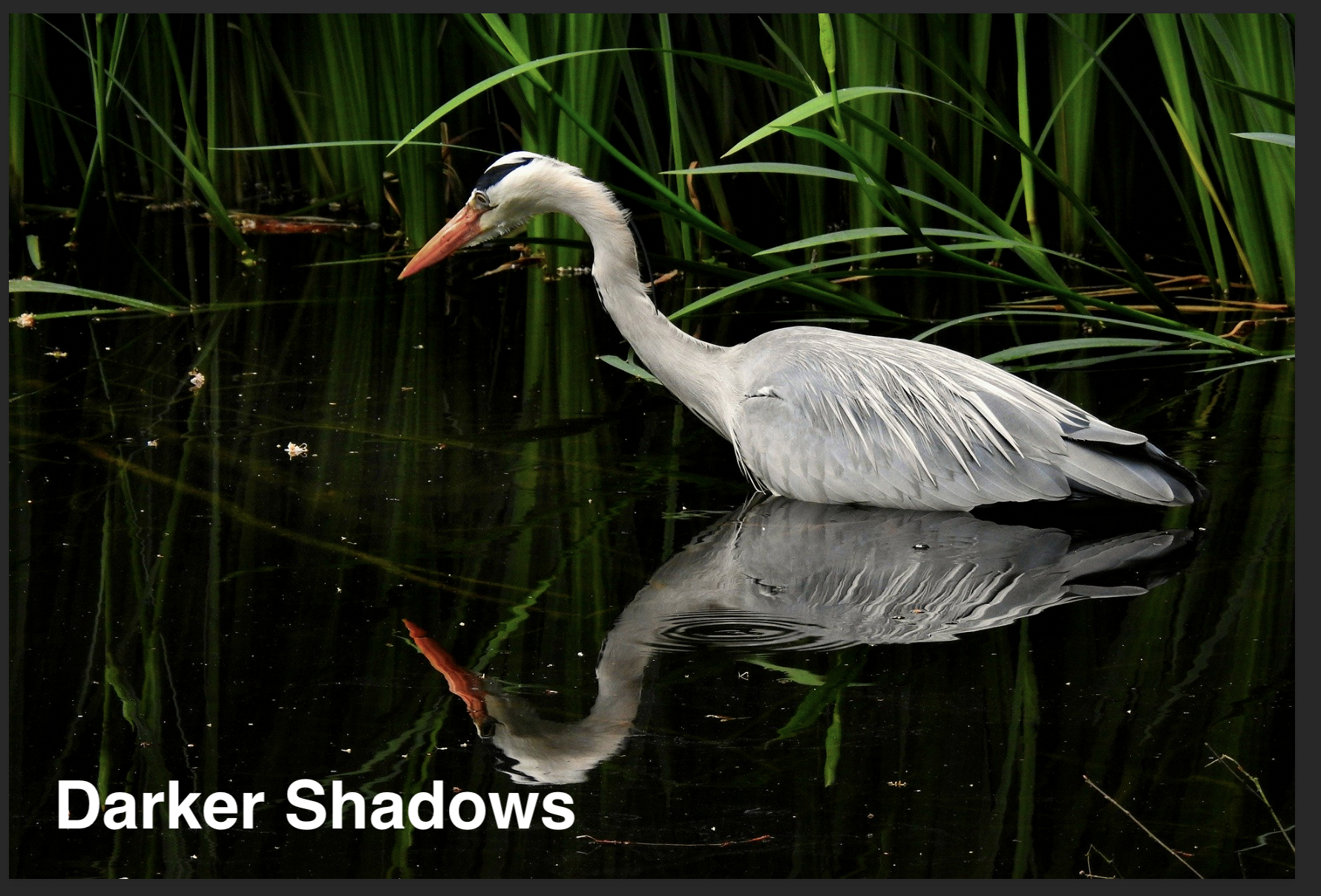
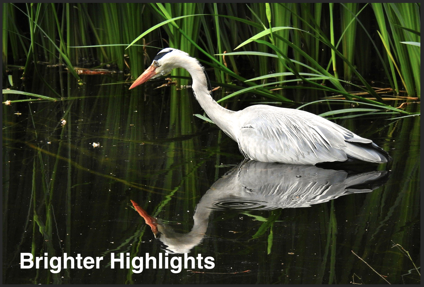
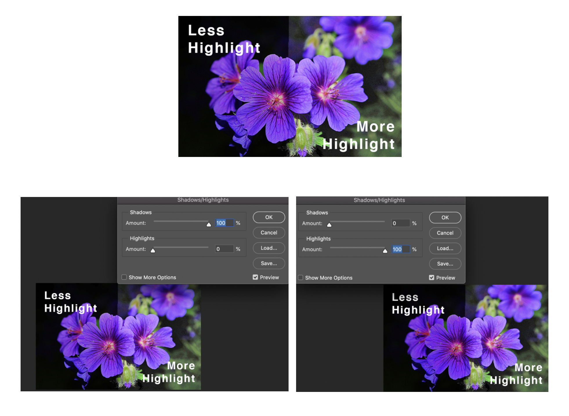
Shadows/Highlights
Shadow and highlights allow you to target the dark and lights of your photo and adjust them rather than uniformly brightening or darkening across an image. For a darker image with less white highlights up the shadows and lower the highlights. For an image with more white highlights and fewer shadows lower the shadow and up the highlights. Both examples are shown below.
Shadow and Highlights Mini Practice
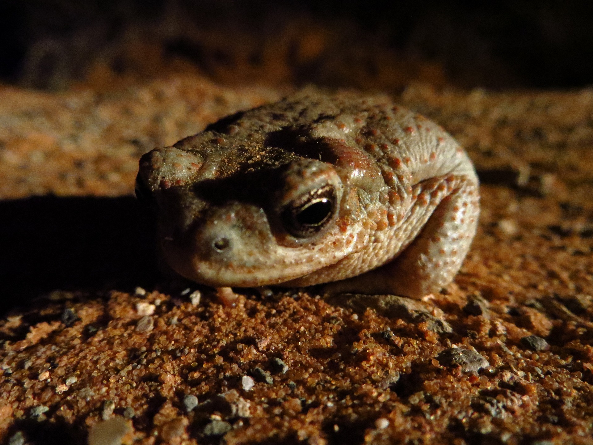
- Save the following image to import into photoshop.
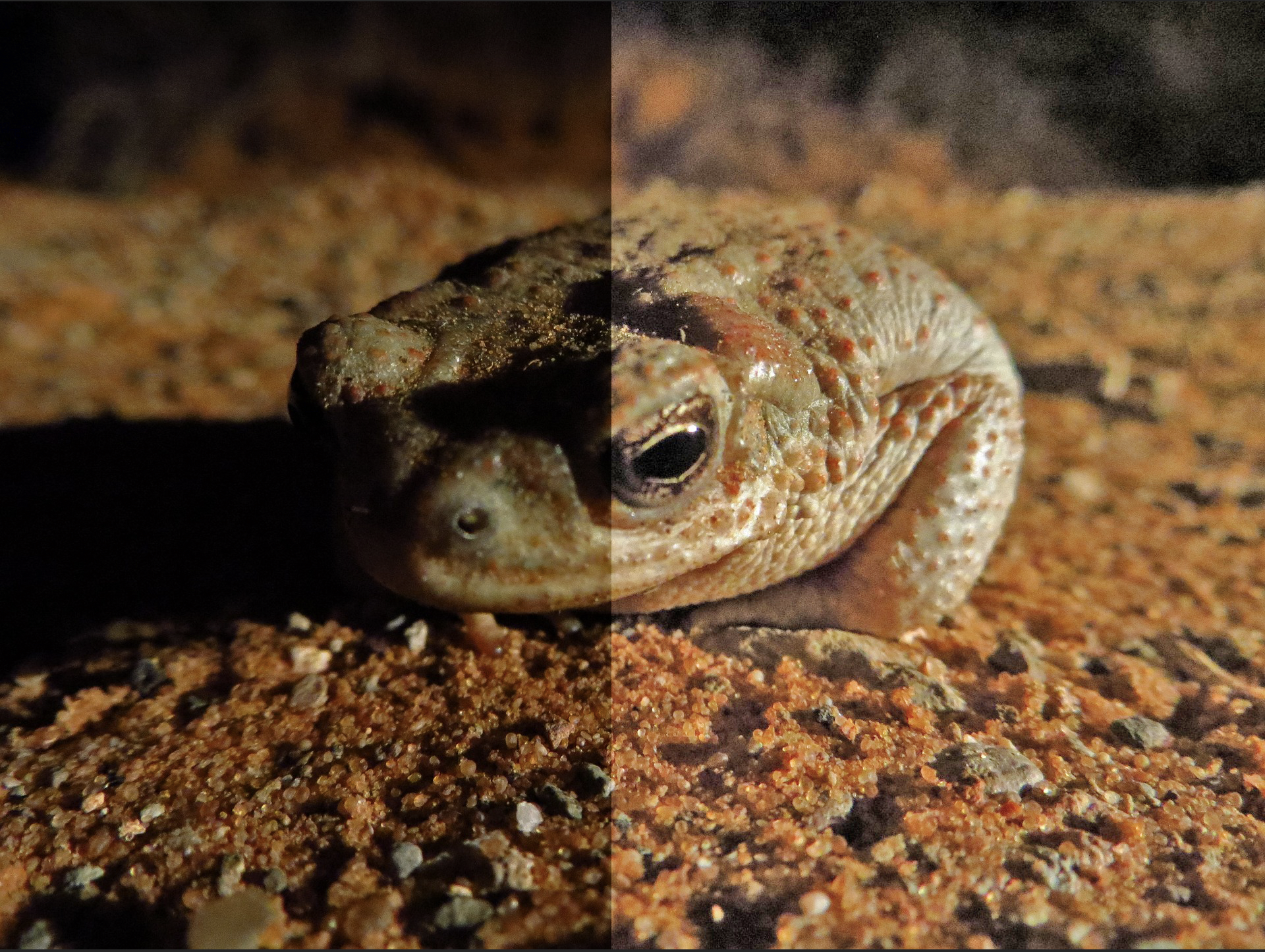
2. Highlight all the way. Quick export as .PNG.
3. Reset image. Shadow all the way. Quick export as .PNG.
Should look like this (not split in one photo though, two separate photos):
4. Post on Basecamp the original photo along with the new edits. Label them appropriately.
Layer and Masking for Isolated Color Correction Edits
Using a layering mask for color correcting is another great way to advance your editing skills and target specific areas of an image.
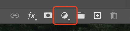
First you will want to upload your image and un-click the pad lock button. Then you will click the half moon icon below and a new layer will appear.
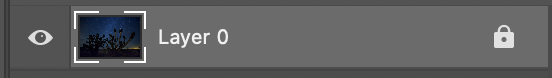
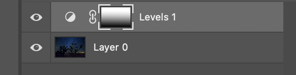
In the pop up window I selected “levels” you can pick any of the options when using this tool. Then in the layers, a box above will have the area where you adjust your photo.
Now let’s say you only wanted a specific part of your image to be brightened, for this example, we only wanted the upper half of the sky to be brightened, and now all of it is.
By clicking the the rectangle to the right of the half circle you can pick what parts of an image will not be affected by the edits you just made. You can use a soft brush or the gradient tool like I did. Just make sure the color you are using is pure black!
Now look at that difference. The sky is brightened from adjusting the levels but the gradient was applied to the lower half of the image to keep it dark.
Layer and Masking for Isolated Color Correction Edits Mini Practice
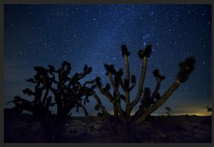
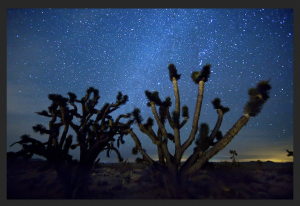
- Save the following image to import into photoshop.
2. Using the steps explained above make the image have even brightness across. concentrating on targeting the right-hand side. You may use a gradient or a soft brush tool.
4. Post on Basecamp the original photo along with the new edits. Label them appropriately.