
In this second part of CLIO training you will be doing more advanced stylings using CSS classes and HTML code snippets.
Part 1: Getting Familiar with the basics of the Chrome Inspect Tool
These set of instructions will be utilizing Chrome as the default browser. The logic should apply to other browsers as well, however the interface might look a little different, therefore using Chrome is recommended.
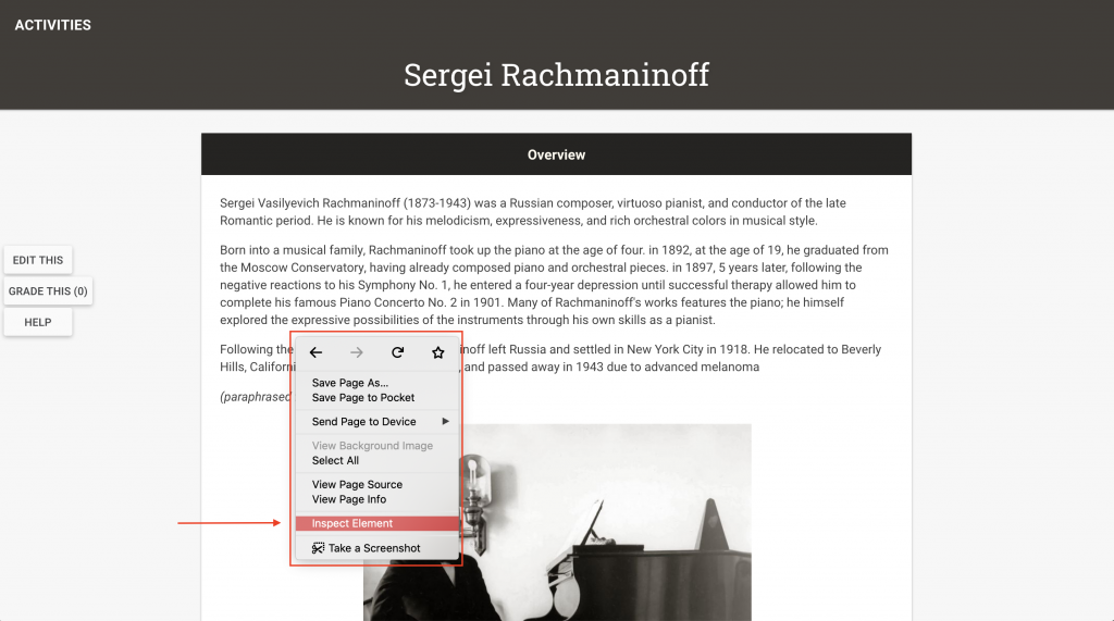
- Navigate to one of your CLIO activity page.
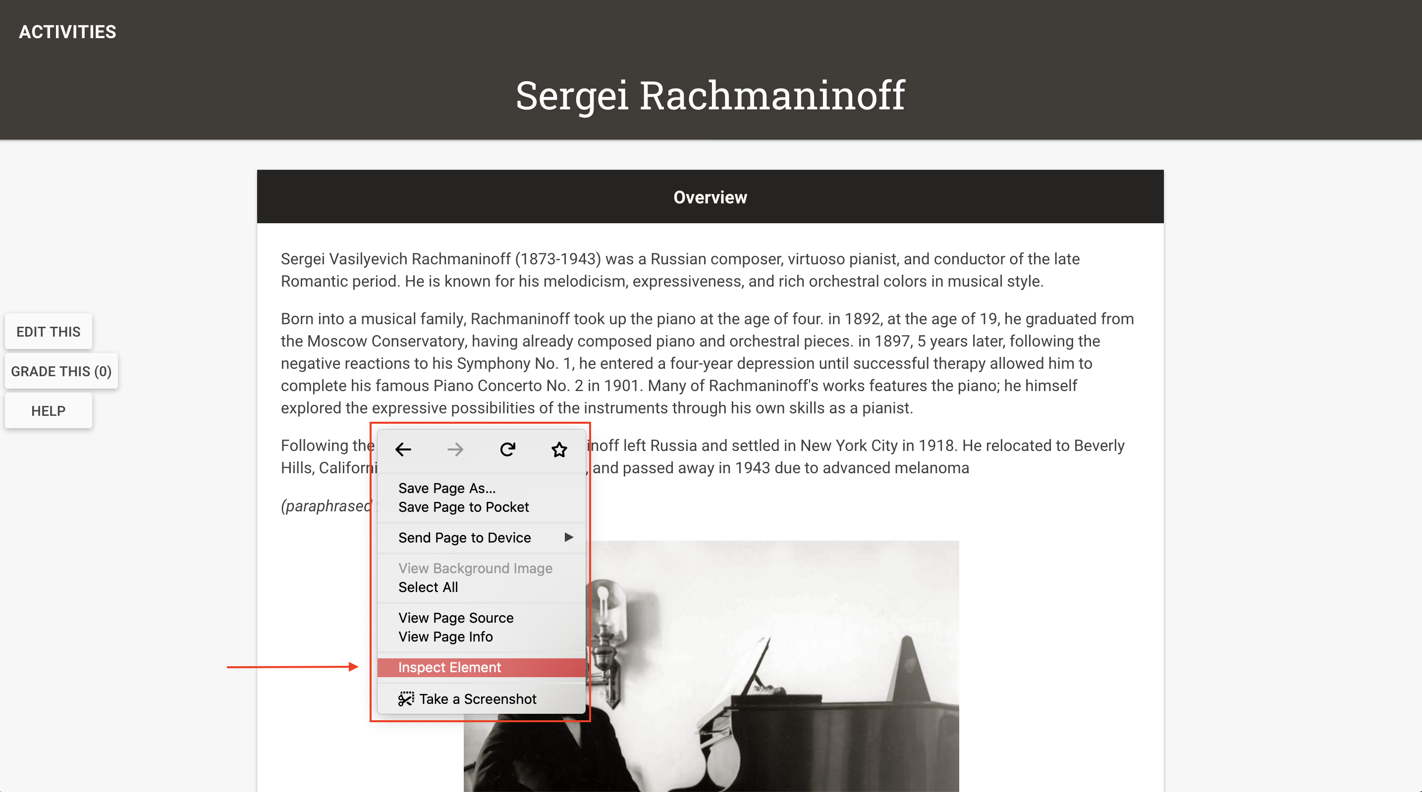
- Right click any where on the page > Inspect.
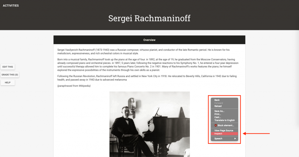
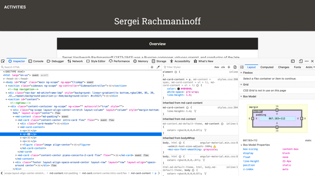
- Your browser should look something like this.
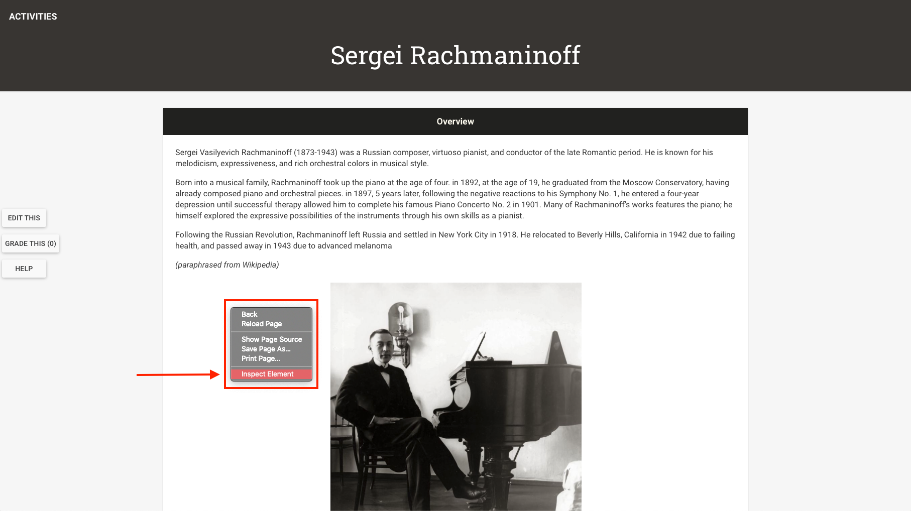
- If you’re on Safari, right click anywhere on the page > Inspect Element.

- Your browser should look something like this. Notice how the HTML elements tree looks the same as the one in Chrome, but the window pops up at the bottom.
- If you’re on Firefox, right click anywhere on the page > Inspect Element.
- You should see something like this.
- If you’re on Safari, right click anywhere on the page > Inspect Element.
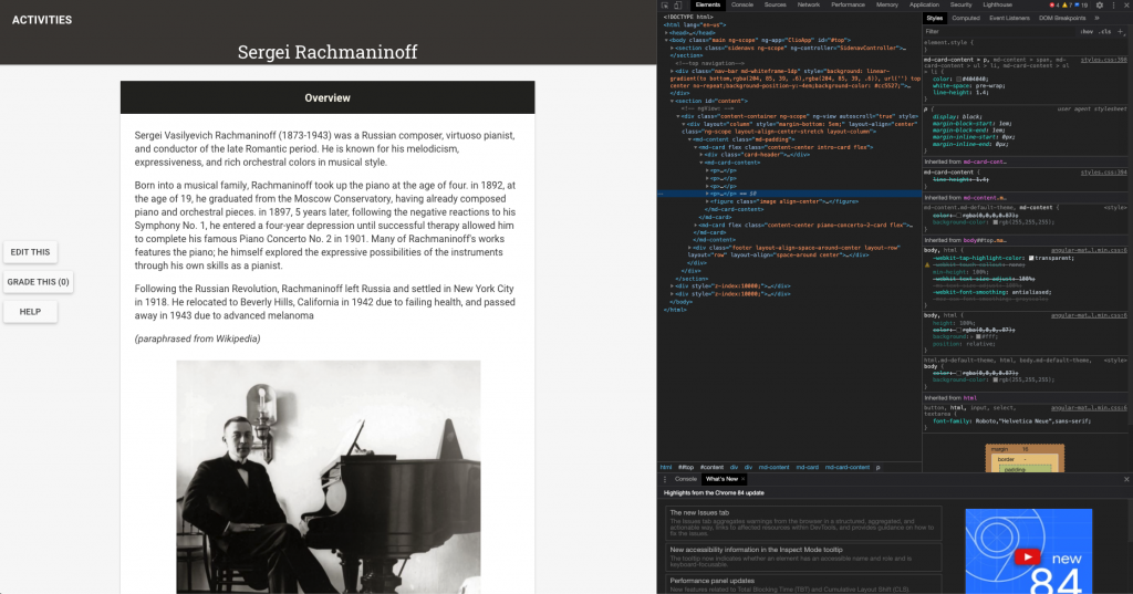
- Explore around a little bit with this Inspect Element interface. It is a lot of information and it is not necessary that you understand everything on this interface, but here are some main things to notice.
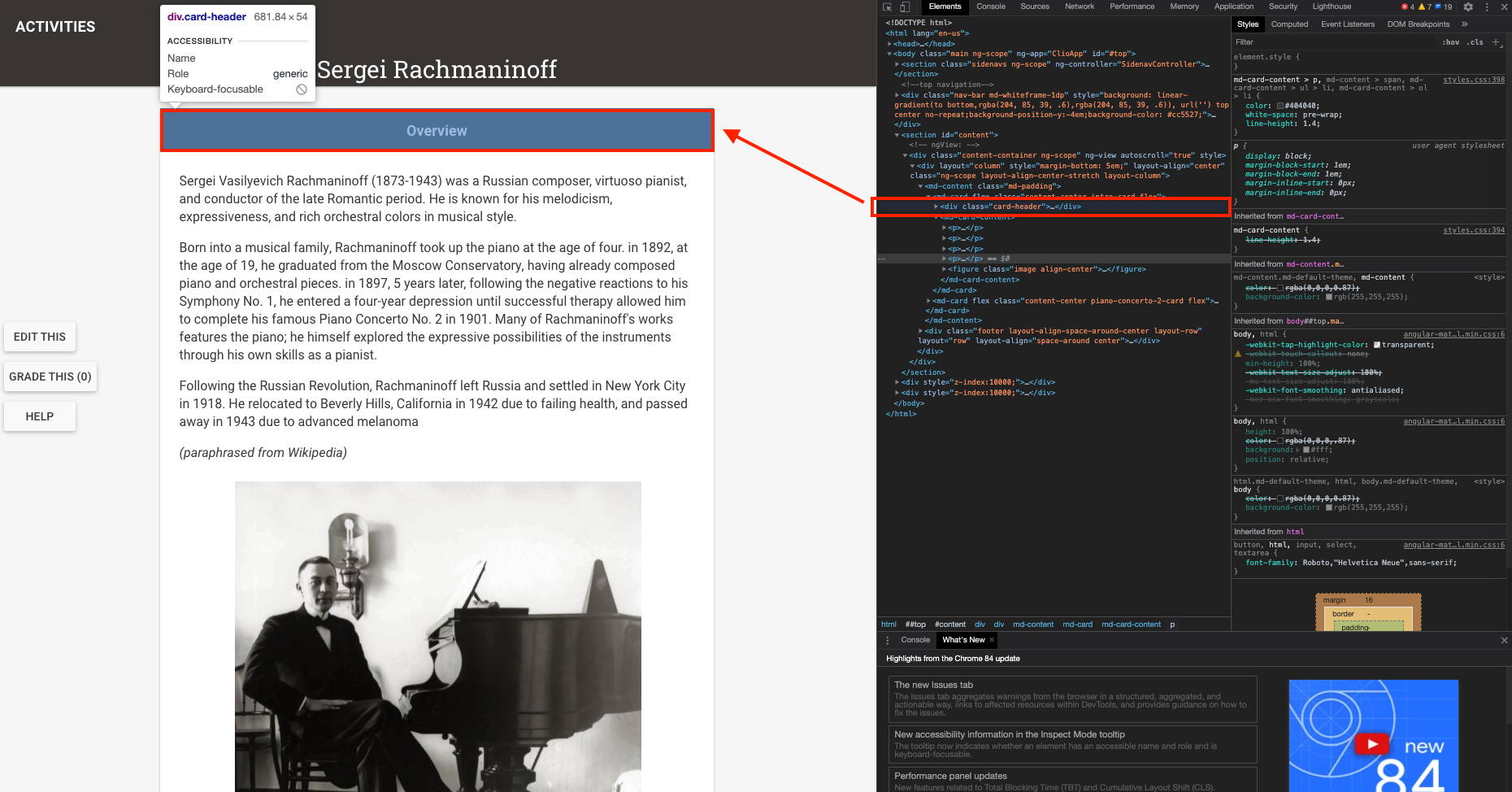
- Hovering on a line of code will prompt the browser to highlight the element that is being selected. For example, when hovering on an “<md-content>”, we can see that the card is being highlighted. Therefore, in order to modify the stylings of the card, we can modify the md-content element in our CSS.
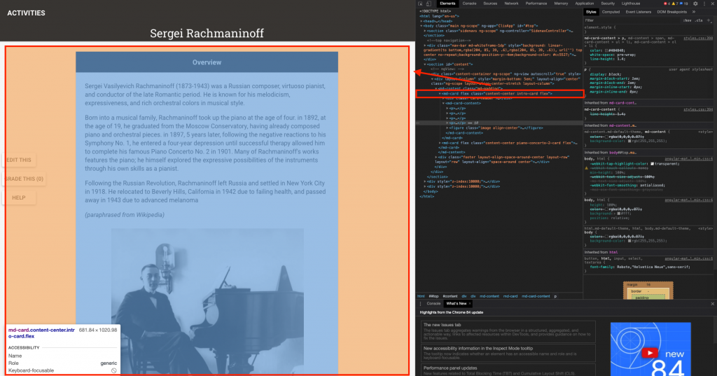
- Another way of modifying the stylings of an element is by using class names, like we’ve been doing with card headers. Here you’ll notice that this div element has a class of “card-header”, and hovering on it highlights the black card header we’ve designed.

- In short, if you’d like to style any elements but you don’t how know to point to it, you can utilize this tool to help you identify it’s class name or element type.
- Hovering on a line of code will prompt the browser to highlight the element that is being selected. For example, when hovering on an “<md-content>”, we can see that the card is being highlighted. Therefore, in order to modify the stylings of the card, we can modify the md-content element in our CSS.


Part 2: CSS “Housekeeping” practices
Here are some CSS practices to keep your code organized, readable, and reusable.
Comments
Comments in your CSS code will not affect the code itself. In other words, the comments you made in CSS will not be rendered on the browser. Comments are just for you to organize your code, so use it as you need it.
To insert a comment, follow this syntax:
/* some comment here */
So, for example:
/* starting CSS code for card headers */
.card-header {
  background: #626c66;
}
/* ending CSS code for card headers */
Declaring global colors
Do you find it a little annoying having to recopied the hex codes for your colors every time? Now you can declare your color palette from the beginning and just use it as you go
:root {
  --dark: #252422;
  --light: #fffcf2;
  --beige: #ccc5b9;
  --green: #626c66;
}
Then, whenever you want to use it, simply follow this syntax:
[some-attribute]: var(--color-name);
For example:
.card-header {
  background: var(--dark);
}
Declare this at the beginning of your CSS stylesheet so you can reference to it anytime.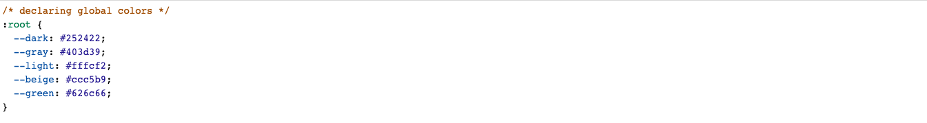
Part 3: More CSS Fun Stuff!
Changing the background of the module
- Let’s first try changing the background color
- Navigate to the Course CSS stylesheet.
- To modify the background, we’d need to modify two things: the “content-container” class and the “md-content” element.
-
.content-container { background: var(--green); } md-content { background: inherit; } - Notice that the “md-content” doesn’t have a period in front of it. This is because we’re modifying the element md-content, not the class name md-content. You can read more about CSS selectors here.
- The “inherit” keyword means that the “md-content” will have the same background properties as it’s parent, which is the class “content-container” in this case.
- Check for your result.

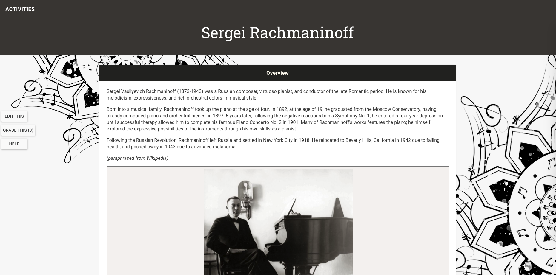
- Let’s try making the background an image rather than a solid color.
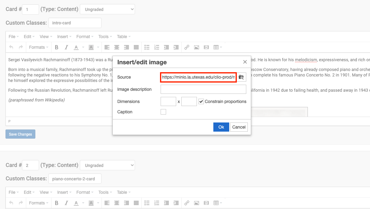
- First, upload the image. Click “Insert/Edit Image” on any card editor.
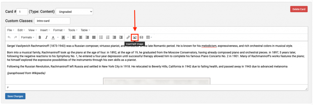
- Choose an image for your background, then copy this entire link.
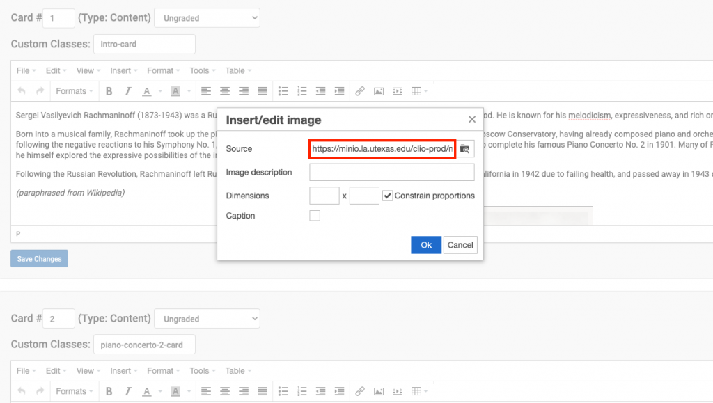
- Click “Cancel”. This is because we don’t want to actually insert the image into this card. This image has been uploaded to this link when you input it into “Source”. Don’t lose this link. Copy and save it somewhere so you can access it, otherwise you will have to upload it again.
- Navigate to the Course CSS stylesheet.
- Make these changes to the class “content-container”. Comment out the old color and give it a new background.
-
.content-container { /* background: var(--green); */ background: url("https://minio.la.utexas.edu/ clio-prod/module_1407/ vSLTtt2Zt32WQ99rWhopLFxDnMM7ZbvpJdQRdqpI.png"); } - Note: the link above is broken up into many lines for the purposes of viewing on this KB post, but please keep the link on one line in CLIO.
- Let’s view the changes.
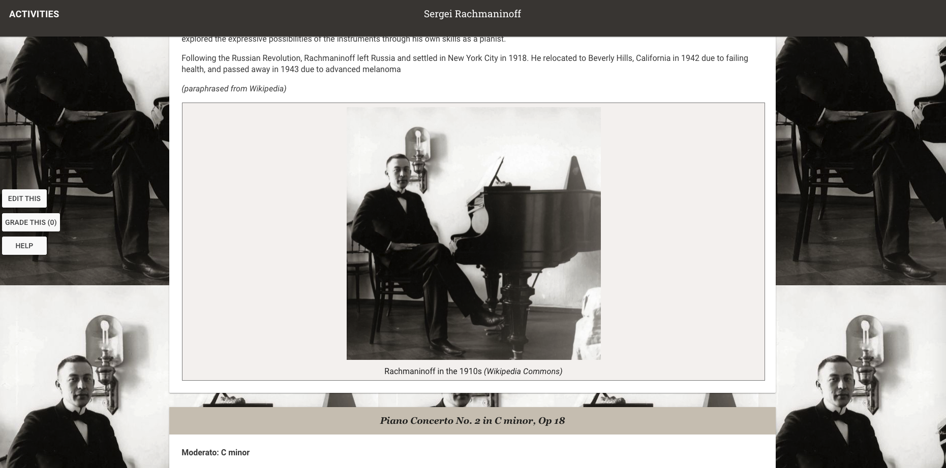
- Note: you may want to manipulate your background image a little bit. When the browser exceeds the image dimensions, it will repeat the image in a grid form. Something like this.
The background used (with the mandala) is designed so that the width is 1920 px (maximum browser size), and the height it 1080 px, however the two mandalas that got cut off are aligned perfectly so that they look like one when repeated.
Another quick fix for this problem is to fix the positioning of the background image even when the user is scrolling. Here’s the CSS to achieve that effect. -
.content-container {
  /* background: var(--green); */
  background: url("https://minio.la.utexas.edu/
  clio-prod/module_1407/
  vSLTtt2Zt32WQ99rWhopLFxDnMM7ZbvpJdQRdqpI.png");
  background-attachment: fixed; /* fixed position */
}
- First, upload the image. Click “Insert/Edit Image” on any card editor.


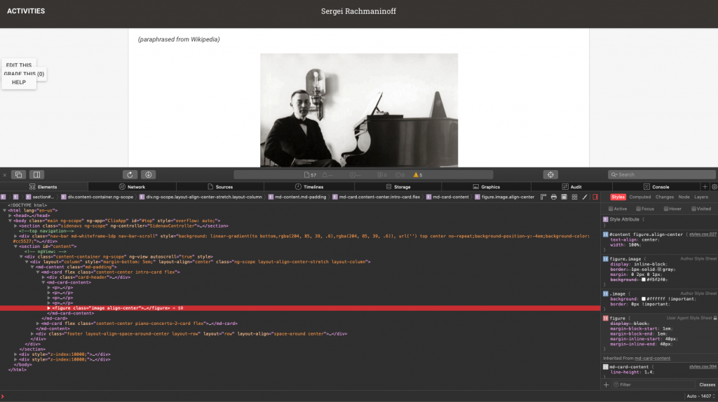
Formatting Image Figures and Figure Captions
Let’s format this image figure.
- An inspection reveals that this image belongs to the element “figure” and has two classes, “image” and “align-center”.
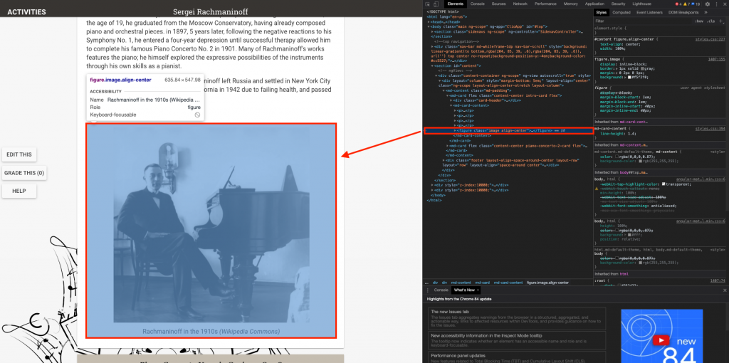
- Override the default formatting for this image with this code, modifying the class “image”.
-
.image { background #ffffff !important; border: 0px !important; /* remove the border frame */ } 
- Let’s check for the result. The background and border are now gone!

- Another way of doing this is to modify the figure element.
-
figure { background: none !important; /* this works like setting it to white */ border: 0px !important; } - Let’s also modify the figure caption.
-
figcaption { color: #959593; } - And view the result.
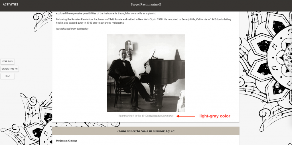
- Note that any image uploaded will now have the same formatting as this one, since they all belongs to the element figure and figcaption.


Adding an Image as the Navbar Banner or Card Header
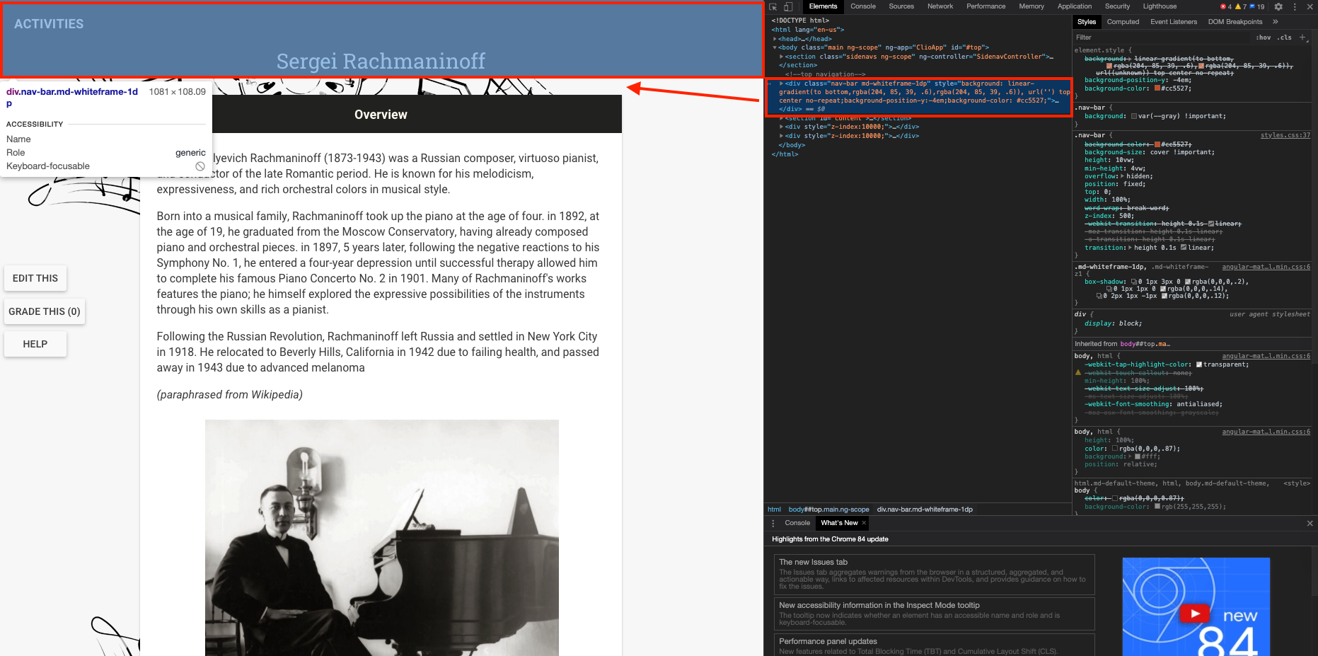
- Add an image as the navbar banner background.
- You can modify the navbar by styling the class “nav-bar”.

- Choose an image with a width as close to 1920 px as possible. It is also recommended that you crop you image to a banner height (~500 px – 600 px). This will make inputting the banner a lot easier since you won’t have to manipulate the image too much. Here’s an example of the banner I’ll be using.

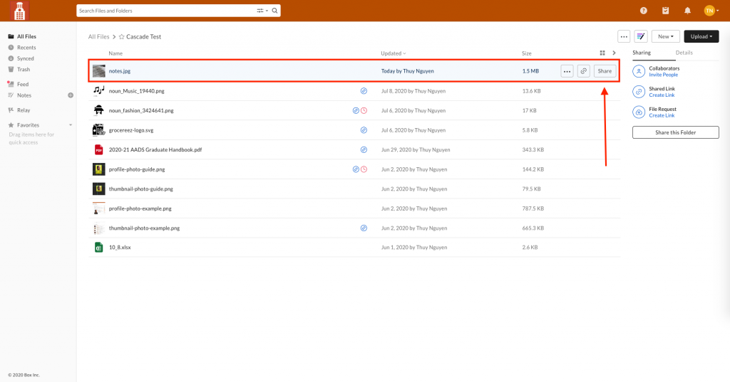
- After you’ve chosen the image, let’s try uploading the image using box rather than CLIO this time, and link it from CLIO. Navigate to your box folder and upload the desire image.
- In Box, click “Share” on the image you’d like to link.
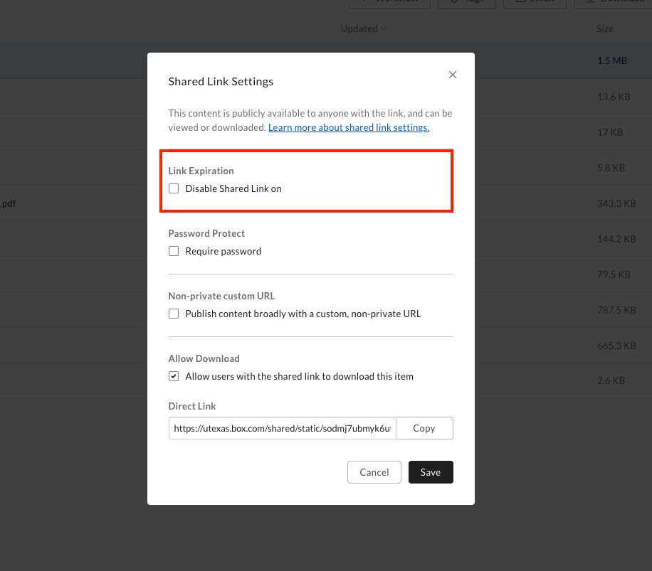
- Toggle “Create shared link”.
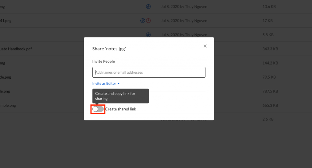
- Click “Link Settings”.
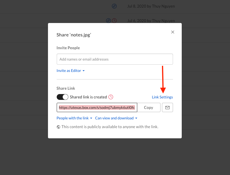
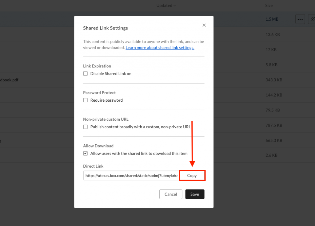
- Uncheck “Disable Shared Link on” and click “Save”, then click “Link Settings” again and click “Copy” on “Direct Link”. Please click “Save” before attempting to copy the direct link.
- Navigate back to CLIO Course CSS stylesheet and add this code.
-
.nav-bar { background-image: url("https://utexas.box.com/ shared/static/sodmj7ubmyk6utl0fc26nuigs7mgg1fi. jpg") !important; /* keep this on one line */ } - “Save Course CSS” and view the result. It might take a little bit to load if your image file is large.
- Let’s add a color overlay to this and make it more cohesive. Use this site to convert your desire color from hex to rgb value, then copy the rgb color under “CSS color”. Paste it next to your image url. Please note that the you need to change “background-image” to “background”.
-
.nav-bar { /* changed from background-image to background */ background: url("https://utexas.box.com/ shared/static/sodmj7ubmyk6utl0fc26nuigs7mgg1fi. jpg") rgba(37, 36, 34, 0.7) !important; /* keep this on one line */ background-blend-mode: multiply; } - Notice that I added a last value, 0.7 to the rgb code and also an “a” after “rgb”. This value specify the opacity of the color overlay, and ranges from 0 – 1.
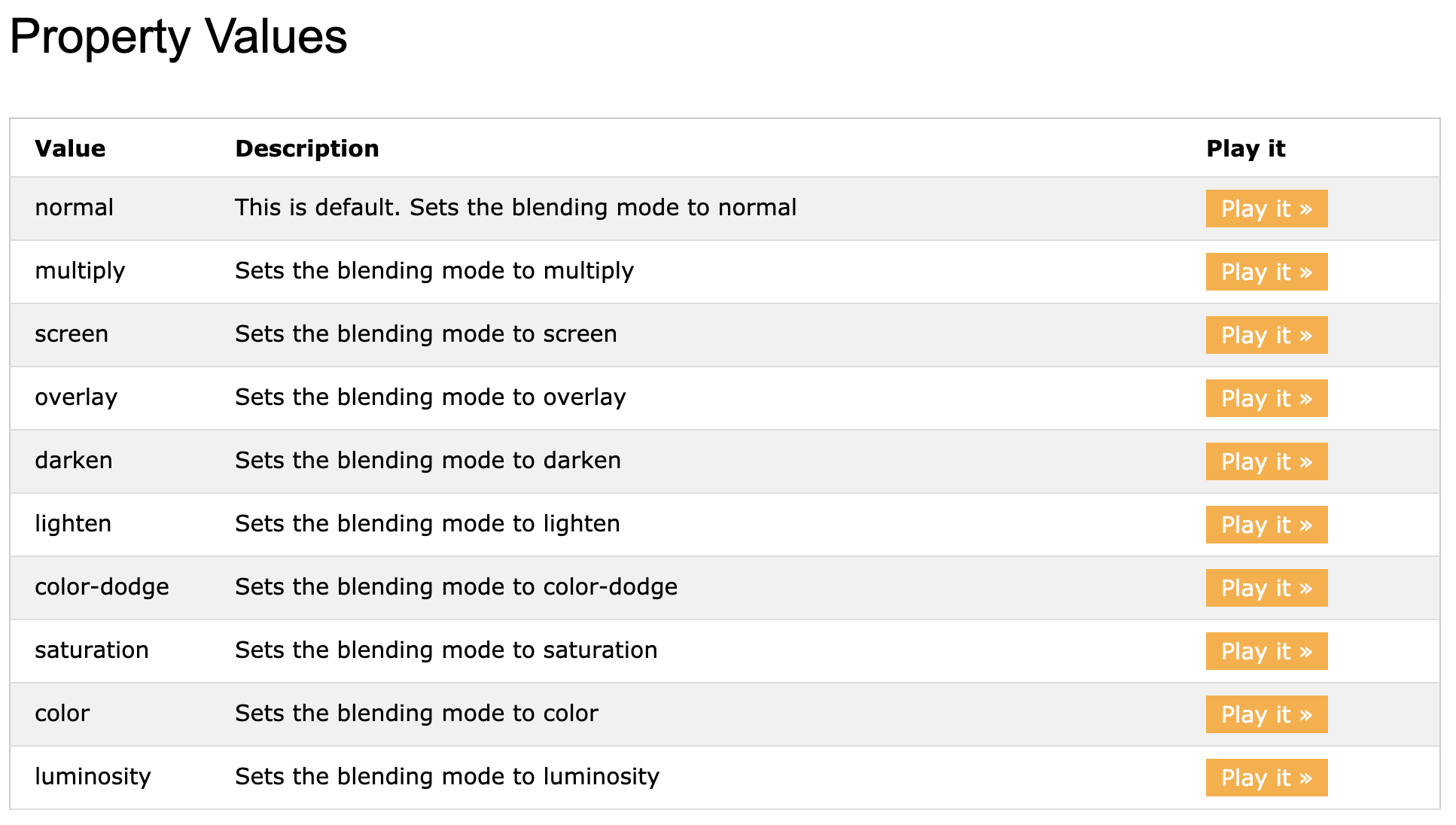
- Feel free to explore other blend modes as well.
- Here’s how it turned out.

- You can modify the navbar by styling the class “nav-bar”.
- Add an image as a card header background.
- This is very similar to how you’d add an image as a nav-bar background. Instead of modifying the class “nav-bar”, you’d want to either modify the class “card-header” (if you want to make the image the default card header) or in your custom class “[some-class-name] .card-header” (if you want the change to be local to that header only.
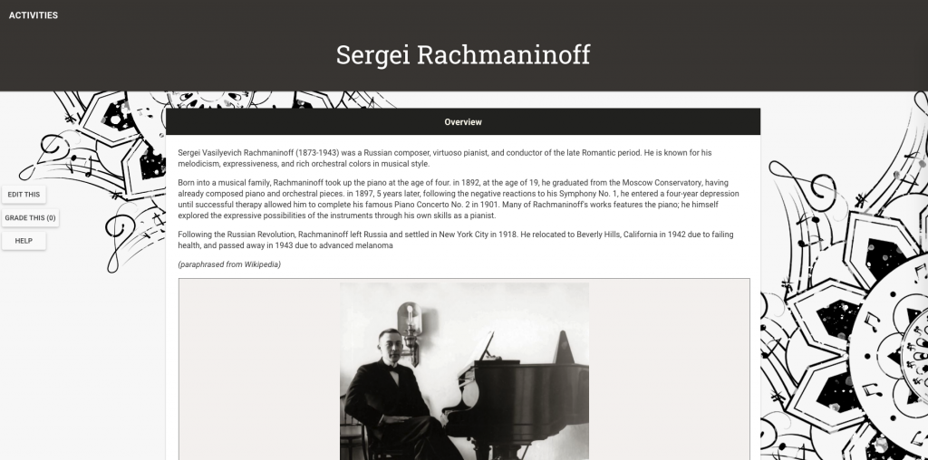
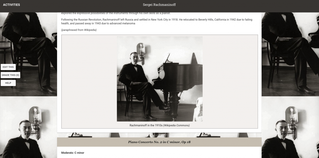
- For example, let’s add an image to the first card header only. Upload the image to either Box or CLIO like how you did before and obtain the link. It is recommended that you chose an image with width of roughly 1248 px. Here’s the one that I picked for my header.
- My first card header class name is “intro-card”.
-
.intro-card card-header { background-image: url("https://utexas.box.com/ shared/static/fpzxsz162u7l91d4ornkqyjq0qaldk0z. jpg"); line-height: 7; /* makes it taller for image */ } - Here’s how it turned out.

- Notice that only the top portion of the image is shown. If you’d like to display the middle or bottom part of the image, try playing around with “background-position”.
-
  background-position: left; /* middle, or */
  background-position: bottom; /* bottom */


Embedding a Google Font
Let’s try embedding a Google Font to use with our headers / navbar.
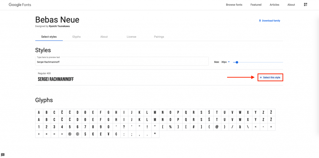
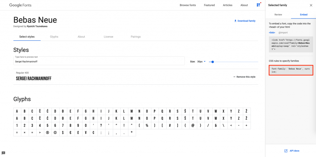
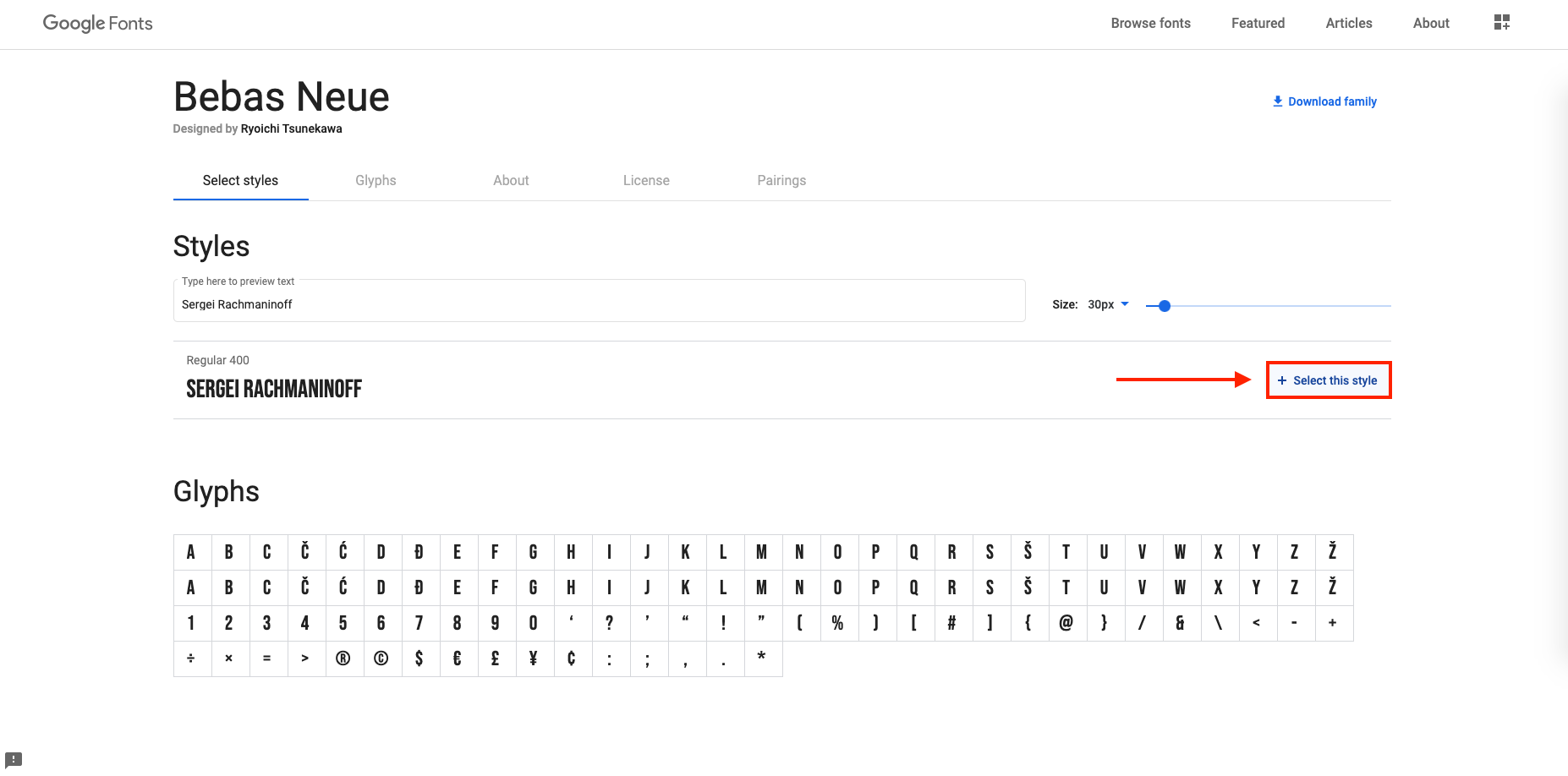
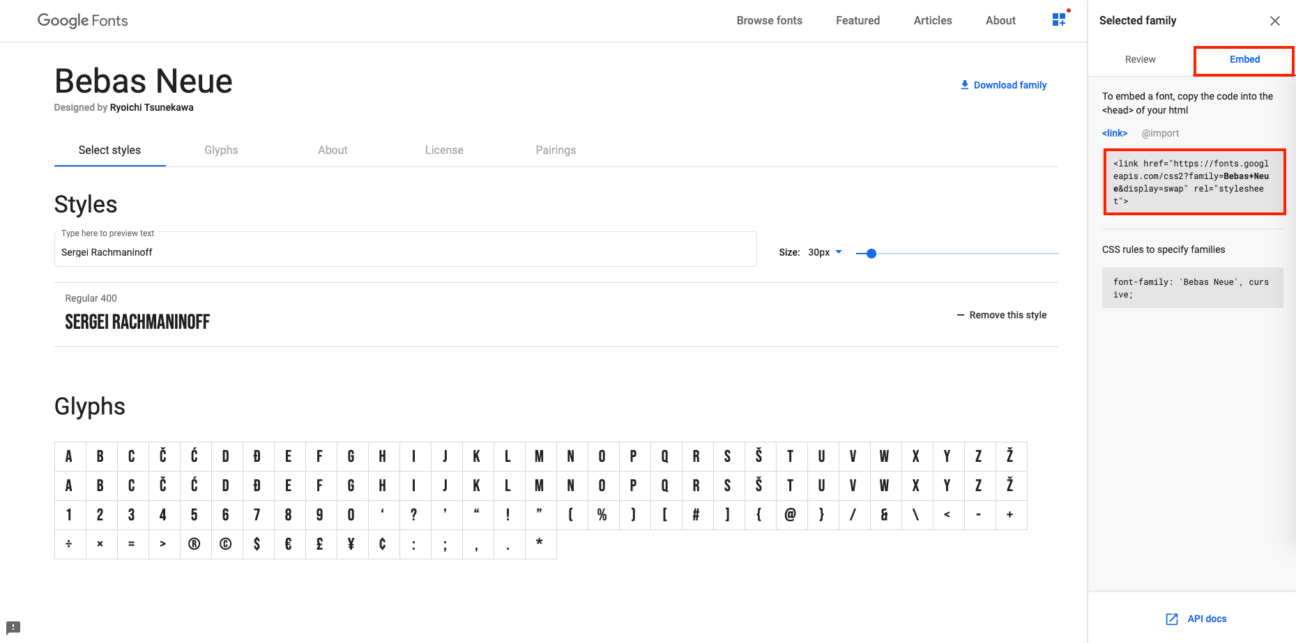
- Navigate to Google Fonts and pick a font you’d like to incorporate. Click on that font.
- Click “+ Select this style”.
- This right side-bar should pop out.
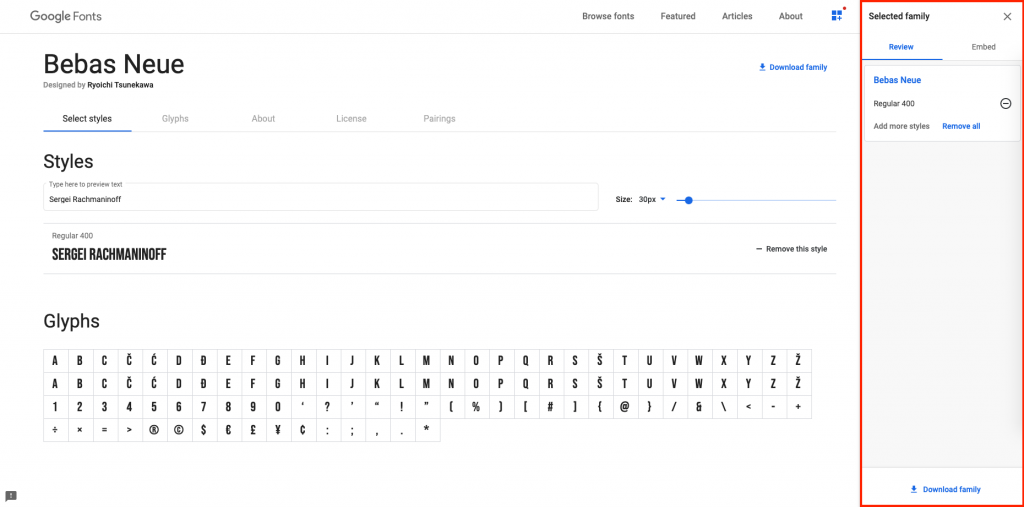
If it doesn’t, click “View your selected families” on the top right.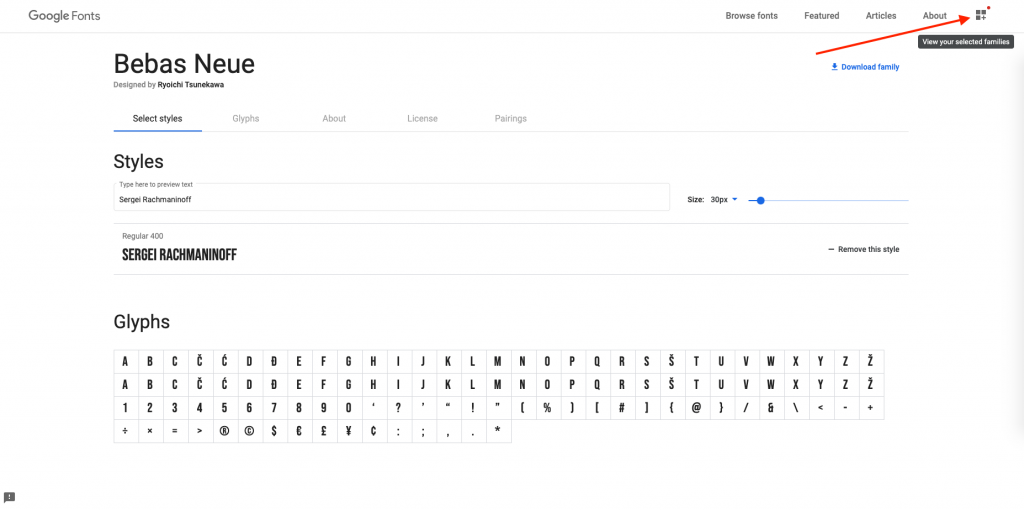
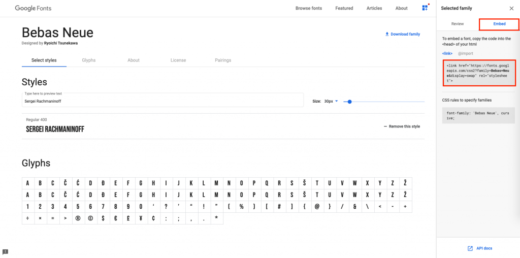
- Click “Embed” and copy this link.
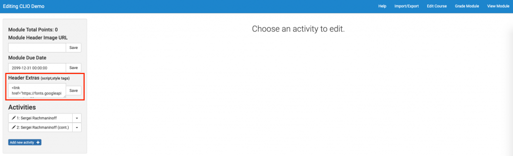
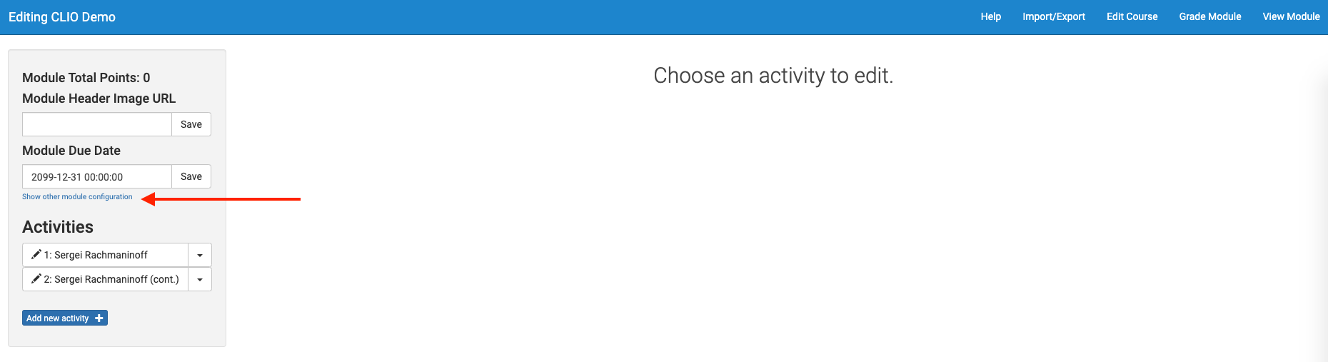
- Navigate back to your CLIO site. On the left box, under “Module Due Date”, click “Show other module configuration”.

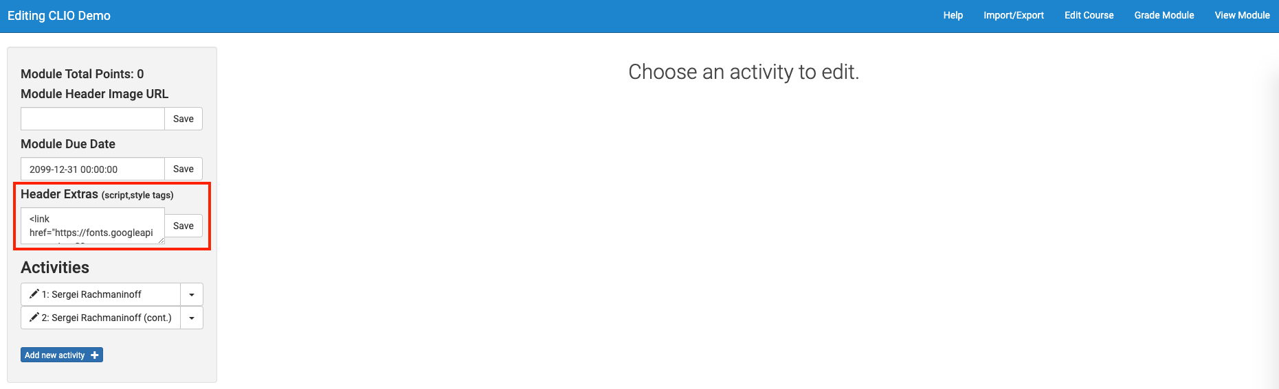
- Paste in the embed code and click Save.
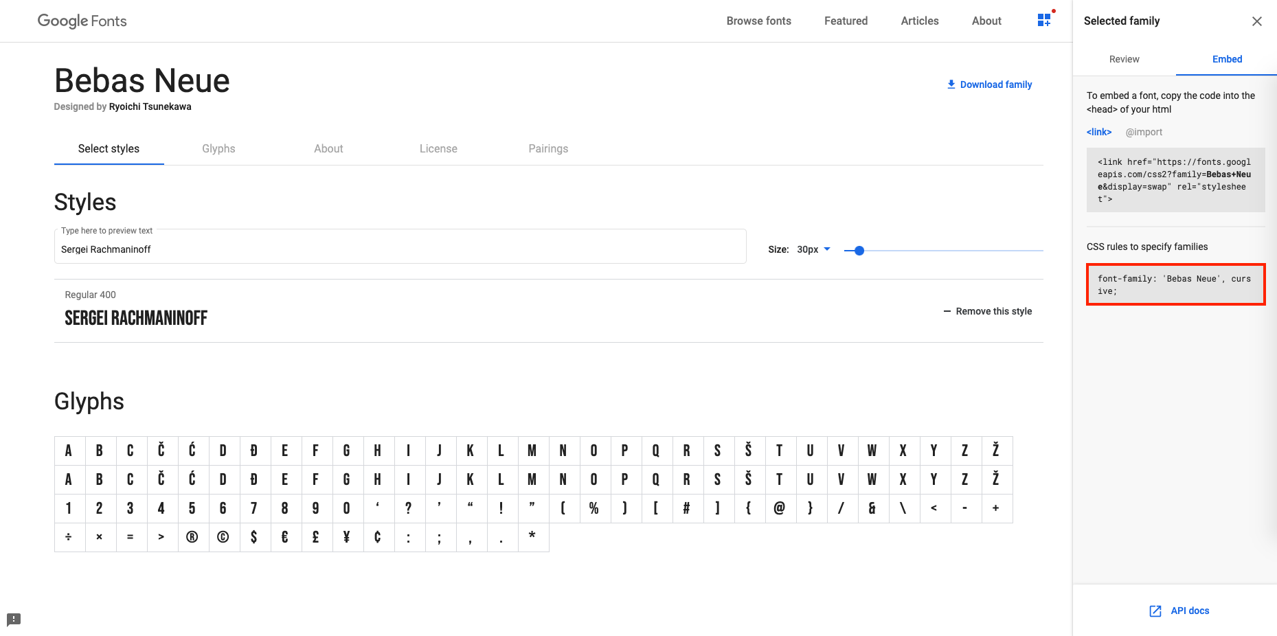
- Let’s change the navbar title font. An inspection reveals that this title has the id “module-title”.
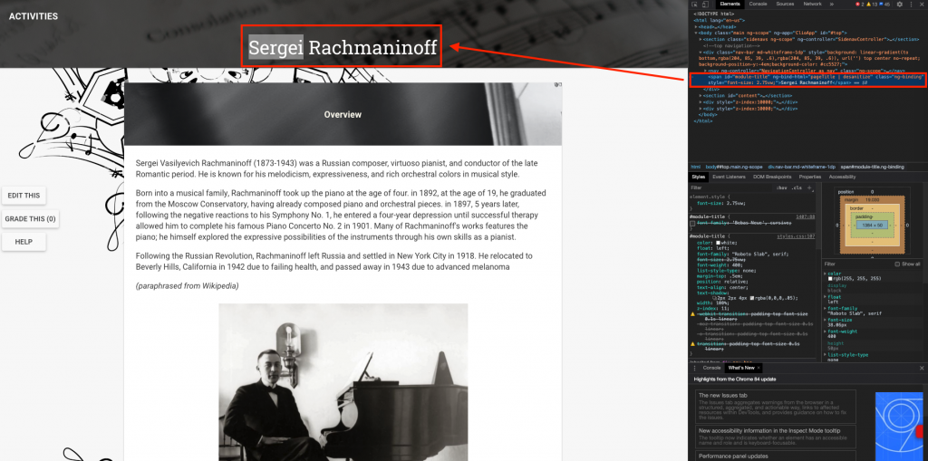
- Modify the CSS of an id with this syntax.
-
#module-title { font-family: 'Bebas Neue', cursive; } - You can find the CSS rules to specify families here, on the Google Font page.
- View the result.

- You may also change the font of the card header by pasting the same font family rules into “card-header:after”.
-
.card-header:after { color: var(--light); /* font-size: 18px; */ font-size: 25px; /* fix for Bebas Neue */ font-weight: bold; font-family: 'Bebas Neue', cursive; } - Feel free to play around with the font and font size to fit your module’s style, look, and feel.


Part 4: Some HTML Fun (and CSS)!
Formatting text-wrapped image figures
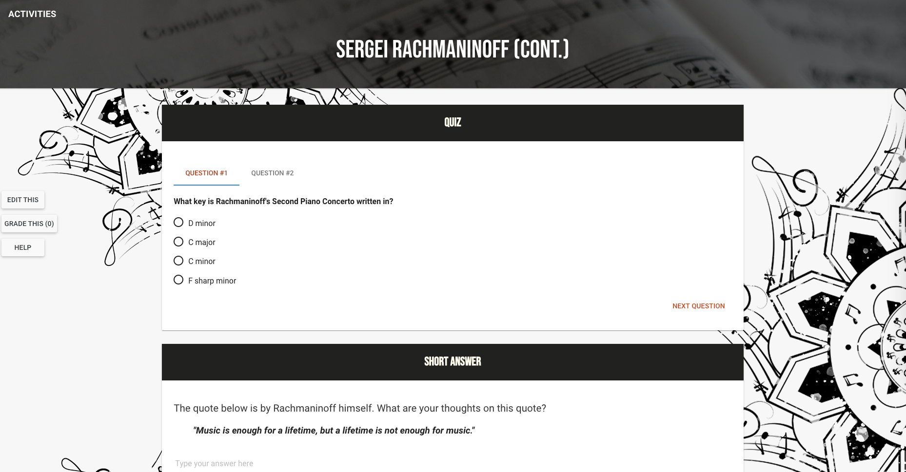
Let’s make an image float left or right.
- Upload the image into your card using the editor.

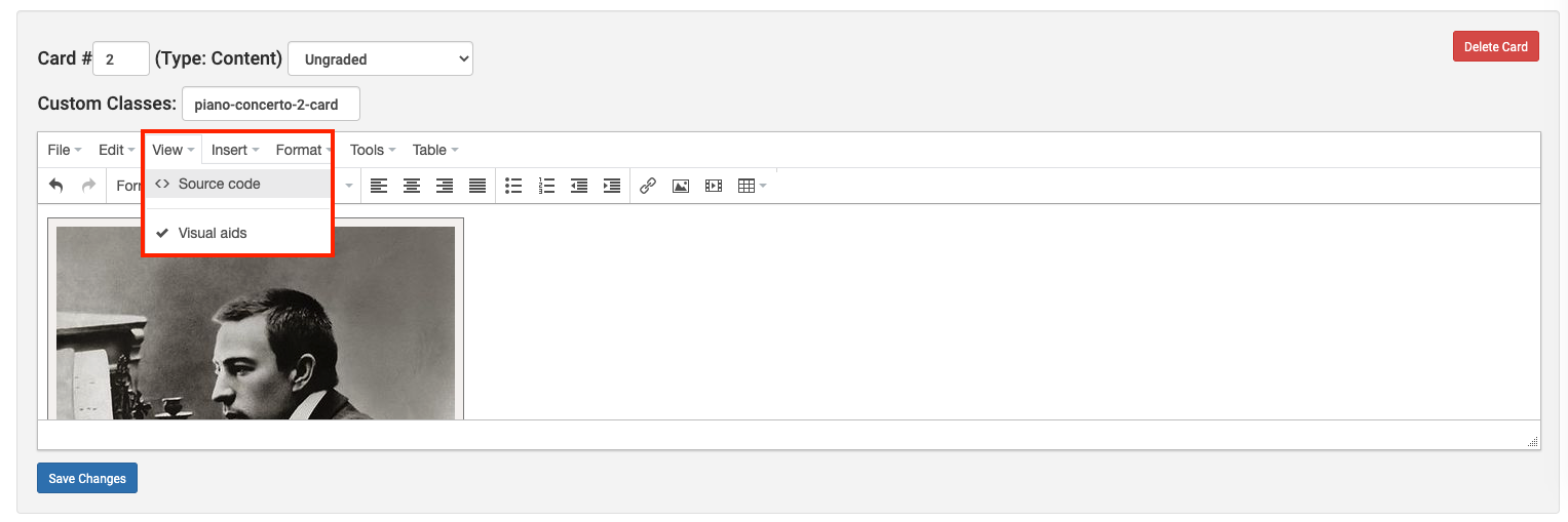
- We’re going to add a class to this image so that we can format it in our CSS. Click View > Source Code.

- The Source Code editor does not format HTML code, therefore it is a little difficult to locate the figure, however try using the text as cues to locate the figure.
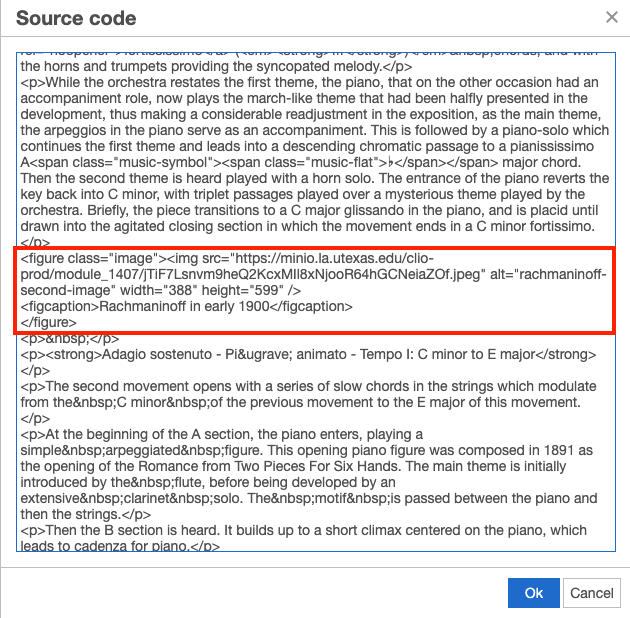
- Modify the class attribute.
-
<!-- here's how you add a comment in HTML -->
<!-- so, instead of -->
<figure class="image">
<!-- add another class by changing it to -->
<figure class="image image-left">
<!-- each class name is separated by a space -->
- Click Ok > Save Changes.
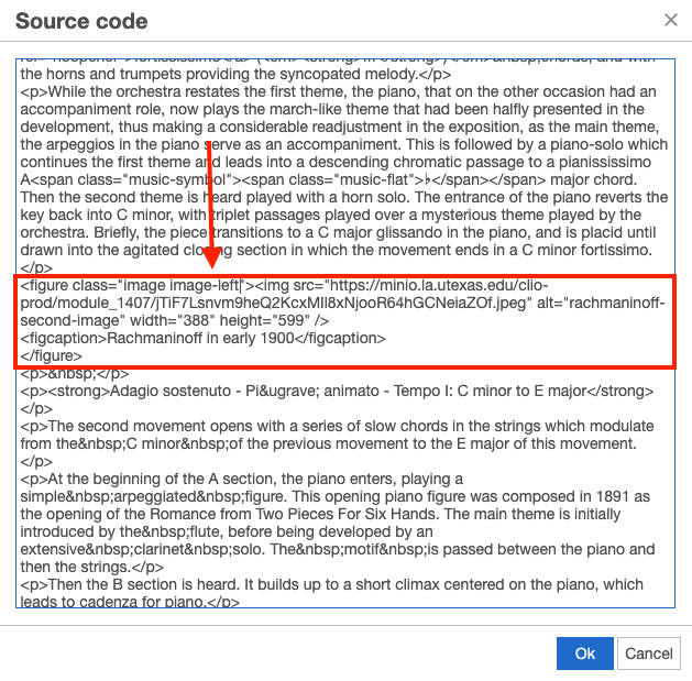
- Navigate to the Course CSS style sheet and add this code.
-
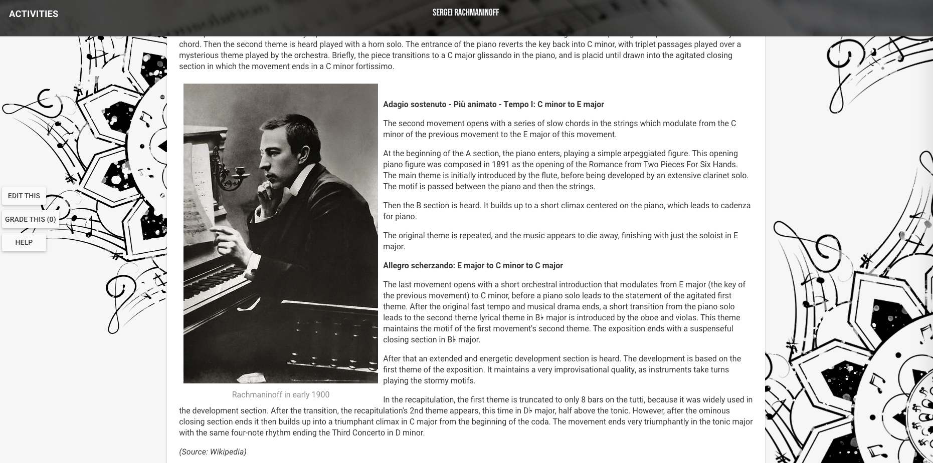
.image-left { float: left; } - Here’s how it turned out.

- Apply the same logic for floating right images.

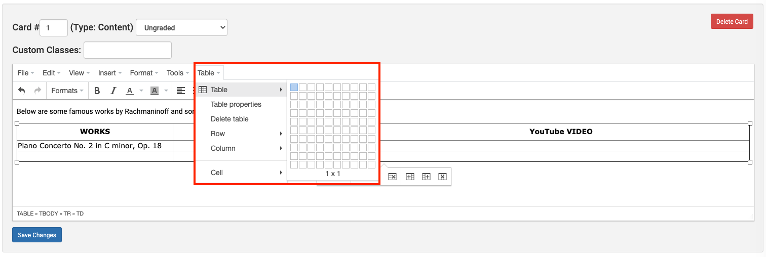
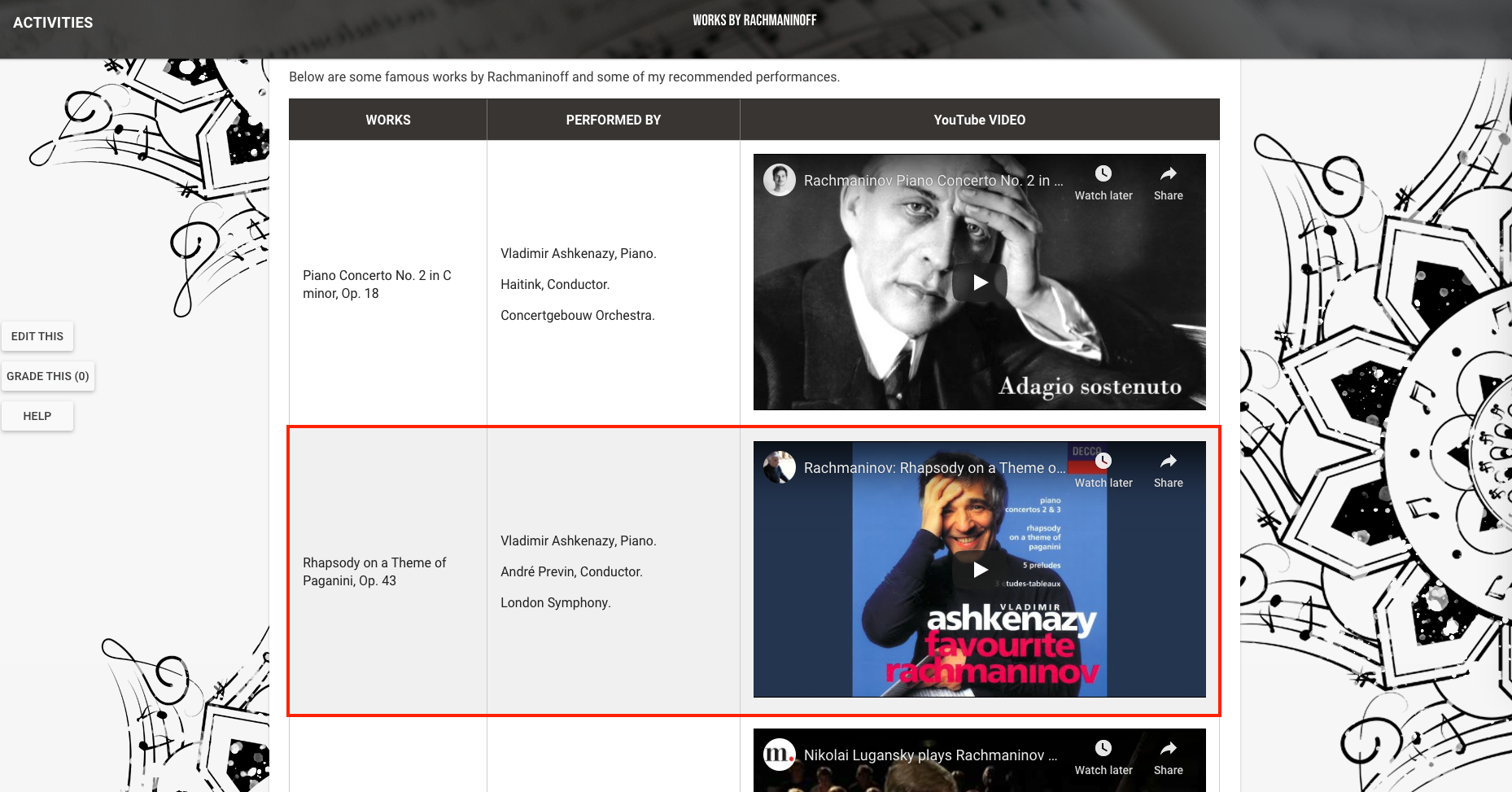
Adding and Formatting a Table
- Create a new Content Card.
- In the editor, click Table > Table, and choose the number of rows and columns that you want.
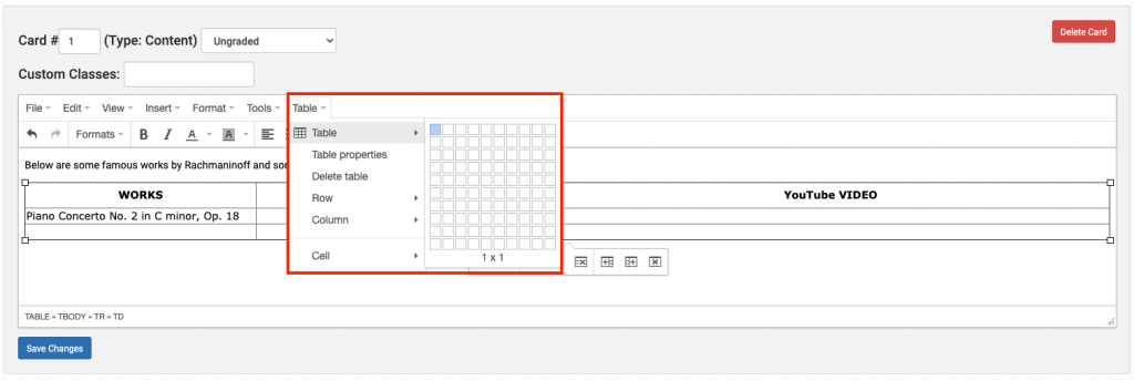
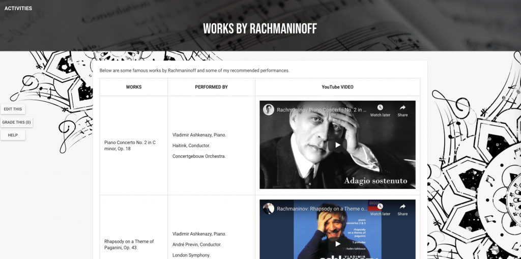
- The table interface is pretty intuitive, so feel free to explore around and add in your content. Here’s how mine turned out.
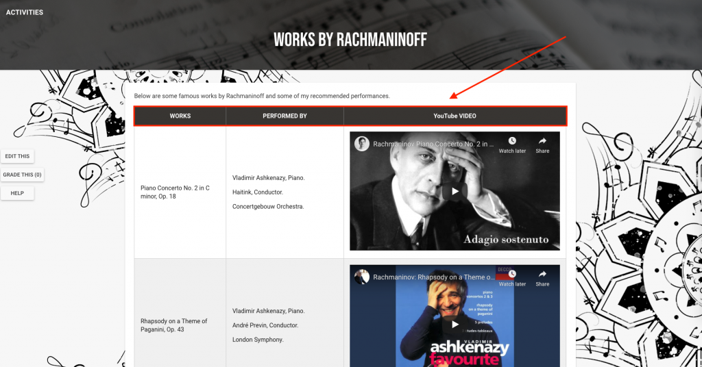
- Let’s enhance this table using CSS. First, let’s add an id to this table so we can uniquely identify it in CSS.
- Click View > Source Code.
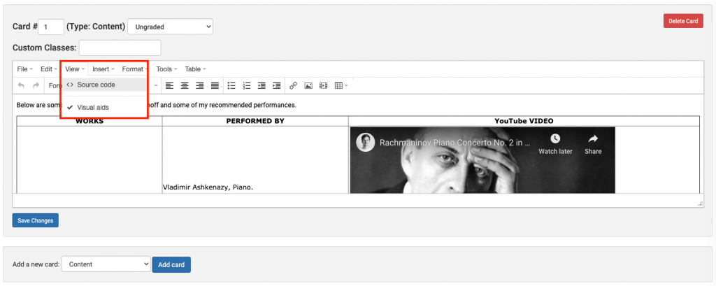
- Next to the key “table”, add an id. You may name it whatever you want. Follow the syntax:
-
<table id="some-id-name" . . . >
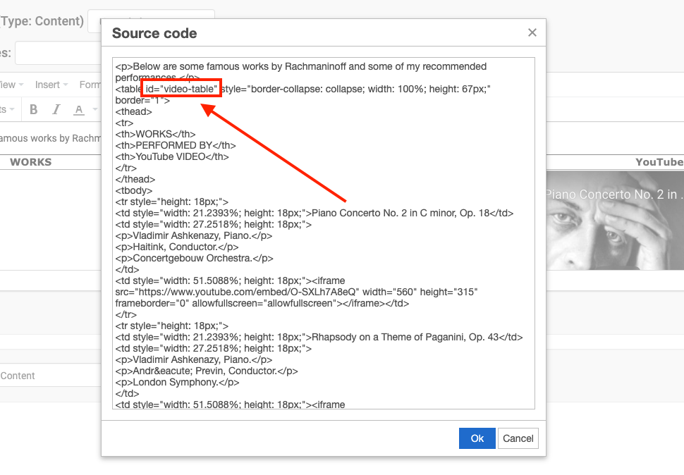
- Click Ok > Save Changes.
- Click View > Source Code.
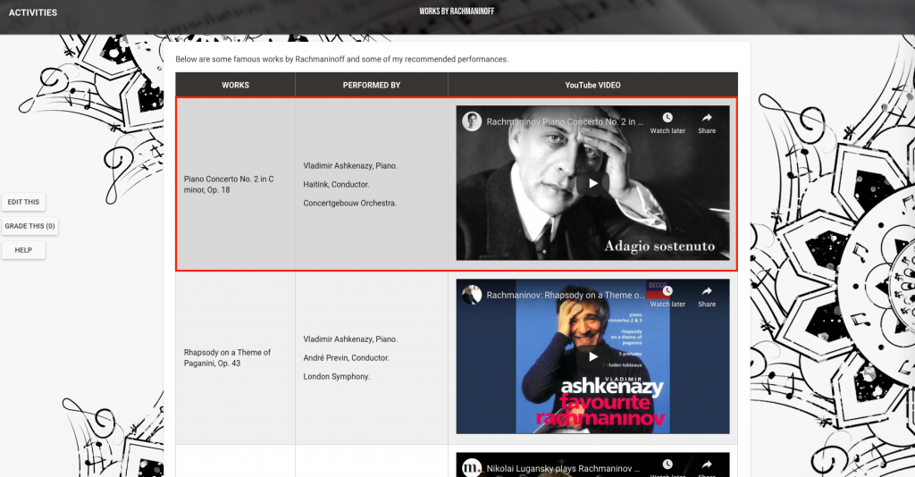
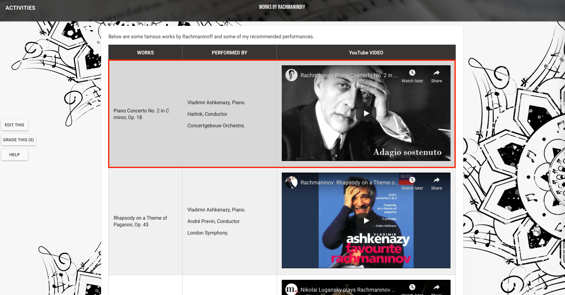
- Second, let’s format it so that the header is different from the rest of the table.
- The Table editor we used above default the first header row to be of the same kind with other content rows, so we’d have to change that to apply a unique styling to the header alone. Click View > Source Code.
- You’ll see that your table hierarchy is something something like this at the header section.
-
<table> <tbody> <tr> <td>First Header</td> <td>Second Header</td> <td>Third Header</td> </tr> <!-- content part --> </tbody> <table> - You’d need to change it into this. Be sure to keep all other attributes, (i.e. style).
-
<table> <thead> <tr> <th>First Header</th> <th>Second Header</th> <th>Third Header</th> </tr> <thead> <tbody> <!-- content part --> </tbody> <table> - Mine turned out like this.

- Click “Ok” and “Save Changes”.
- Navigate to the Course CSS stylesheet and add formatting to the table header following this syntax.
-
#your-table-id-name th { background-color: /* any color you want */; font-weight: bold; line-height: 3; color: #ffffff; /* text color */ } 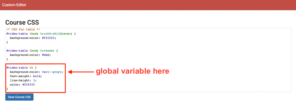
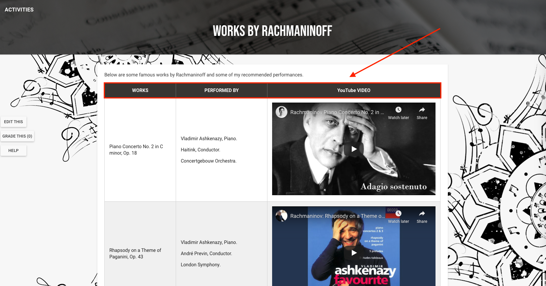
- “Save Course CSS” and view the result.
- Next, let’s make the table alternate colors.
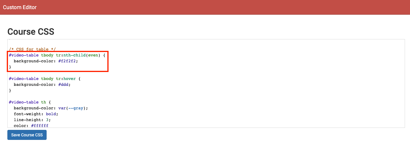
- In the Course CSS stylesheet, add the following.
-
/* these formats apply to only the even rows */ #your-table-id-name tbody tr:nth-child(even) { background-color: #f2f2f2; } 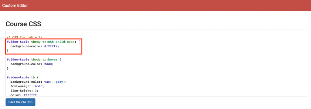
- “Save Course CSS” and view the result.
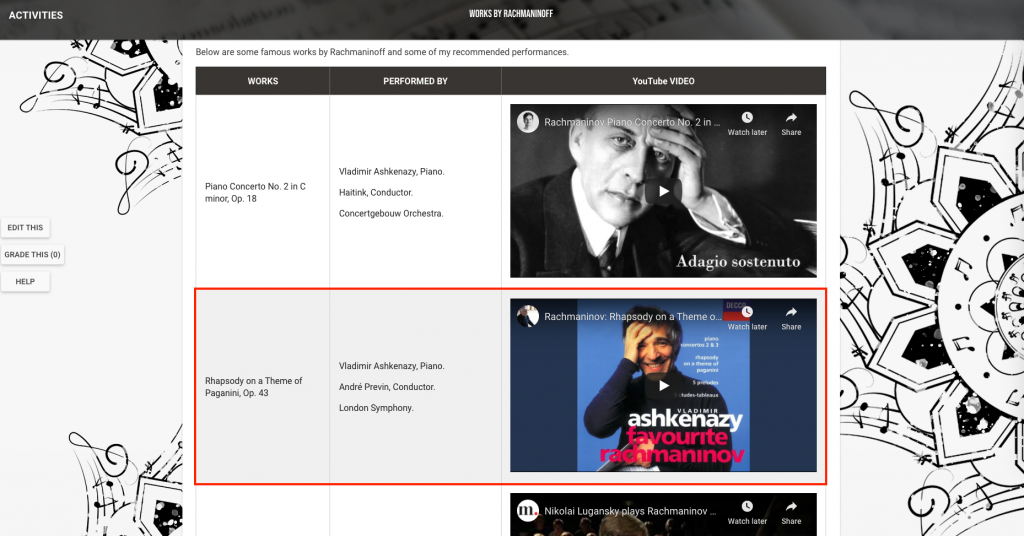
- Lastly, let’s make each row of the table hoverable.
- In the Course CSS stylesheet, add the following.
-
#your-table-id-name tbody tr:hover { background-color: #ddd; /* or any color you want */ } 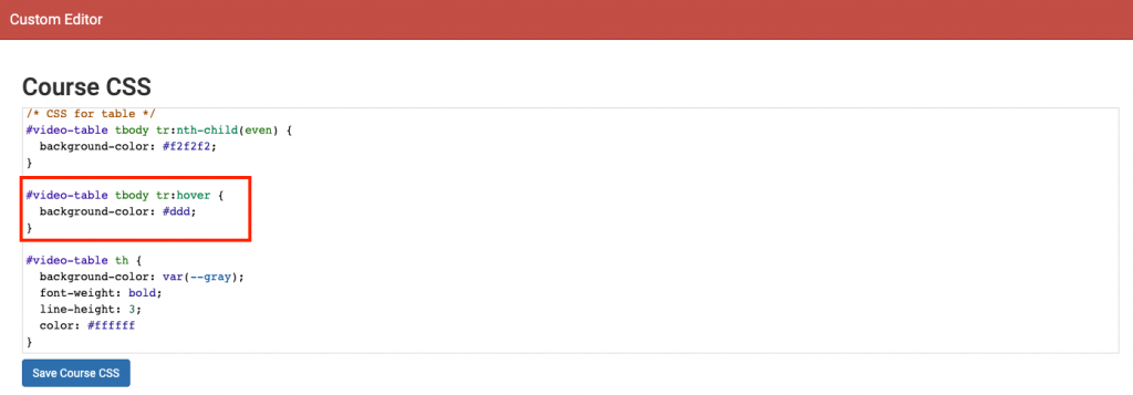
- “Save Course CSS” and view the result.


Creating an Images Carousel
Lastly, we will be creating an image carousels!
- Prepare your images. Choose your images and then upload them to Box.
- Here’s the base HTML for the carousel.
-
<md-tabs flex="true" md-dynamic-height="true" md-border-bottom="true"> <md-tab flex="true" class="tabbed-content"> <img src=[url-to-img]> </md-tab> <md-tab flex="true" class="tabbed-content"> <img src=[url-to-img]> </md-tab> <!-- repeat md-tab until done --> </md-tabs> - Obtain the direct link for the images on Box and add them to the field [url-to-img].
-
<md-tabs flex="true" md-dynamic-height="true" md-border-bottom="true"> <!-- first image --> <md-tab flex="true" class="tabbed-content"> <img src="https://utexas.box.com/shared/static/ 3tzbfpsv345nyae0gzd8647feovj5lis.jpg"> </md-tab> <!-- second image --> <md-tab flex="true" class="tabbed-content"> <img src="https://utexas.box.com/shared/static/ riqy63edlyhuanulaipzfhf8jl6dtz7z.jpg"> </md-tab> <!-- third image --> <md-tab flex="true" class="tabbed-content"> <img src="https://utexas.box.com/shared/static/ 50k4zc9khrzrv6gxaovbget1d104rzus.jpeg"> </md-tab> <!-- fourth image --> <md-tab flex="true" class="tabbed-content"> <img src="https://utexas.box.com/shared/static/ f8jnwuxepycsc5z7om59ty0vzr8s8k26.jpg"> </md-tab> </md-tabs> - For each image, normalize them to a similar width and height by giving them the same width. Note that by setting the width, the height is automatically scaled. You might want to play around with these values depending on the orientation of your image.
-
<md-tabs flex="true" md-dynamic-height="true" md-border-bottom="true"> <!-- first image --> <md-tab flex="true" class="tabbed-content"> <img src="https://utexas.box.com/shared/static/ 3tzbfpsv345nyae0gzd8647feovj5lis.jpg" width="400"> </md-tab> <!-- second image --> <md-tab flex="true" class="tabbed-content"> <img src="https://utexas.box.com/shared/static/ riqy63edlyhuanulaipzfhf8jl6dtz7z.jpg" width="400"> </md-tab> <!-- third image --> <md-tab flex="true" class="tabbed-content"> <img src="https://utexas.box.com/shared/static/ 50k4zc9khrzrv6gxaovbget1d104rzus.jpeg" width="400"> </md-tab> <!-- fourth image --> <md-tab flex="true" class="tabbed-content"> <img src="https://utexas.box.com/shared/static/ f8jnwuxepycsc5z7om59ty0vzr8s8k26.jpg" width="400"> </md-tab> </md-tabs> - Add a label to each md-tab for each image’s name.
-
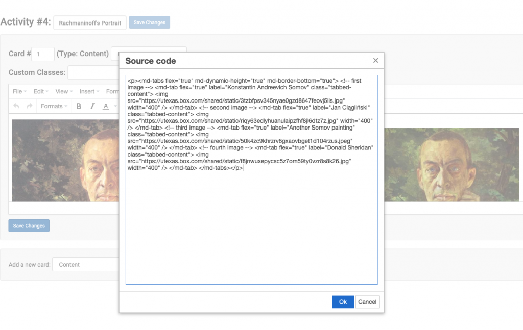
<md-tabs flex="true" md-dynamic-height="true" md-border-bottom="true"> <!-- first image --> <md-tab flex="true" class="tabbed-content" label="Konstantin Andreevich Somov"> <img src="https://utexas.box.com/shared/static/ 3tzbfpsv345nyae0gzd8647feovj5lis.jpg" width="400"> </md-tab> <!-- second image --> <md-tab flex="true" class="tabbed-content" label="Jan Ciągliński"> <img src="https://utexas.box.com/shared/static/ riqy63edlyhuanulaipzfhf8jl6dtz7z.jpg" width="400"> </md-tab> <!-- third image --> <md-tab flex="true" class="tabbed-content" label="Another Somov painting"> <img src="https://utexas.box.com/shared/static/ 50k4zc9khrzrv6gxaovbget1d104rzus.jpeg" width="400"> </md-tab> <!-- fourth image --> <md-tab flex="true" class="tabbed-content" label="Donald Sheridan"> <img src="https://utexas.box.com/shared/static/ f8jnwuxepycsc5z7om59ty0vzr8s8k26.jpg" width="400"> </md-tab> </md-tabs> - Lastly, wraps the entire <md-tabs> content in a <p> tag to align the content center.
-
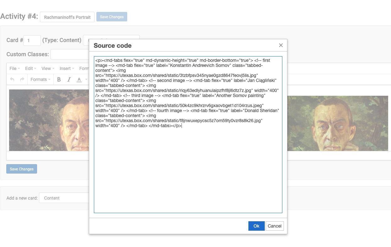
<p style="text-align:center"> <md-tabs flex="true" md-dynamic-height="true" md-border-bottom="true"> <!-- first image --> <md-tab flex="true" class="tabbed-content" label="Konstantin Andreevich Somov"> <img src="https://utexas.box.com/shared/static/ 3tzbfpsv345nyae0gzd8647feovj5lis.jpg" width="400"> </md-tab> <!-- second image --> <md-tab flex="true" class="tabbed-content" label="Jan Ciągliński"> <img src="https://utexas.box.com/shared/static/ riqy63edlyhuanulaipzfhf8jl6dtz7z.jpg" width="400"> </md-tab> <!-- third image --> <md-tab flex="true" class="tabbed-content" label="Another Somov painting"> <img src="https://utexas.box.com/shared/static/ 50k4zc9khrzrv6gxaovbget1d104rzus.jpeg" width="400"> </md-tab> <!-- fourth image --> <md-tab flex="true" class="tabbed-content" label="Donald Sheridan"> <img src="https://utexas.box.com/shared/static/ f8jnwuxepycsc5z7om59ty0vzr8s8k26.jpg" width="400"> </md-tab> </md-tabs> </p> - Choose a card where you’d like to place the carousel, and click View > Source Code. Then paste the code in where you’d like it. Note: for displaying purposes, the url up here are broke into separate lines. Please keep them on one line.
- “Save Changes” and view the result.
Yay! You’ve done a great job! Hope you have fun playing around with HTML / CSS, and CLIO. Feel free to check out the demo site here if you’d like a reference at any time!