
CLIO is a Content Management System that allows the users to create customizable course modules. In this Basic Training you will be designing and creating your own CLIO course module.
Part 1: Creating a New Canvas Assignment with a CLIO module
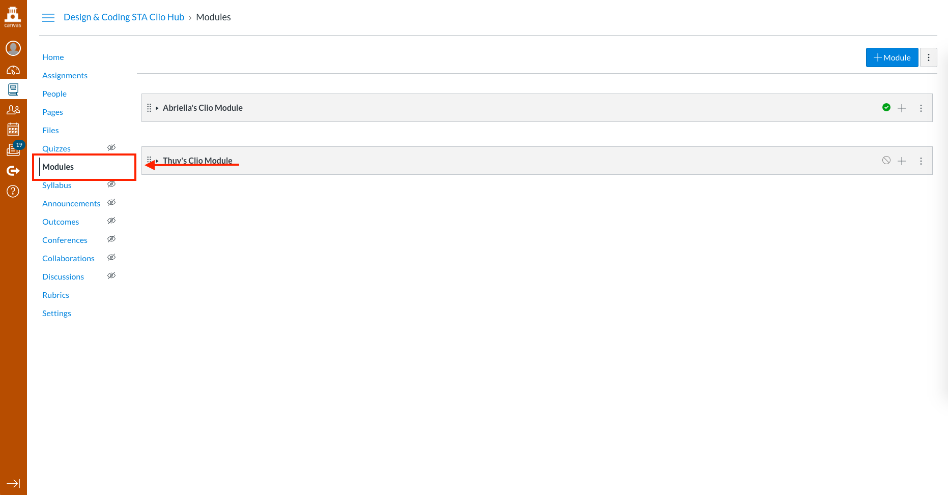
- Navigate to your Canvas page. Click on the “Module” tab.

- Click “+Module” and give it a name.
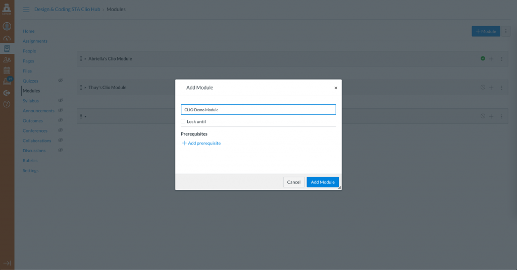
- Under this module, create a new Assignment. Give it a name.

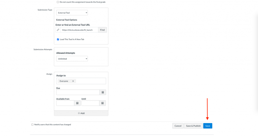
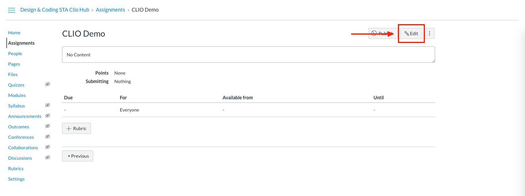
- Click on this assignment, and click “Edit.”

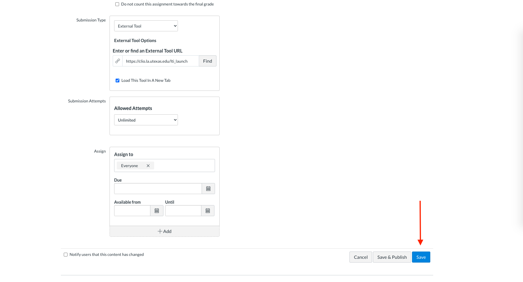
- Under “Submission Type,” choose “External Tool.”
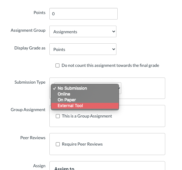
- Under “Enter or find an External Tool URL,” click “Find,” and choose “Clio.” Then click “Select.”

- Check “Load This Tool In A New Tab.”

- Scroll down to the bottom and click “Save.”
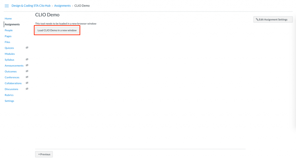
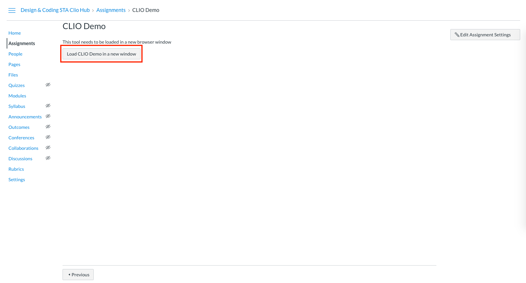
- Click on “Load [assignment_name] in a new window to open up the CLIO page.

Part 2: Getting Familiar with the CLIO Interface
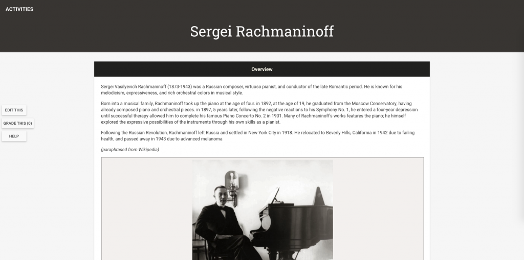
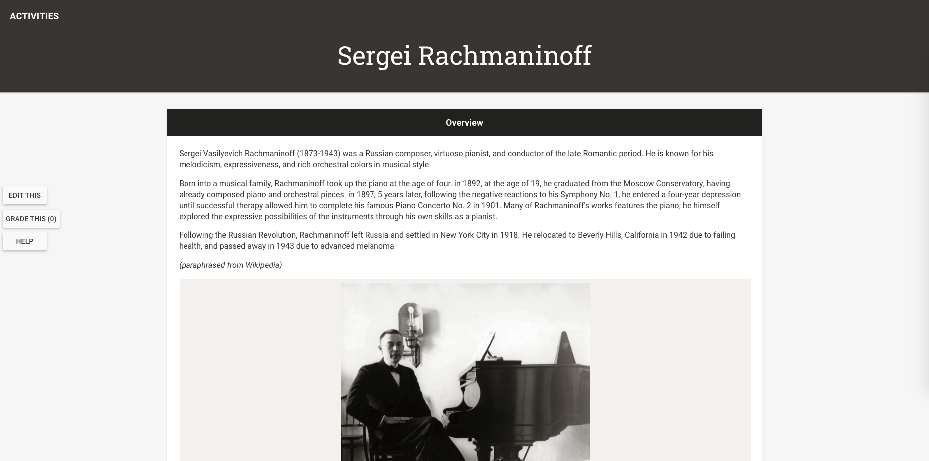
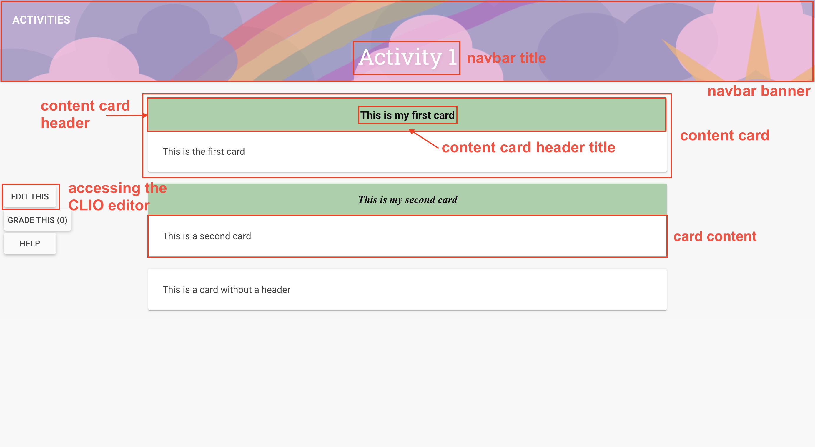
When you first open up a new CLIO page, this is the default settings you’ll be seeing.

Please take a look at this annotated image and familiarize yourself with the terminologies we will be using throughout the training. Don’t worry if you are confused on any terminologies, we will walk through all of these throughout the training.
Part 3: Creating a Basic Module
In this part you will be creating a Basic CLIO module with your own course Content.
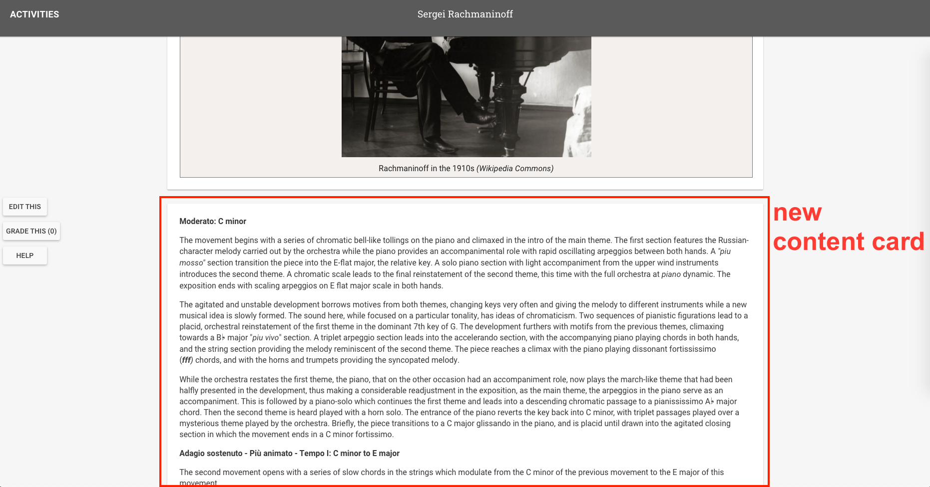
Adding a Content Card with text and images
- Choose a topic for your course. Keep the content of your course uniform throughout the modules.
- Choose a color palette for your course, ideally 4-5 colors. Think about how this palette relates to your content. Use this palette throughout your course design.
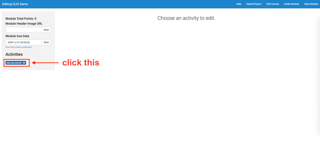
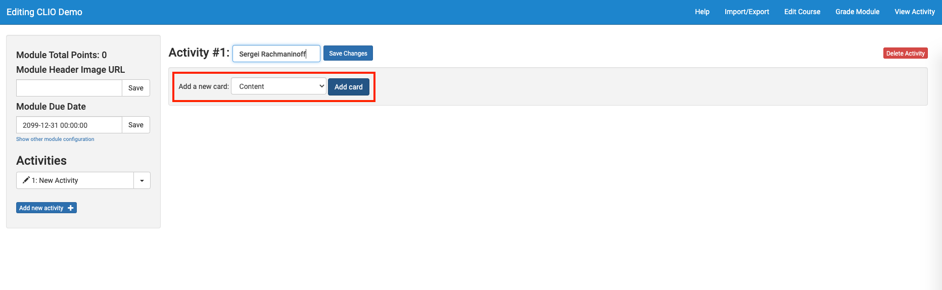
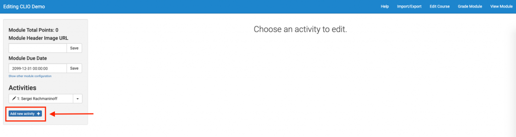
- Add a new activity page. In your CLIO editor, click “Add new activity +”. This will add an empty page where you can add multiple cards with content. As you work on more cards and content, please keep in mind that you might want to break your content up into different pages to keep the information organized and not overly crowded with cards on a single page. A typical CLIO module will have around 3 module pages.
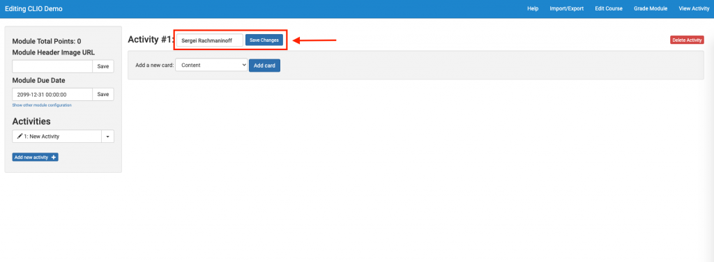
- Name your activity page. Then click “Save Changes.”
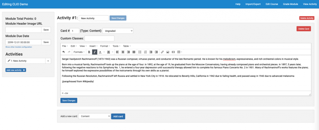
- Click “Add card”. Choose “Content” type for card.

- In the text editing section, input any text content you’d like for your card.
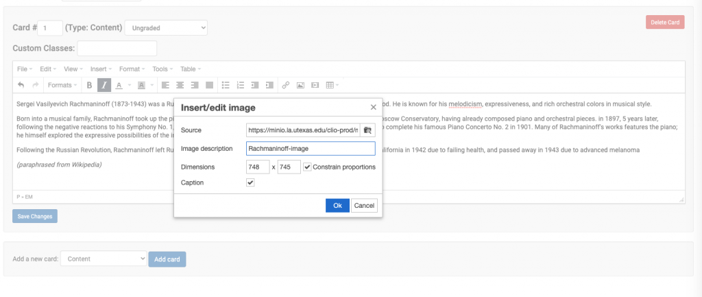
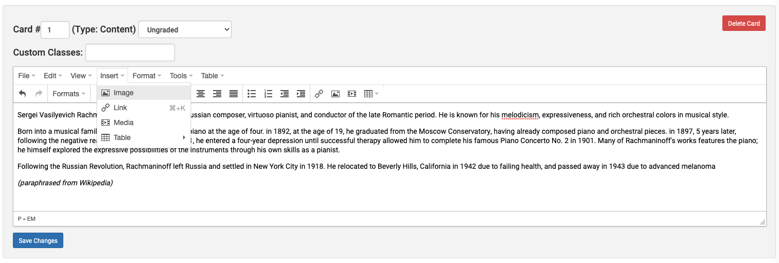
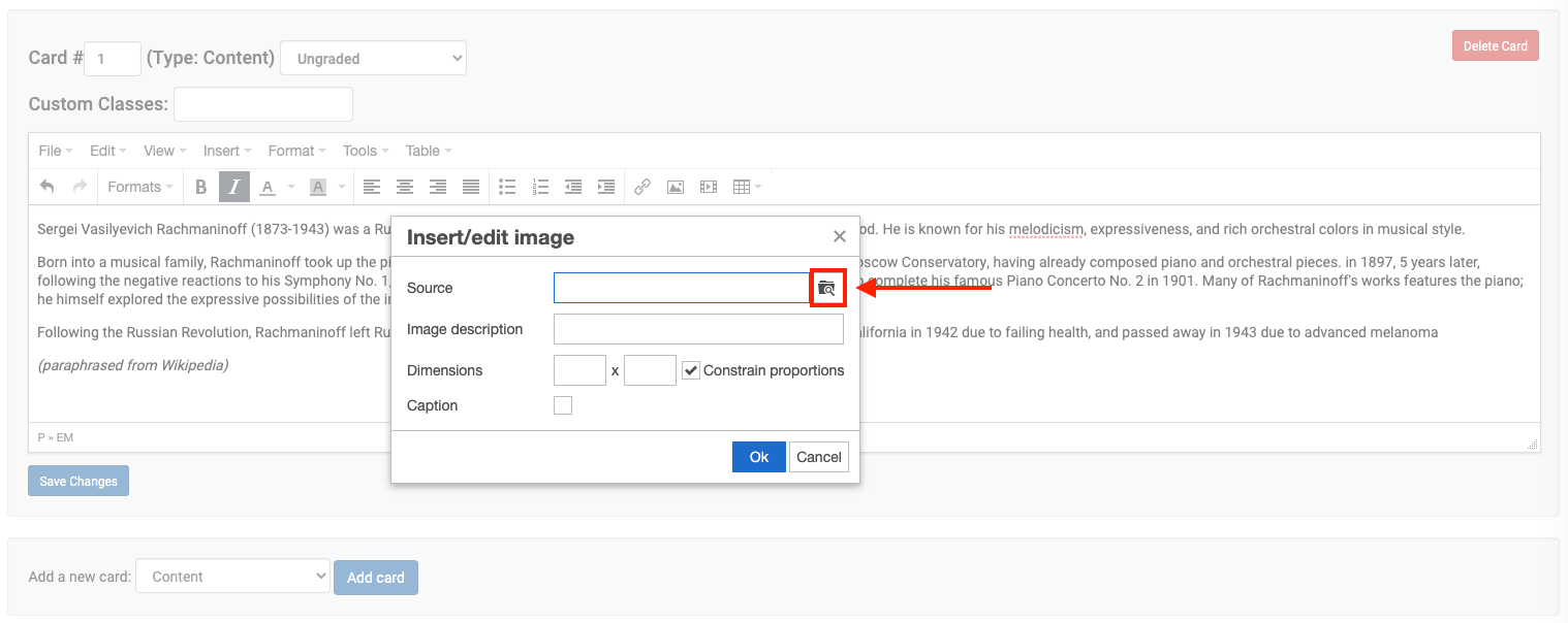
- To add an image to go along with the text, click Insert > Image.

- Click on the “Search Files” icon next to the Source input field.

- Choose your image file. Give it a description and dimensions, if you’d like. If you’d also like to add a caption, put a check next to “Caption”. Click “Ok”.
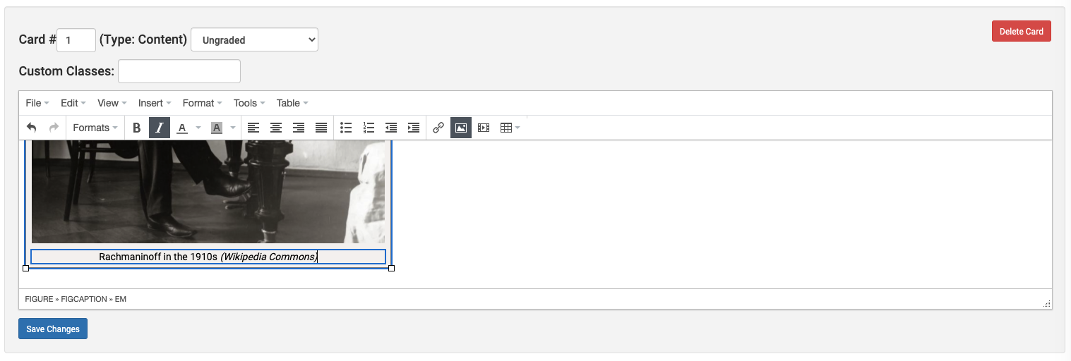
- Edit the caption underneath the image.

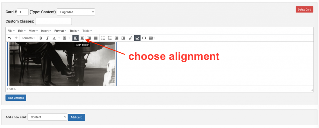
- If you wish to change the alignment of this image figure, click on the figure and choose the desired alignment.
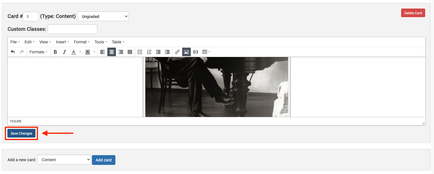
- Click “Save Changes” for this card. It is important that you click “Save Changes” for each card on a page after editing it.

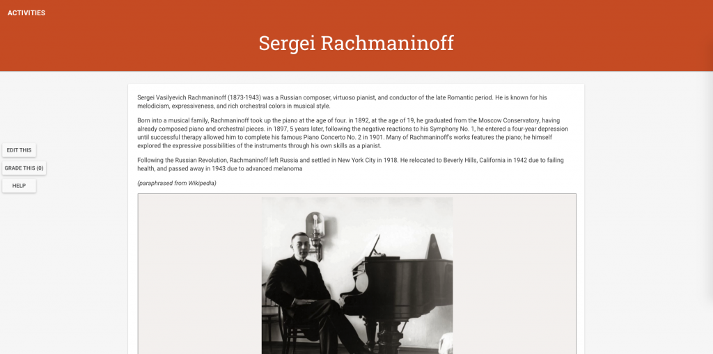
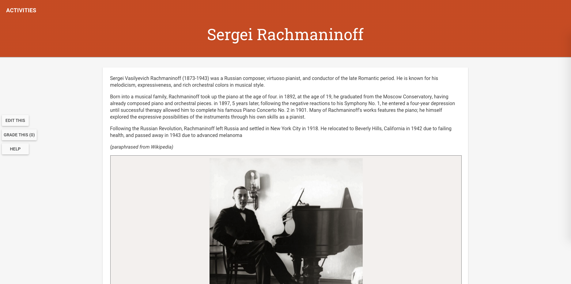
- Click “View Activity” to see the changes you’ve applied.


Adding a Content Card with links and embedded video
- Let’s add another card content with different card header stylings and some more interesting content. Add another card following the same steps you’ve done above.

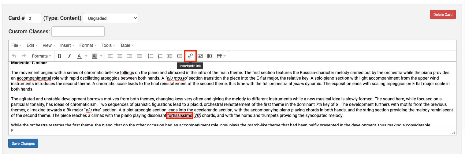
- Let’s add some external links to this text. Select the text you’d like to link and click “Insert/Edit Link”.

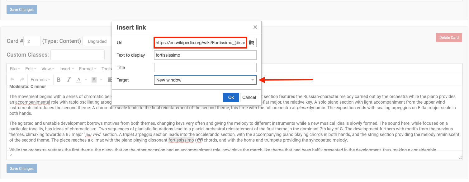
- In the “Insert Link” editor, paste in the external URL you’d like to link. You can also change the setting in “Target” to make the link opens in a new window.

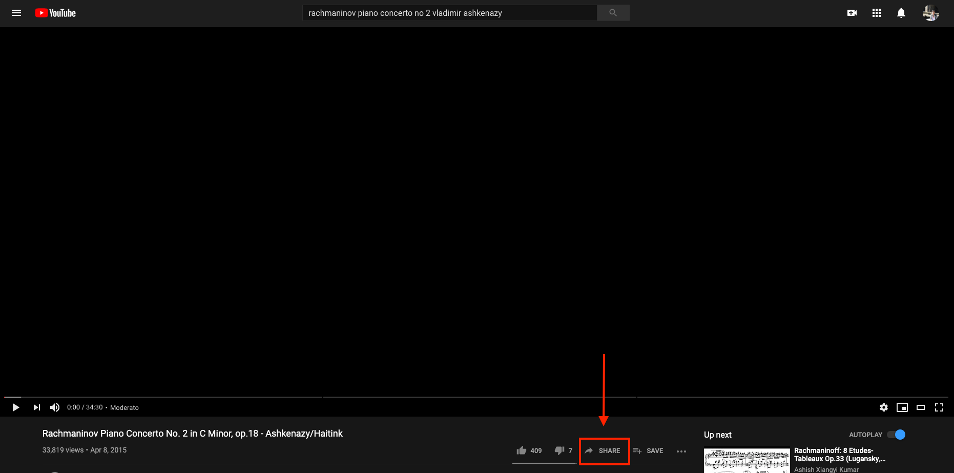
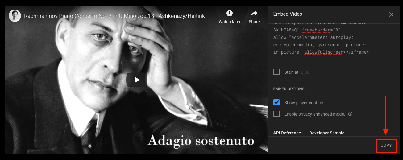
- Lastly, I’d like to embed a YouTube video into this card. Navigate to YouTube and click “Share”.

- Click “Embed”.
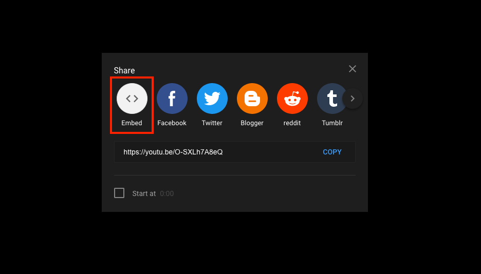
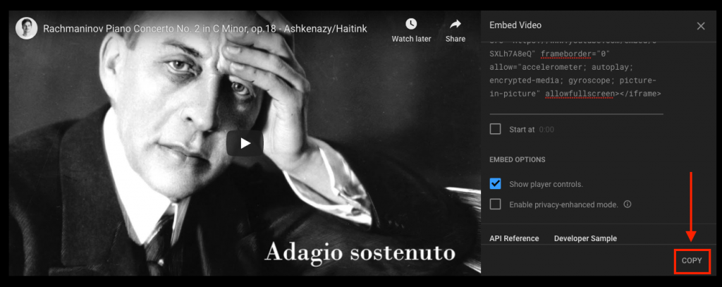
- Click “Copy” to copy the embed code.
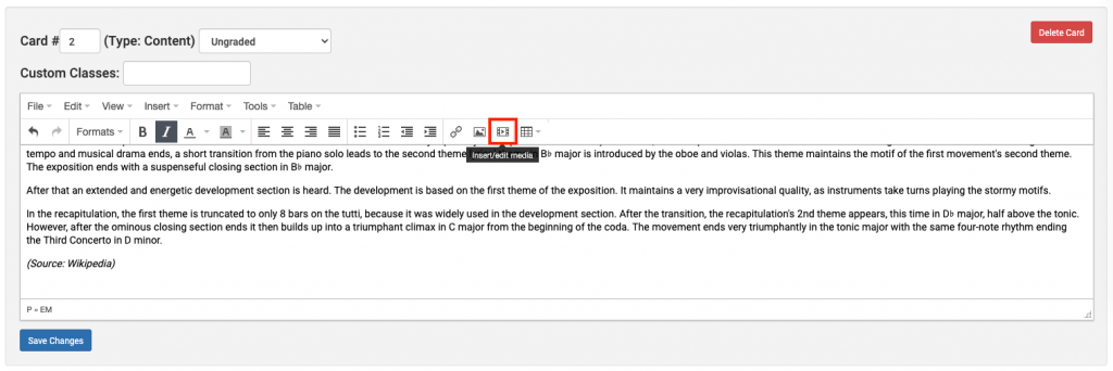
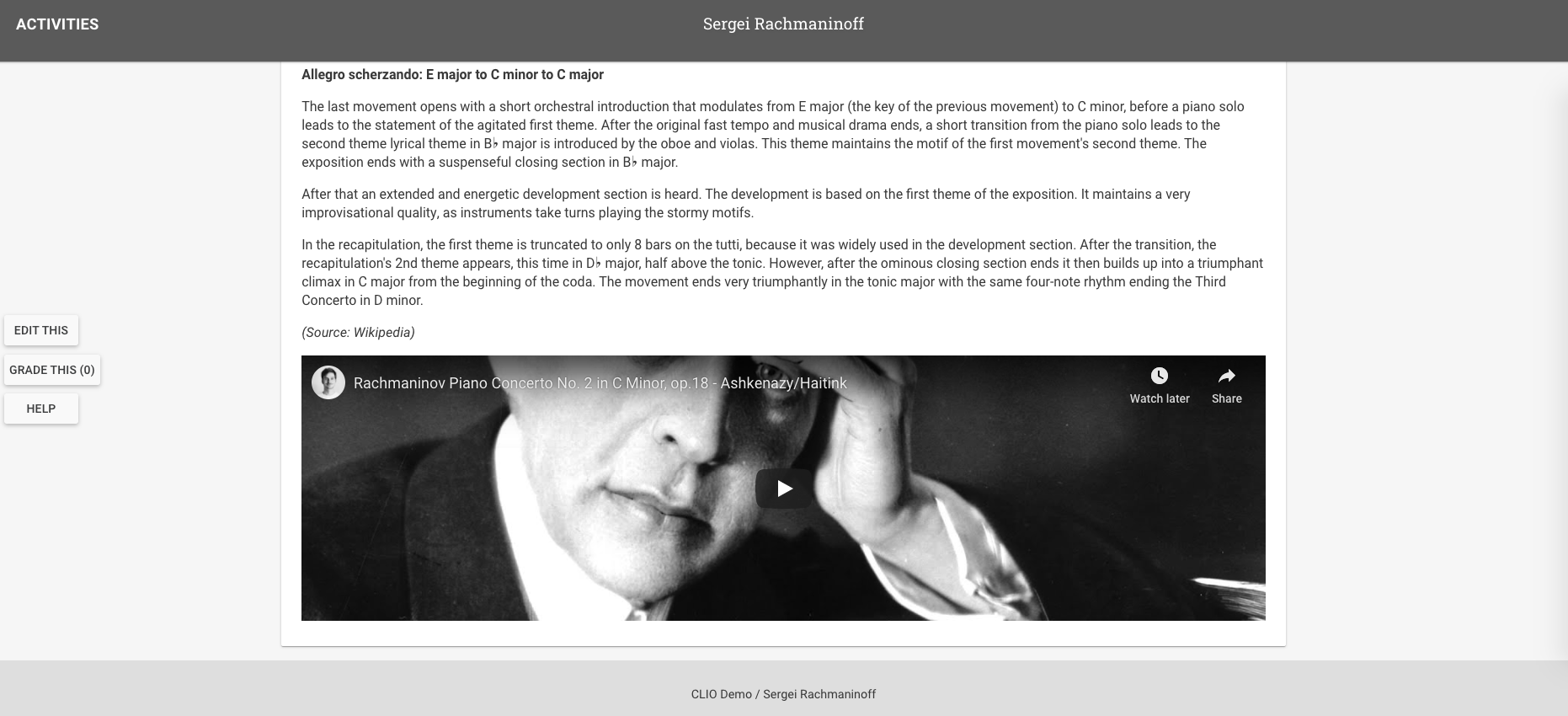
- Navigate back to CLIO. In the editor, click “Insert/Edit Media”.
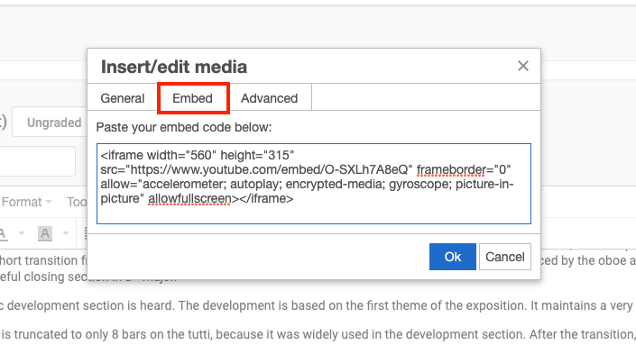
- Click on the “Embed” tab and paste in your embed code, then click “Ok”.
- Click “Save Changes”. Your CLIO card should look like this.


Adding Card Headers for Cards
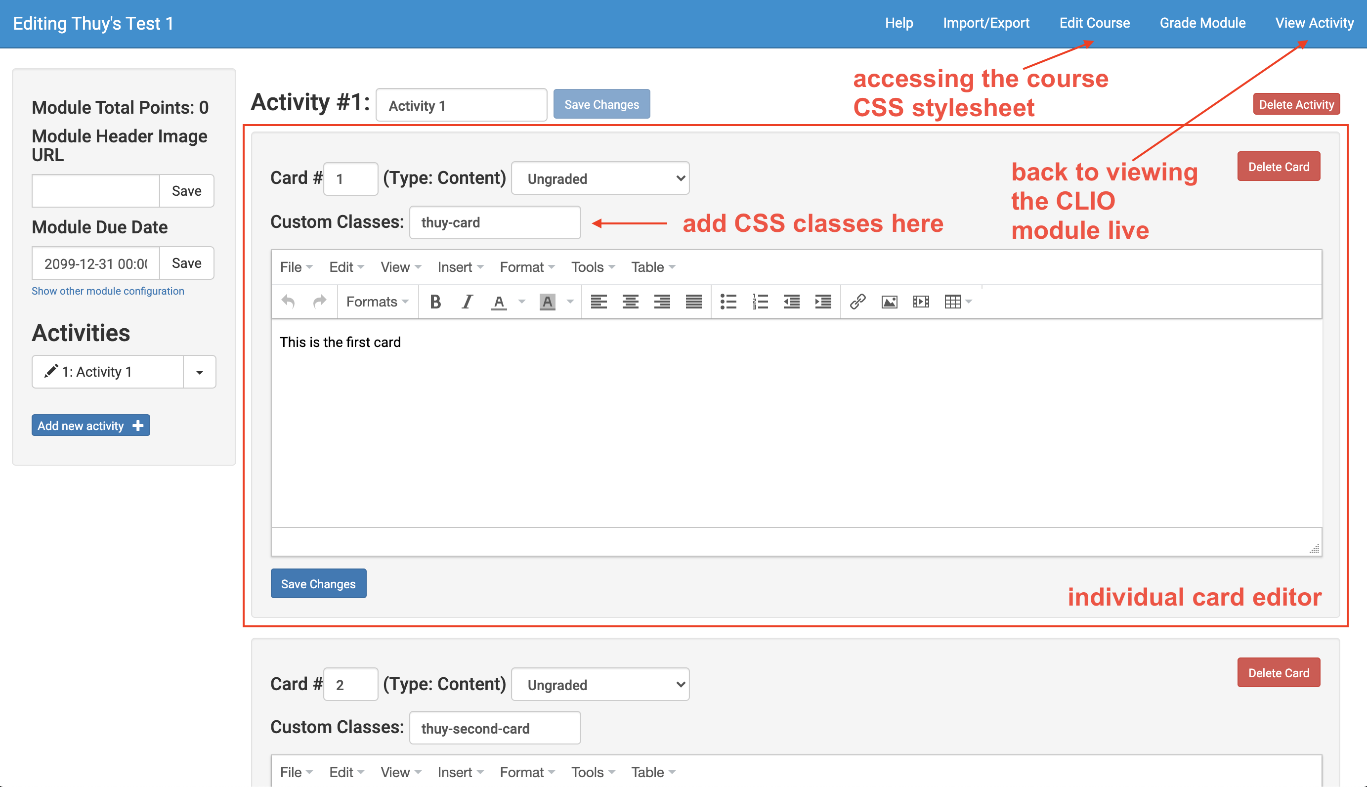
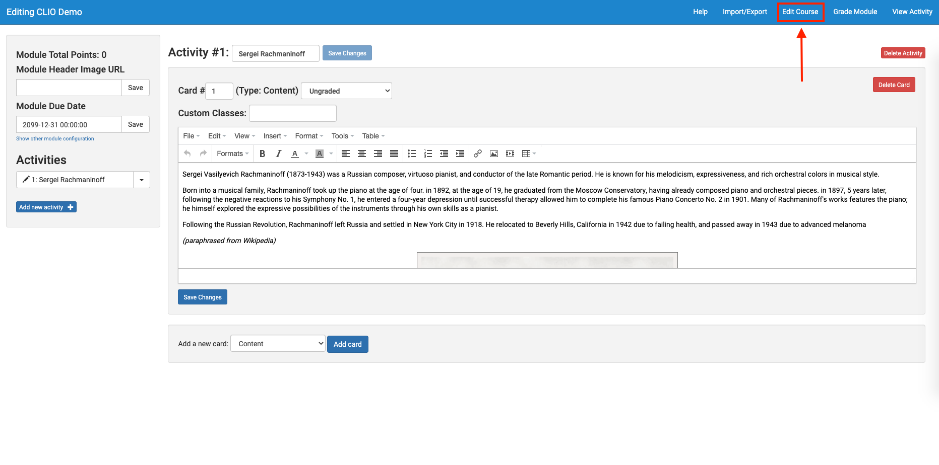
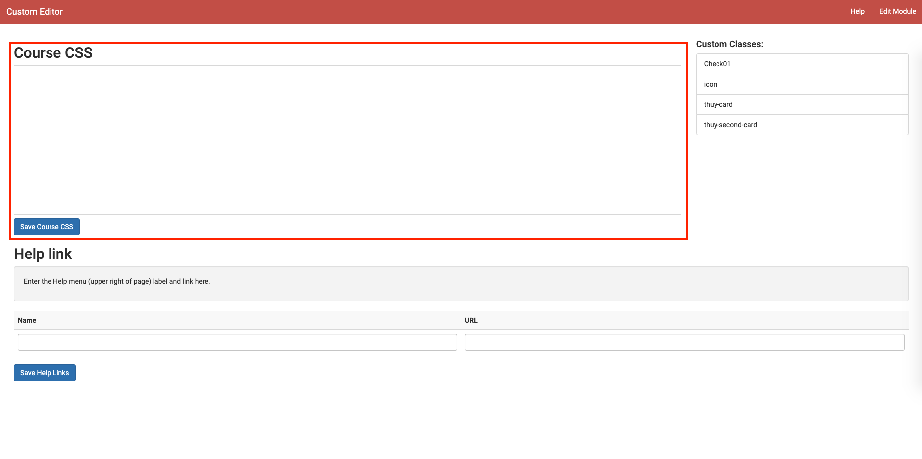
- Let’s add a card header for this card we’ve made above. In the CLIO editor, navigate to the Course CSS stylesheet by clicking “Edit Course”.

- Here’s where you’ll be editing your custom CSS.

- Edit the default card header stylings by editing the class “card-header”.
-
.card-header { background: #252422; } .card-header:after { color: #FFFCF2; } - These two classes above style the default card header that will affect any item that belongs to these two classes. “card-header:after” tells the browser “after you’ve finished rendering the card-header, style everything afterwards with this CSS,” therefore, anything under this styles the card-header text content. Thus, “background” specifies the color of the card header, while “color” specifies the color of the text.
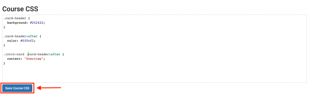
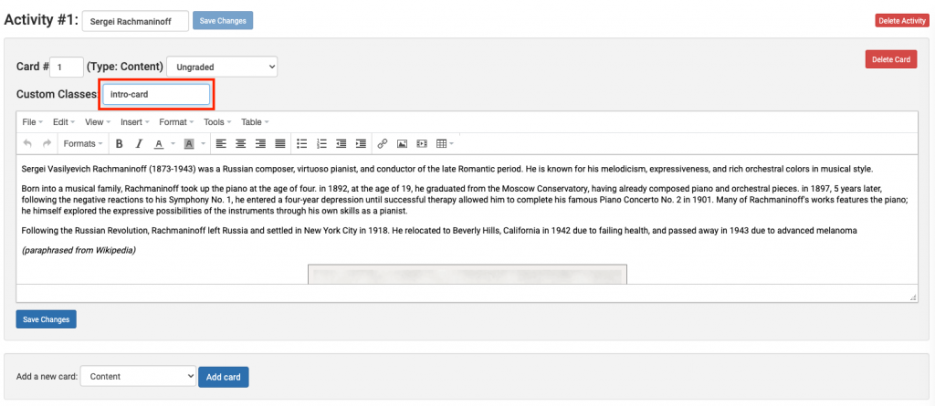
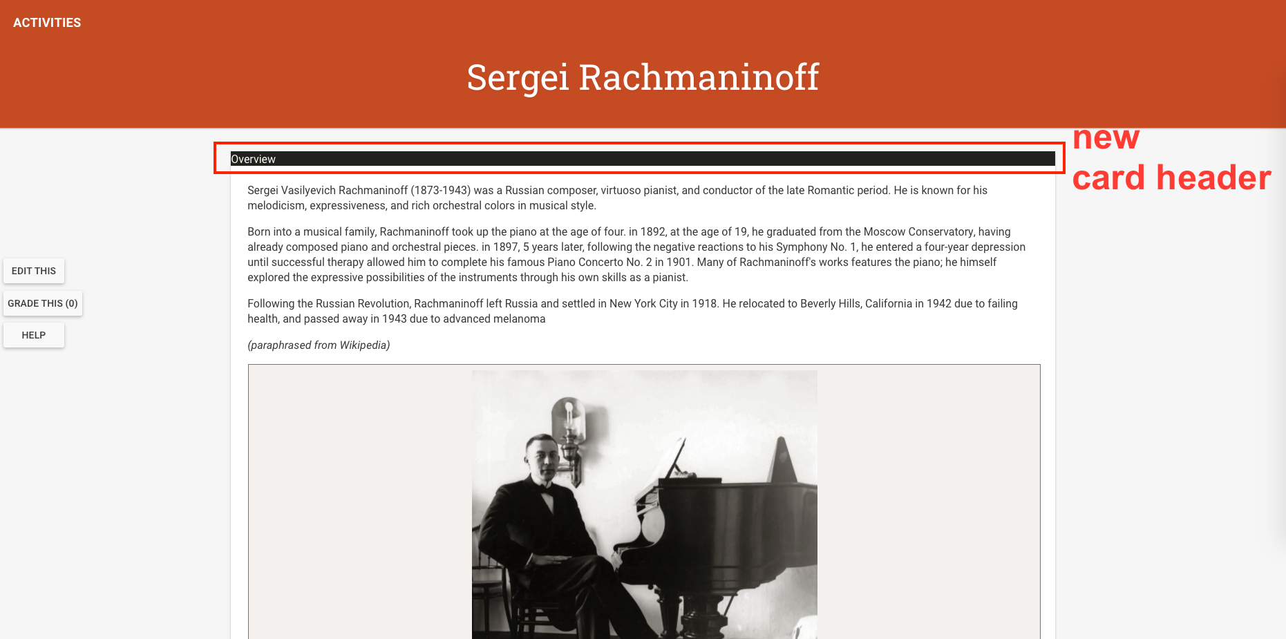
- Add another class styling, this time use a specific name you’d like to give for your card. For example, the first content card gives an overview about the composer, so I named it intro-card
-
.intro-card .card-header:after { content: "Overview"; } - This syntax means “style any item with class named ‘intro-card’ that also belongs to the class .card-header:after. The “content” specify the text that will be rendered. Click “Save Course CSS”.
- Go back to “Edit Module”.
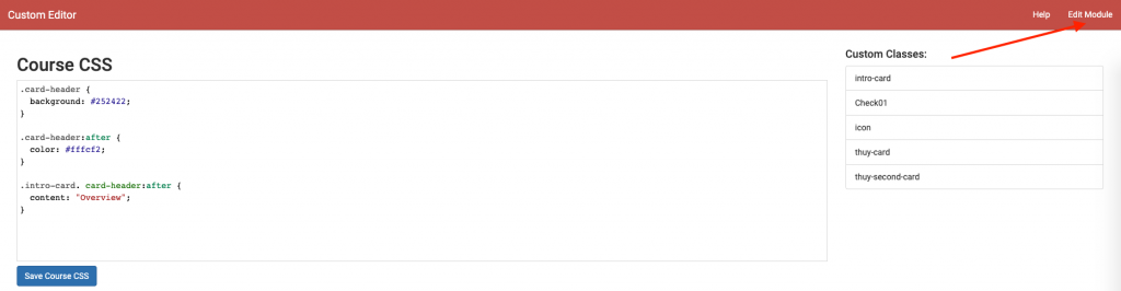
- Click on the activity you’re editing.
- Then add the custom css class for the card header to the card. Make sure to type [class_name] and not .[class_name].
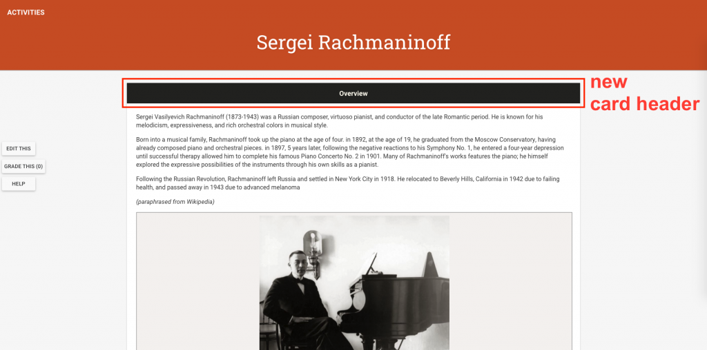
 Click “Save Changes”, then go back to “View Activity”.
 - You will see the changes applied.

- Let’s add some more stylings to make the header for attractive and visible. Go back to the “Edit Course” and make these changes.
-
.card-header { background: #252422; line-height: 3; text-align: center; } .card-header:after { color: #FFFCF2; font-size: 18px; font-weight: bold; } .intro-card .card-header:after { content: "Overview"; } - Then go back to viewing the activity live. You’ll the these changes.
-
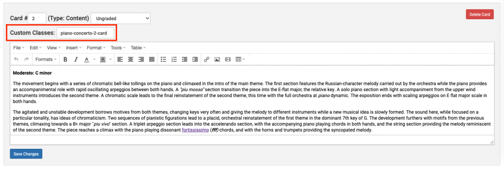
- Let add a different styling to the second card we created.
- Navigate back to the Course CSS stylesheet. Create another class that belongs to “card-header:after” with a different text content.
-
.piano-concerto-2-card .card-header:after { content: "Piano Concerto No. 2 in C minor, Op 18"; } - Let’s also make the color of this card different from the default black, and the text different from the default white. To do this, override the background in the default “card-header” by creating a new class (with the same name as the class that has your content text) that belongs to “card-header”. Then, override the default white in “card-header:after”.
-
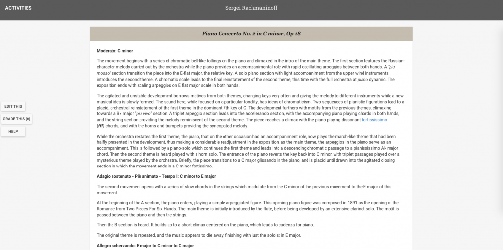
.piano-concerto-2-card .card-header { background: #CCC5B9; } .piano-concerto-2-card .card-header:after { color: #252422; content:"Piano Concerto No. 2 in C minor, Op 18"; } - If you wish to add some additional stylings to the text, do so in your new card which belongs to “card-header:after”. Editing anything that belongs to “card-header” edits the banner itself, while editing anything that belongs to “card-header:after” edit the text.
-
.piano-concerto-2-card .card-header:after { color: #252422; font-style: italic; font-family: Georgia, serif; content:"Piano Concerto No. 2 in C minor, Op 18"; } - For font-family, you can find web safe fonts at this link here.
- Lastly, go back to this card and add this class name.
- “Save Changes” and view your card.


Adding Interactive Cards
Let’s add a new activity page with different types of content
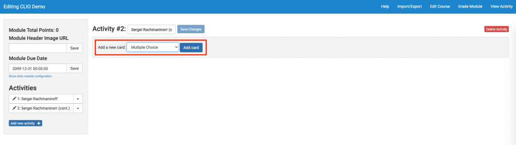
- Click “Add new activity +” to add a new activity page. Name it similarly to how you name your first activity page.
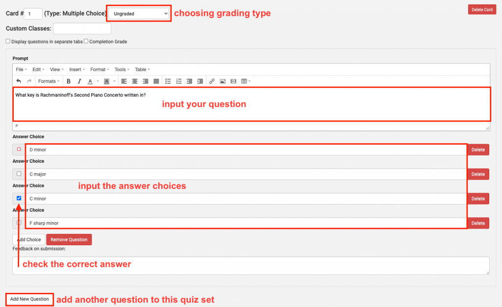
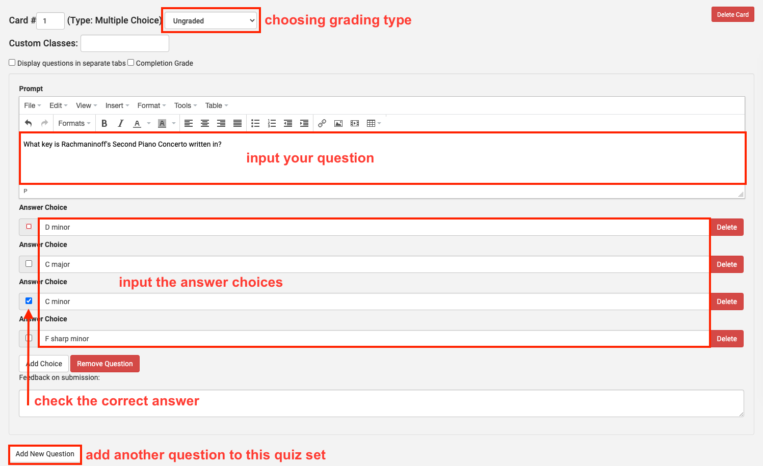
- Add a new card, this type choosing “Multiple Choice” for card type.
- The interface for this is pretty intuitive. Explore the options below and create your own quiz.
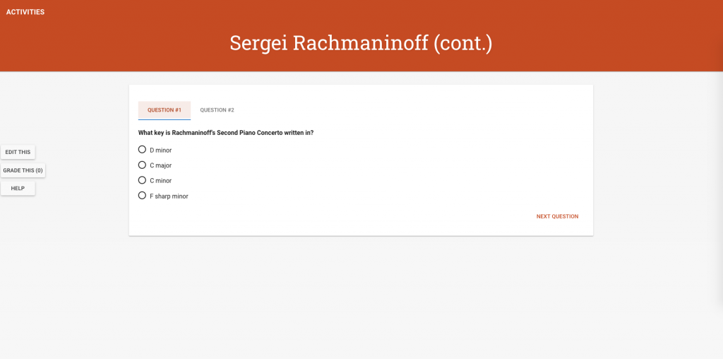
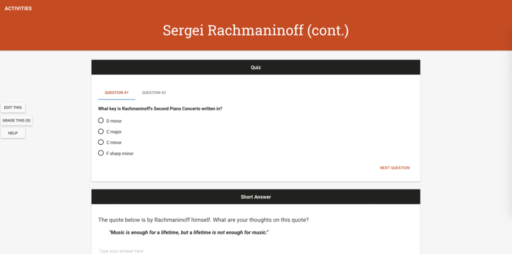
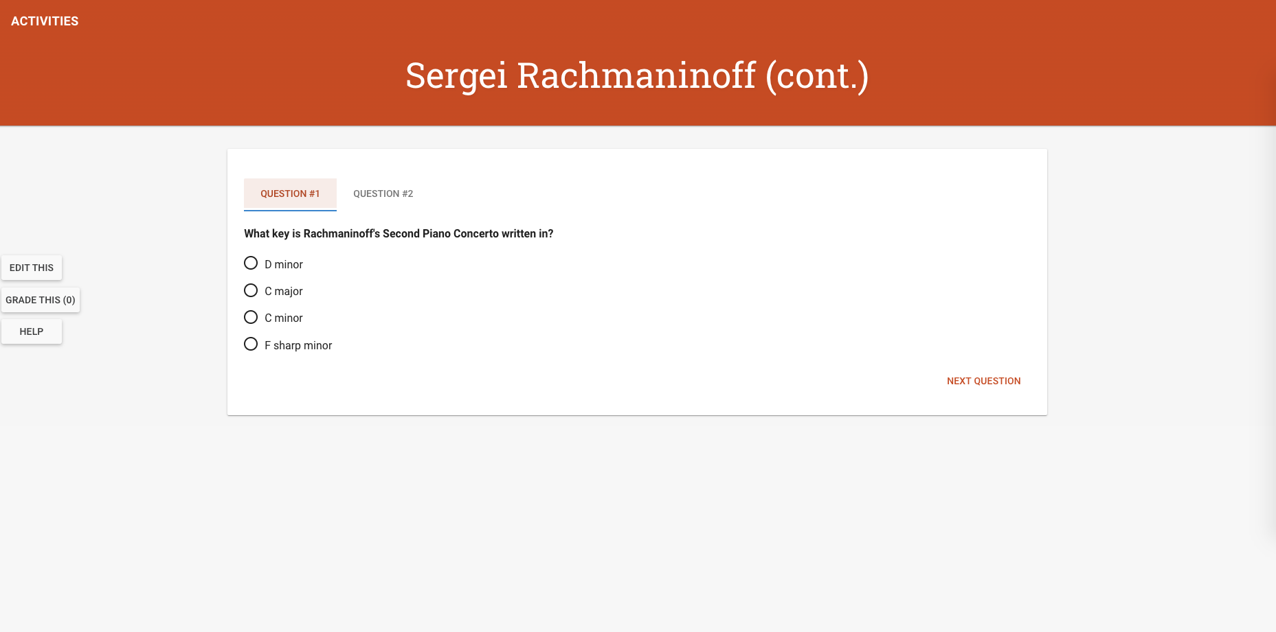
- Mine turned out like this, with “Display questions in separate tabs” checked.
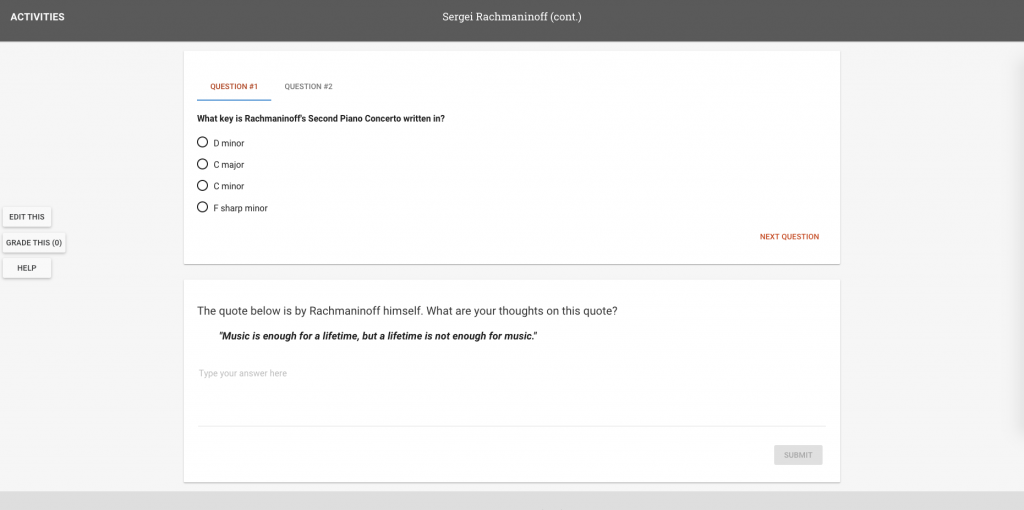
- Let’s add a “Short Answer Question” type card. You will see that this is very similar to the “Multiple Choice” type. Design your own question.
- You should have something like this.
- Add some card headers to this as well.


Format the Navbar Banner
Let’s change the color of the navbar on top.
- Navigate to the Course CSS stylesheet.
- At the very top of the stylesheet, add formatting to the class “nav-bar”.
-
.nav-bar { background: #403d39 !important; } - You must add the keyword “!important” here, otherwise the changes won’t come to effect. This is because of how CLIO is set up with the default navbar color. “Save Course CSS” and view your changes.