The main goals of online instructional graphics:
– Attract students’ attention
– Aid with retention
– Enhance understanding
Choosing the correct type of graphic to portray your information is important in creating an engaging experience and make the audience feel the piece is customized for them.
Instructional Graphic Types:
– Representational: closely resemble the information

– Analogical: implying information with objects

– Arbitrary: graphics with no real-life counterpart
When creating, consider which functionalities should be prioritized for your piece:
Functionalities of Instructional Graphic:
– Descriptive: show what the information looks like
– Expressive: impactful imagery
– Constructional: show relationships between parts
– Functional: show a process or system
– Logico-mathematical: show a mathematical concept
– Algorithmic: show range of possibilities
– Data display: illustrate textual information
Read more about different types of charts:
How to Choose the Best Types of Charts For Your Data
Another thing to keep in mind is to make your piece replicable by using basic elements such as shapes and icons, that way it could be easily modified and reuse for other materials.
Below is an example of the process one would go through when creating an instructional graphic.
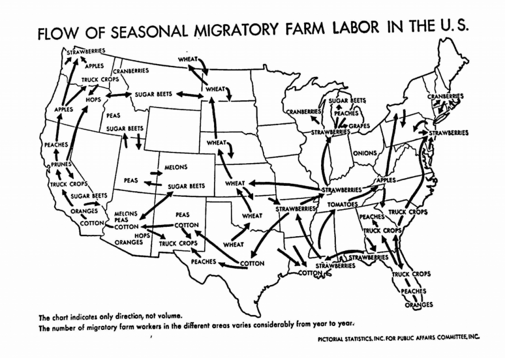
Example: “Interactive” map for HIS314K
Analyze the graphic/information
- What type of information are you illustrating (Ex: quantitative, qualitative)
This map is showing trade routes of seasonal farm labor for different produces
2. Identify the focus and story. What is the audience supposed to learn from your piece? Which part of the information is important?
The arrows are prominent elements on the map, which we should keep.
The text labels are clustered together and hard to read, we can fix that by using icons to represent produces because shapes and symbols have stronger visual impact than plain text.
3. Choose a theme. What is the tone/visual style? Where will your piece be shown?
PowerPoint slides for the course was provided, so we should keep the graphic style and color palette consistent with existing course material.
The map will be used for lecture, so a good format for this graphic would be a slide animation.
Redesign
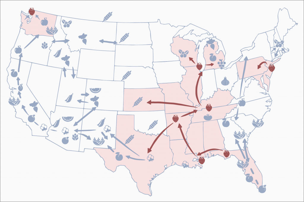
Use color palette and visual style that match your theme
– Reused color from the PowerPoint slides provided by the professor
– tapered the end of arrows to shift the weight of arrows and make it more modern
Emphasize important information
– Added color and highlight to help lead the eye and spotlight each route
– Separated each migratory route to make it less overwhelming
– Used icons to help relieve the eye from small, crowded texts
Activity: Redesign Graphics
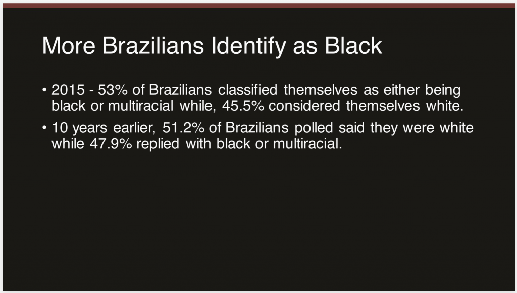
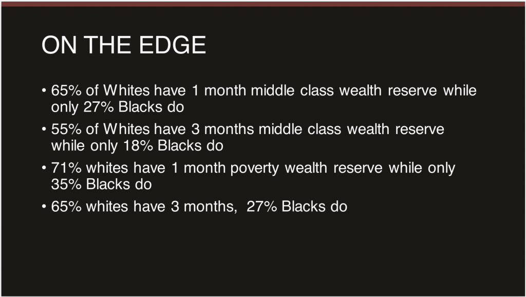
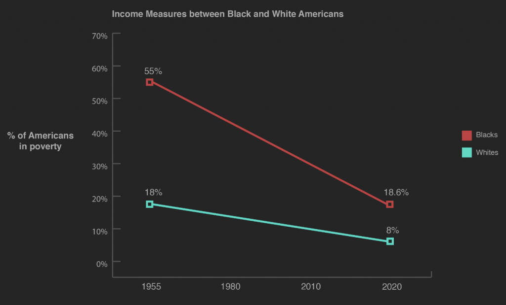
Design graphics for these slides from AFR303 Intro to Black Studies following steps listed below:
- Post your analysis on Basecamp
– What type of information are you illustrating? (Ex: quantitative, qualitative)
– What is the audience supposed to learn from your piece? Which part of the information is important?
– What is the tone/visual style? Where will your piece be shown?
– What type of graphic will you make? (Ex: map, pie chart, table, etc.) - Design
– Use illustrator to create your designs
– Post your design on Basecamp