
Courses taught in LAITS studios
One of the main services LAITS provides is online course production. Studio courses are recorded by the LAITS production team, including Video STAs, Audio STAs, and Design STAs, and are offered to students either live or pre-recorded. Recording in-studio gives courses at UT a higher production value and an engaging online learning experience for students.
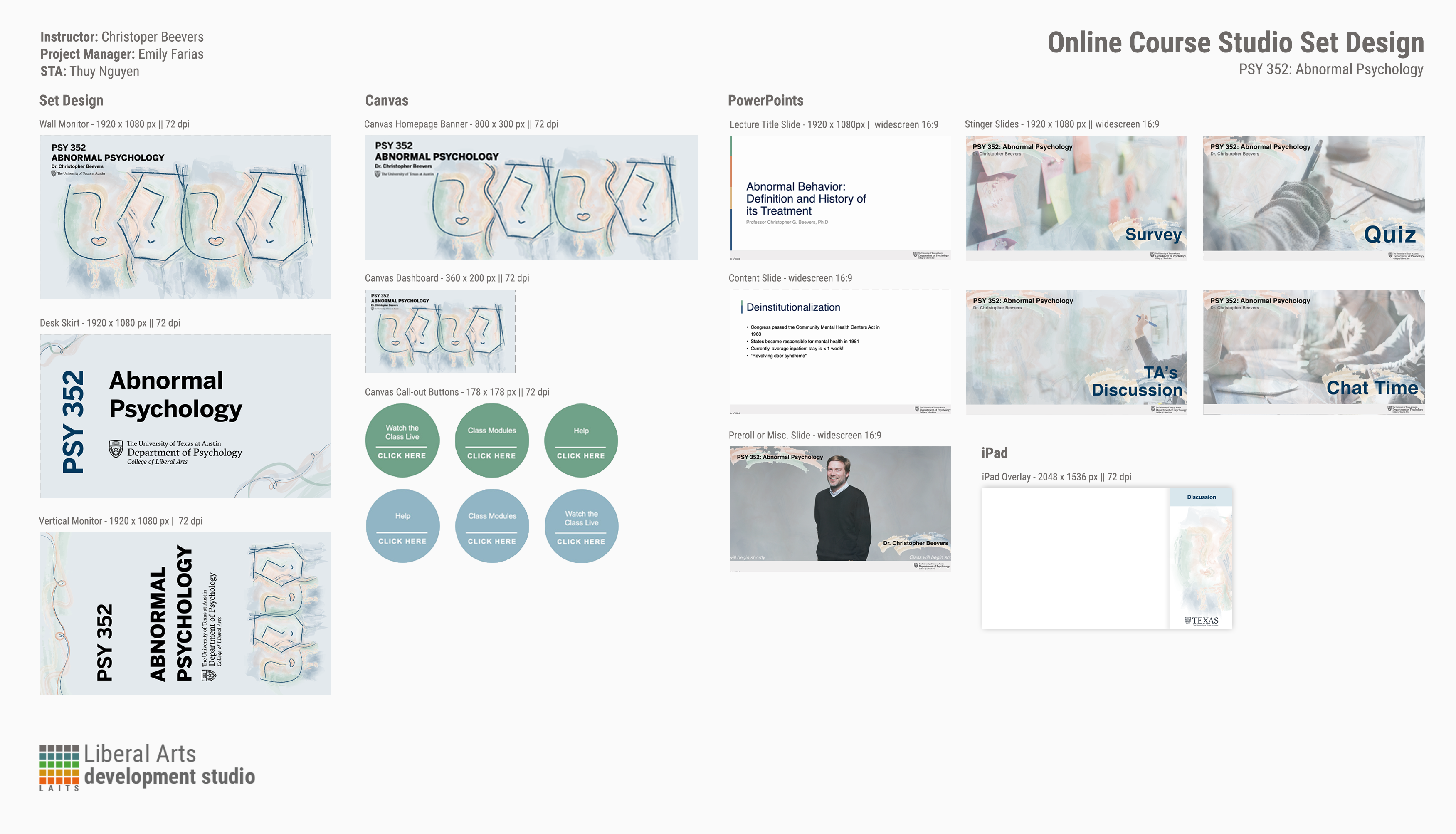
Courses taught in the LAITS Studios require stage set design. Our design team creates a cohesive design package for each course, from the studio set design monitor graphics, to the graphics for the Canvas web interface platform.
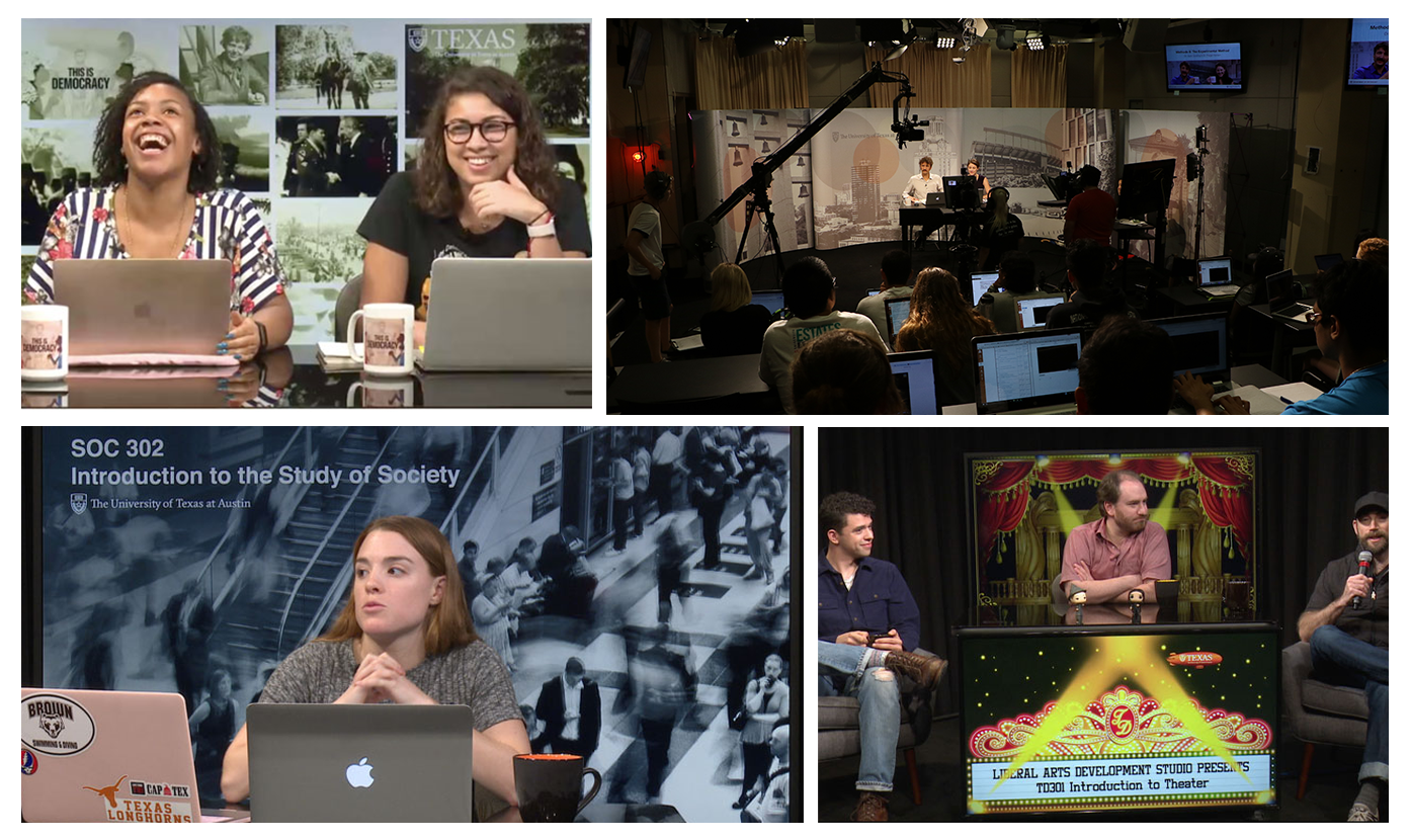
This Summer School video shows clips from an array of studio courses:
Here is what you should take away by the end of this section:
- Graphics are the visual language of a studio course
- Studio asset terminology (wall monitor vs. desk skirt vs. stingers, etc)
- How to create a cohesive, thoughtful design
- Considering color correction adjustments
More about studio courses
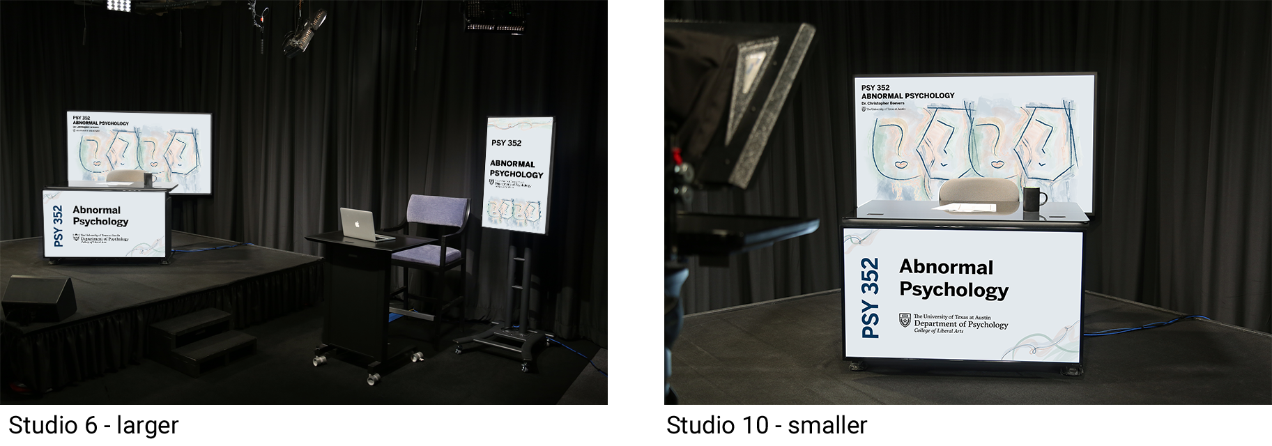
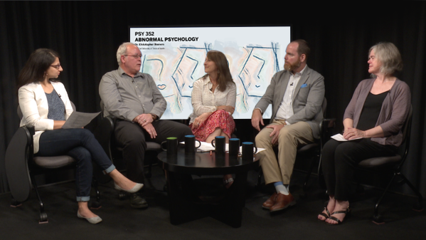
LAITS has three main studios right down the hall from our Graphics Dev Lab. They are former classrooms retrofitted with professional video, audio, and broadcasting equipment. They are Studio B (a larger studio with seating for TAs and a studio audience) and Studios A and C (for smaller productions with just a professor or two).
Courses can be live or pre-recorded. During a live production, video and audio STAs operate cameras, mics, and broadcast stations while the professor instructs. Pre-recorded classes are made the same way, but can include a post-production process.
Before a course begins production, the project team will put in a request for studio graphics. That’s where we come in!
In-Studio and Video Assets
The graphics for the course should be a distilled visual representation of the course, though the course may cover several topics. STA designs activate the physical studio space, and can give the student-viewer an idea of what content to anticipate, as well as create an exciting environment for the course, even before the student begins work for their course.
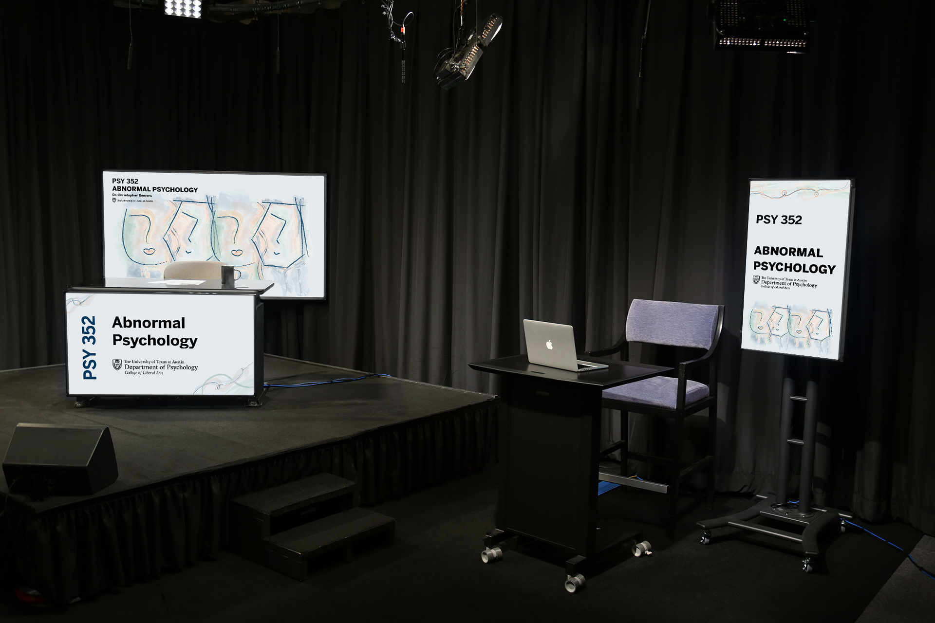
- Wall Monitor
The wall monitor is a TV screen that sits directly behind the professor lecturing. It will be visible nearly all the time to the remote audience.
- Desk skirt
The desk skirt is a screen covering the front of the desk usually out-of-frame, but occasionally visible in wide shots.
- Vertical monitor
The vertical monitor is set up to be behind any TAs or guests. It is a TV flipped on its side to stand-up vertically.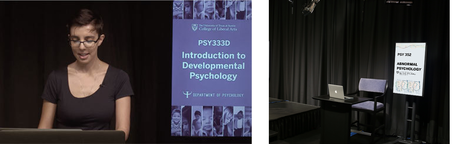
- Intro Animation
Most online courses will have a 10-30 second intro video modeled on movie previews & trailers. The production of intro-videos give design STAs the chance to collaborate with audio and video STAs.
Design STAs will storyboard, create assets for, and depending on their skills animate the intro as well. It will then be handed off for an audio STA will create the musical introduction (i.e. “Live from The University of Texas at Austin, LAITS presents… The Psychology of Advertising… with your professor, Dr. Lee Ann Kahlor” *music plays*).
Example: E316L Intro
Example: COM301E Intro - Stingers
Stingers are graphic title cards that mark the beginning of a new segment of class (such as Q&A time, or Activity work time). These work a lot like the Style A & B stingers you made in Powerpoint. For studio courses, we will create custom stingers and sometimes include light animation/audio.
Example: COM301E Stinger
Example: E316M Stinger
In addition to studio assets, we also create matching Canvas graphics and custom Powerpoint templates. Here is a full design menu showing just some of the possibilities:
 + PSY 352 Intro Video Animation
- Notice how cohesive the course is overall: muted cool tones, 4 faces motif, same font, and watercolor style. Each asset uses these elements in a unique, varied way.
- The design STA, project manager, art director and faculty member collaborate on the direction of the look and feel of the course. It is the STA’s role to help achieve the faculty’s vision for the course’s visual appeal.
Creative process behind making studio course graphics
Studio course graphics like these are unique to each course and professor, so they require more thought than a simple Style A/B course. When brainstorming ideas, think of 2-3 ways you could best represent the course. Consider the course’s department, course content, professor’s personality, etc.
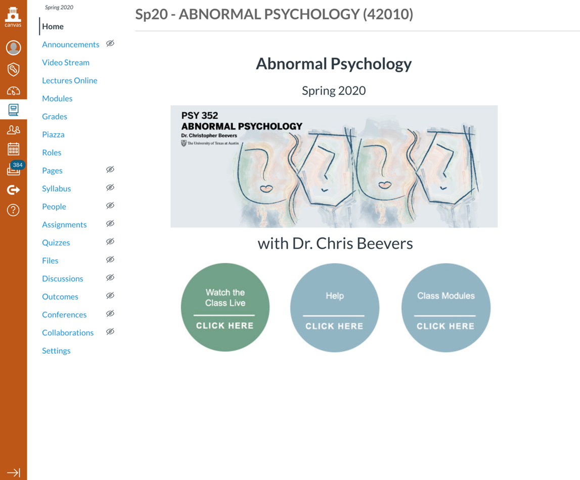
- In PSY 352, the abstract face design represents the abstract nature of our minds, of which psychology is the study of. The muted colors match the course’s serious tone, and on an even deeper level they also support our mental connection between psychology = mind = mindfulness = calm = muted colors.
- In contrast, COM 301E is a fun and welcoming introduction to modern communication technology. Therefore, the graphic look and feel is a lot more colorful and energetic. These choices all depend on the course and professor.
As you brainstorm, you should share your sketches on Basecamp with your team lead for feedback.
Creating a Cohesive Course Visual Design
Every LAITS course should have a cohesive look and feel, from studio graphics all the way to its Canvas site. You should carry color, style, font, and motifs all throughout the design process.
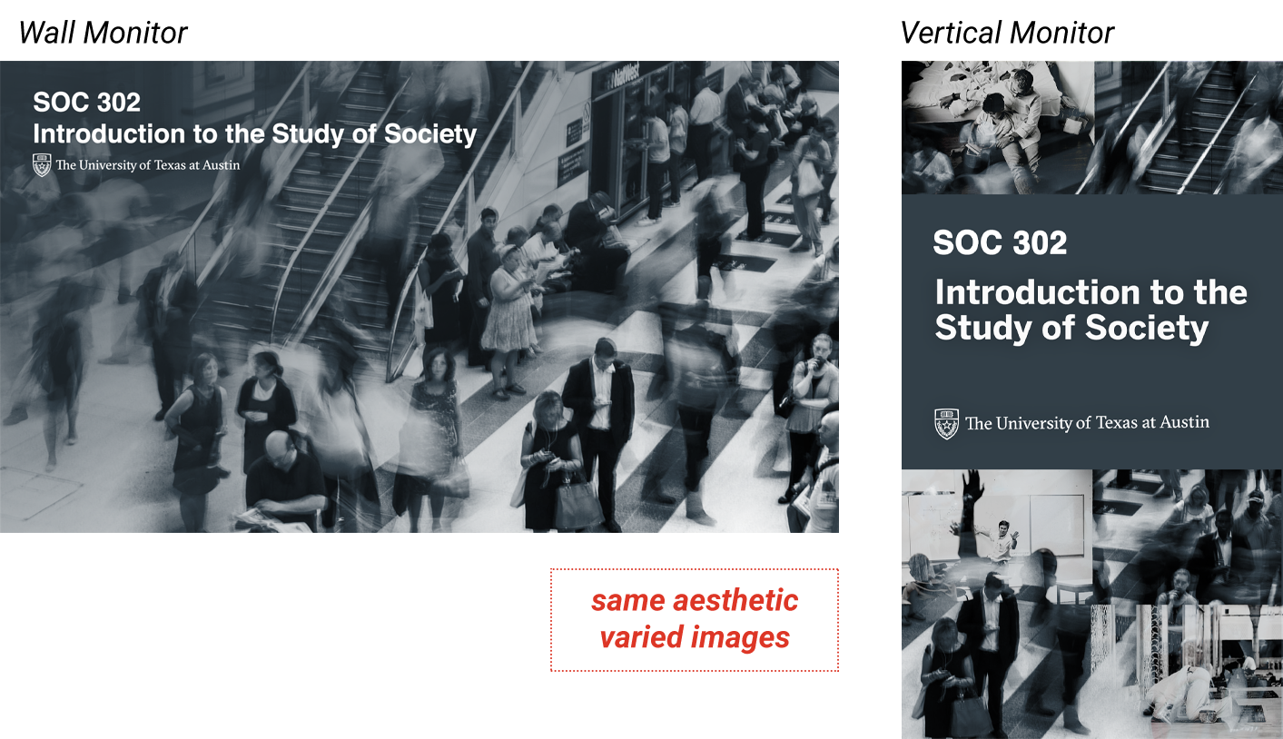
However, avoid making each graphic look the exact same. This will create variation in the course, and provide the viewer’s eye places to rest. See how in SOC 302, the STA designer used different layouts and photographs that all still fit into the theme (society) and color scheme (cool grays and blues).
A Note on Color Correction
*Edit: As of Spring 2022, the studio has adjusted their equipment and color settings so this is much less of an issue for designers. Keeping this section here for archival purposes!*
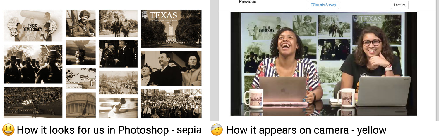
A quirk of studio graphics is your original colors may not always appear as intended. This is because after graphics are made on our computer with our screen’s color settings, they are then projected on a TV with different color settings, under studio lights that have their own color tint, and then recorded on cameras with different color settings. Here is an example of this color shift:
It’s hard to 100% know what will look right, but we can work on this by color testing in the studio and referencing our color correction archive.
Color correcting purple: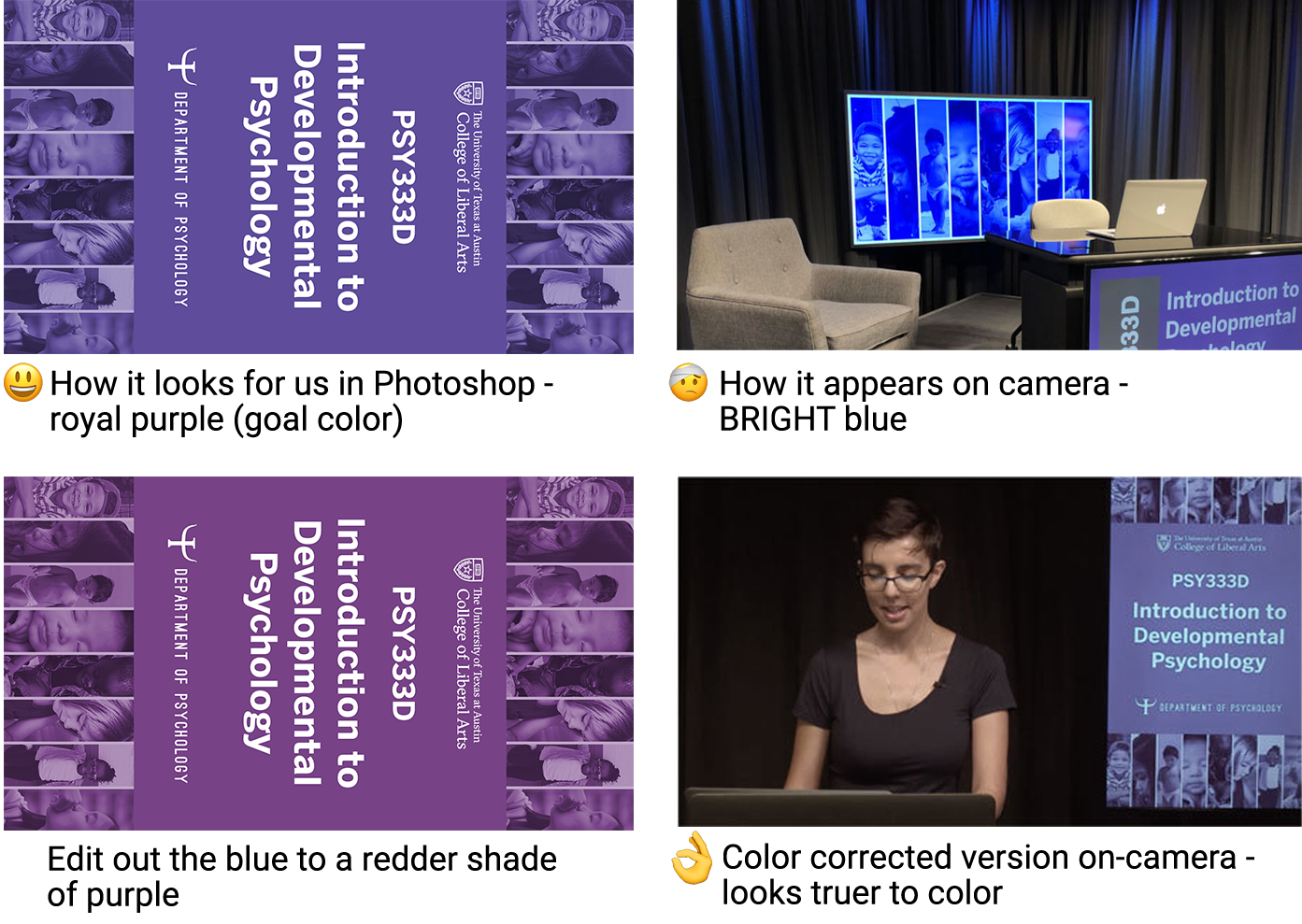
Color correcting beige: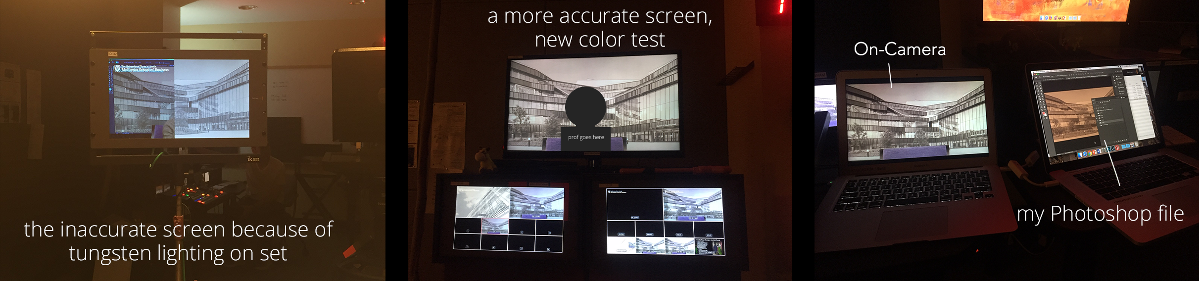
What we can do to help the production team save time is stick to colors we know have worked in the past. Also consider skin tones, wardrobe options, etc. For example, a tan background will mesh too much with most skintones.
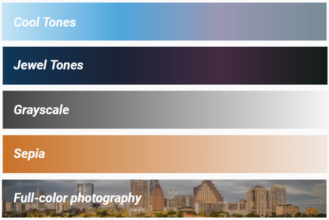
Colors that typically appear better:
Colors to avoid:
- Beige and burnt orange (appears muddy brown)
- Pure white (appears light blue)
- Avoid using in large swaths (OK for small areas), provides too much back-lighting on-set
- If necessary, use LAITS off-white in small amounts: #fafafa
- Pure black (creates dead space)
- OK for small areas
- Consider using off-black in small amounts: #1a1a1a
- Bright, pure hues such as any of these:

Now it’s your turn
Create a full suite of graphics for an imaginary studio course of your choice.
This Box folder will have everything you need. Please explore the folders and familiarize yourself before moving on:
1. Choose a Course
First, choose from the two courses available for this tutorial. Learn more about each course by exploring their info in Box. You must read through the professor’s design requests and syllabus as these will inform your design.
- Option #1: EAS1030: Earth’s Dynamic Environment II
- Option #2: ART3800: Twentieth Century Art
2. Brainstorm
Brainstorm 2-3 design directions and share them with your trainer on Basecamp. Create a small moodboard of style inspiration (at least 5 photos) for each design direction and share it on Basecamp.
- Consider the course subject, tone, mood, personality, etc. when choosing colors, imagery, font, etc.
3. Create Studio Assets
Once a direction is approved, begin mocking up your STUDIO assets first.
Create designs that are simple, ambient, and mood-setting. They should never take center-stage over a professor. SIMPLE IS BETTER!
Find ways to create DEPTH via receding color, perspective, image choice etc. We want to avoid our design looking claustrophobic and busy behind the prof.
-
- Digital Wall Monitor (1920 x 1080px, 72dpi, .png)
There are 7 options a professor may choose from.
Choose one option to base your design off of. These options are meant to provide you (and the client) a clear direction while still leaving you room for creativity.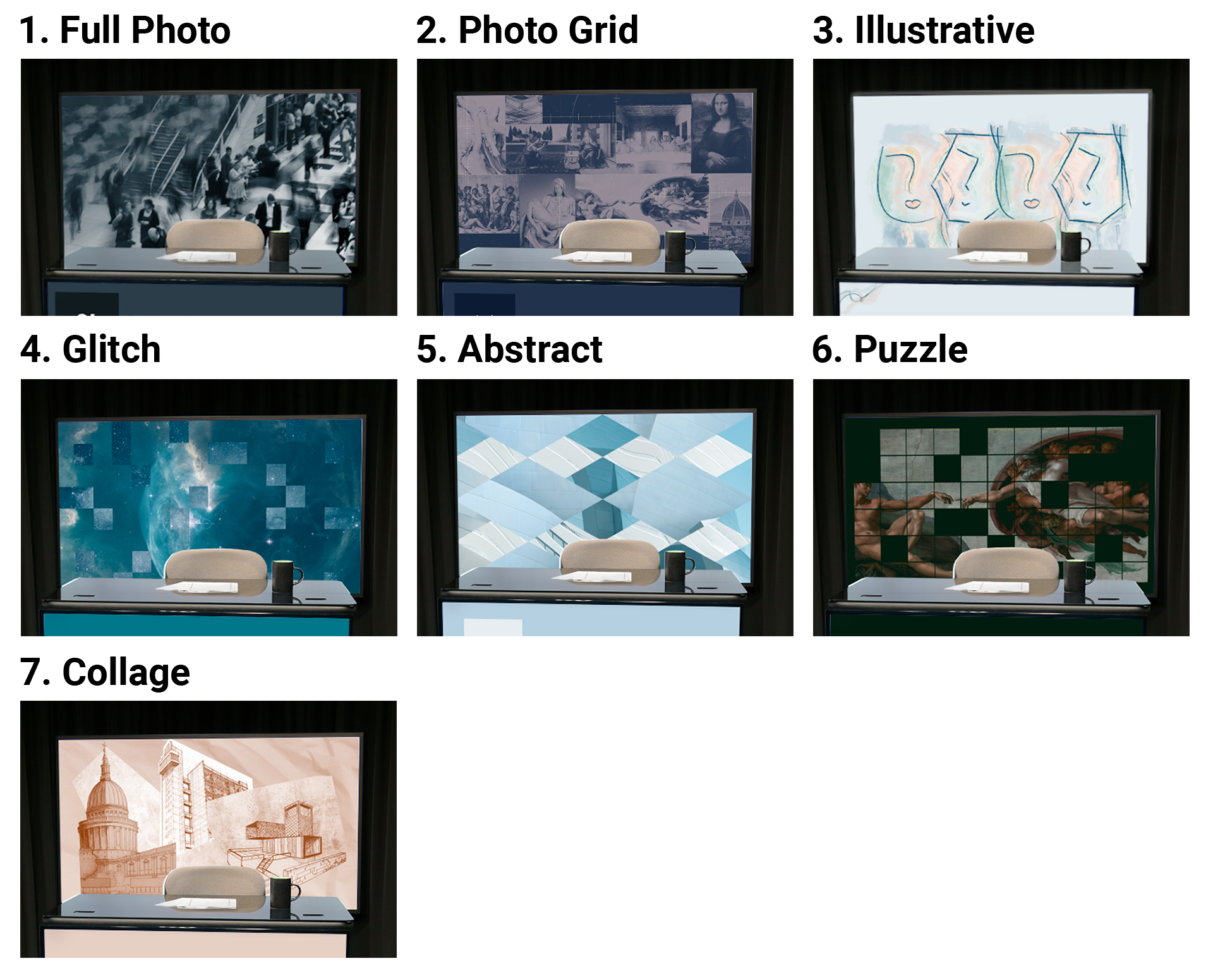
Your wall monitor design should…
– Be textural, subtle over all else.
– Create a sense of depth using one or more of the following: color overlay, gradient overlay, blurs, or a clear delineation between foreground/midground/background
– Use asymmetry. Very symmetrical backgrounds usually make the professor look too perfectly framed, which can look awkward.
– Use a limited range of recommended studio colors. Your backdrop will affect what clothes the professor can wear on-camera (which they will practice in dress-rehearsal!)
– Avoid using lots of faces if you use photographs or a grid. Another face next to the professor’s actual face will be distracting.
– Leave out any text. The studio team will project text/logo on in post-production. Text/logos on the wall monitor often get cropped or appear crooked on camera, so it’s best we leave it out. - Digital Desk Skirt (1920 x 1080px, 72dpi, .png)
There are 2 desk skirt templates you can choose from:
- Vertical Monitor (1920 x 1080px, 72dpi, .png)
There are 3 vertical monitor templates you can choose from:
*Vertical Monitor needs to be saved rotated 90° clockwise. The vertical monitor is a TV screen rotated on its side.
- Digital Wall Monitor (1920 x 1080px, 72dpi, .png)
**USE A DESCRIPTIVE FILE NAMING CONVENTION**
4. Test Studio Assets
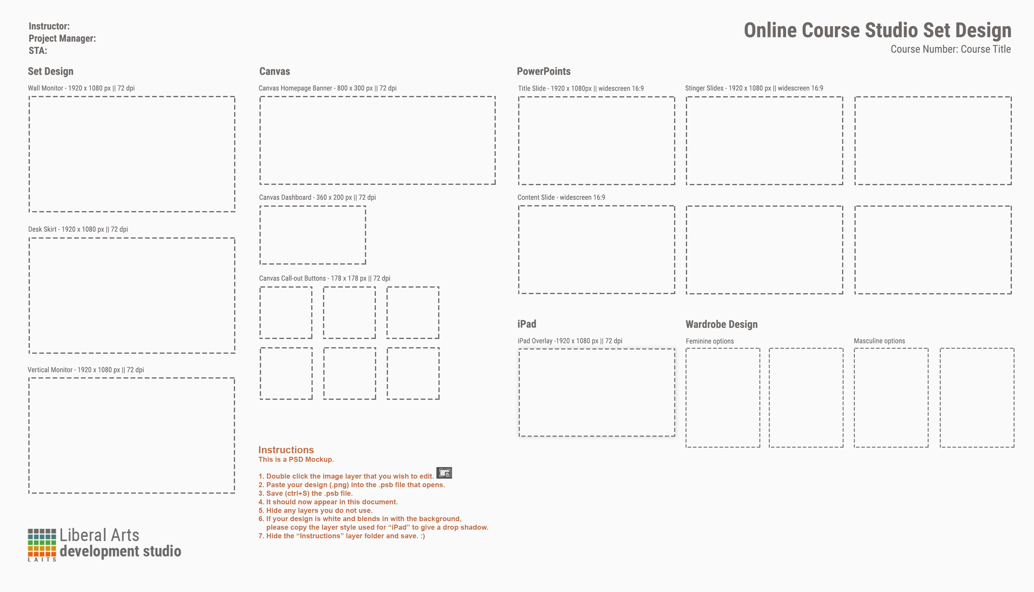
You have created beautiful studio graphics, and now we should test if they will work in context. In the Box folder “Design Menus and Mockups” there are five mockups to place your designs into:
- studio-graphic-mockups.psd

- studio6-set-mockup.psd
- wall-monitor-w-multipleguests.psd
- (Make this yourself), Place mockup #4 into your iPad overlay, cropped and centered like so — you will make the iPad Overlay in step 6:

Look at these carefully, and ask yourself these critical questions:
- Does this design create a sense of depth, like a backdrop in a play? Or, does it feel too close, making the shot feel claustrophobic?
- Is the design distracting, too intense?
- Do the colors mesh or clash with a wide range of skintones?
- What colors of clothing would best suit this design? (You will be suggesting wardrobes at the end of this training)
Share your mockups and observations on Basecamp and note what edits you think need to be made. Make further edits.
5. Storyboard an Intro
Once these are finalized, begin storyboarding an intro animation. It can be purely aesthetic, or have a simple narrative. Spend no more than 20 minutes sketching and brainstorming a concept, and share on Basecamp. You do not need to mock it up any further or animate.
This example for HIS 315K has a subtle narrative and is 11 seconds long.
6. Canvas Graphics
Begin creating the Canvas graphics. They will probably vary slightly from your studio graphics, that is good. Be sure to include the course title and the departmental logo, just as you did in Style A/B.
Here are examples, but by no means do you need to follow this Style A/B-esque layout:
- Canvas Dashboard (360 x 200px, 72dpi, .jpg)

- Canvas Homepage (800 x 300px, 72dpi, .jpg)

- Canvas Callout Buttons (Must use template in Box)

- iPad Overlay (Must use template in Box, 1920 x 1080px, 72dpi, .png)

*Keep the background of this SIMPLE, SOLID color – even this example borders on too busy.
Remember that a picture-in-picture video of the prof in front of your wall monitor will be overlayed over this.
7. Create a Powerpoint Template
Design a custom Powerpoint Template (see: Master Slide Tutorial and template in Box) based on the course design. There are two basic slide types to create:
- Title slides should have room for a large, simple title and subtitle. They can be full color/have more design on them because the text is simple.
- Content slides should be very, very plain – a simple branding bar (must use template in Box), #fafafa background, and a small splash of color will do. This is where professors will place their bullet points so the design needs to be subdued.
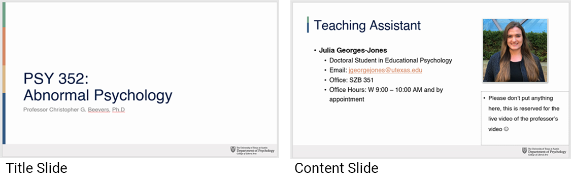
– Notice the placeholder that says “Please don’t put anything here, this is reserved for the live video of the professor”. This is called person-in-picture (PIP). You can create a placeholder like this while working in Master Slide mode that is only visible in edit mode.
Download the PSY 352 template to see
9. Create a Final Design Menu
When all your designs are finalized, create the full design menu; StudioCourse-DesignMenu-Template.psd is located in “Design Menus and Mockups”.
- Notice the area for wardrobe design; please show a range of outfit colors that would work well with your digital wall monitor art. Neutrals like black, gray, tan, and no busy patterns usually work well.
- White clothes should NEVER be suggested, they do not look good on camera
- We did not create stingers in this tutorial, in Roboto Condensed write “N/A” in the four boxes.
9. Share your final mockups to Basecamp and your blog!
Studio graphic specs are subject to change in a case-by-base basis. We are always working to incorporate client requests while learning what looks good on camera.