

A Card Layout is an excellent way to organize multiple longform content pieces into smaller, bite-sized sections. For instance, if you have a list of articles, you can use a card layout to better organize and summarize them, complemented by additional visual components like images.

You will learn how to create these using the tools at your disposal through the Cascade editor and additional HTML coding. For the purposes of this training, you will make 3×3 tables to achieve the card layout. These dimensions have been proven successful since 3 rows can fit an image row, one for a title and another for content and 3 columns compliment that successfully, but that can be reduced to or expanded upon depending on your card layout needs.
Step 1
Click on the Edit button of your site.
Once the Cascade web editor opens, scroll down to work on the main-body-content and click on a button that looks like this “<>” to edit the source code.
Step 2
Type in a code such as the one shown below:
<table summary="here you write the card summary"> | ← defines and summarizes a table ← groups the body content ← defines a row in a table ← switch out the word “Image” and add your image; make sure to crop all images to the same dimensions! ← defines a cell and the “card-title” for styling purposes ← switch out the word “Title” for the actual title of the card entry… repeat ← switch out the word “Content” & add your content; you can add text and/or links to internal/external resources as needed ← defines the table’s style ← defines the cells’s style ← defines column width ← defines row height ← aligns content to top rows ← “card-title” label styling ← converts that border to white to create an invisible-like effect |
The previous code should look something like the following when previewed/published…
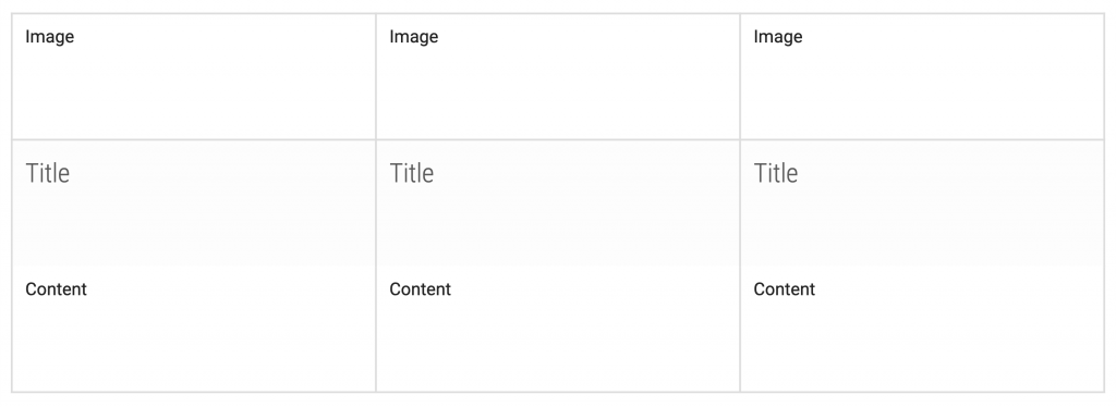
| Note: if you need to increase or decrease the amount of columns you need, you must go to the source code and either write in or delete the amount of <td></td> code you have. Also, make sure that the width of the cells in the style section of the code is set to the proper percentage of the total table width. Otherwise, you will have formatting issues. |
Step 3
Add your content! Using the Cascade WYSIWYG editor add:
- Images – Add through the insert/edit image button. Also, make sure the images you add have the same dimensions as each other.
- Titles – Edit through the format → headings buttons. A size 4 heading is recommended.
- Content – Add regular content by writing on the cell with the standard paragraph feature. Incorporate links if needed through the insert/edit link button.


Step 4
Repeat as needed. If you need more cards just copy and paste the same code and re-edit the content.